AED, occasional Print
AED, occasional Print
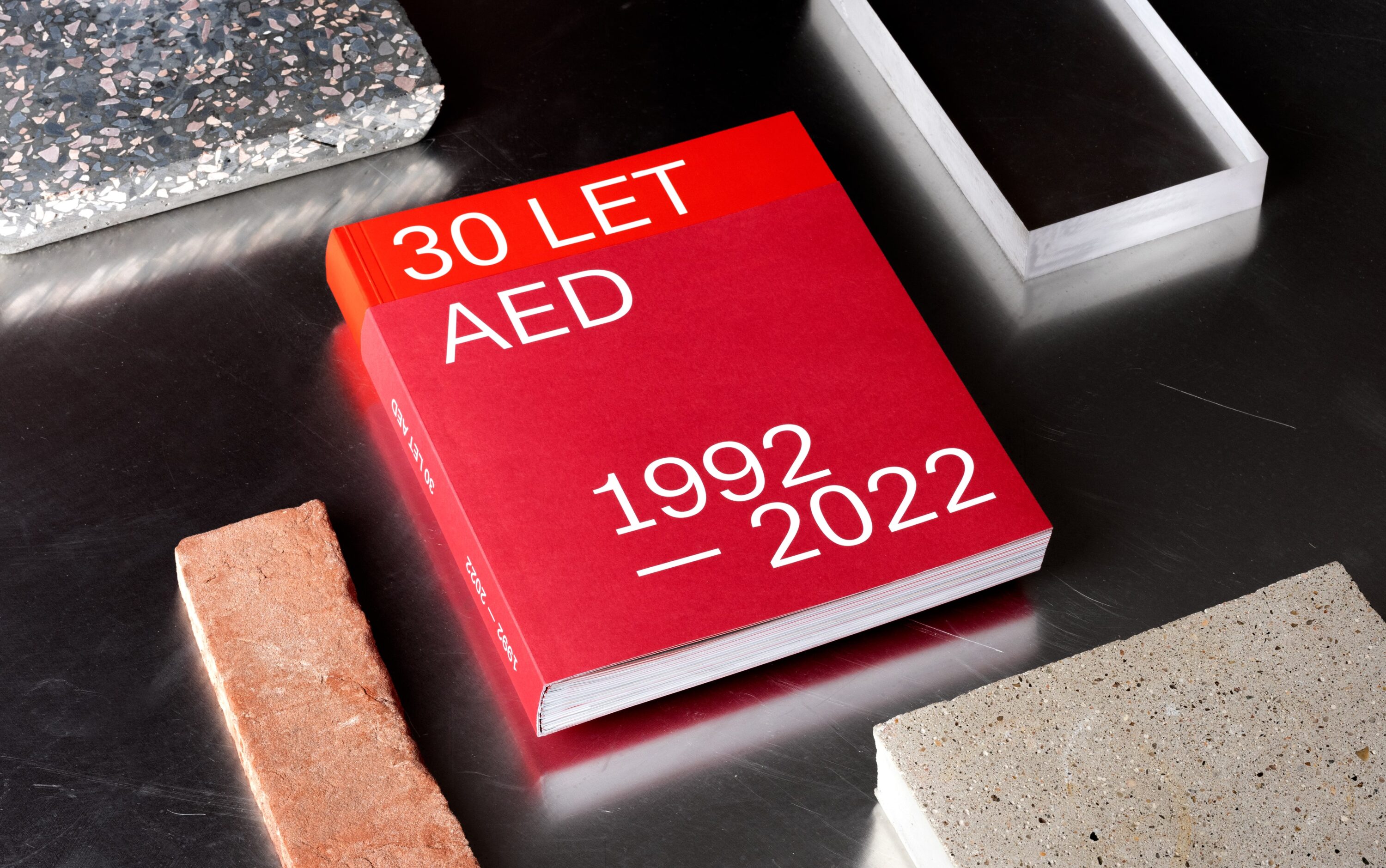
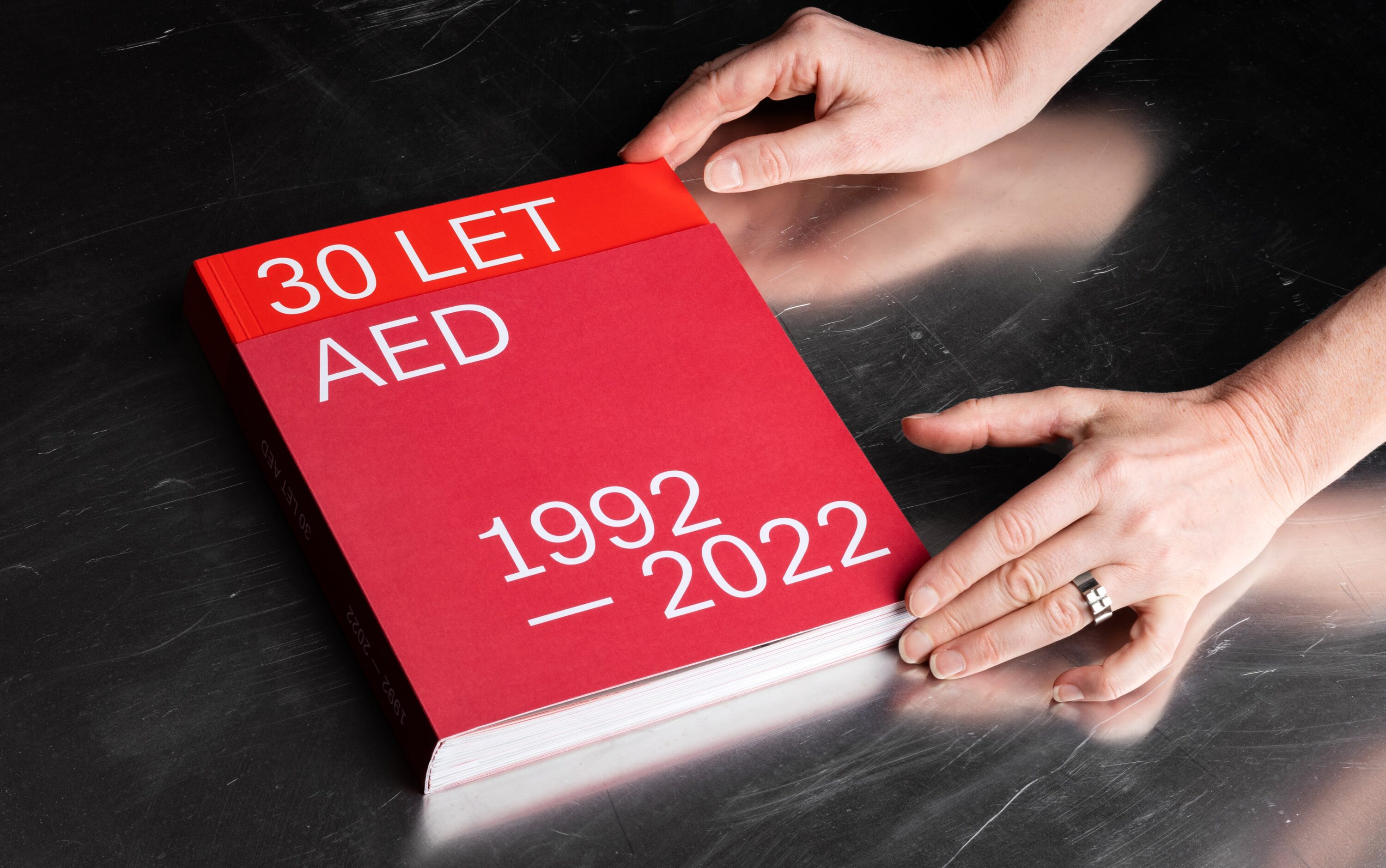
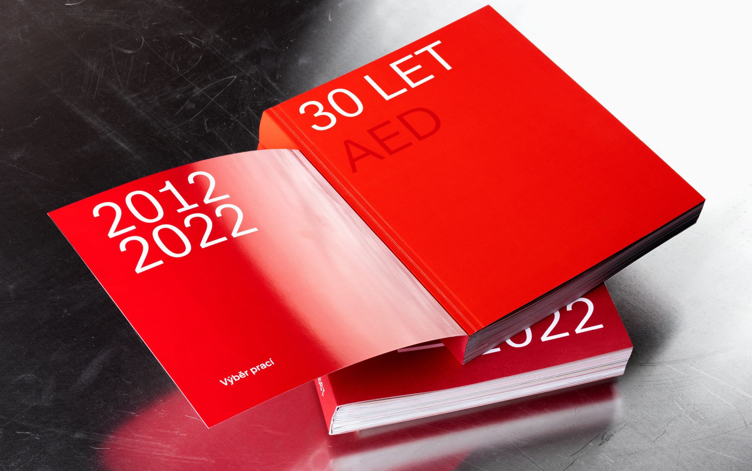
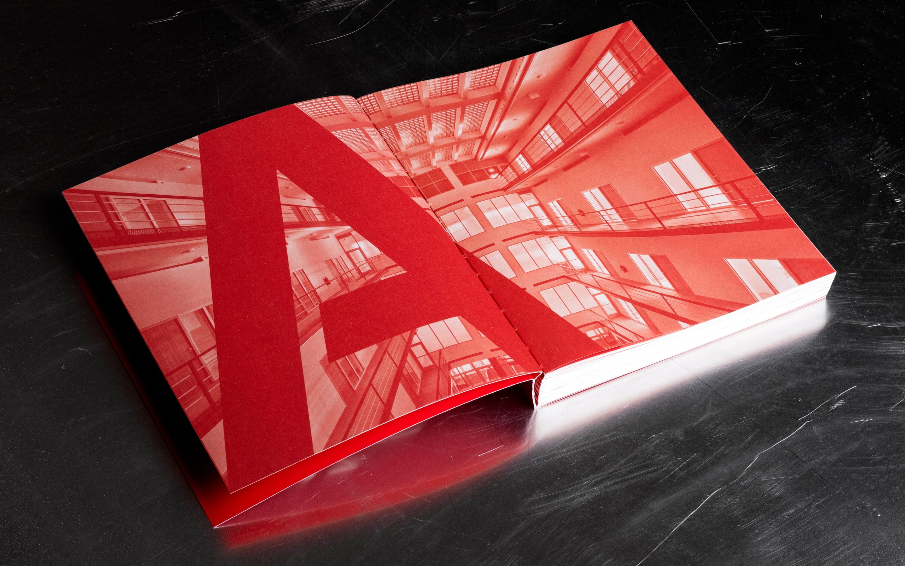
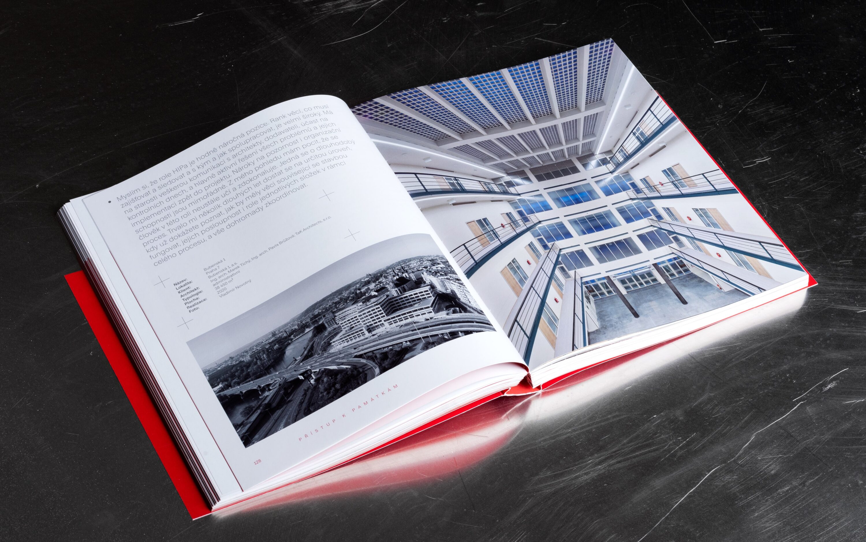
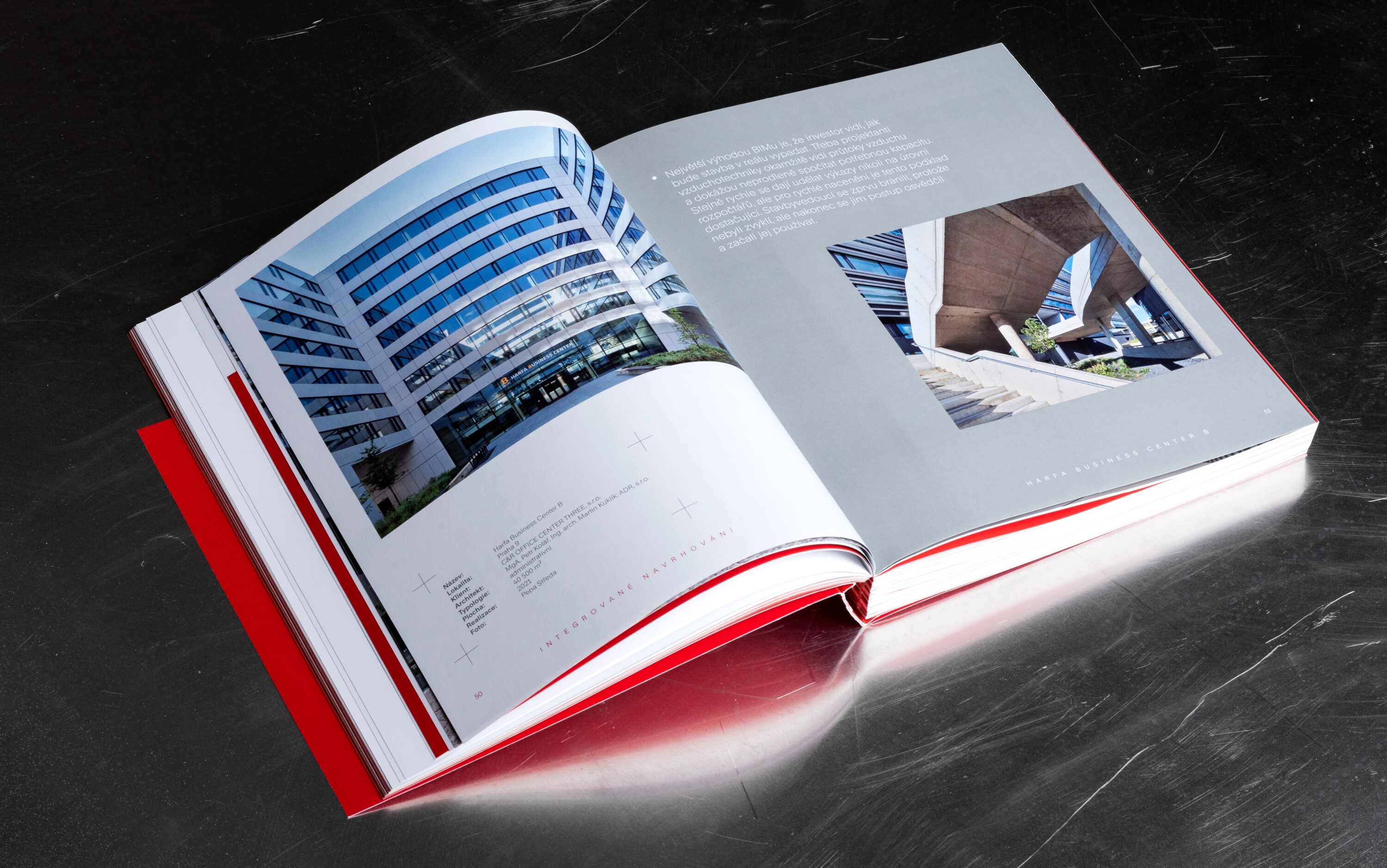
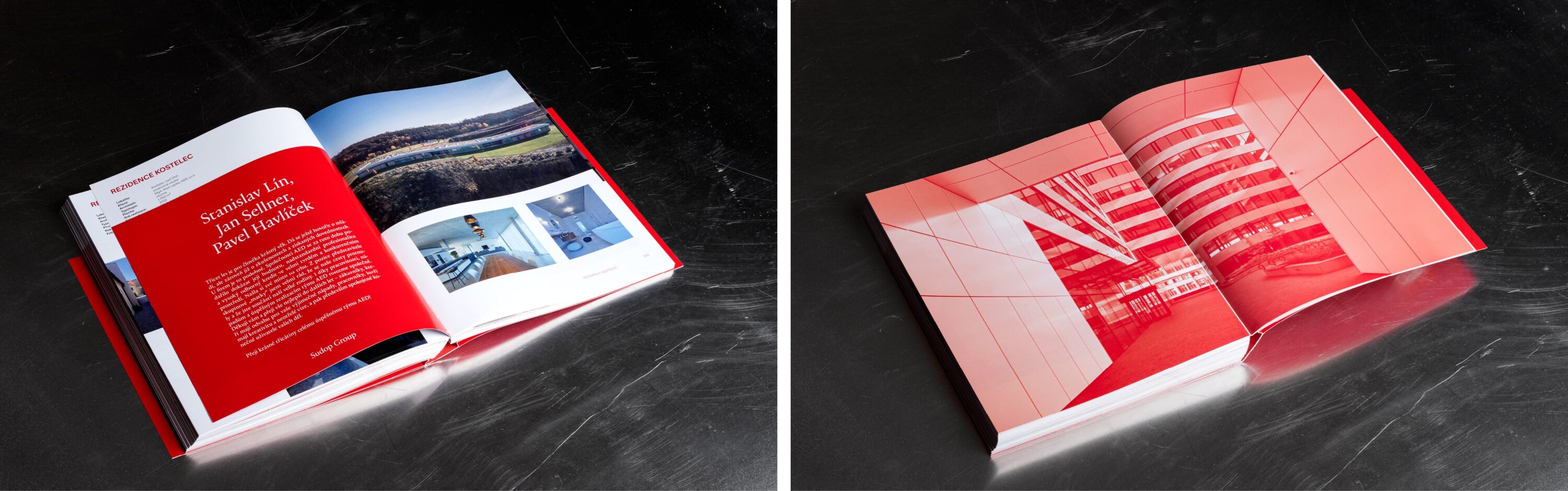
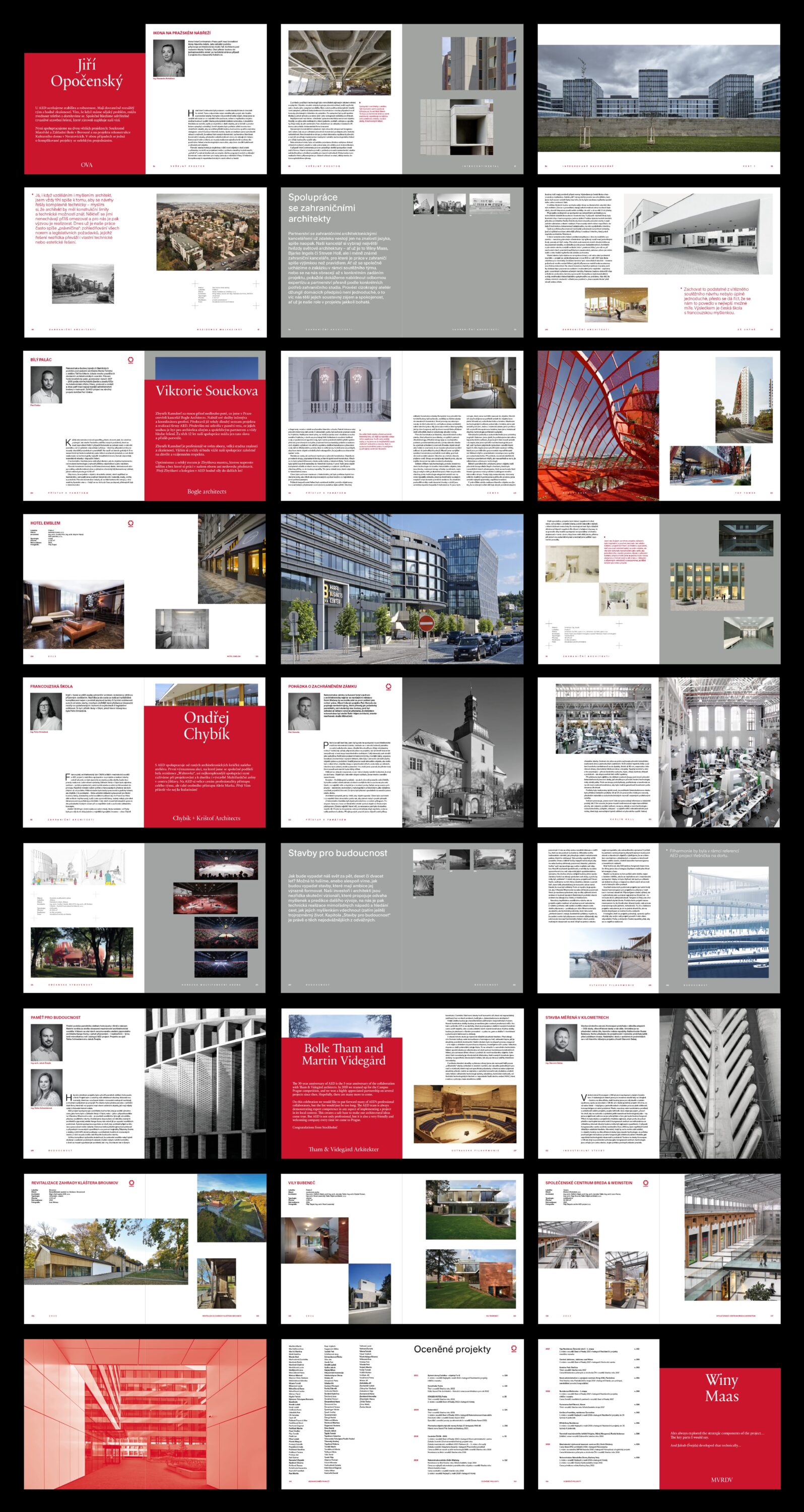
AED is a company for which we made a logo and complete corporate identity a long time ago. We are happy that it is still working well, so we have something to build on. While working on the book design, we carefully analyzed the assignment, it was not easy. Interviews, topics, statements of employees, photos of realizations, all this forms a broad scope of the book. The composition of the visual material is very diverse, so it was not possible to follow a monothematic arrangement, each chapter deals with different realizations of buildings. The cover of the book is designed in such a way that, in a double version of a different format and type of paper, it meaningfully separates 20 and the added 10 years of the company’s operation, i.e. a total of 30 years. A number of “confessions” of renowned architects run through the book, which, following the cover, are on a separate sheet of a different format and type of paper. As a whole, you hold in your hands the thanks of Aleš Marek and Zbyňek Ransdorf to all the co-workers and colleagues who helped build this company.
Design
Jakub Šilhavý, Matyáš Bartoň, Klára Kvízová
Concept of the book, texts
Matěj Šišolák
Photo
AED
Priting, binding
Protisk, České Budějovice
Typeface
Rand
Paper
GardaPat Bianka, Crush Grape, křída lesk, Bindakote ice white
Catalogue photo
Oskar Helcel
Occasional Print
2023