Jan Vodňanský Elementary School, navigation system
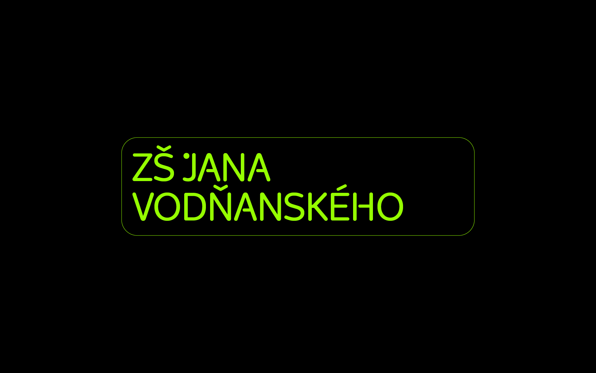

Jan Vodňanský Elementary School, navigation system
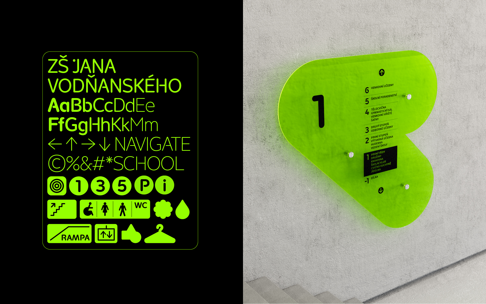
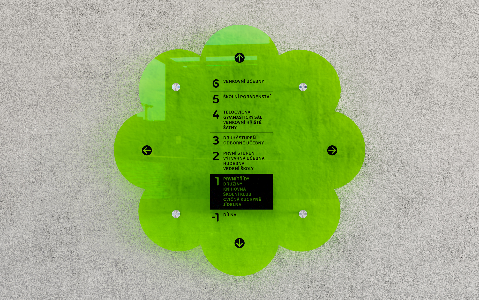
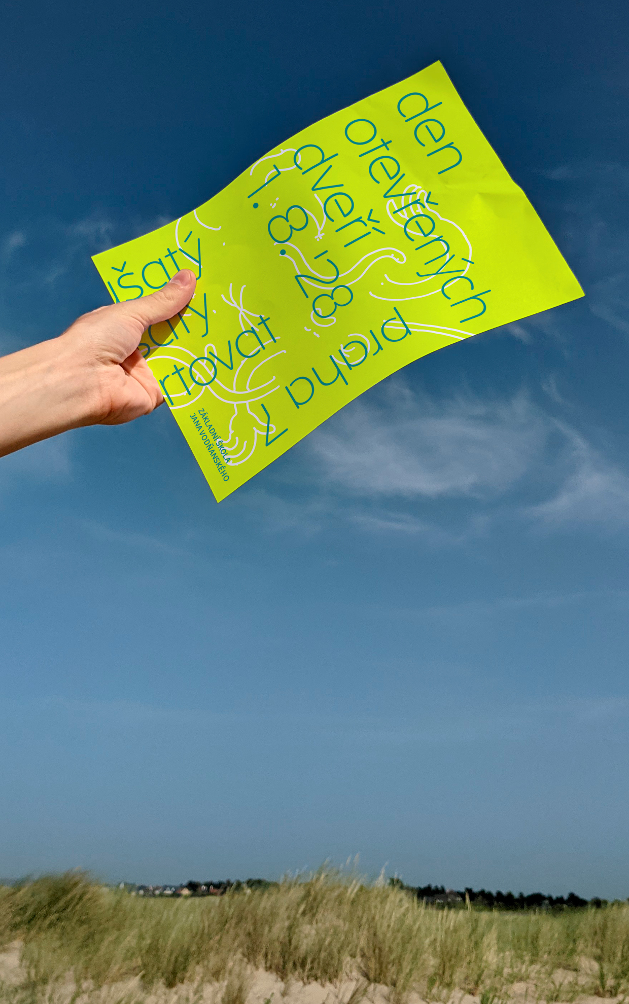
The basic characteristic of the navigation system for the future Jan Vodňanský school is a simple geometric and abstract construction. Within the creative environment of the school, we consider the original shape to be an important moment of inspiration. It is based on the drawing of the font and smoothly follows it. In the case of cut pictogram shapes, on the other hand, an immediate connection of information with visuality is necessary, which is why the shapes are realistic, yet unused and in a certain sense picturesque. As for the material colors of the building’s interiors, a rich greenish-yellow (lime) color was chosen for the navigation panels. The material is 6 mm thick plexiglass with a matte surface, printed in matte black. The panels have rounded edges (for the safety of the school environment).
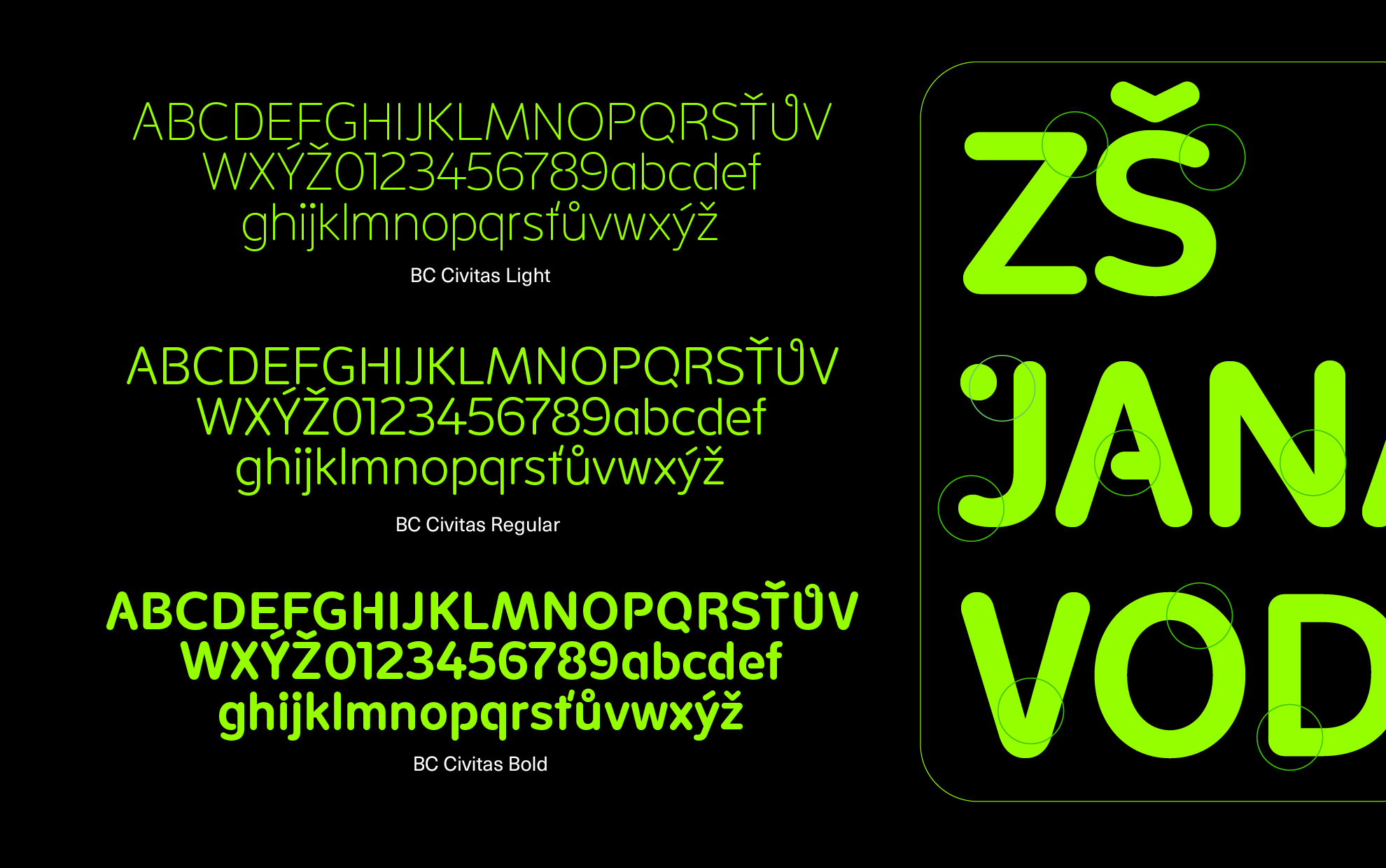
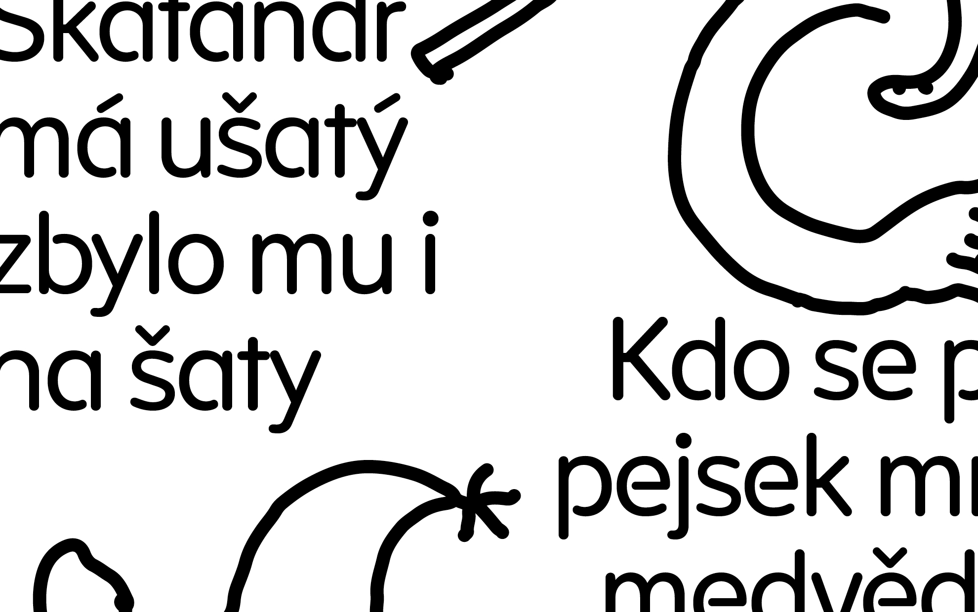
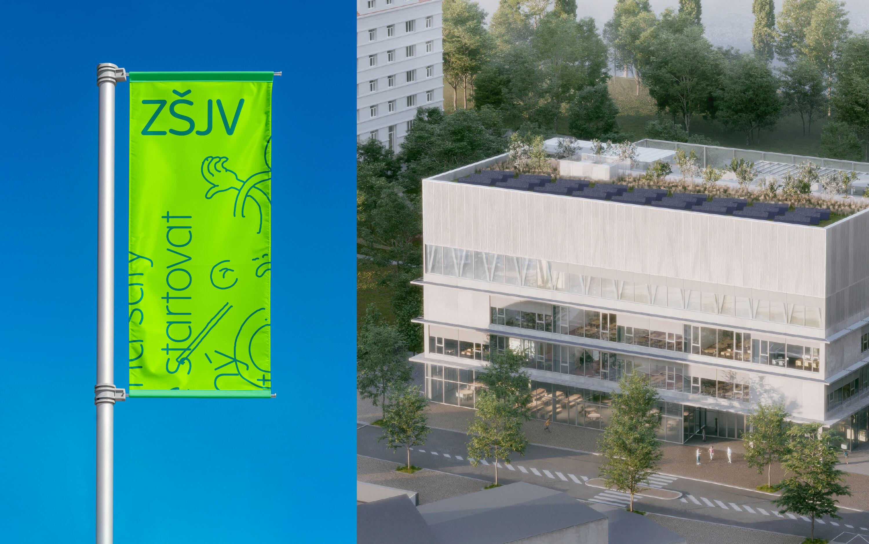
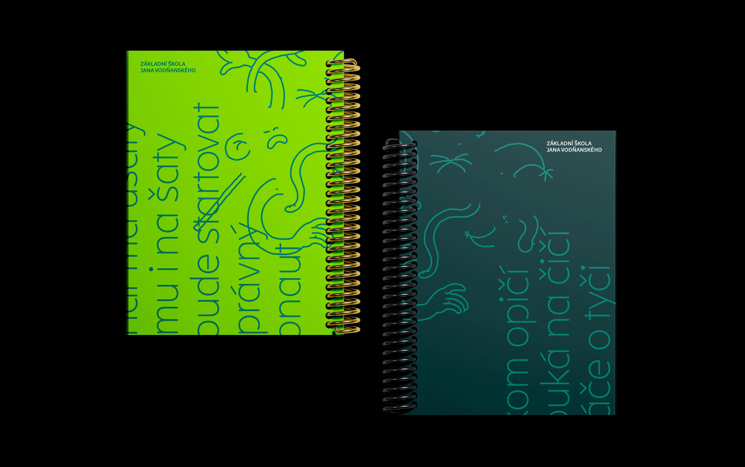
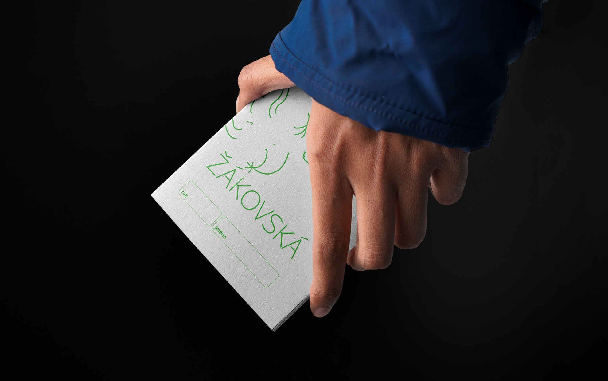
The graphic outputs are complemented by illustrations by Jan Kostohryz based on the motifs of Vodňanský’s poems. The visuals are based on the BC Civitas typeface designed by Czech typographer Jiří Rathouský. The current digitization and modernization was carried out by the leading Czech typography studio Briefcasetype in collaboration with Matyáš Bartoň.