Jewish Museum in Prague, visual identity

Jewish Museum in Prague, visual identity
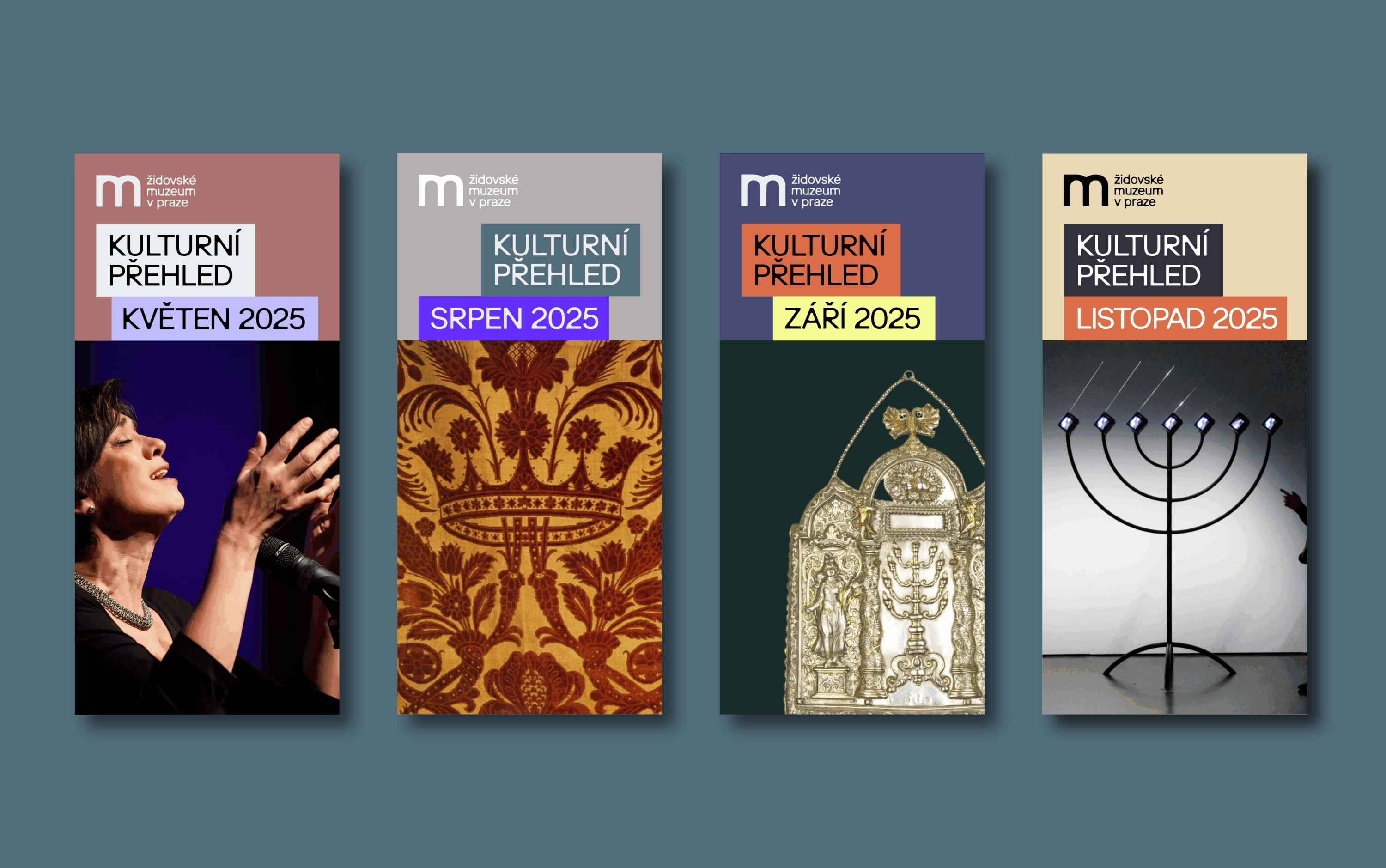
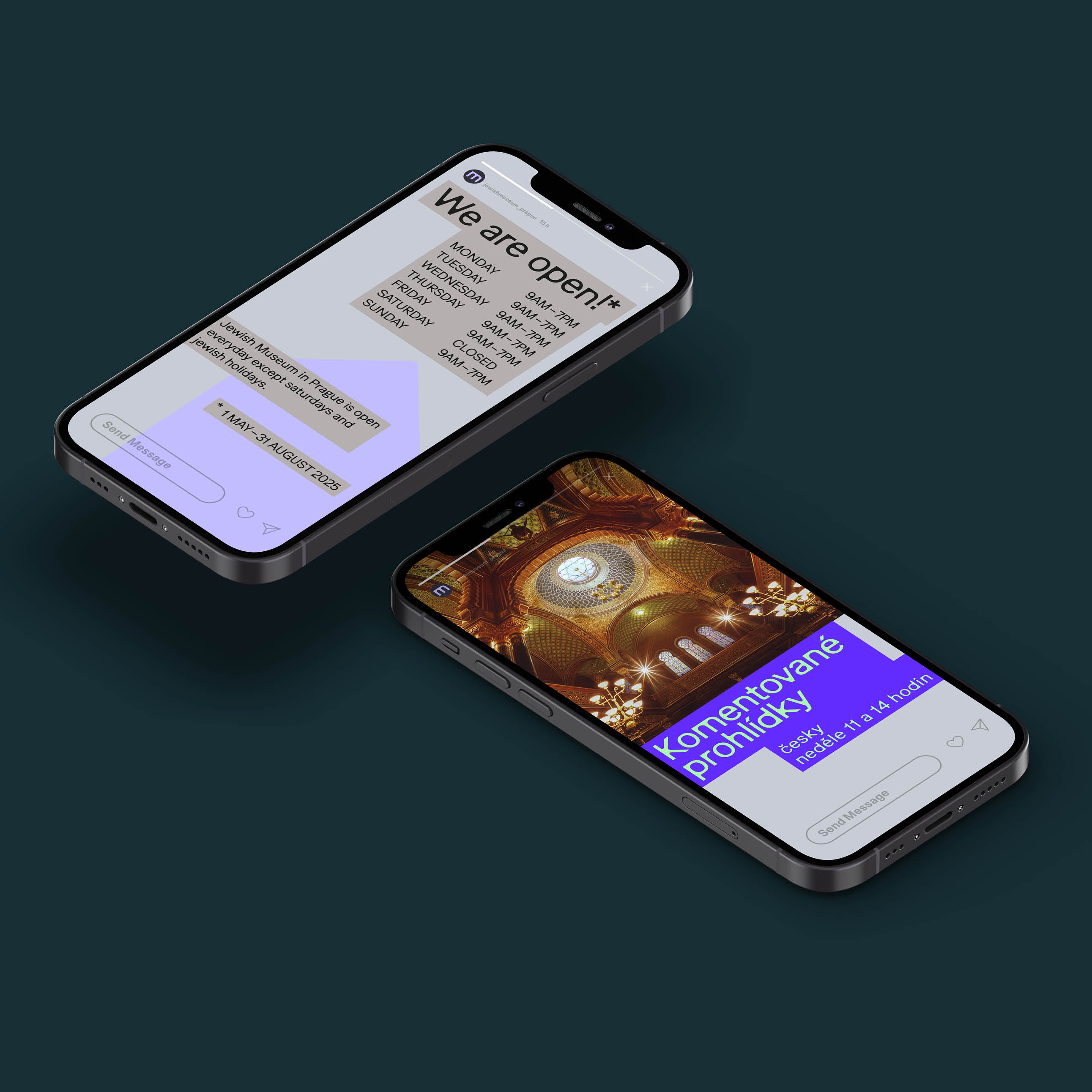
Graphic “Ten Commandments” for the Jewish Museum in Prague. The new visual identity of the Jewish Museum in Prague represents a thoughtful and sensitive update of the visual communication of an institution that honors history, architecture and cultural heritage, while at the same time reflecting current graphic standards and the needs of the digital age in its presentation.
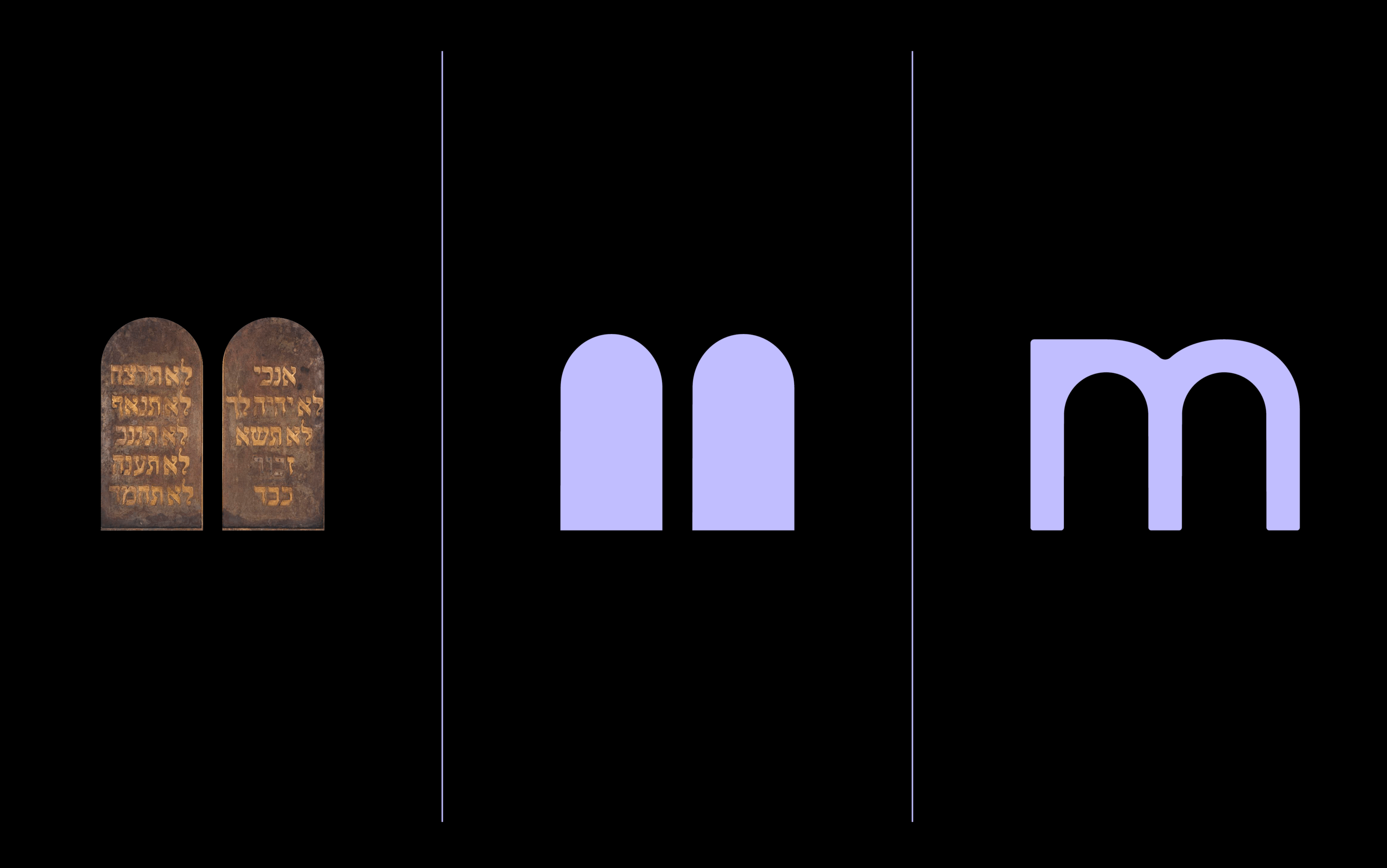
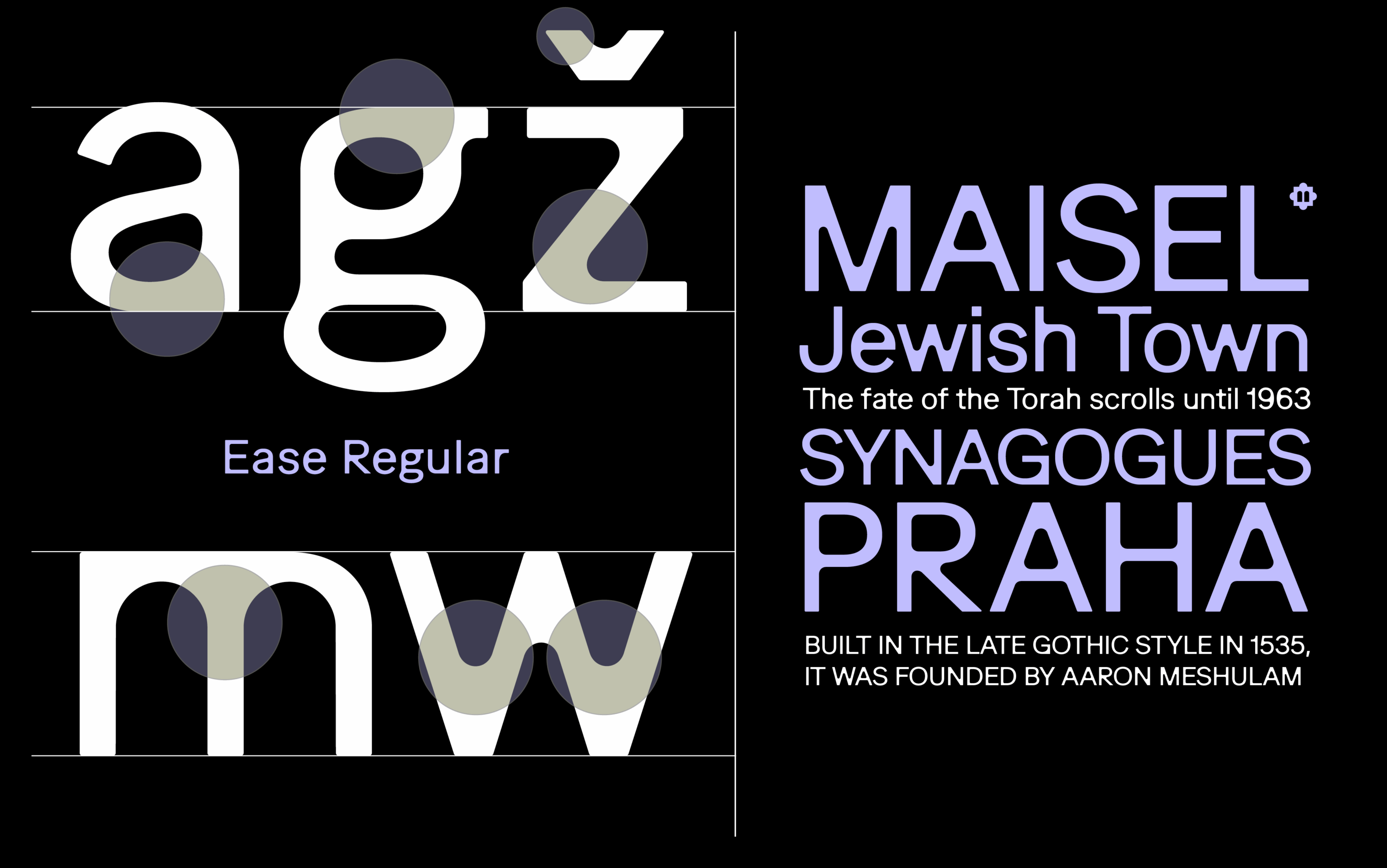
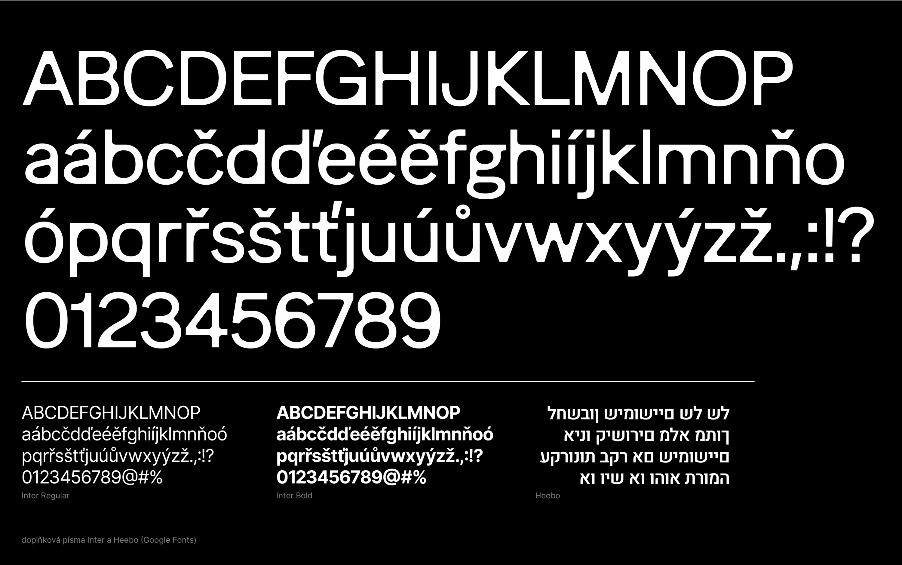
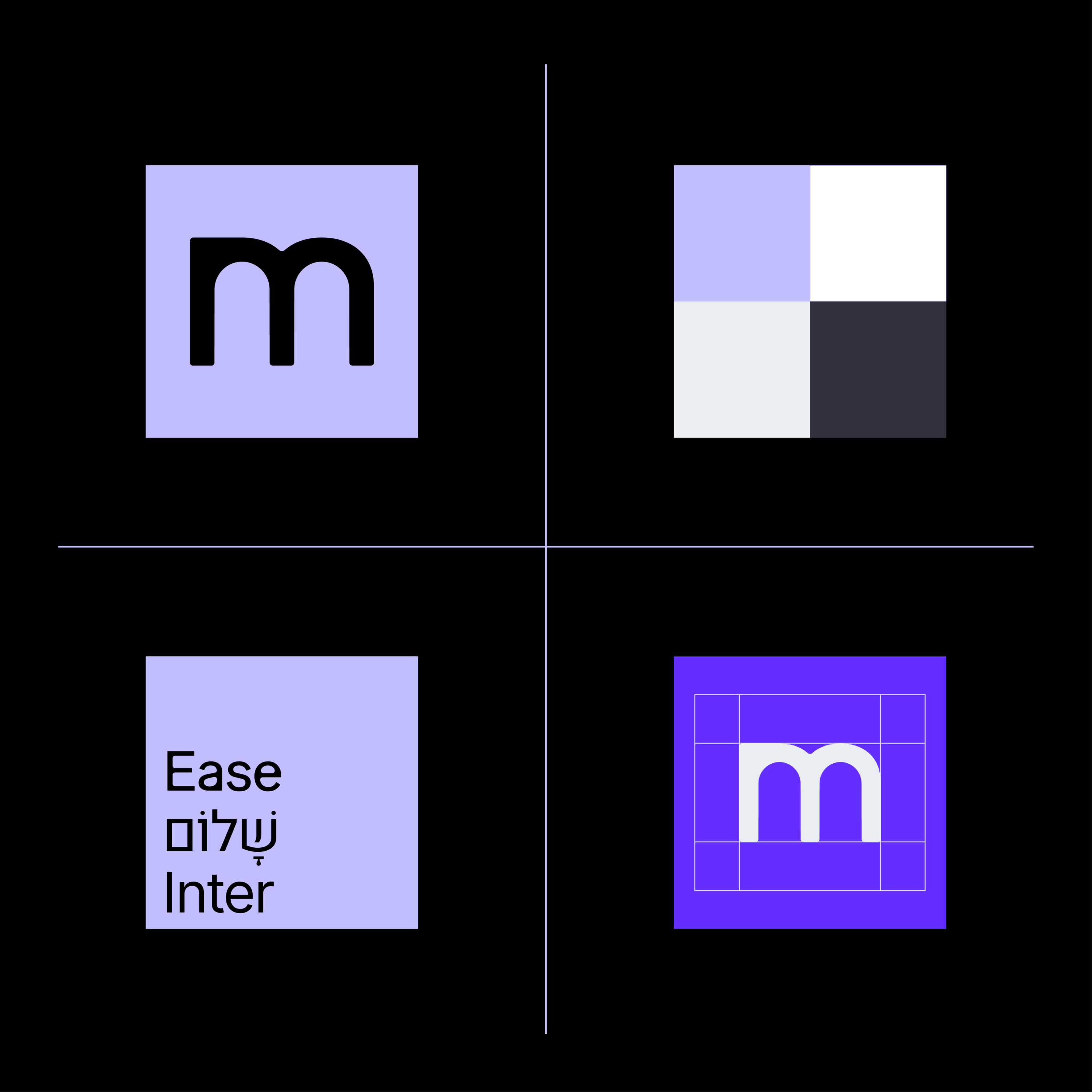
The centerpiece of the new identity is the Ease Display font by the Swiss studio Feixen. The font’s distinctive typography combines geometric precision with softness and humanity. Its details refer to the architectural elements of the synagogues and other buildings that the museum manages. The typography thus becomes not only a carrier of information, but also reflects the cultural memory and significance of this institution. The letter “m” symbolically refers to the shapes of Ten Commandments, as one of the pillars of the Jewish faith.
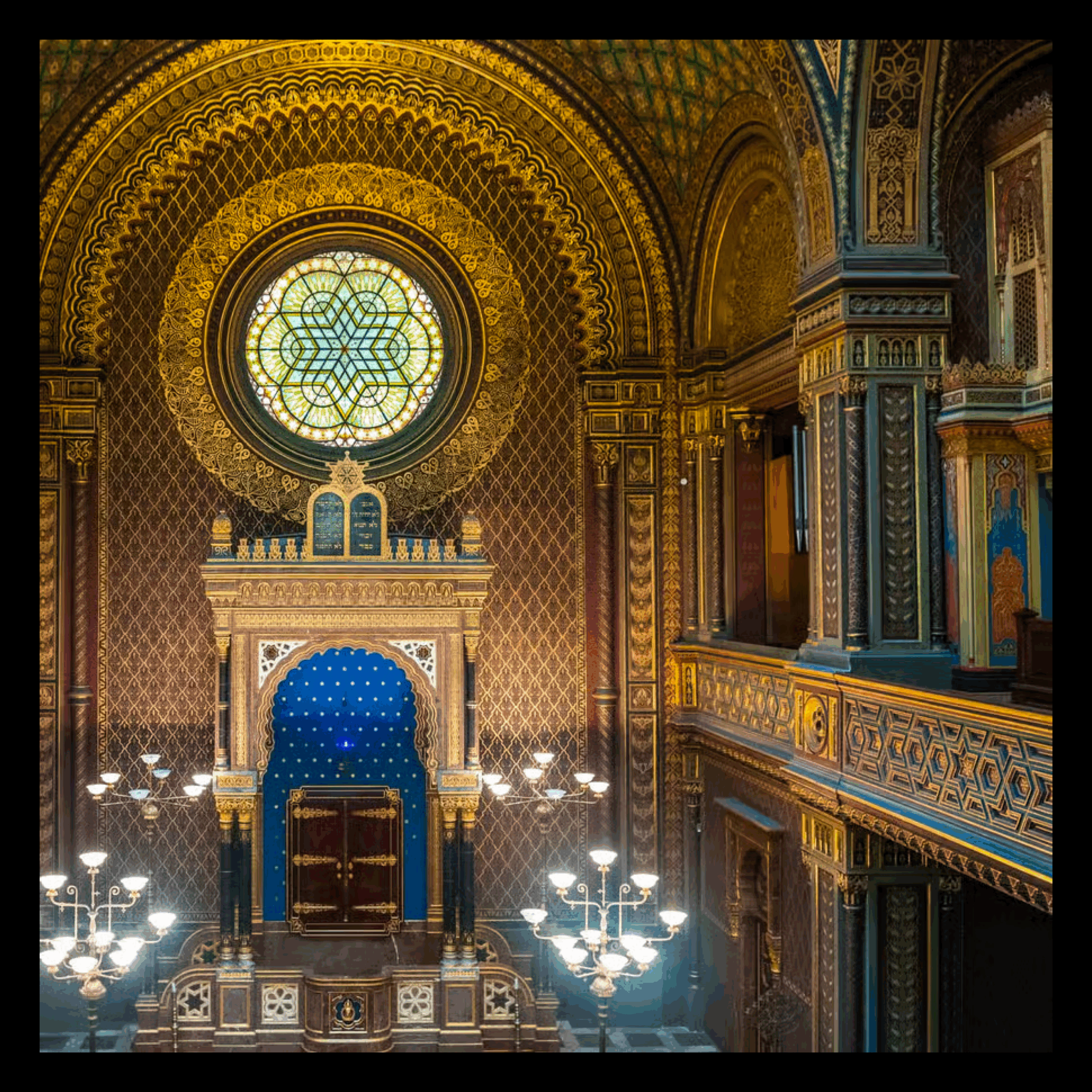
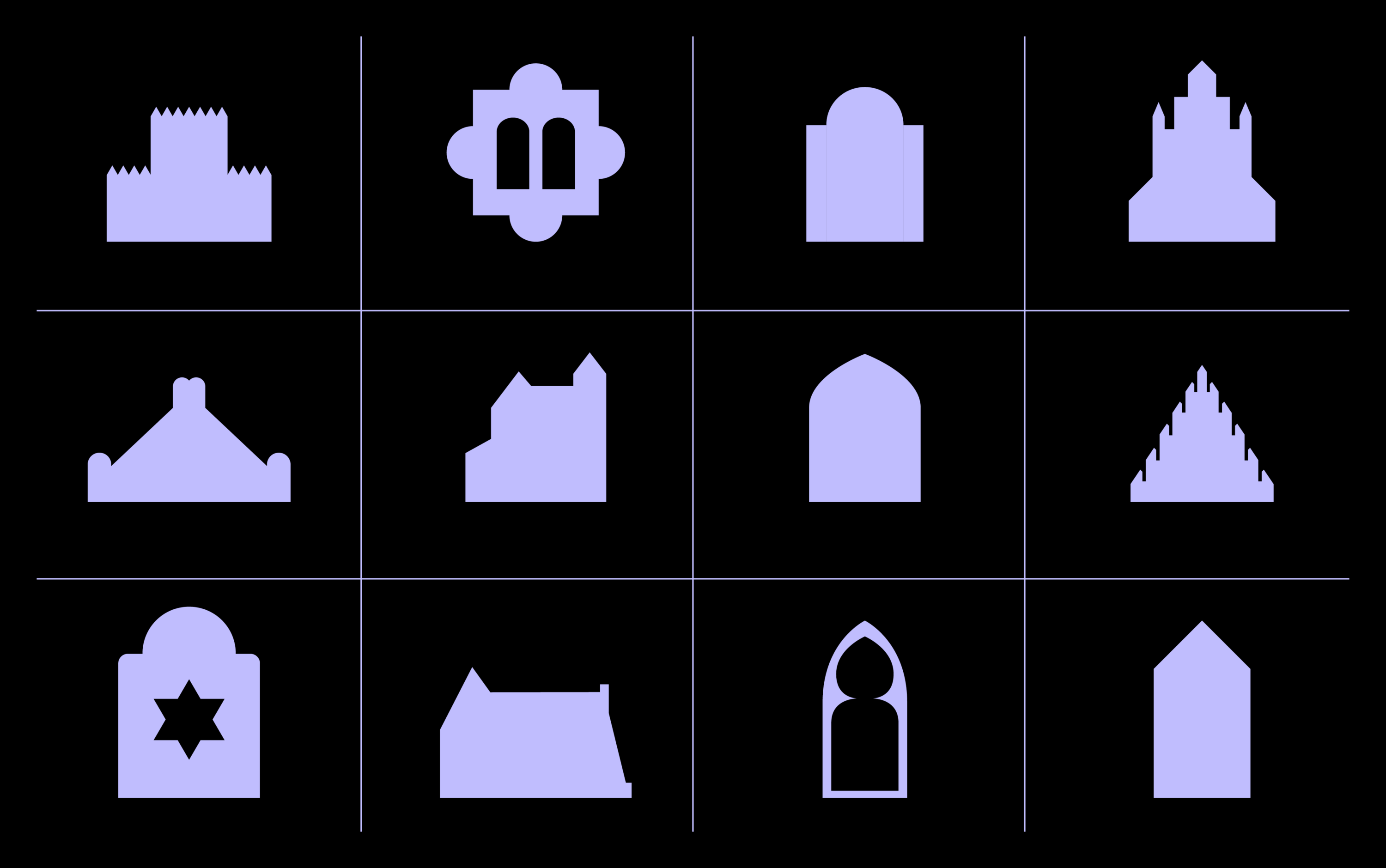
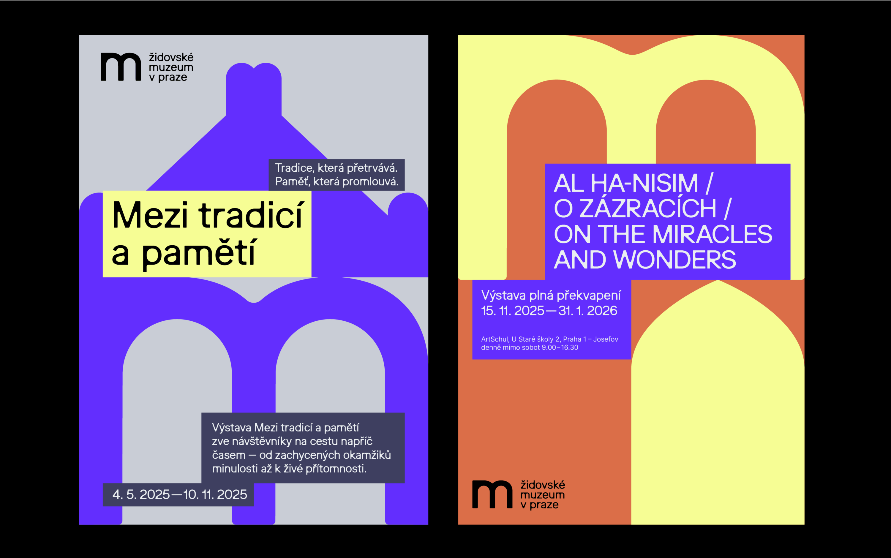
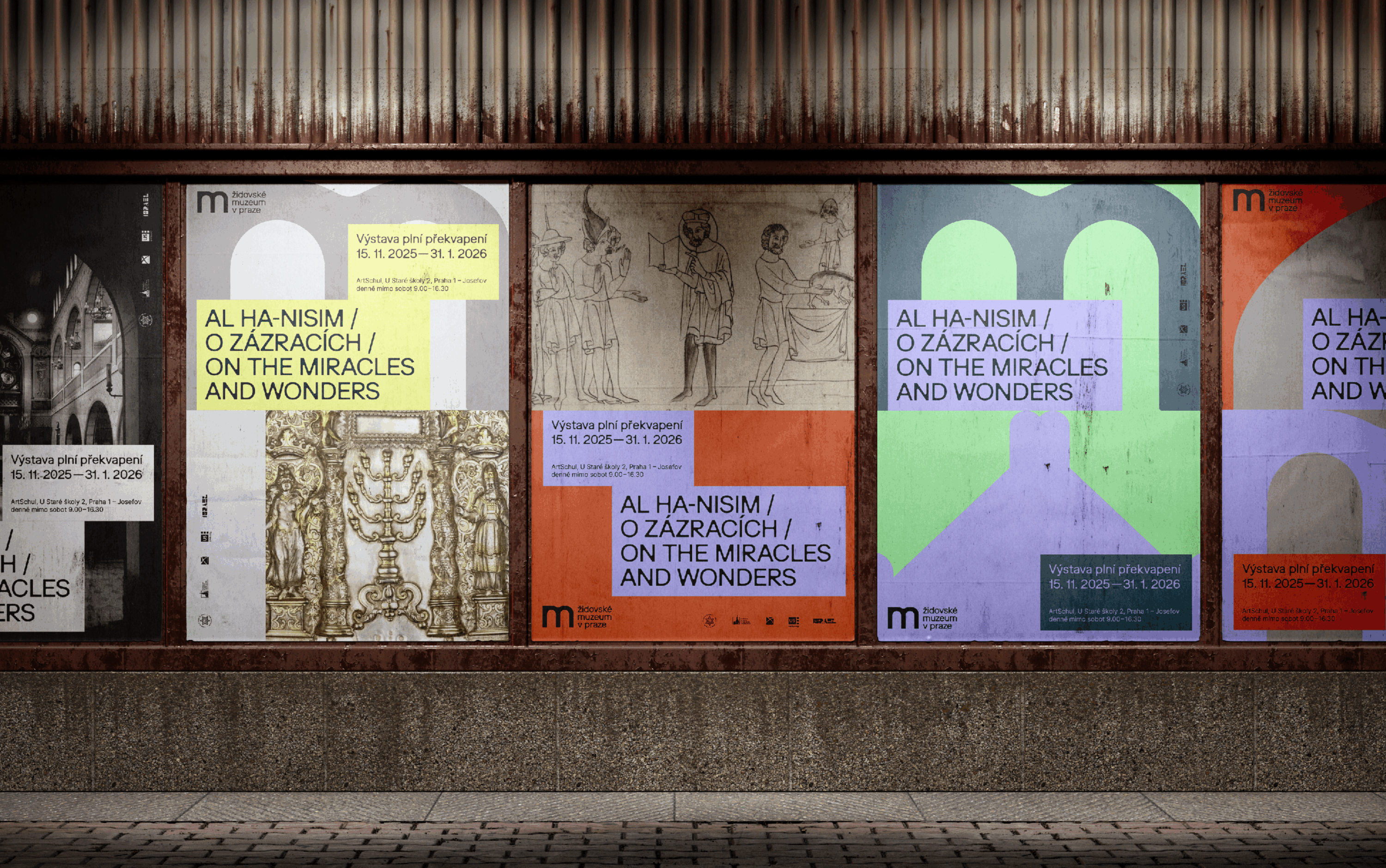
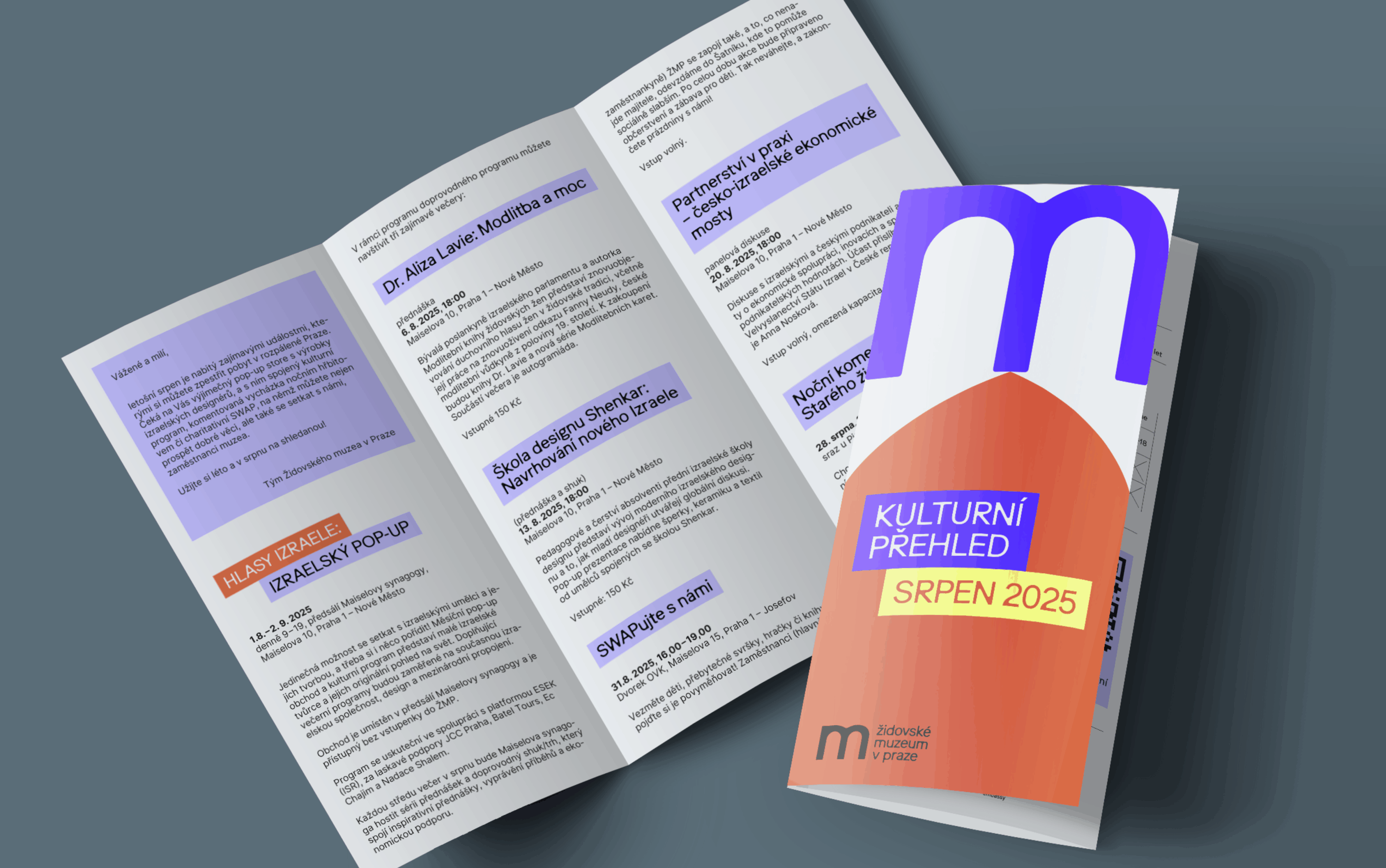
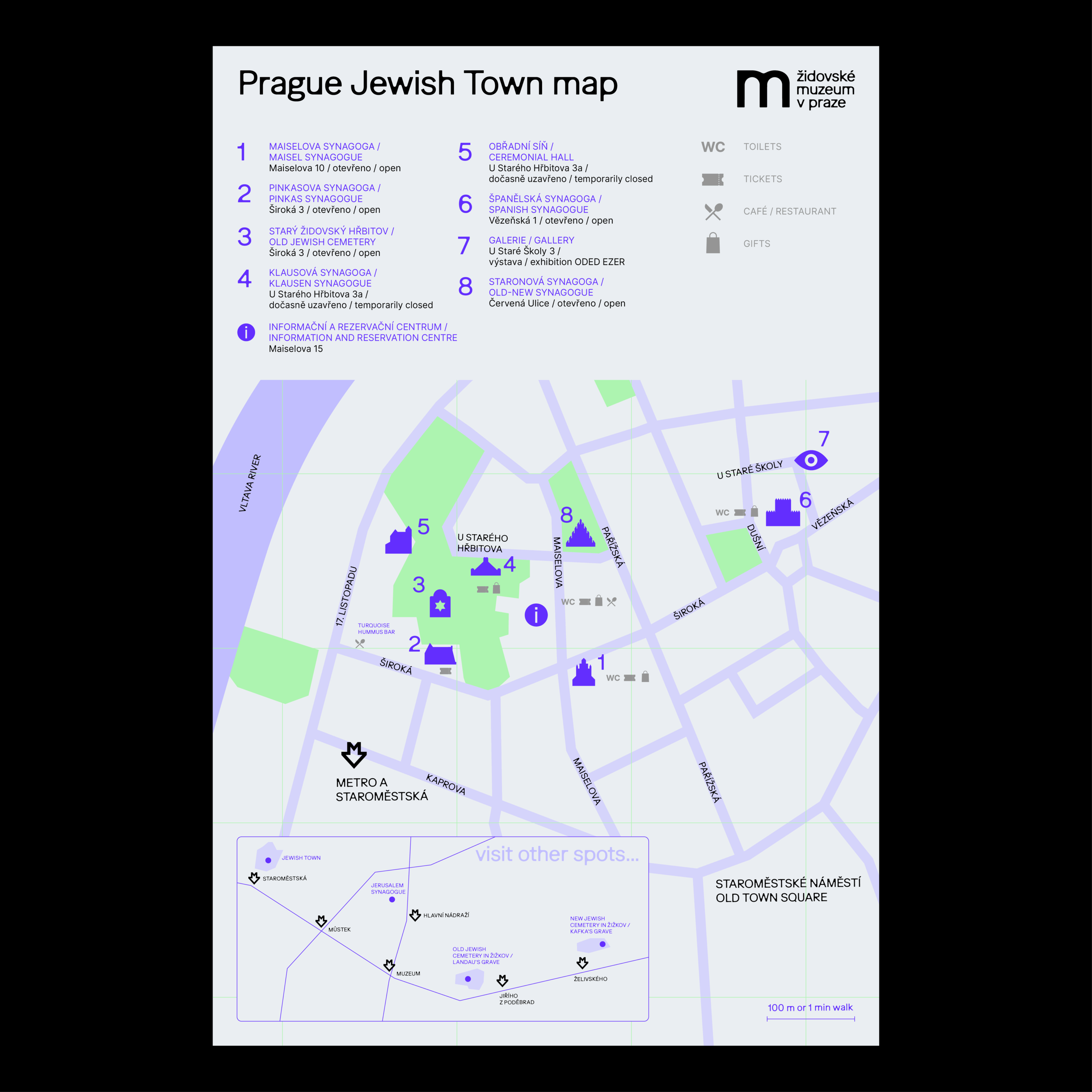
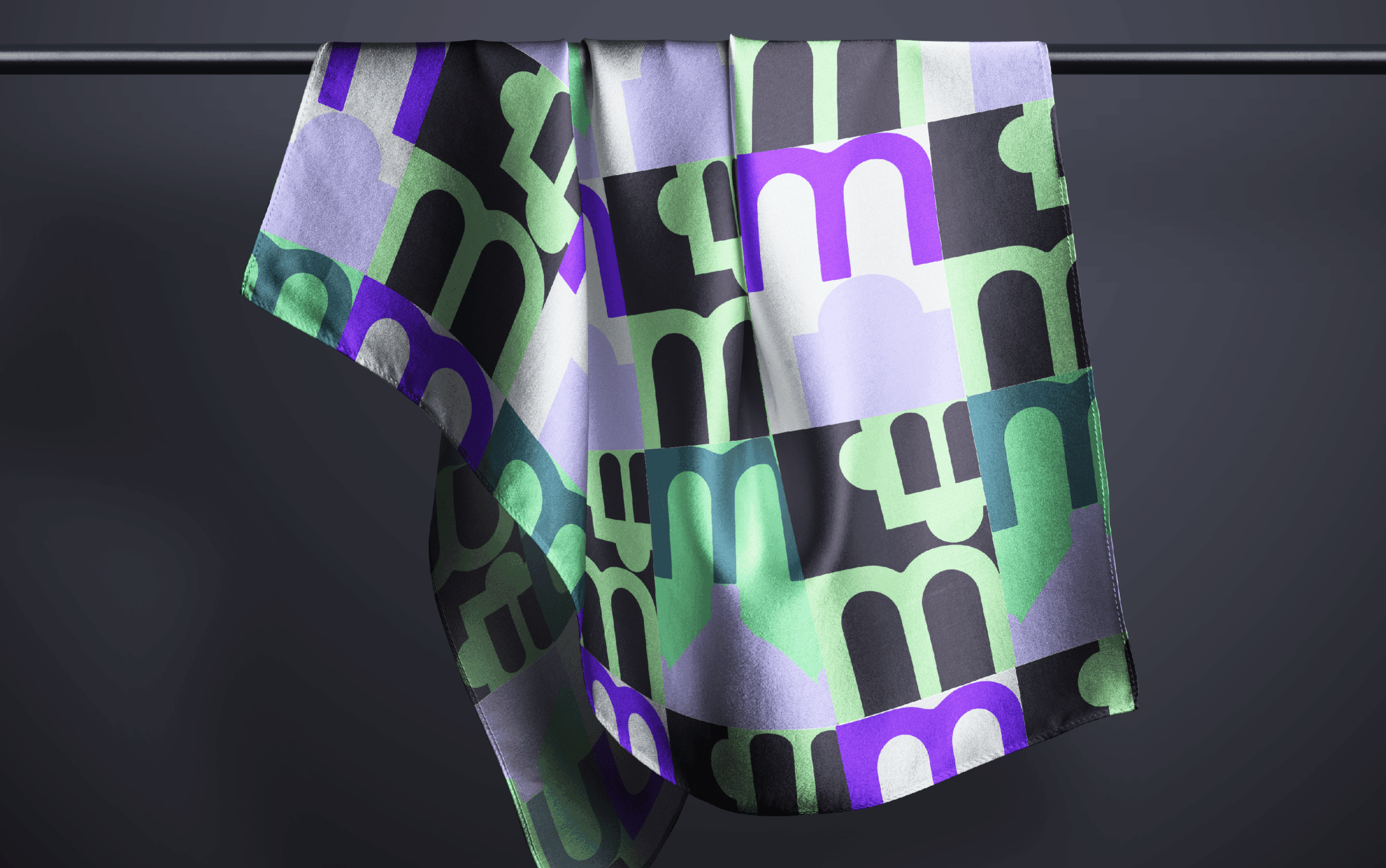
A bank of shapes was created for the new identity, the elements of which are based on the characteristic forms of individual buildings of Prague’s Museum (e.g. window arches, niches, vaults, etc.). These shapes serve as a modular building block that can be variably assembled within various outputs – from posters, through catalogues to digital formats. On these free compositions we build a strong visuality that is unmistakable with other institutions.
The new visual identity of the Jewish Museum in Prague is the result of understanding the historical context, architecture and spiritual legacy of Jewish culture. At the same time, it brings tools that will enable the museum to communicate effectively, professionally and clearly in the current media space.
Design concept
David Šrot
Design application
Klára Kvízová, Matyáš Bartoň, Lucie Kvapilová
Typeface
Ease Display, Inter
Client
Jewish Museum in Prague
competition, 1st place, 2025