Milevsko Cloister
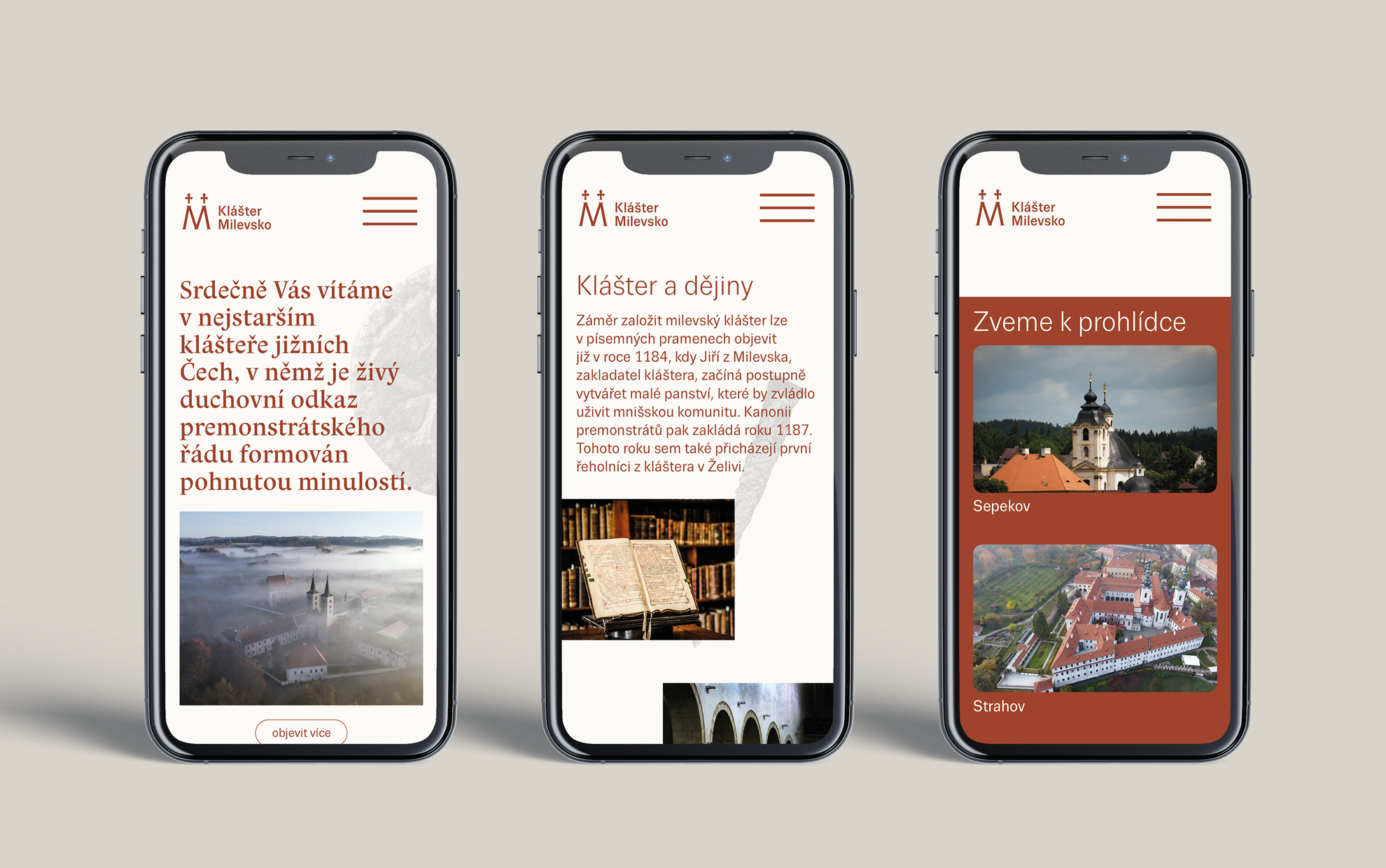
Milevsko Cloister
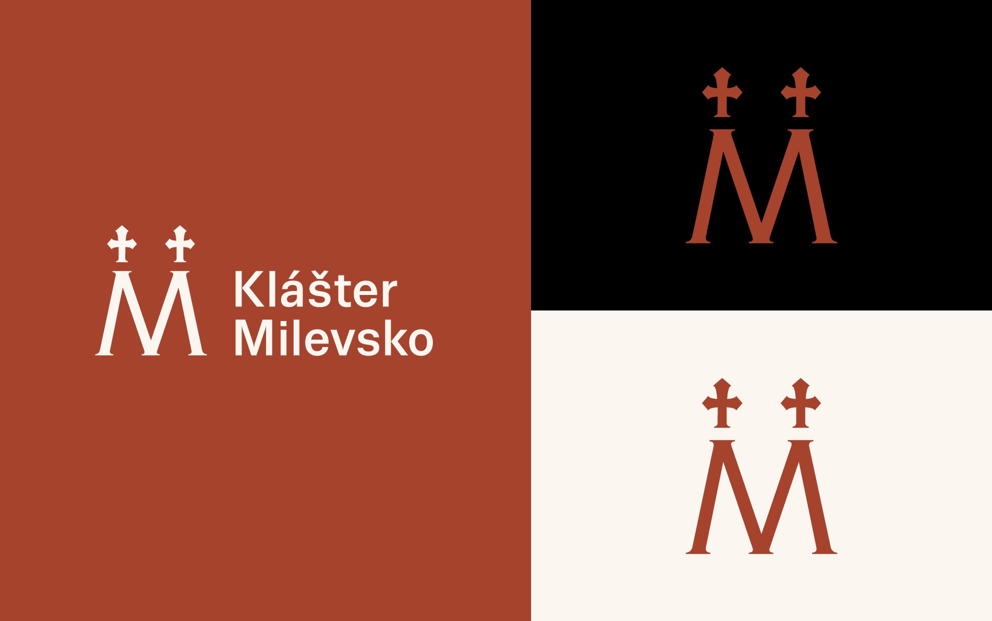
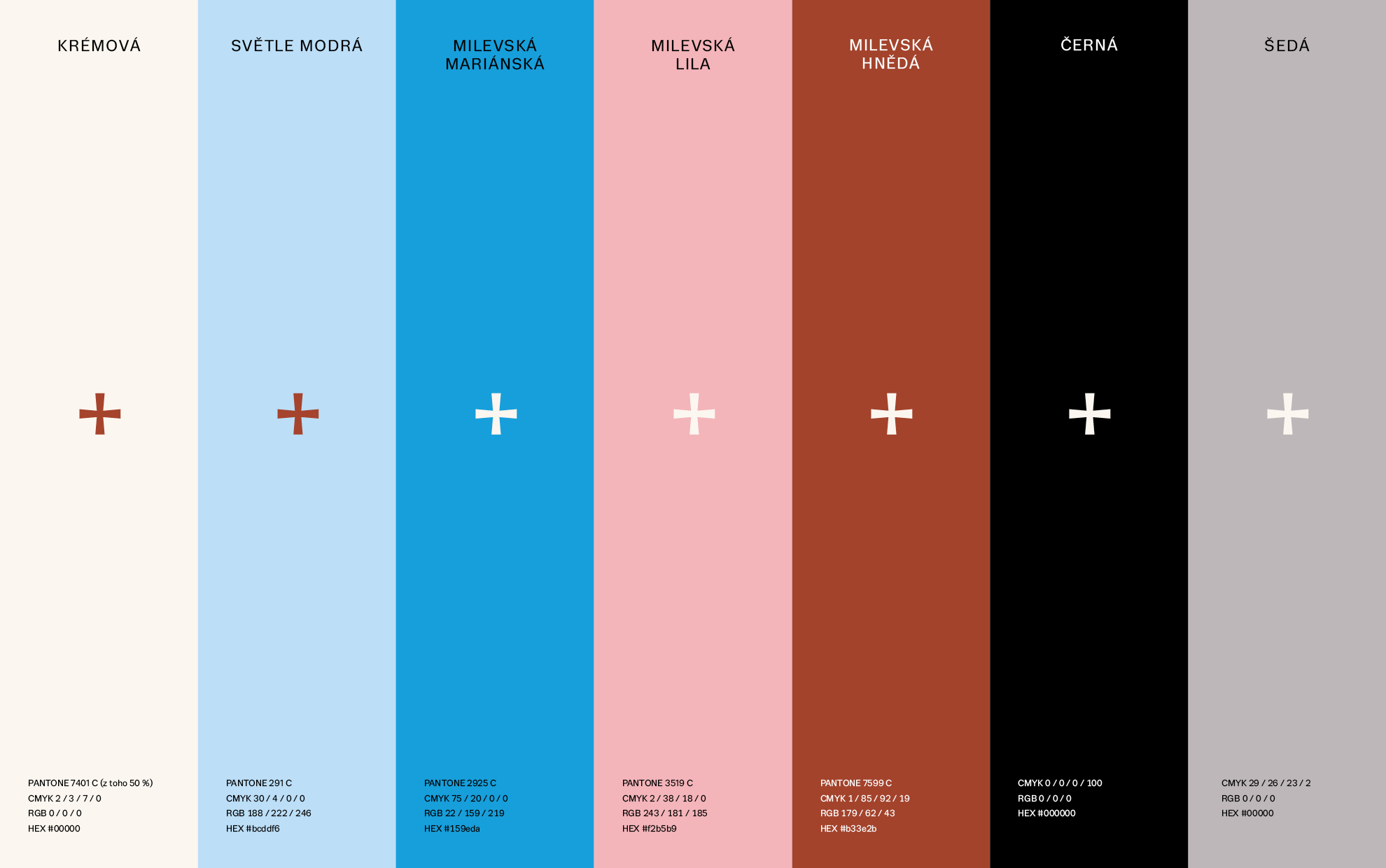
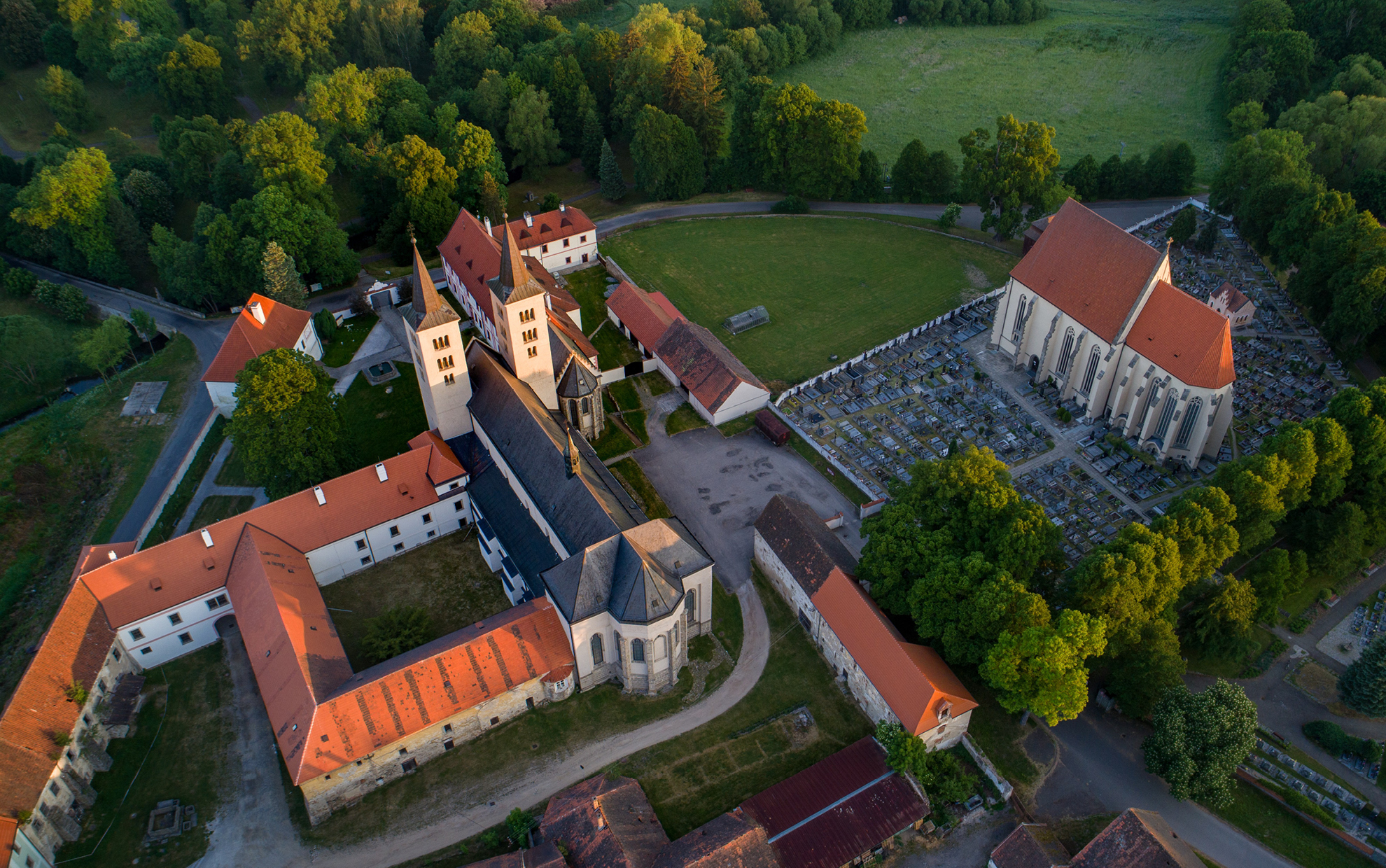
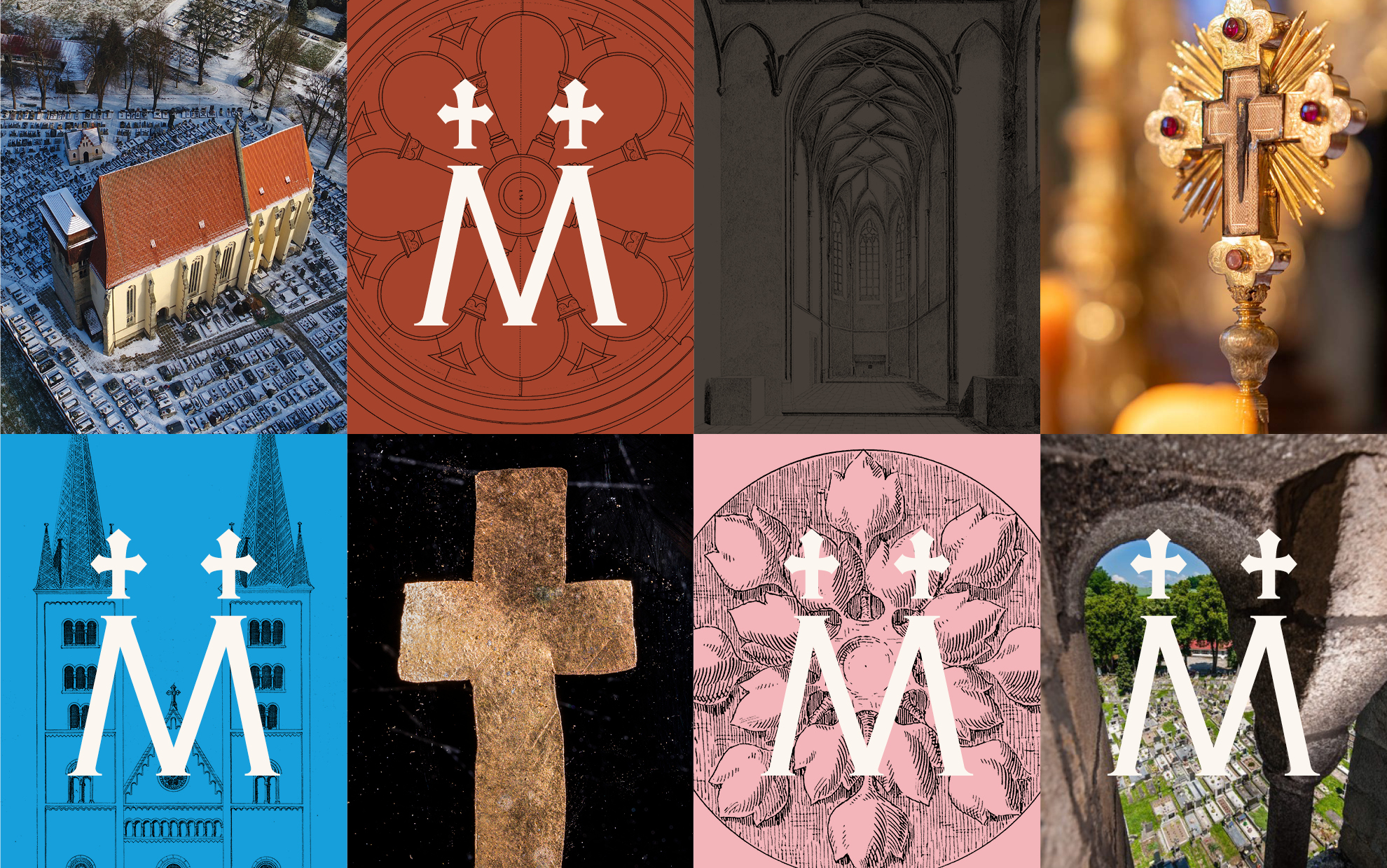
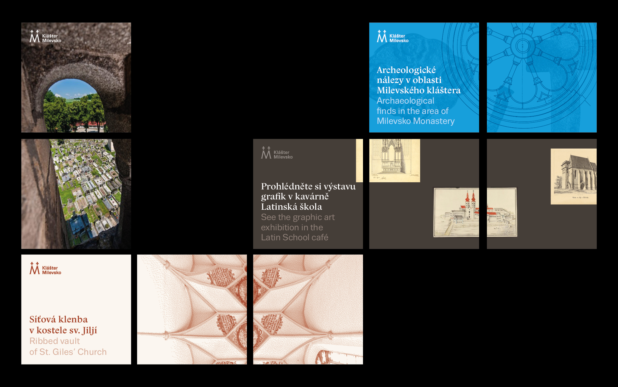
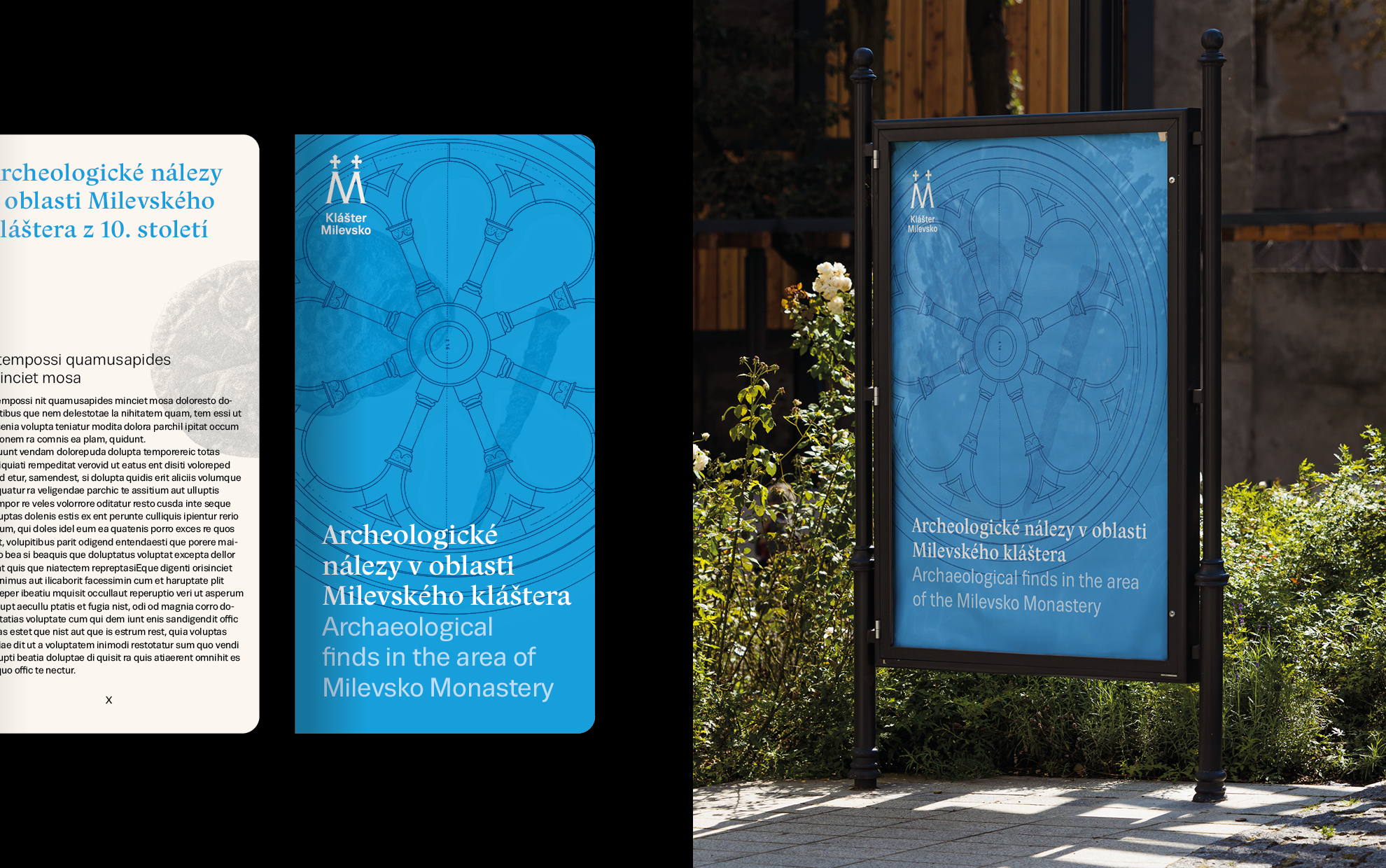
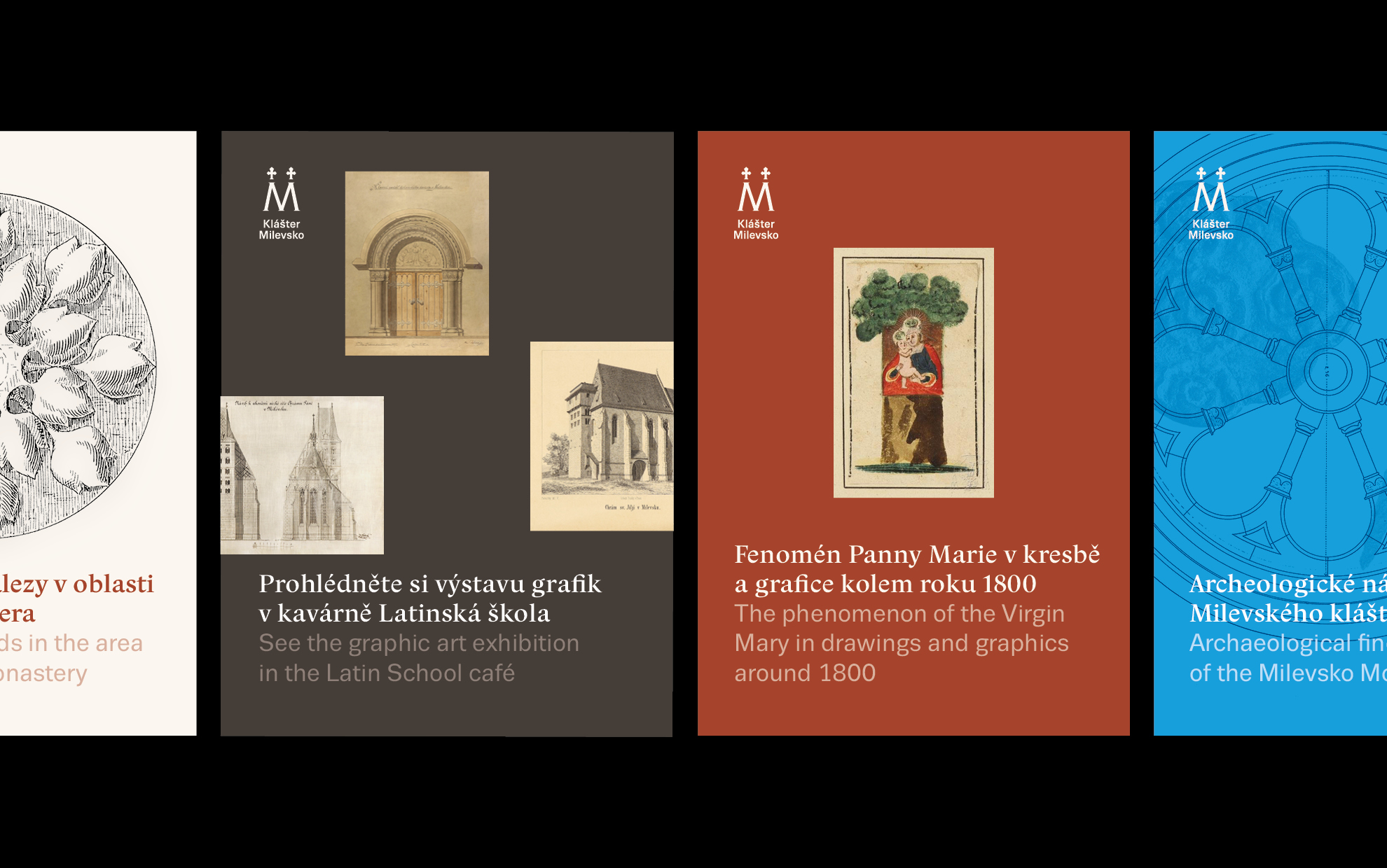
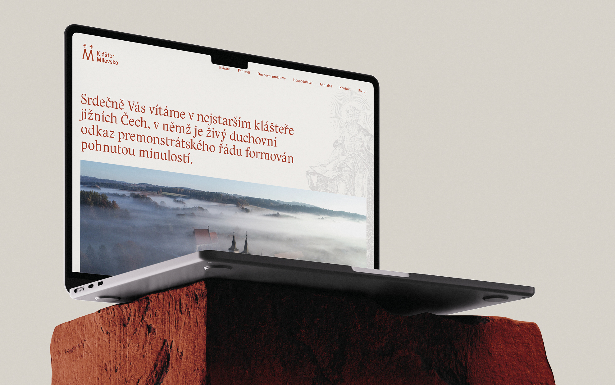
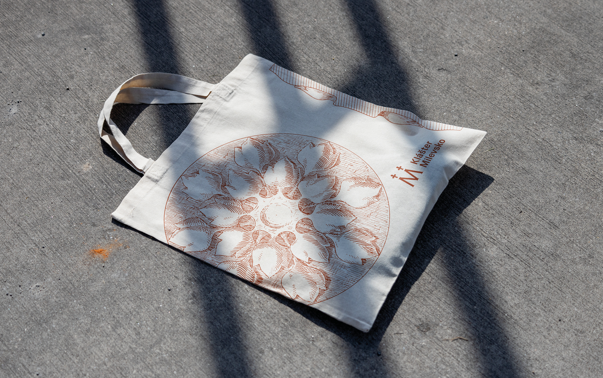
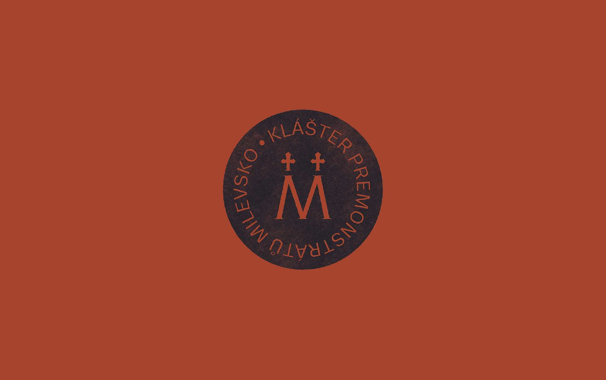
The logo and visual identity of Milevsko Monastery follow the graphic style of Strahov Monastery, on which our studio cooperates. The key visual elements are the logo and the color, which, in this case, is earthy brown-red. The logo is simple; the letter M is derived from the monastery’s name. The two crosses in the logo symbolize the towers of the church of the Basilica of the Visitation of the Virgin Mary in Milevsko.
Design
David Šrot
Cooperating graphic design intern from VOŠ Hellichova (college)
Ema Schubertová
Typeface
Trivia Sans, Trivia Serif
Client
Královská Kanonie premonstrátů na Strahově
2025