Uniform presentation of the state administration of the Czech Republic, competition
Uniform presentation of the state administration of the Czech Republic, competition
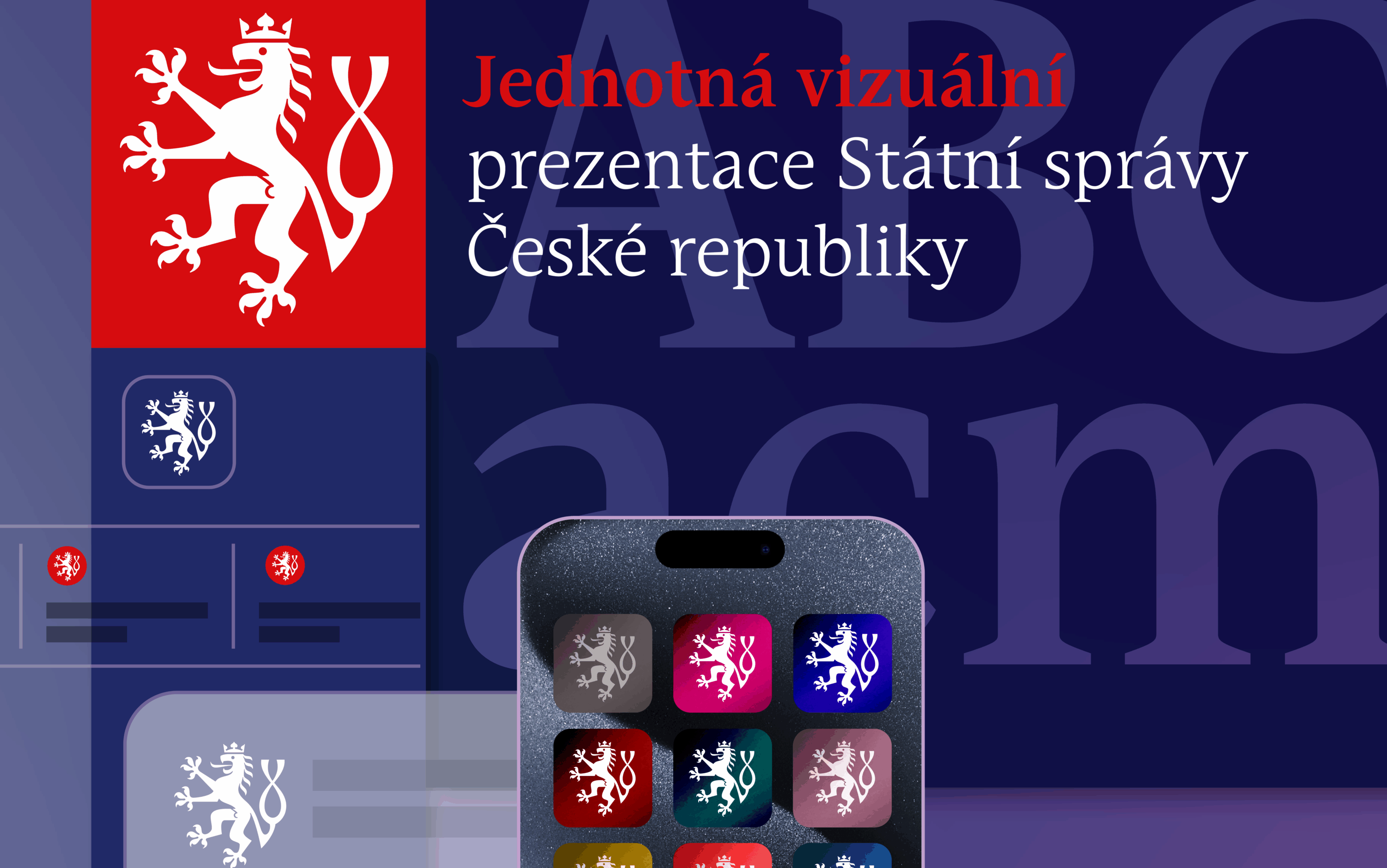
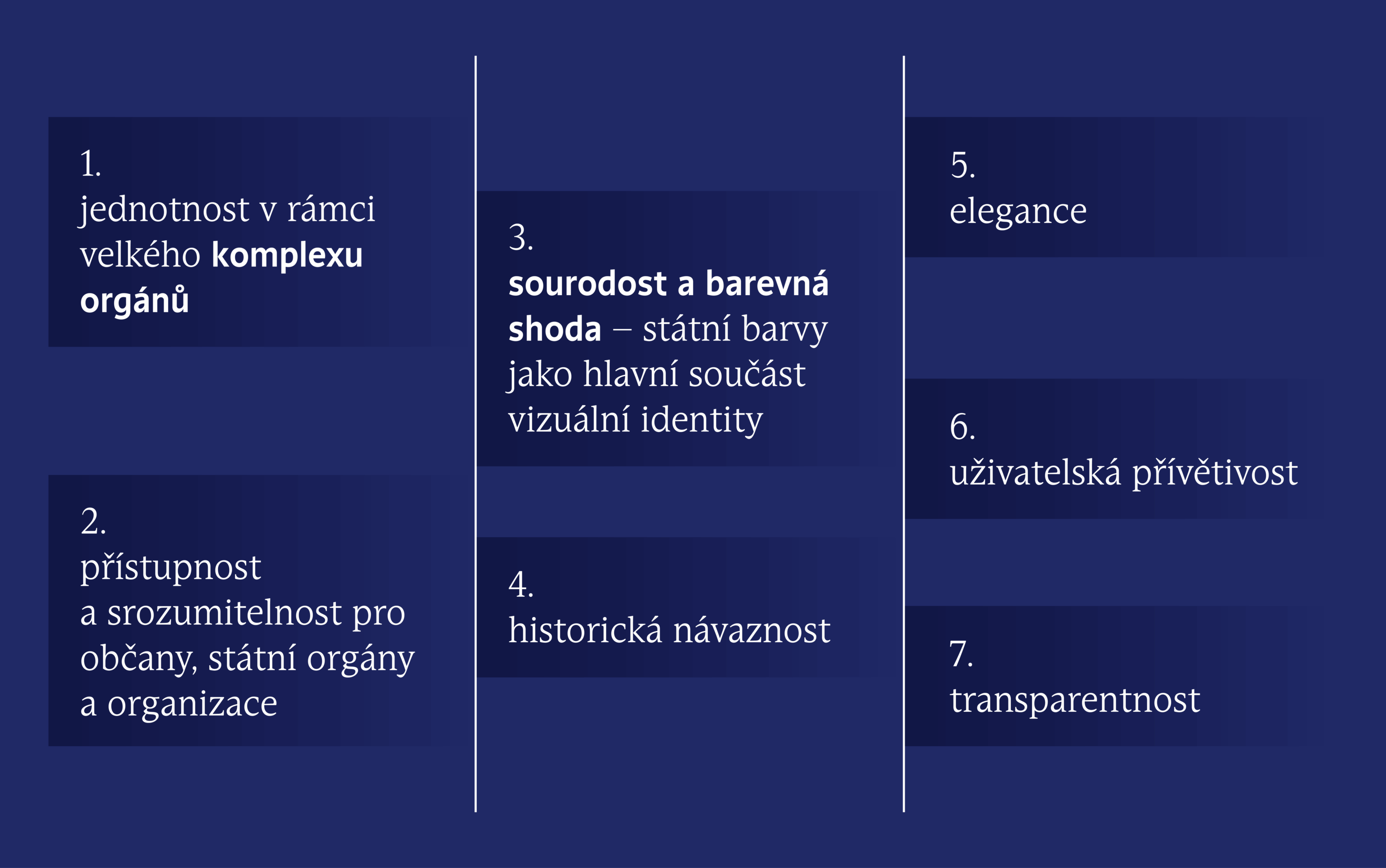
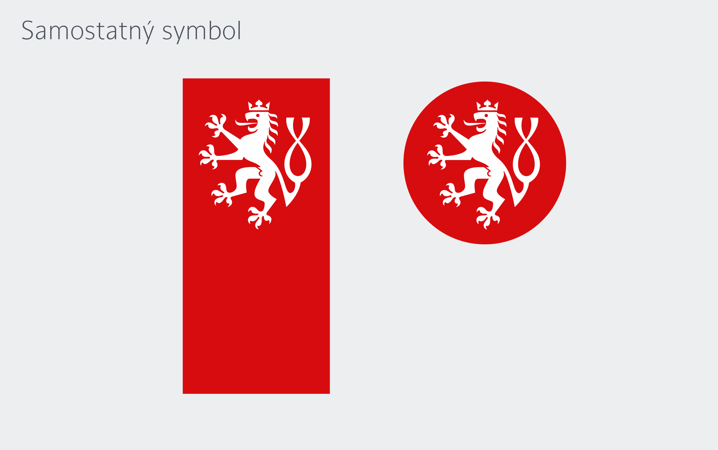
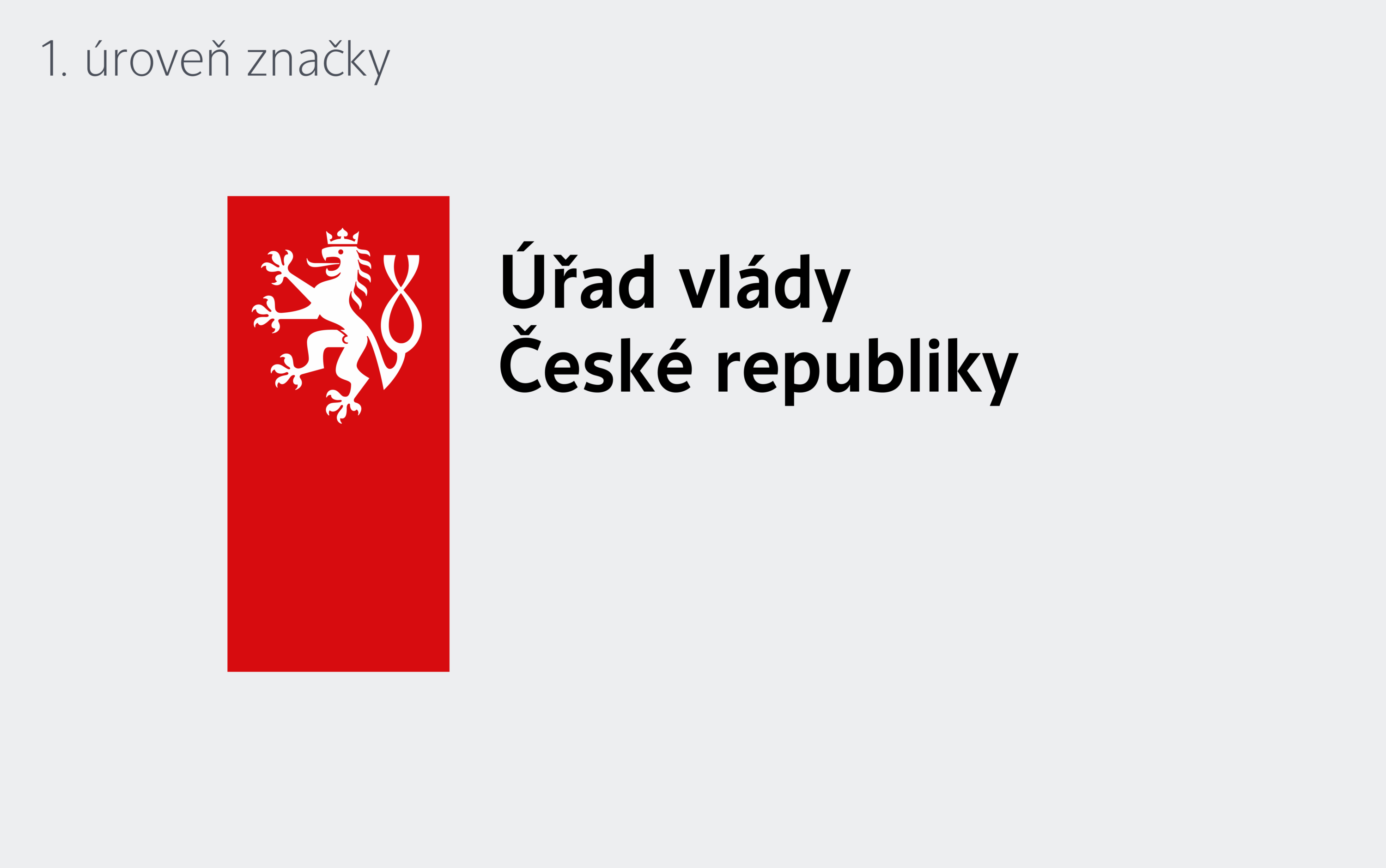
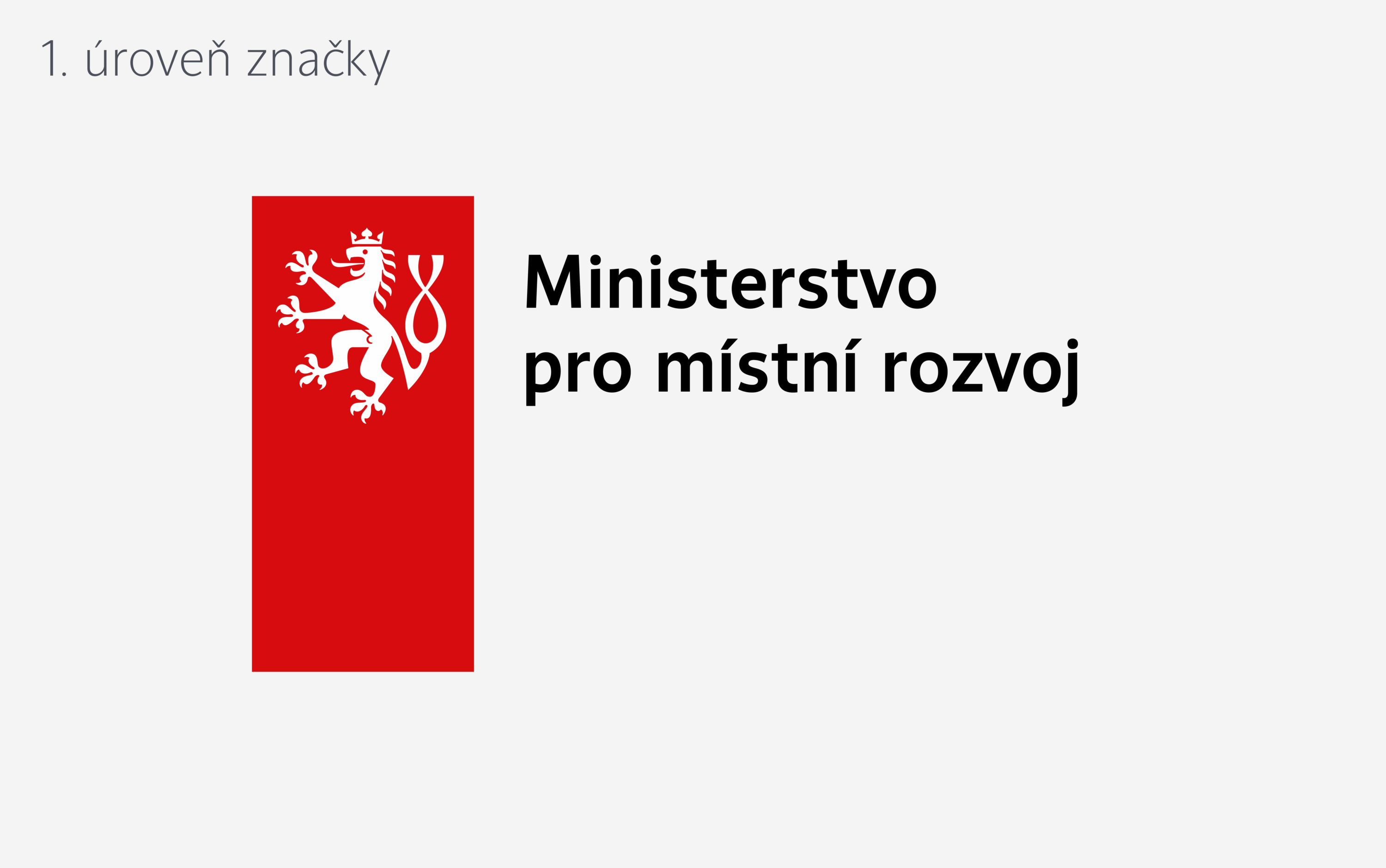
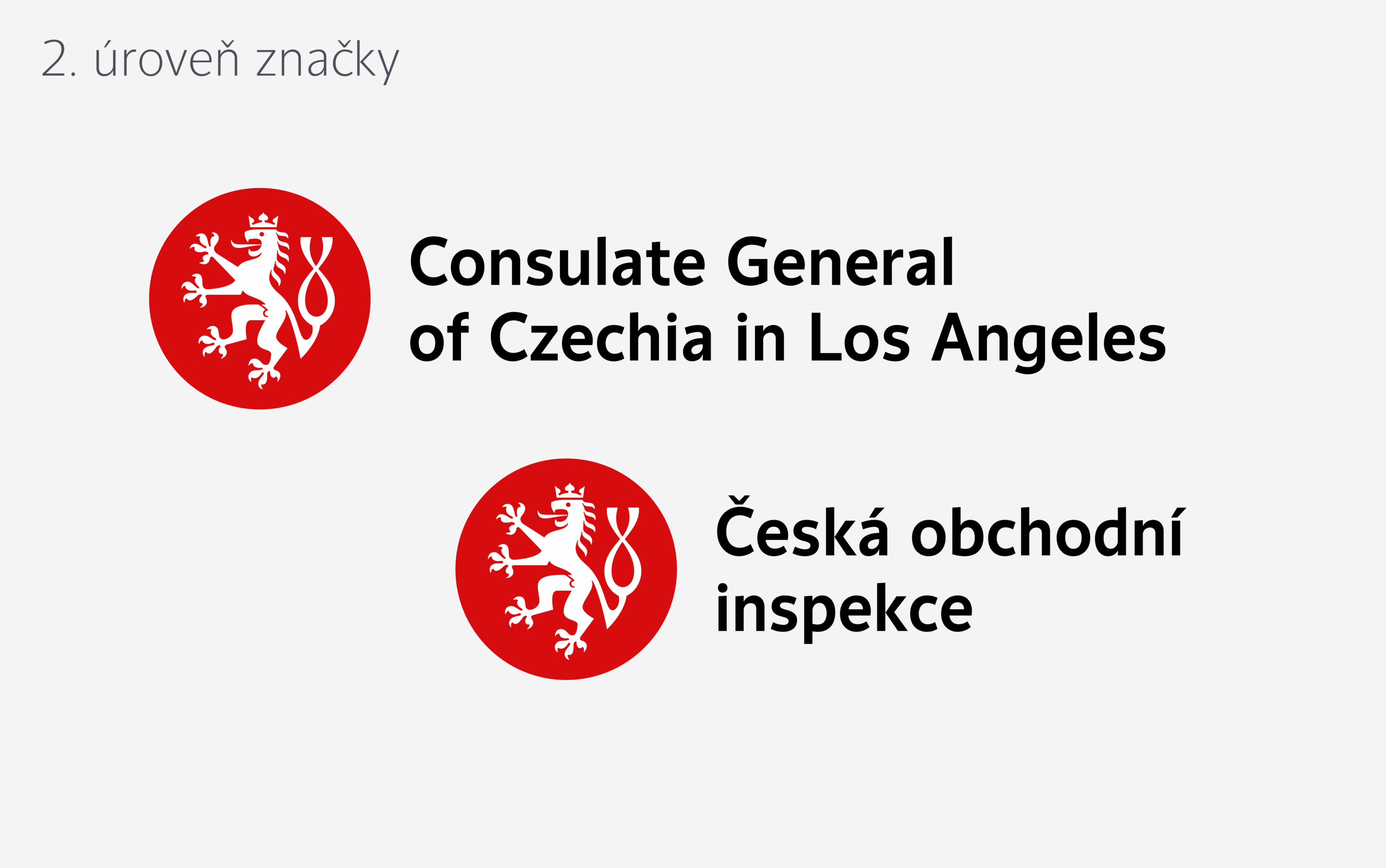
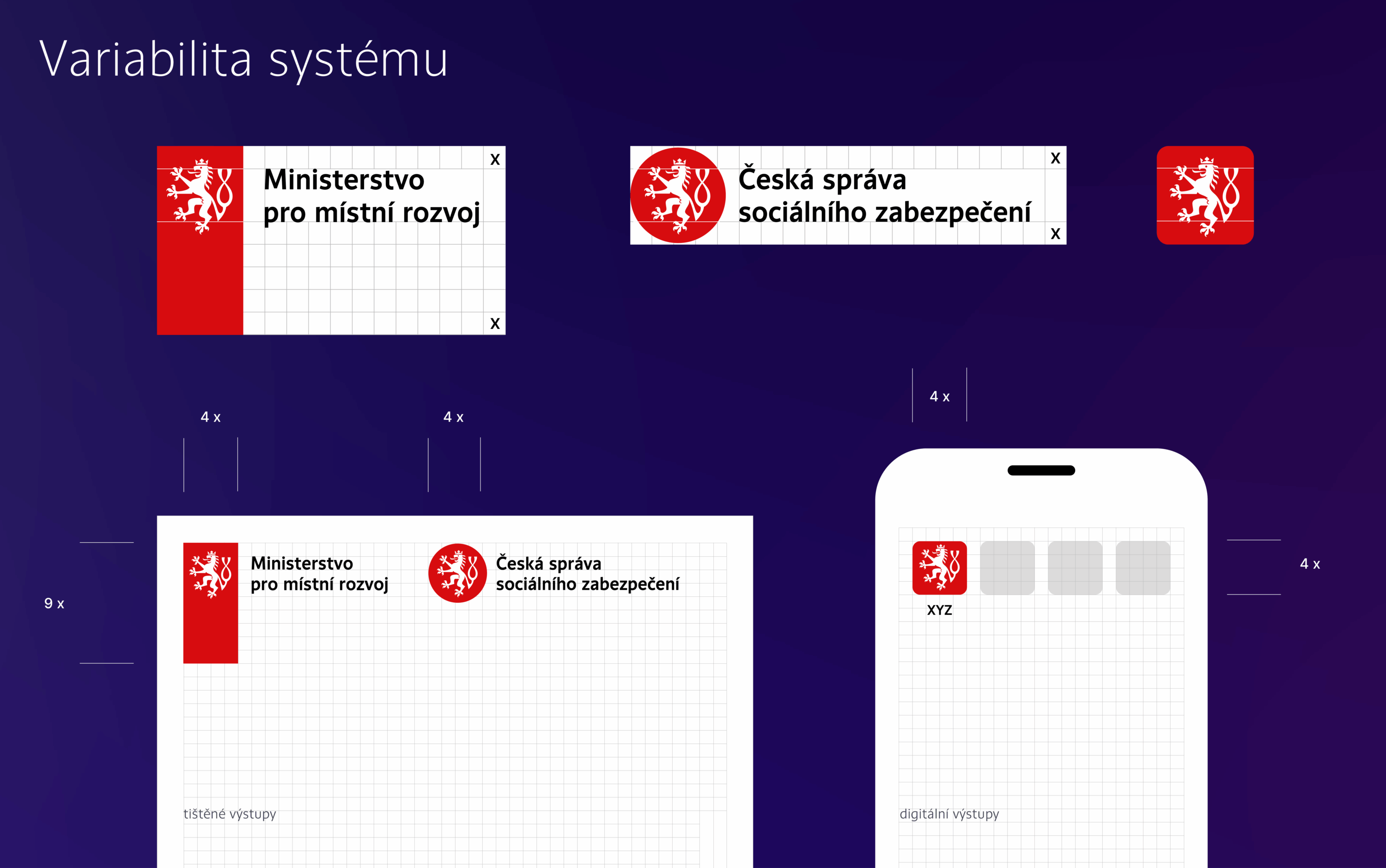
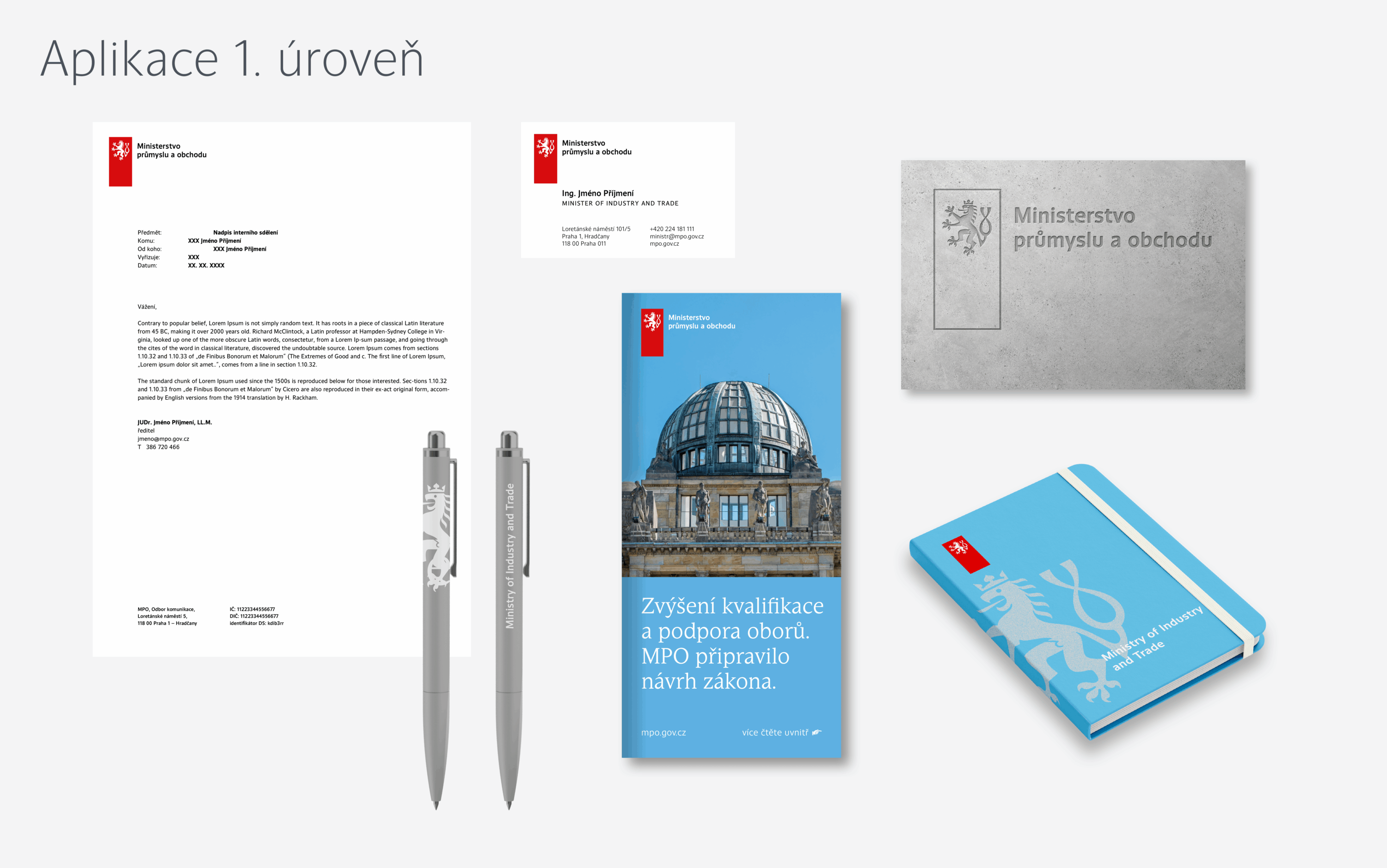
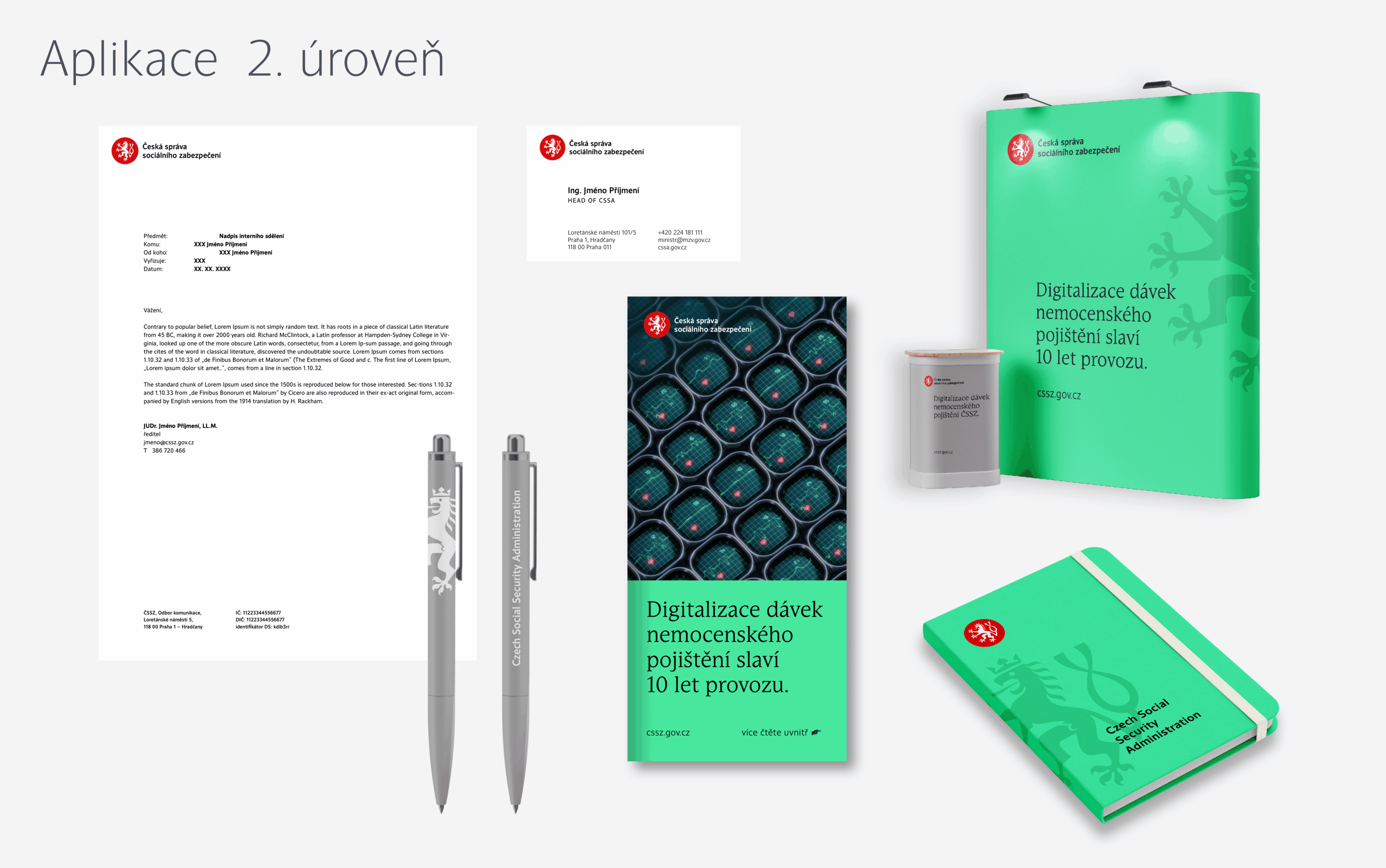
The objective of the brief is to unify the visual style and visual presentation of the State Administration of the Czech Republic abroad and to the citizens of the Czech Republic. The design presentation includes an original typeface and a drawing of a lion in collaboration with František Štorm. The distinctive elements of the design are organized into two tiers. The shape of a rectangle, symbolizing a ribbon, is associated with the Government Office and all ministries. In the second tier, we work with the shape of a bezant (circle). Both levels maintain uniformity, legibility, consistency, and recognition of a unified visual style. The link is the size and placement of the text and the use of the same lion.
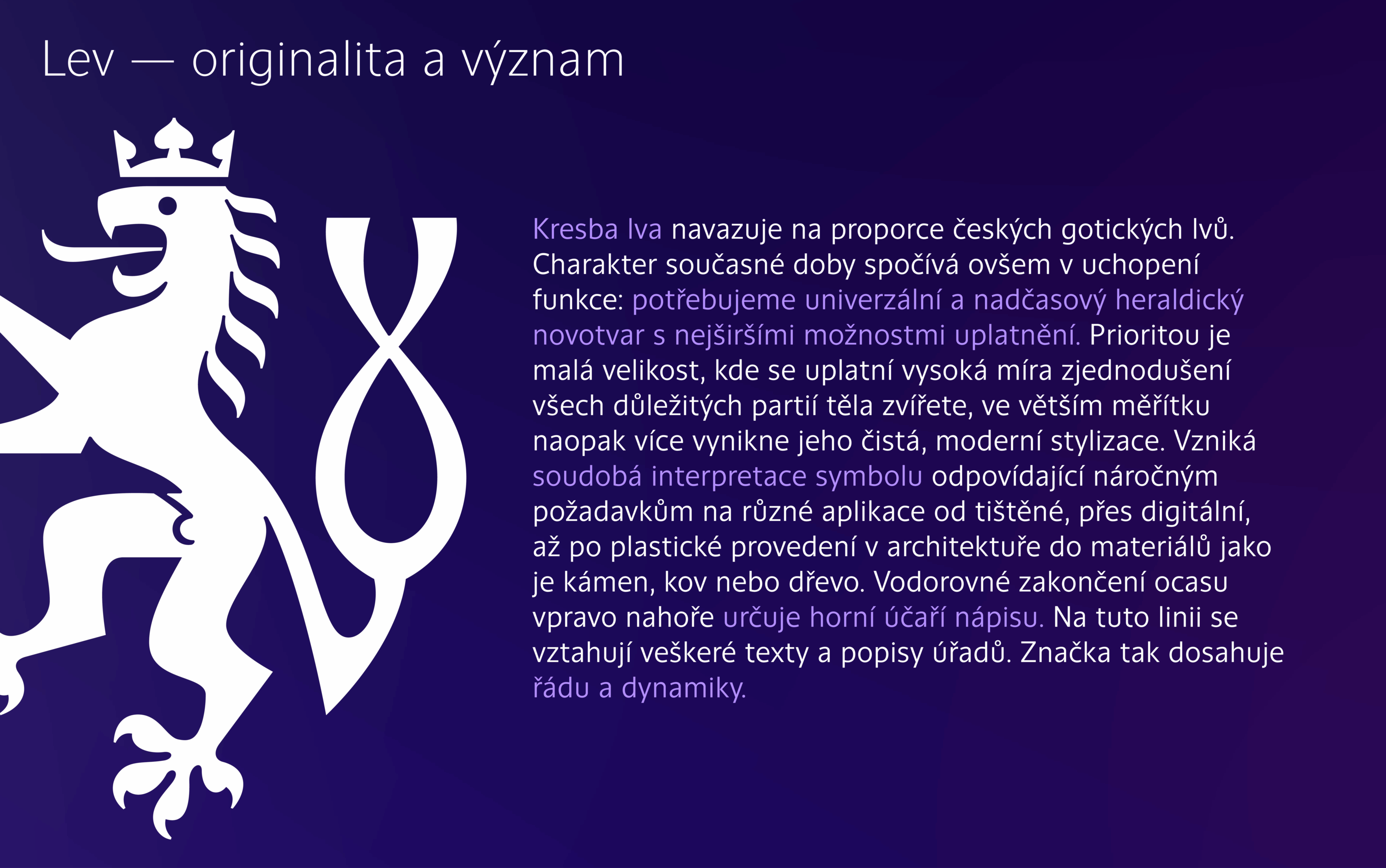
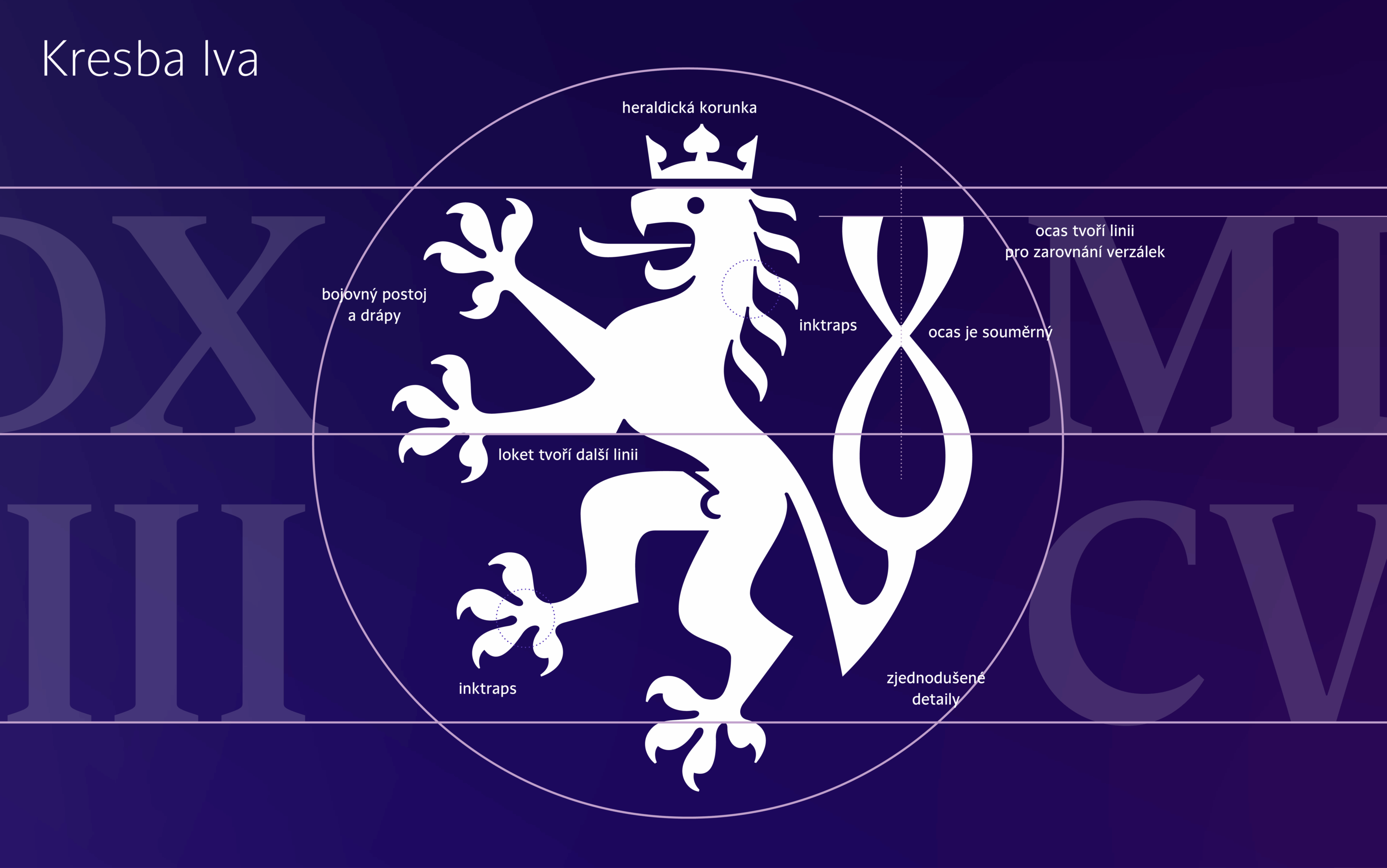
The drawing of the lion reflects the proportions of Czech Gothic lions. The new design represents a universal and timeless heraldic graphic language with the broadest possible range of applications. Priority is given to the smallest sizes, where all essential parts of the animal’s body are highly simplified, while on a larger scale, a clean, modern stylization stands out more. A contemporary interpretation of the symbol is thus created, meeting the demanding requirements of various applications–from print to digital to sculptural ones in architecture, executed in materials such as stone, metal, or wood. The horizontal ending of the tail at the top right determines the upper typing line of the inscription. All texts and descriptions of offices relate to this line. The sign thus establishes order and dynamism.
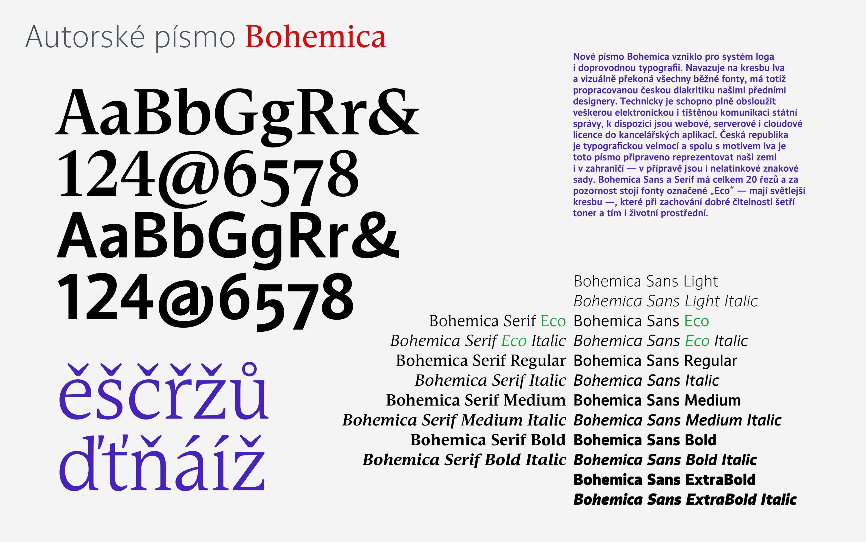
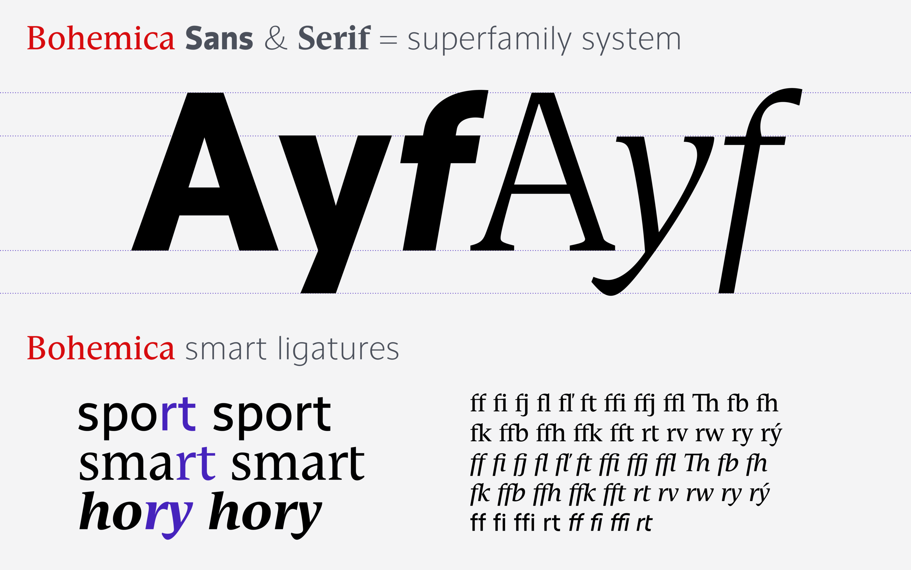
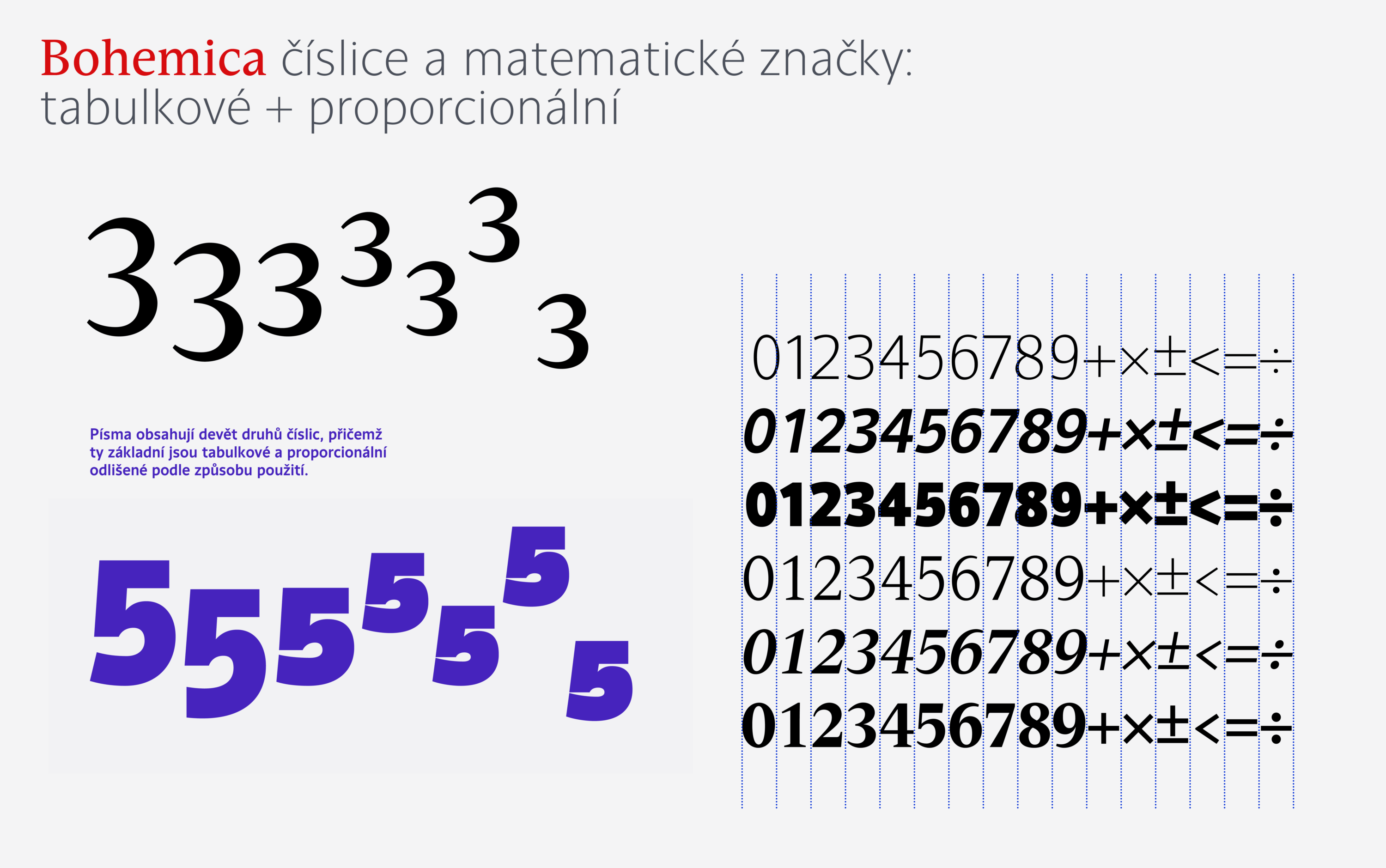
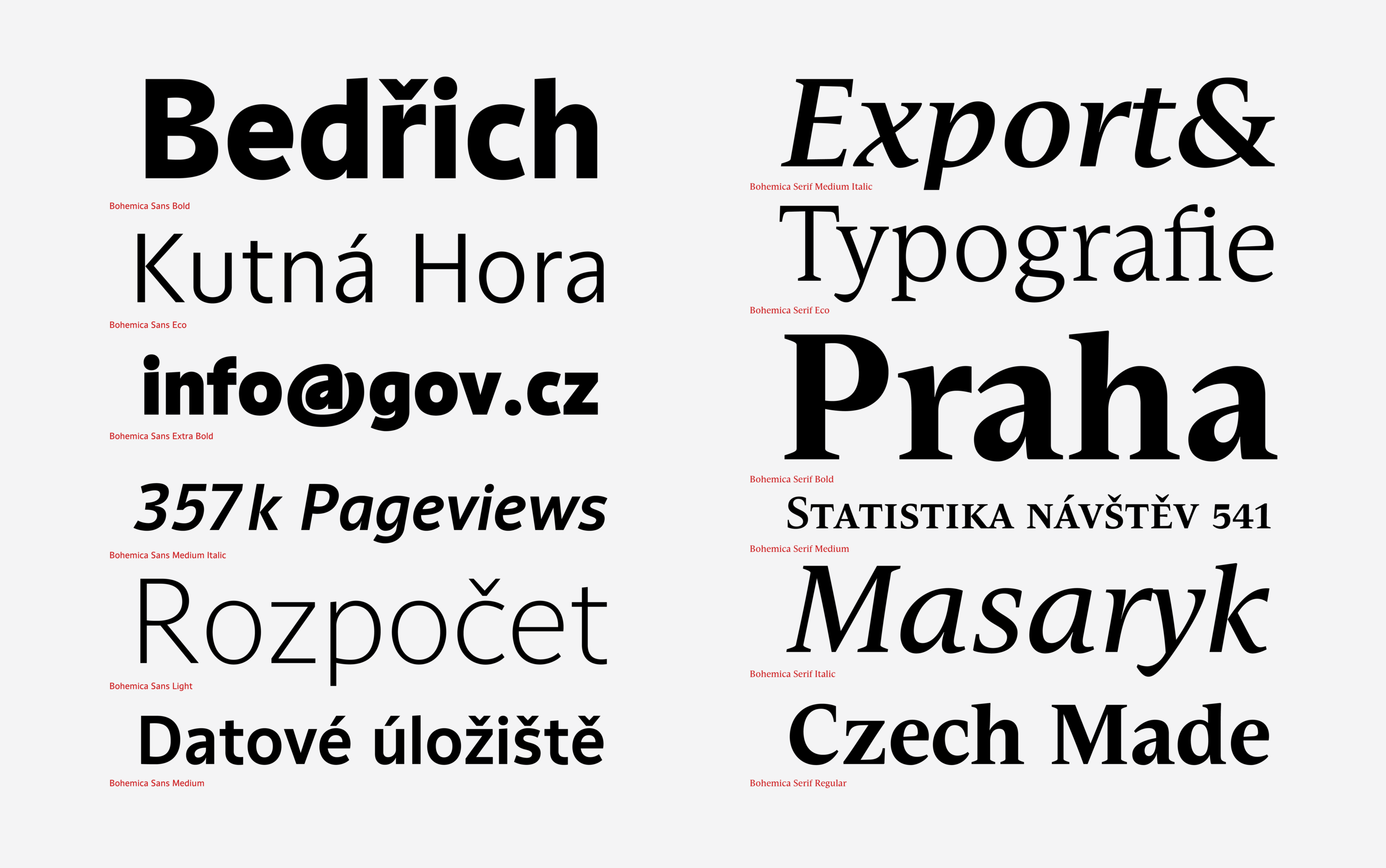
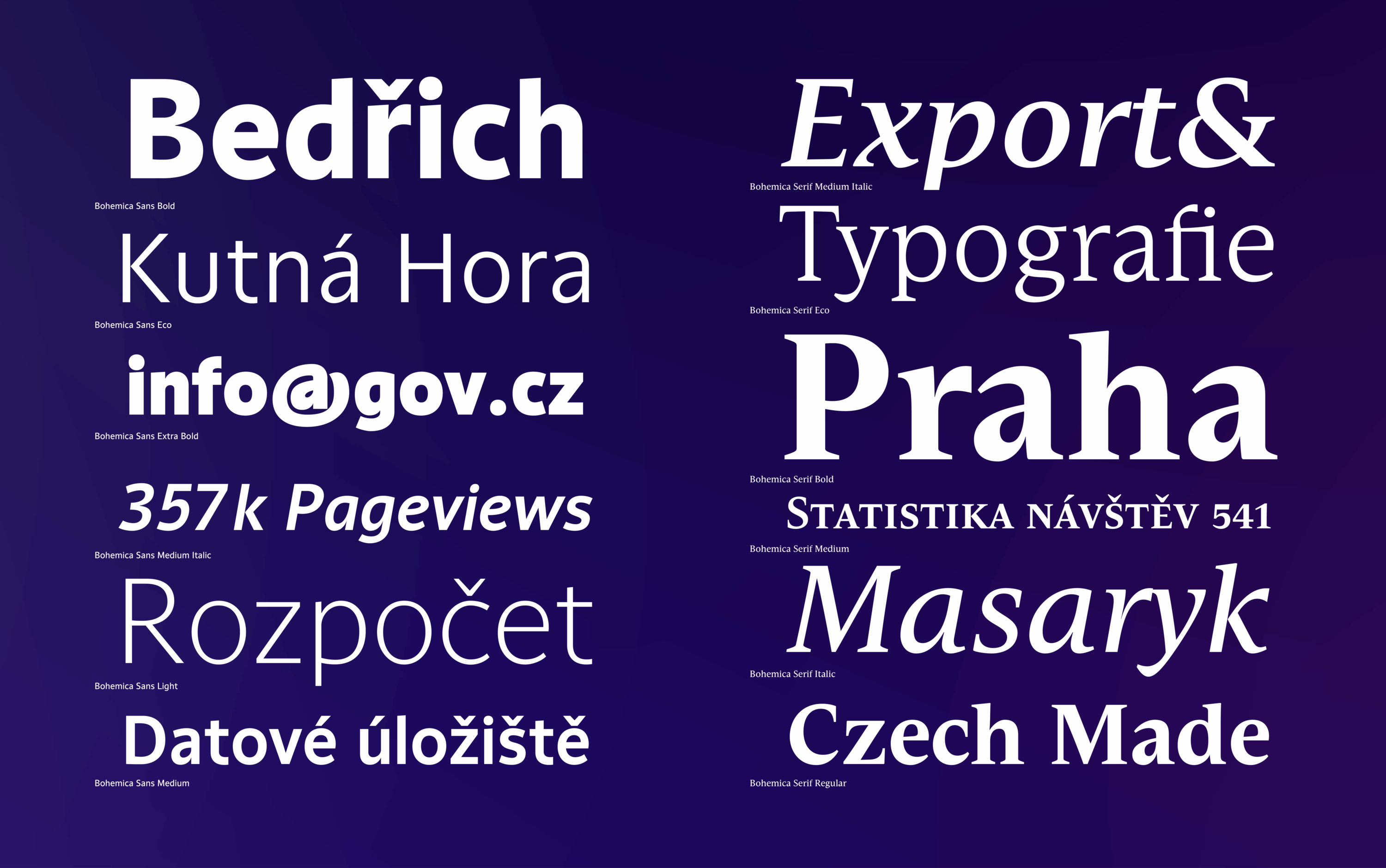
The proposal includes a new typeface Bohemica. It references the drawing of the heraldic lion, and its Czech diacritics are well developed. Technically, it is fully capable of conveying the state administration’s entire electronic and printed communication; web, server, and cloud licenses for office applications are available, including a non-Latin character set. Bohemica Sans and Serif has a total of 20 styles. The typefaces marked “Eco” are noteworthy– their typeface is lighter– which, while maintaining good legibility, saves toner and are environmentally friendly.
We unify the communication and the visual style of even very different agendas with color while subtly distinguishing between individual ministries by using different color schemes. We use these color schemes for the digital representation of the state domain gov.cz. and in the printed version. At the same time, everything is unified by the overreaching official red and white color scheme of the state.y
When working on a consistent visual style, navigating the website is integral to its design. The positioning of the logo, menu content, basic menu, footer, and website footer are identical for all institutions. Individual items are easy to find, in fixed (or) similar locations on the site, and should contain essential information.
Co)designer in cooperation with KKG
František Štorm
Design team
Klára Kvízová / Matyáš Bartoň / David Šrot / Lucie Kvapilová
Client
Ministry of Foreign Affairs of the Czech Republic
Typeface
Bohemica Sans, Bohemica Serif