South Bohemia Region, competition
South Bohemia Region, competition
How should the identity of the South Bohemian Region be delivered to the public?
What graphic language would correspond to this challenging and attractive task?
When creating a comprehensive visual style for the South Bohemian Region, we chose one option that simply yet distinctively worked in the intended broad communication. It was challenging for us to find out how to process a complex brief into a simple expression that had to meet a range of requirements and meanings.
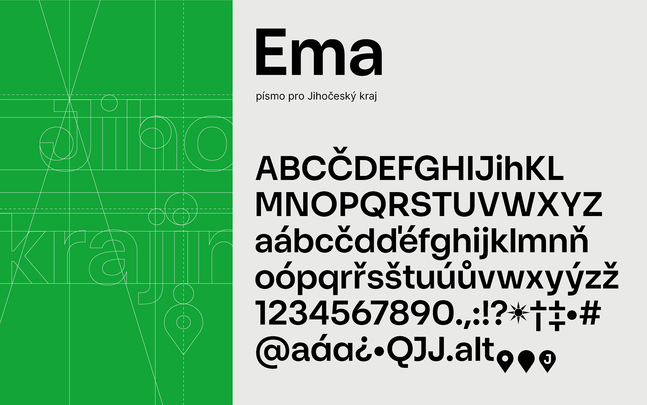
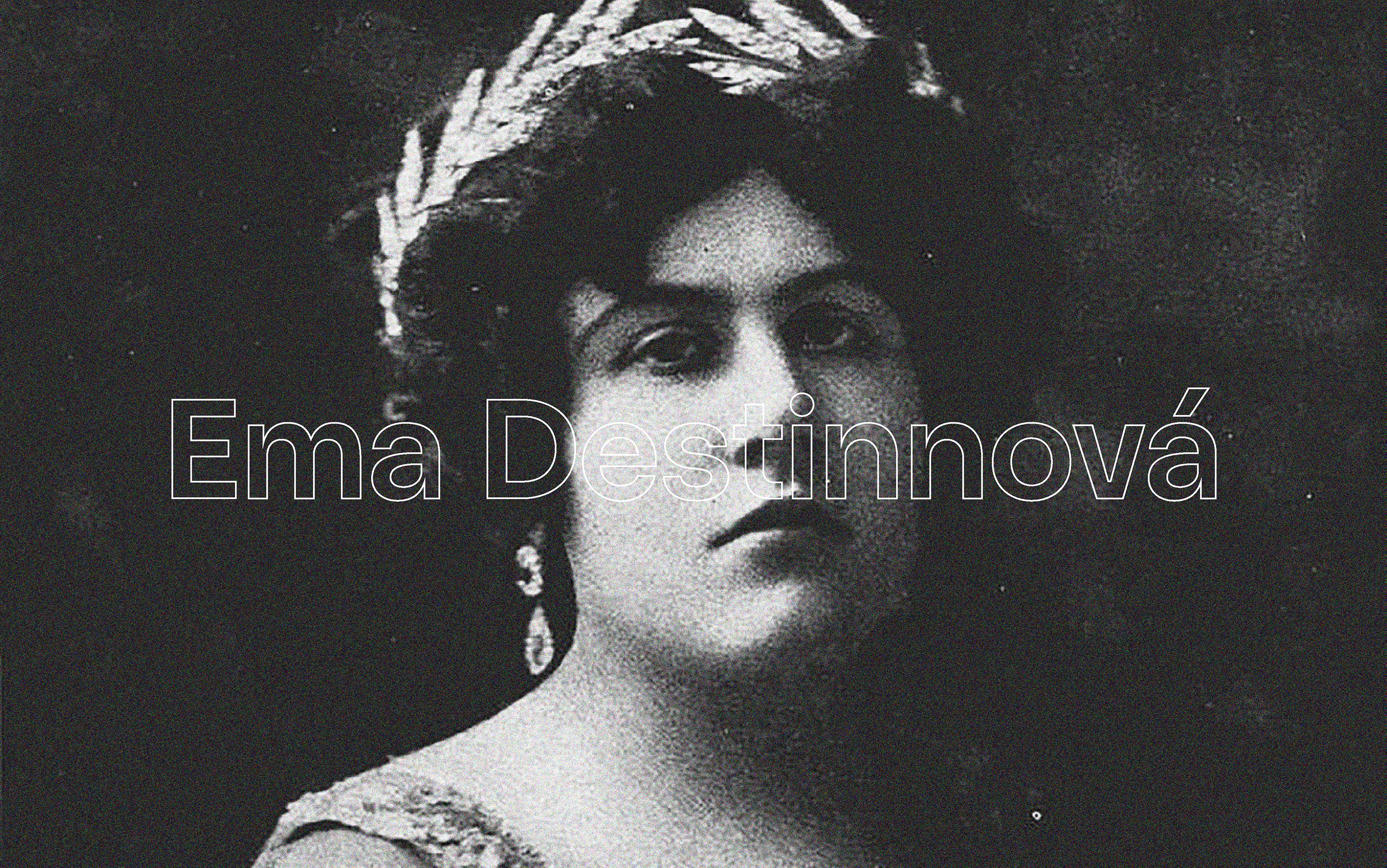
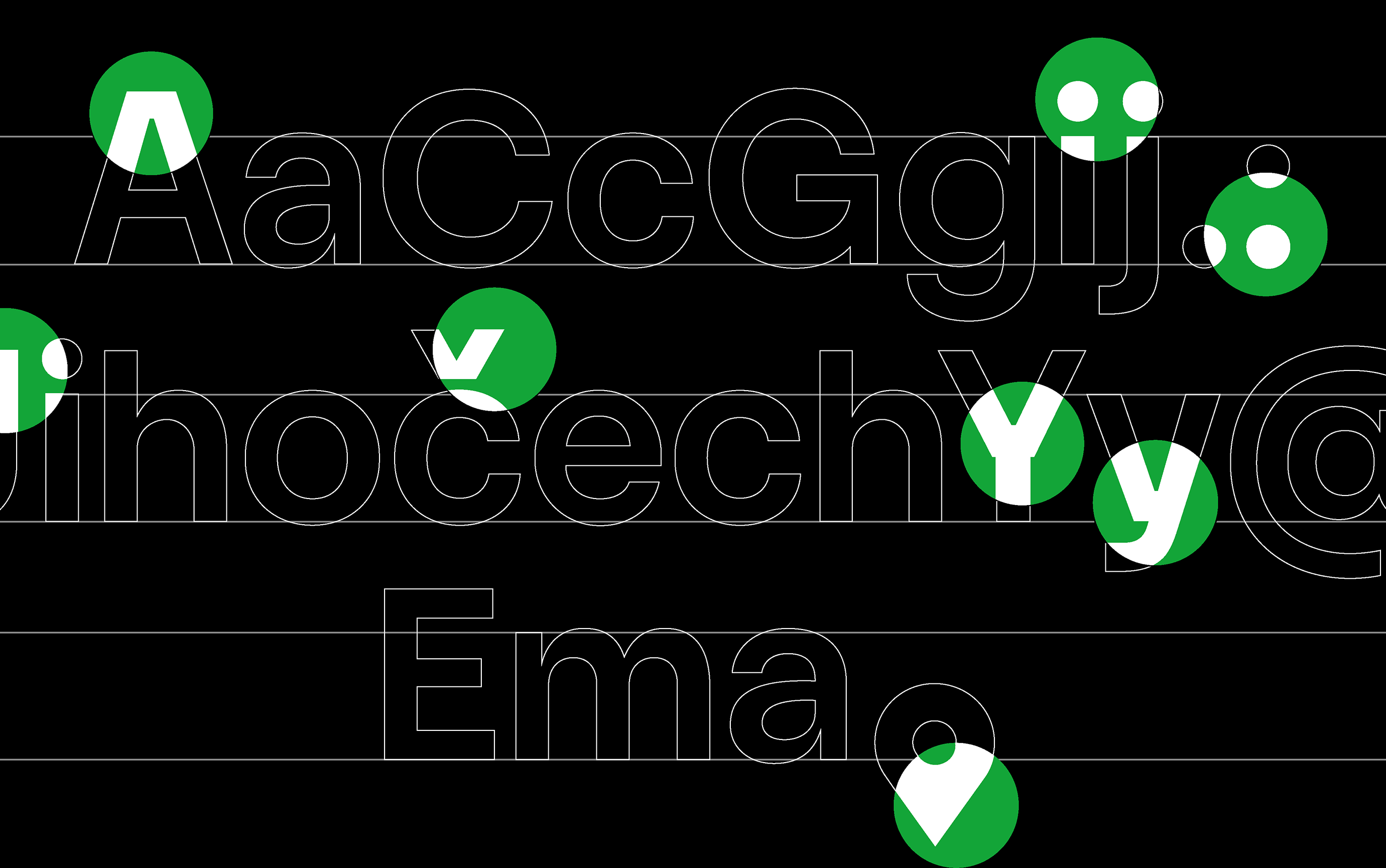
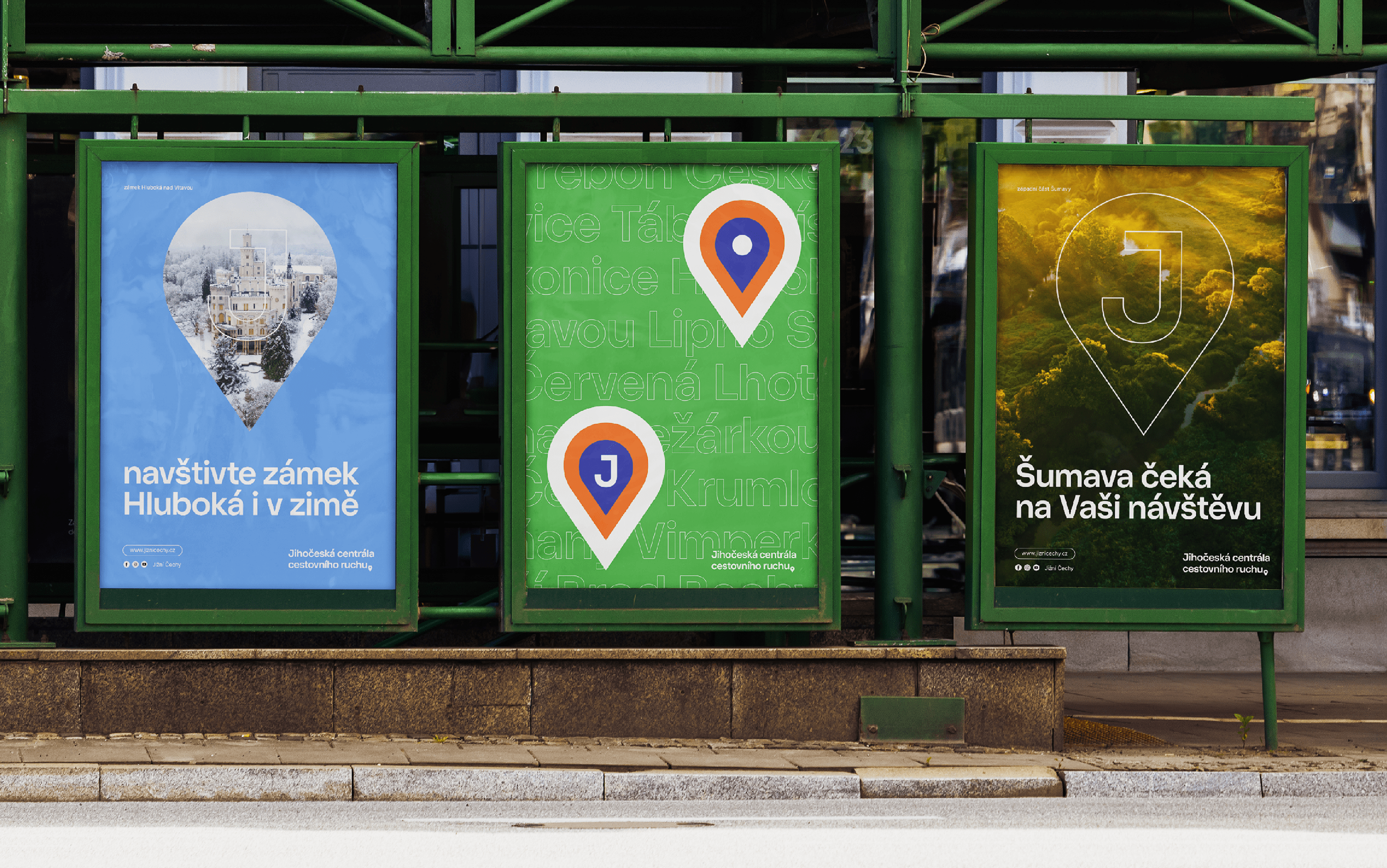
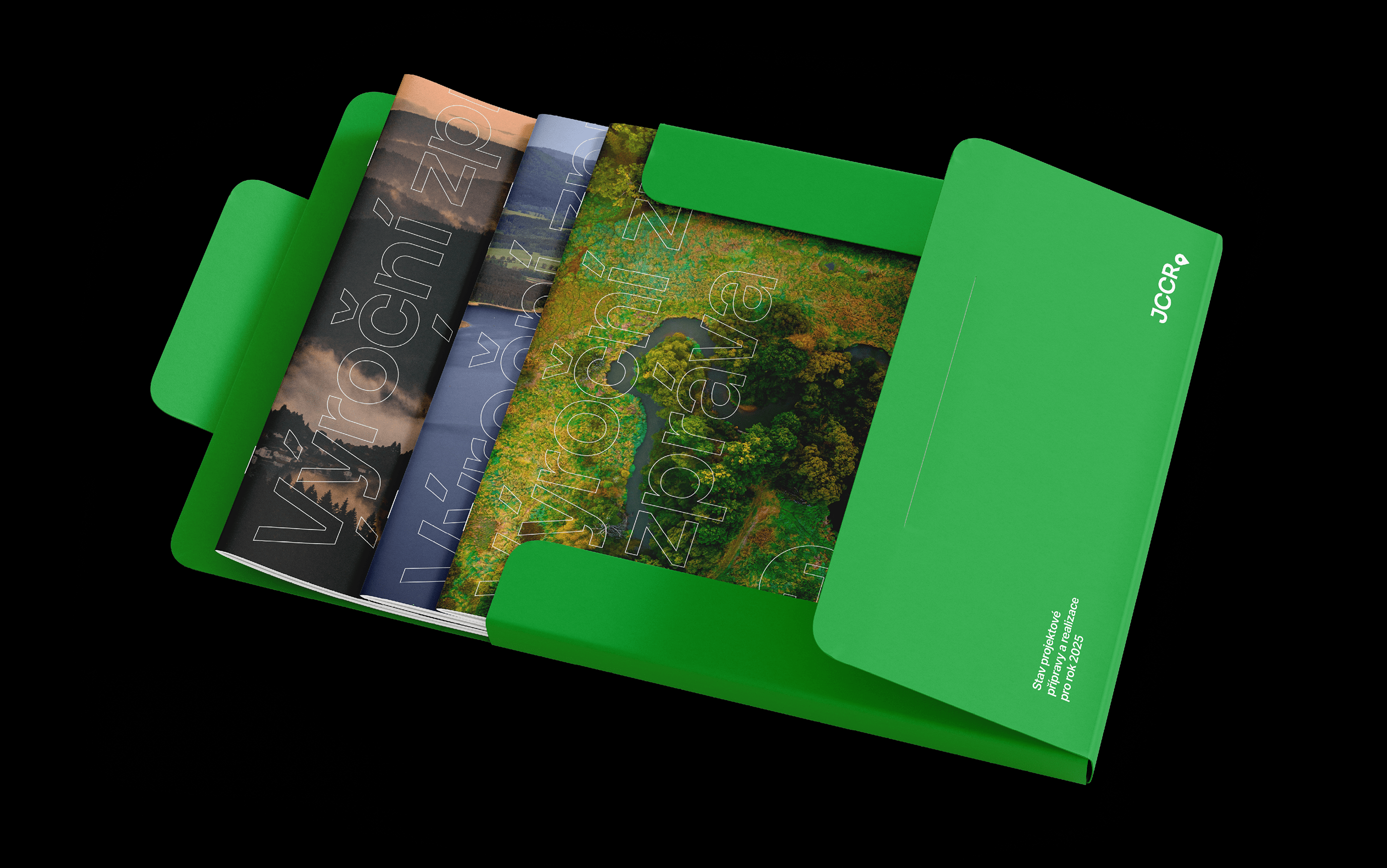
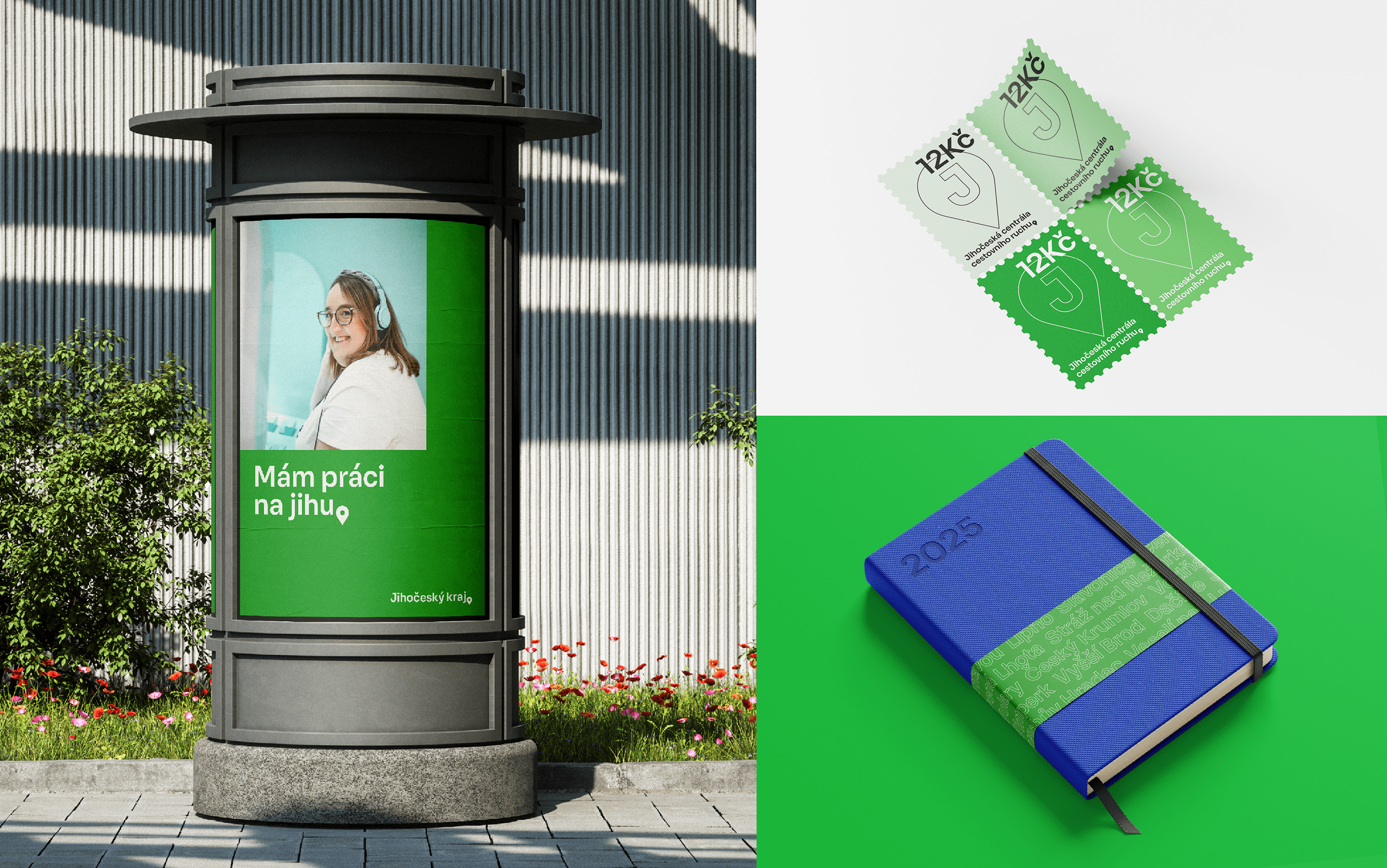
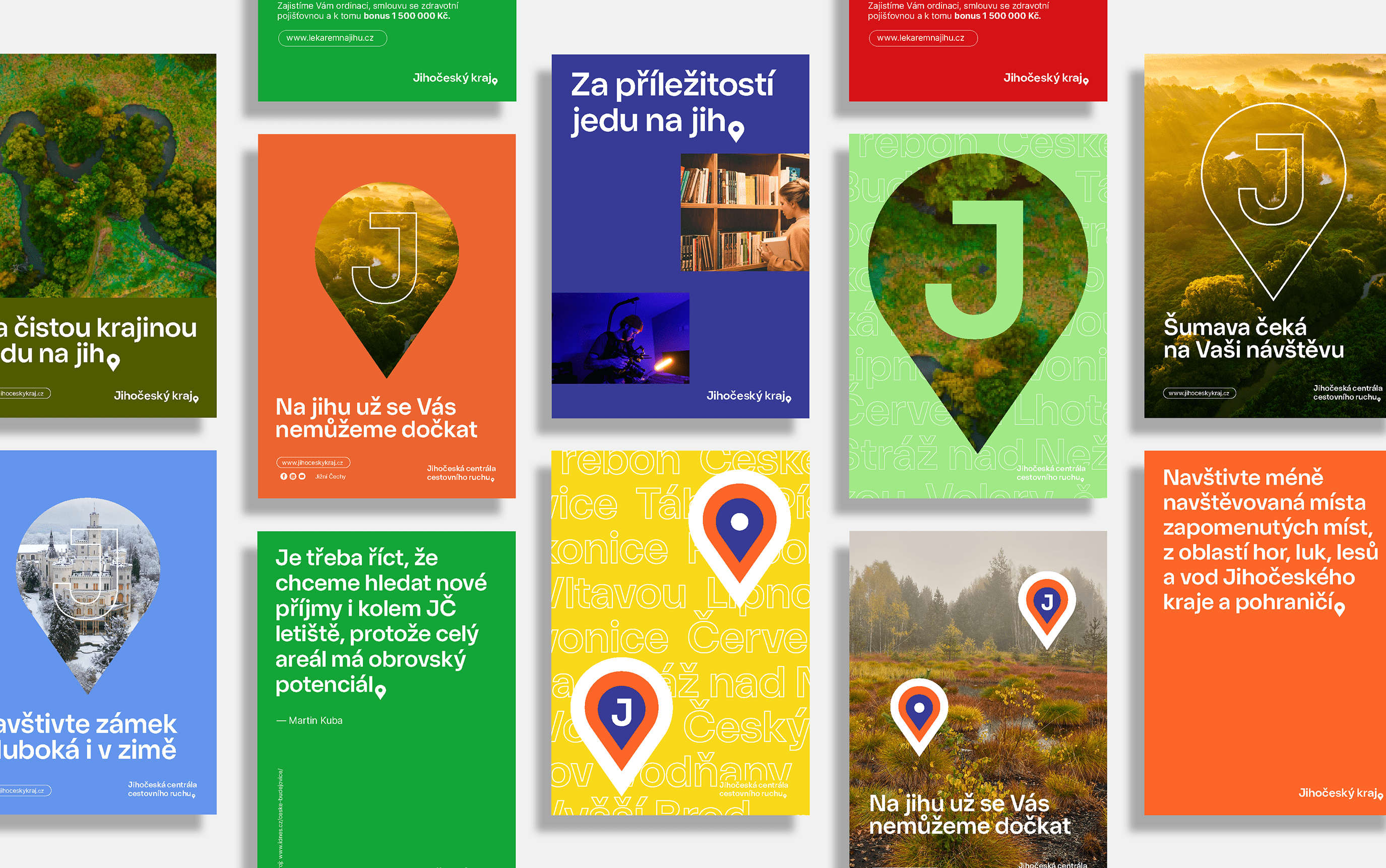
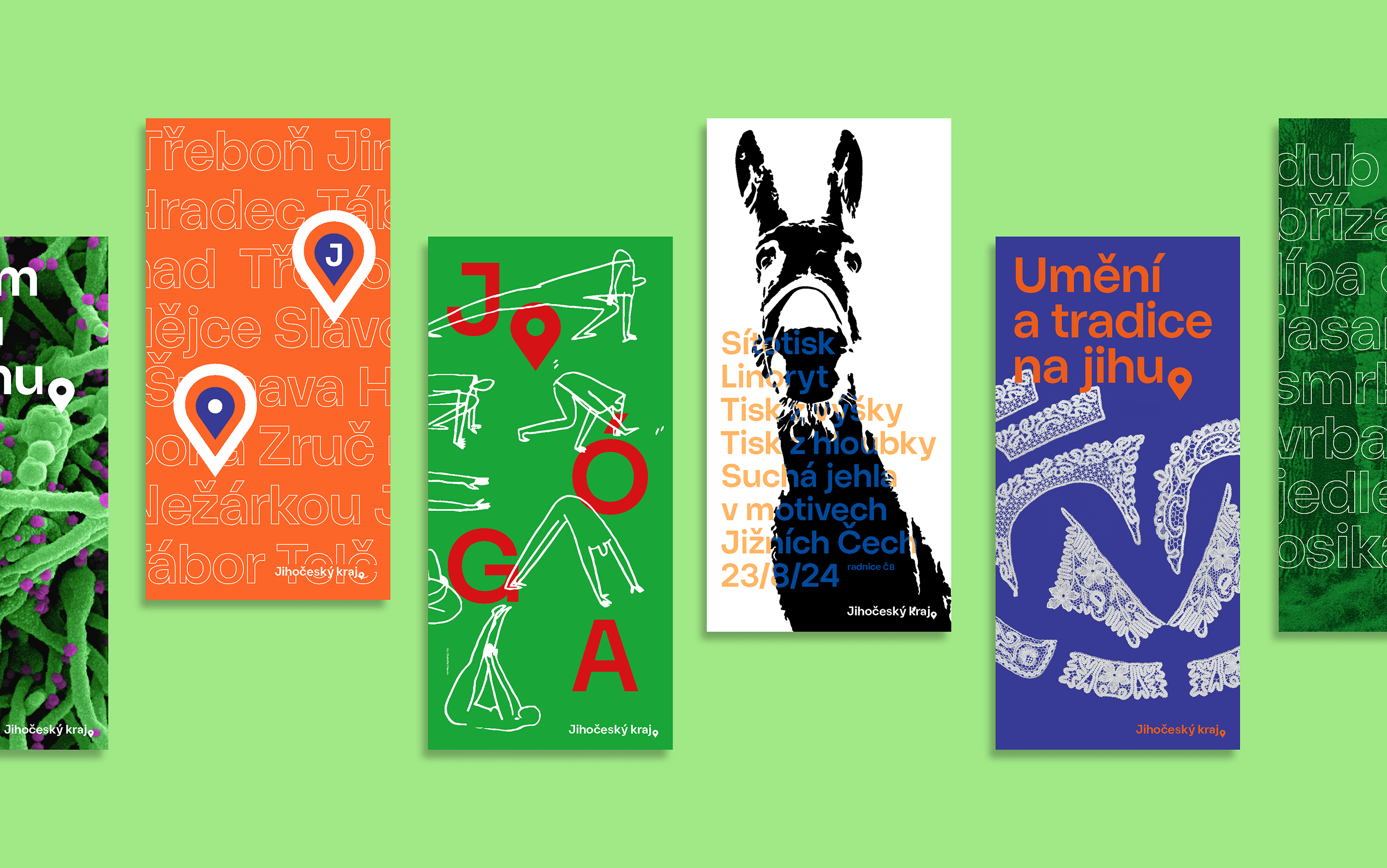
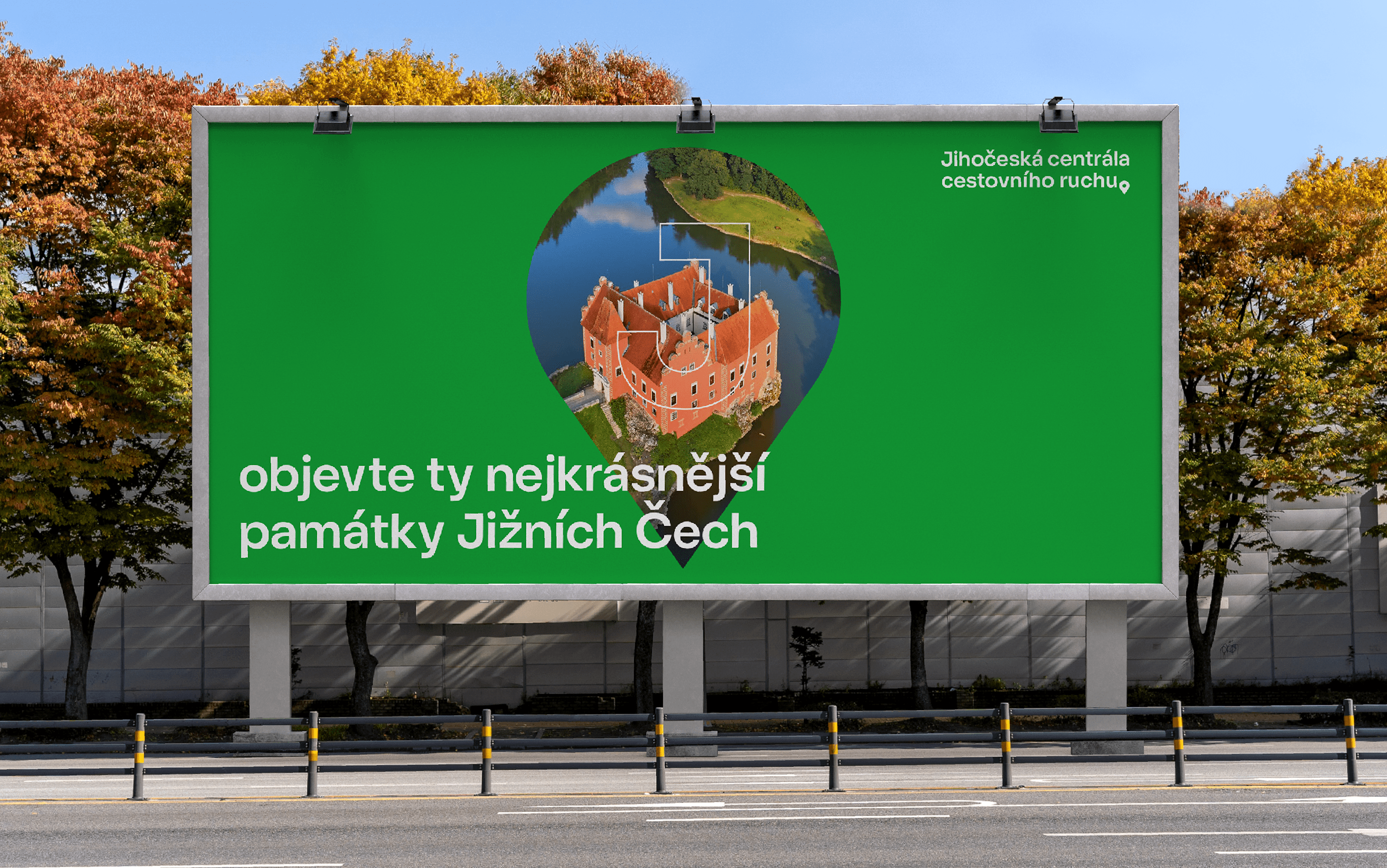
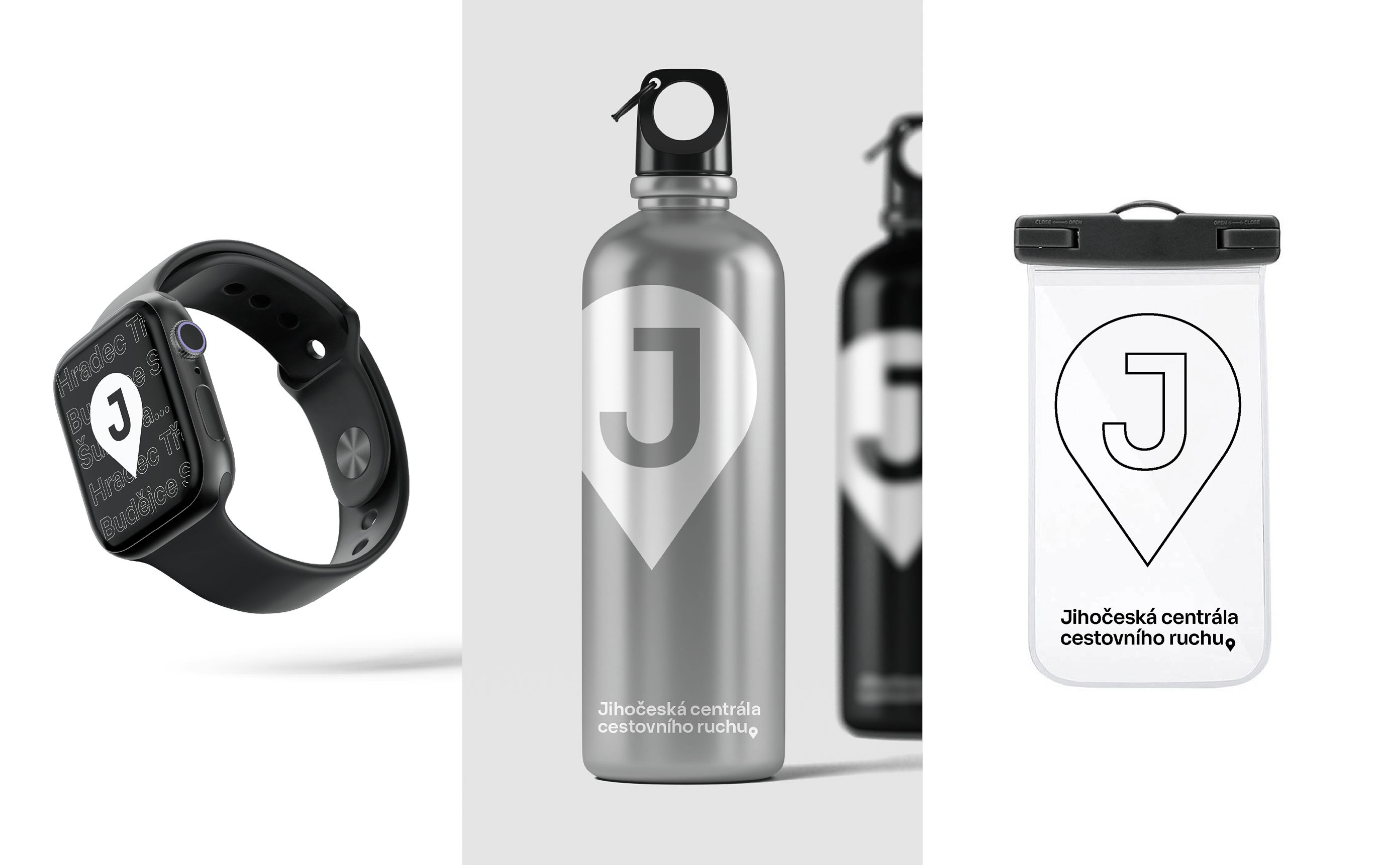
First of all, we focused on the type. Type is a medium of expression, and it cannot be overlooked. Moreover, we think the task prompted us to design a typeface tailored to the project. We succeeded in doing that; we named the typeface Ema, after the famous native Ema Destinn, who lived in Stráž nad Nežárkou. We based it on the traditional proportions of Gothic types. A typical feature was the characteristic uppercase letters and the initial letter J, or geometric punctuation corresponding to the symbol of the pin symbol that appeared in the logo.
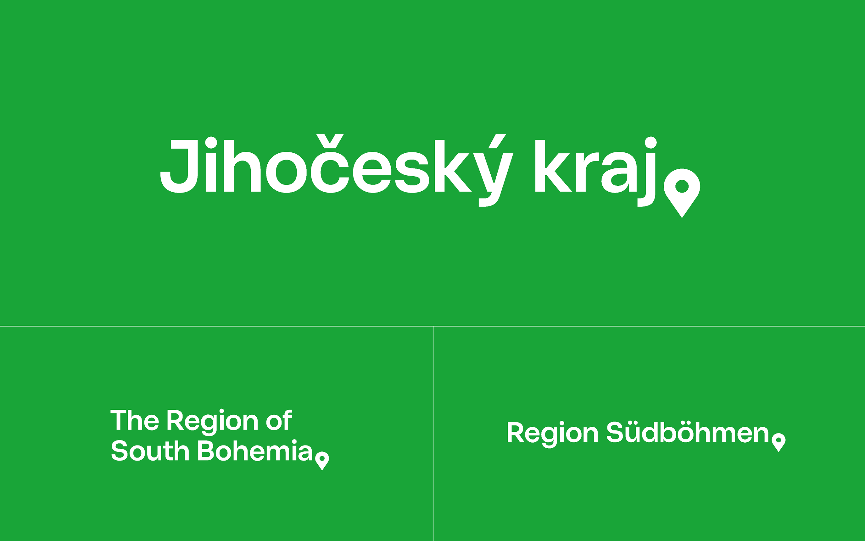
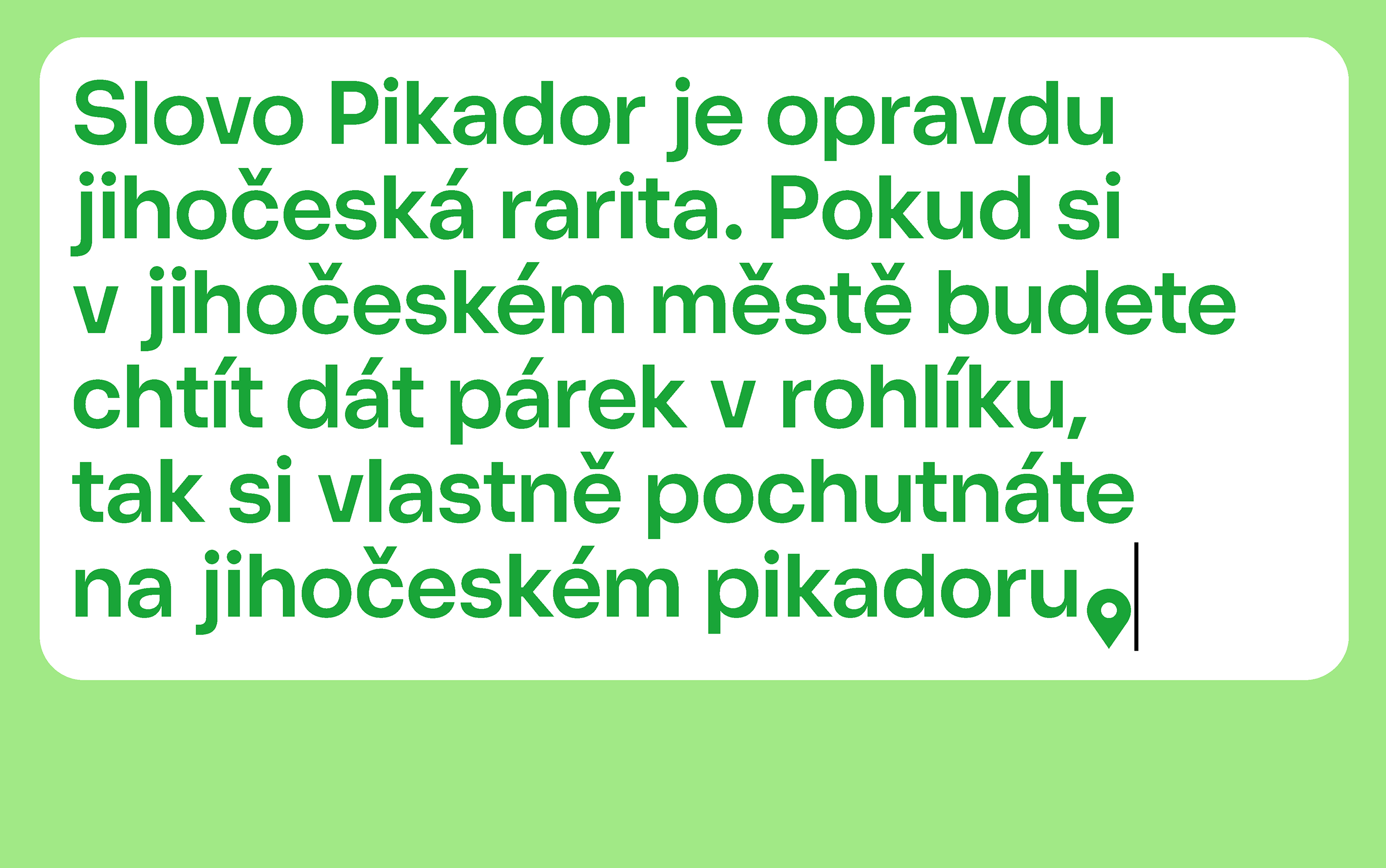
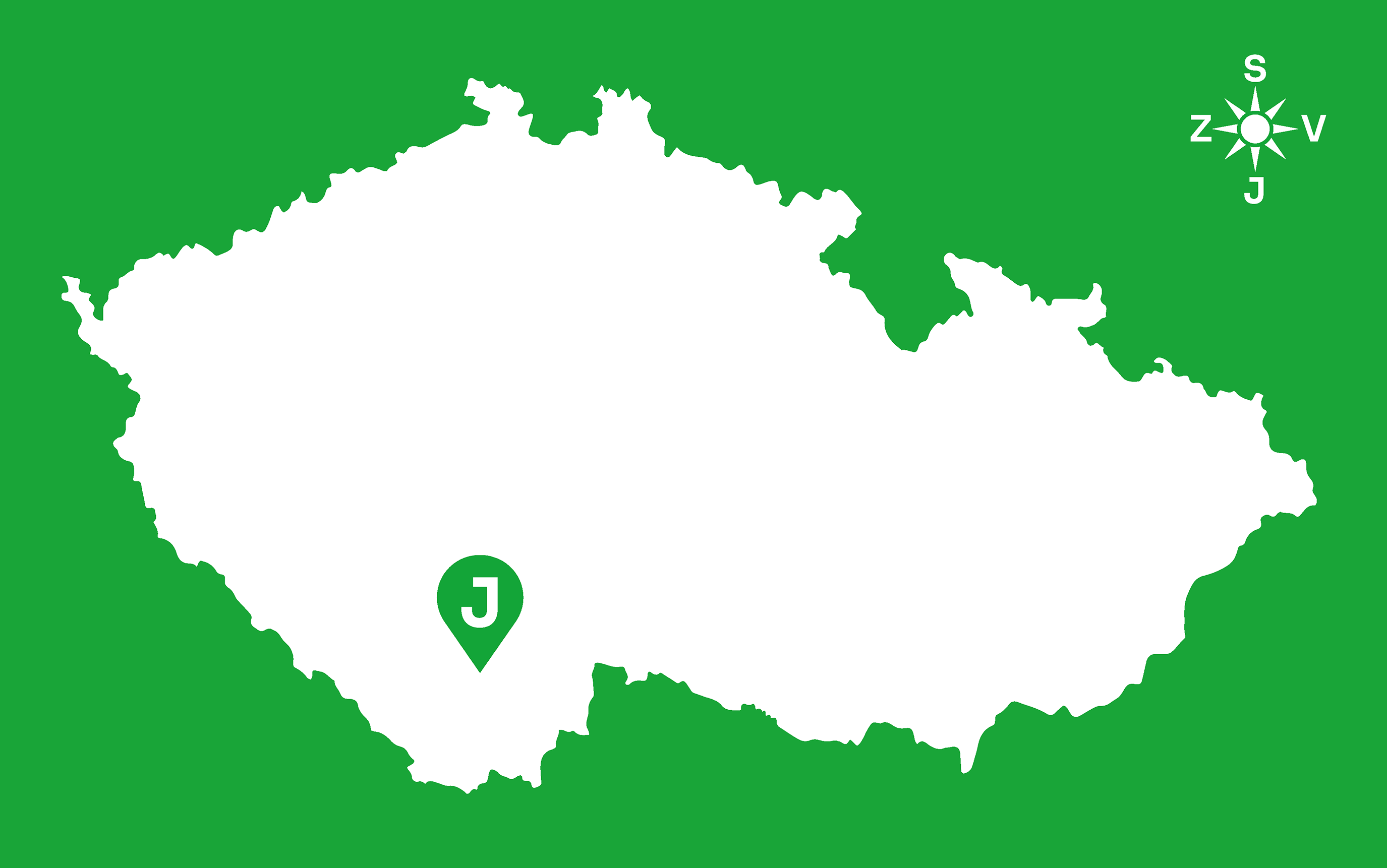
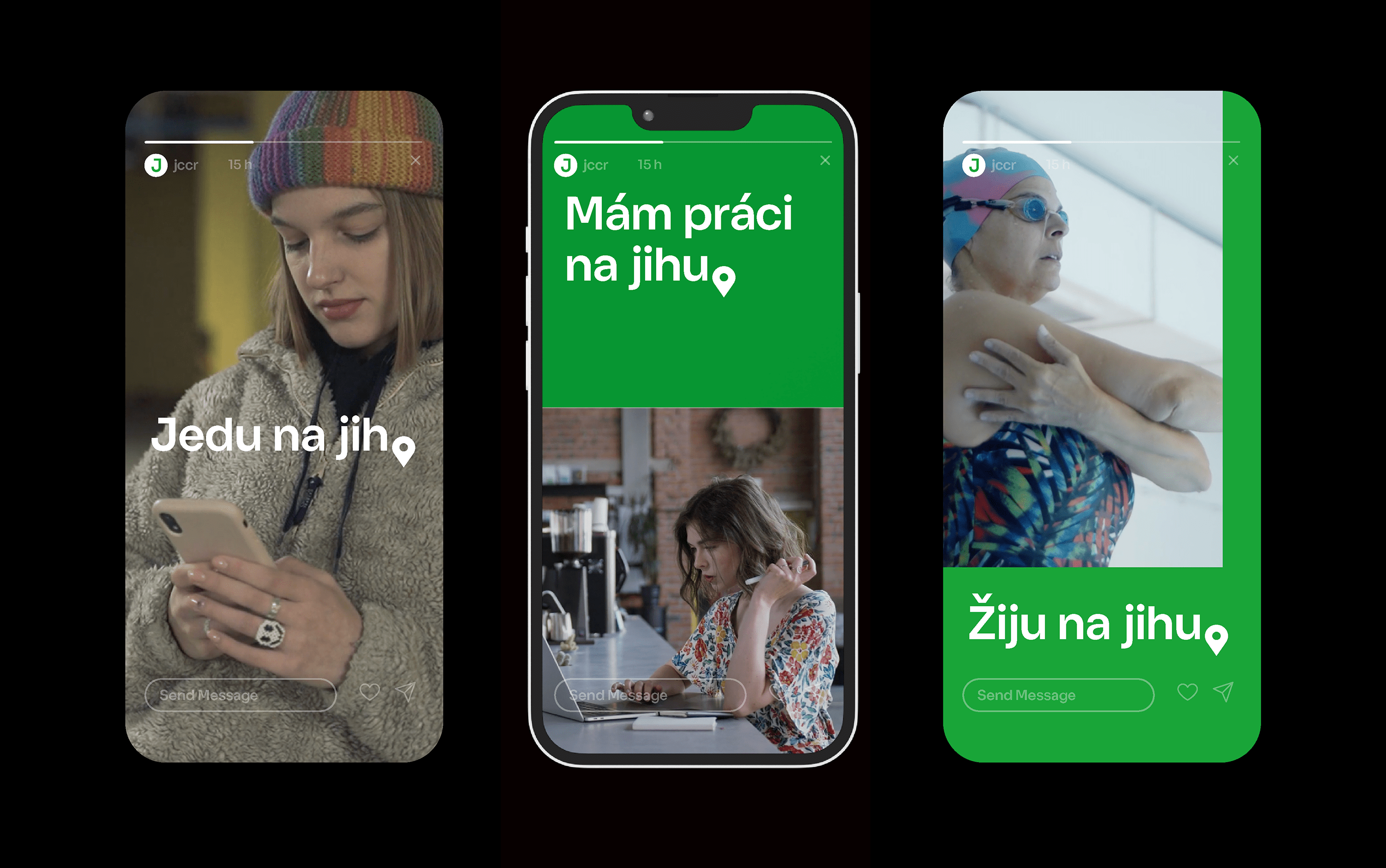
The logograph consisted of the name “South Bohemia Region” and the symbol of a “pin” placed at the end of the text. The same positioning of the “pin” was used in the names of other organizations, such as the South Bohemia Tourism Centre or the sub-brand “South Bohemia”. The well-known icon of a pin (pin, place) is a comprehensible symbol widely recognizable through its use in maps or navigation. Our design suggested that we wanted to “stay in the location.” South Bohemia is a place to mark a location in the metaphorical sense of home, travel, destination, or “a place to live.”
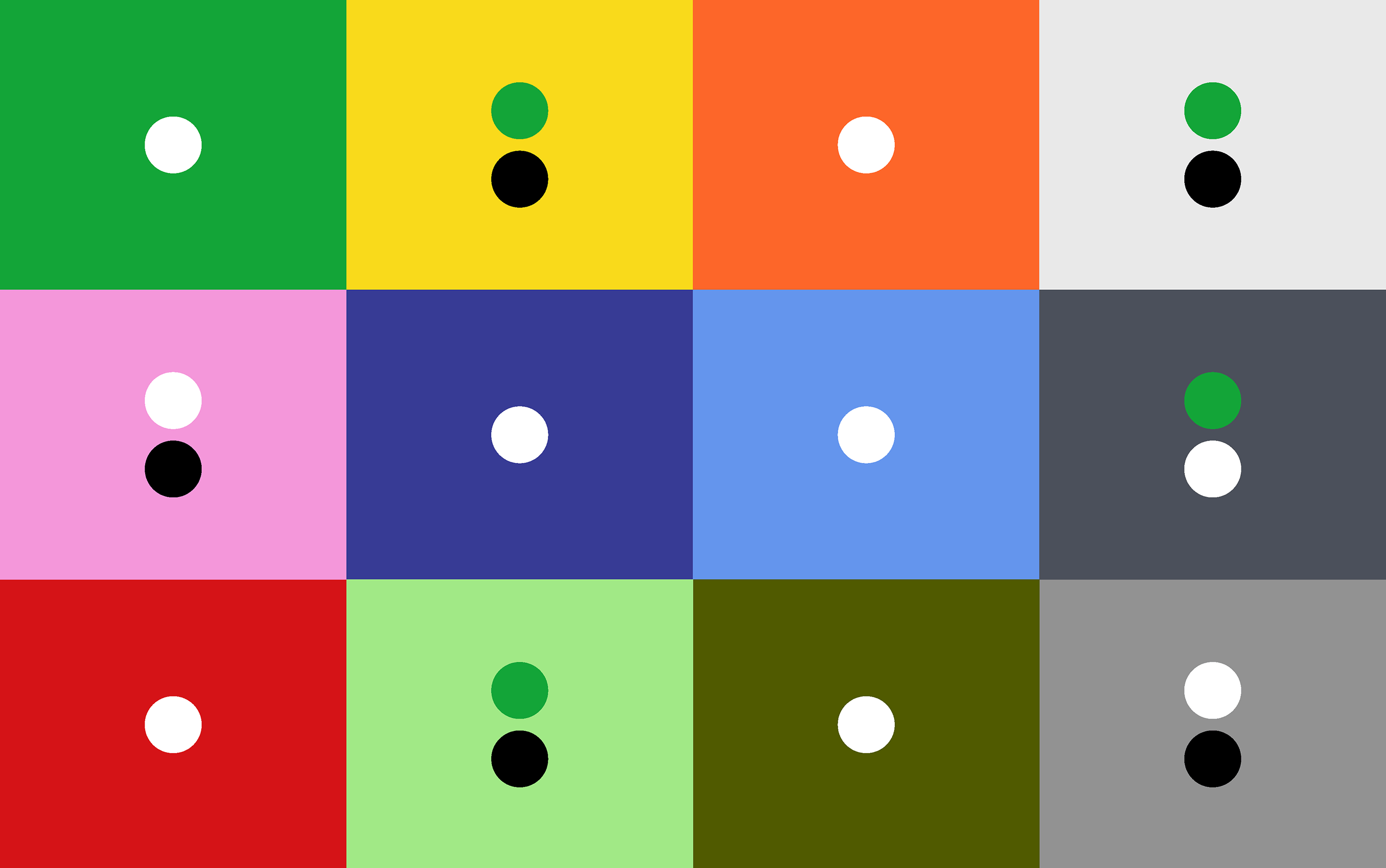
Color was a distinctive aspect of the visual style. From our point of view, the color palette of the region is rich and varied; in the associations with South Bohemia, we saw a whole palette of bright colors associated with holidays, vacations, and nature, where the green color of forests and the blue color of water bodies played the most prominent role. When we projected the fabulous colors of the roofscapes of South Bohemian towns and the sun’s brilliance, we arrived at the palette used in the current logo. Our fundamental idea was to keep to the limited palette while maintaining the brightness and variety described above. It also implied the task of promoting the region as a place to live, and not only as a tourist destination. We chose a distinctive green color, which was dynamic and modern and best answered the question of how to communicate the entire identity. We did not turn our backs on other colors; we used them in other visual design layers. It gave us a design that worked well in the base form, and its further refinement offered a range of recognizable timeless solutions. Thus, identifying a place became easy; ultimately, that mattered.
Klient
South Bohemia Region in cooperation with Czech Design
Design team
Klára Kvízová / Matyáš Bartoň / David Šrot
Cooperation
Inter from VOŠ Scholastika / graphic design: Lucie Kvapilová
Video
Jakub Šilhavý
Typeface
Ema