WorksInformation System
Premonstratensis of StrahovStrahov products 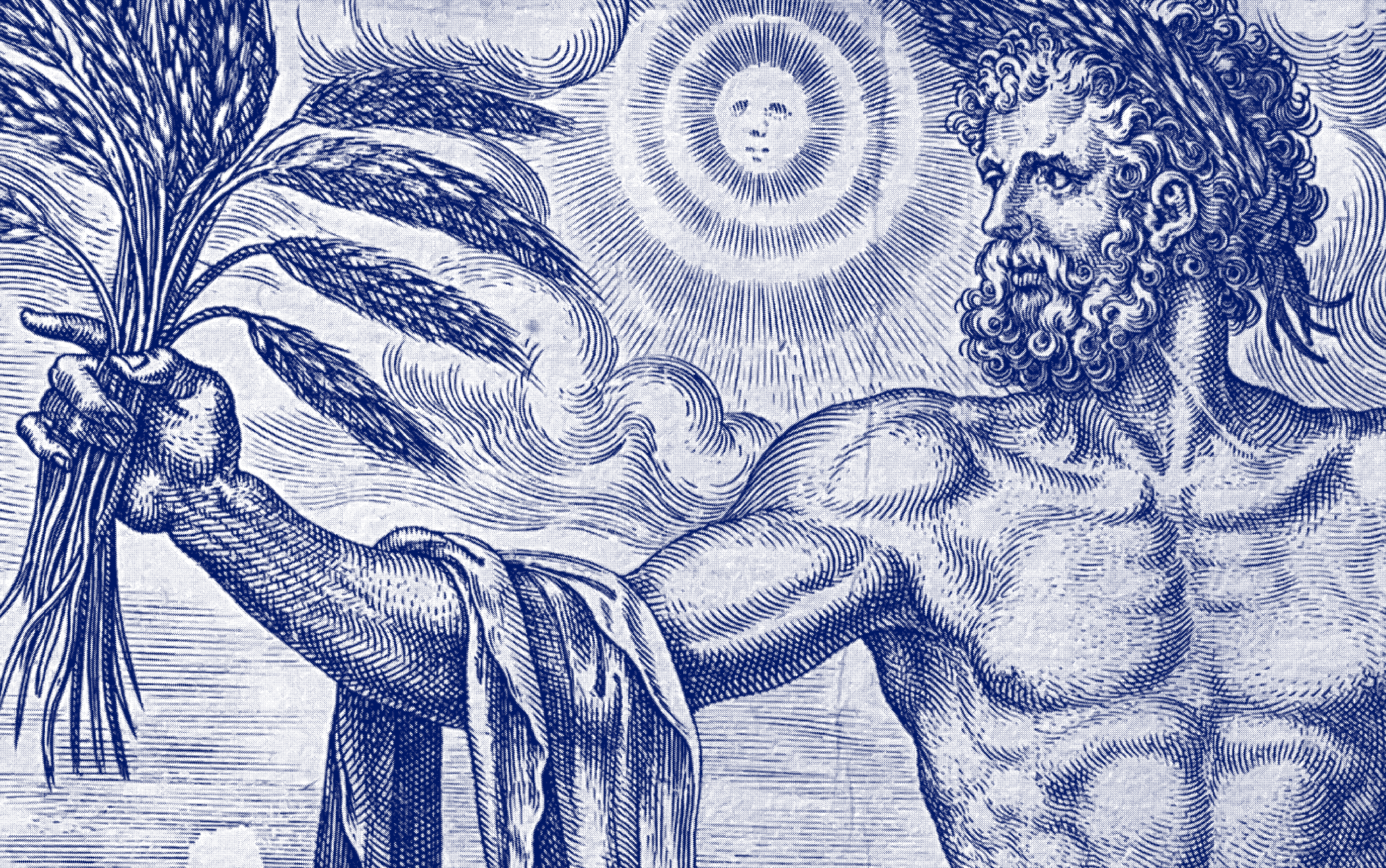
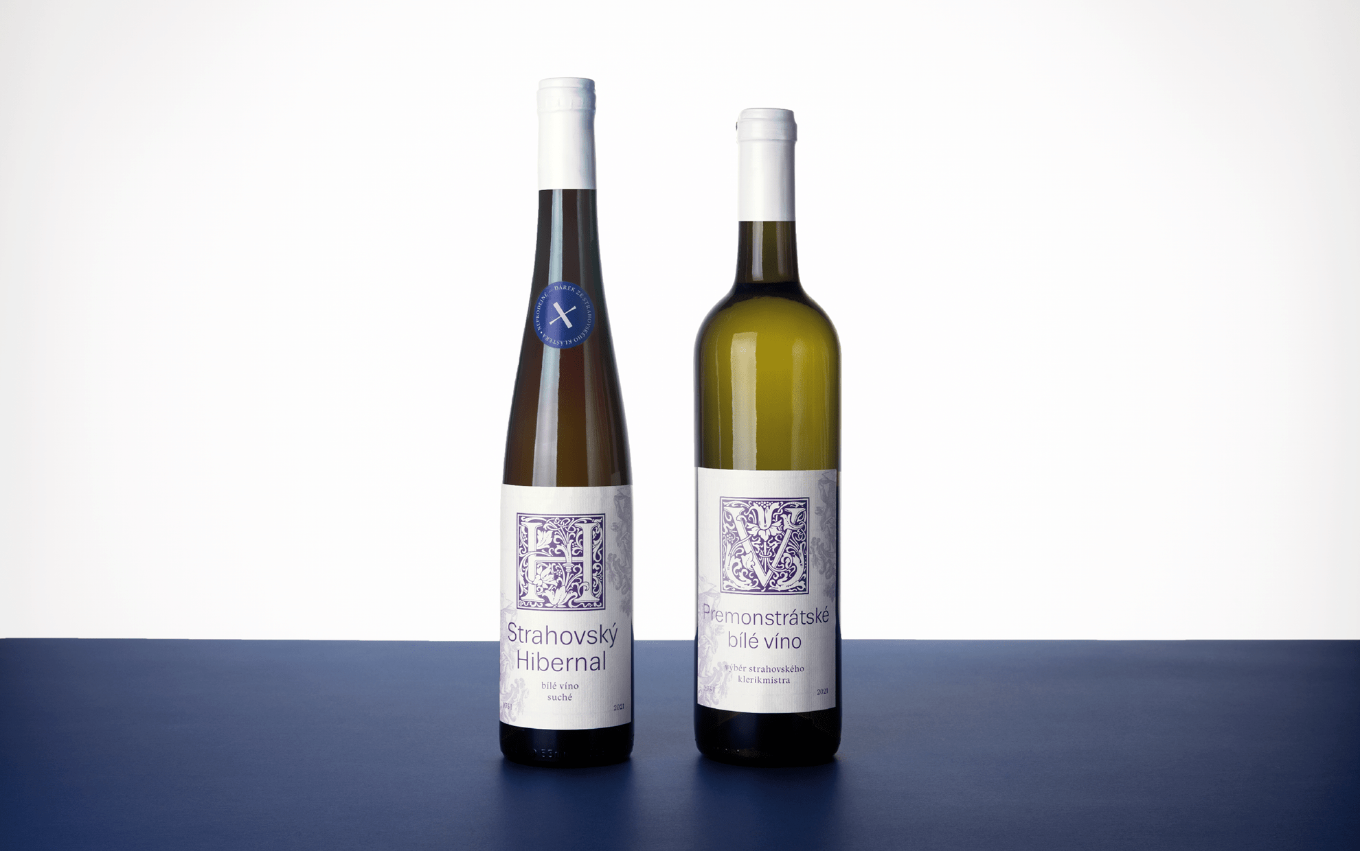
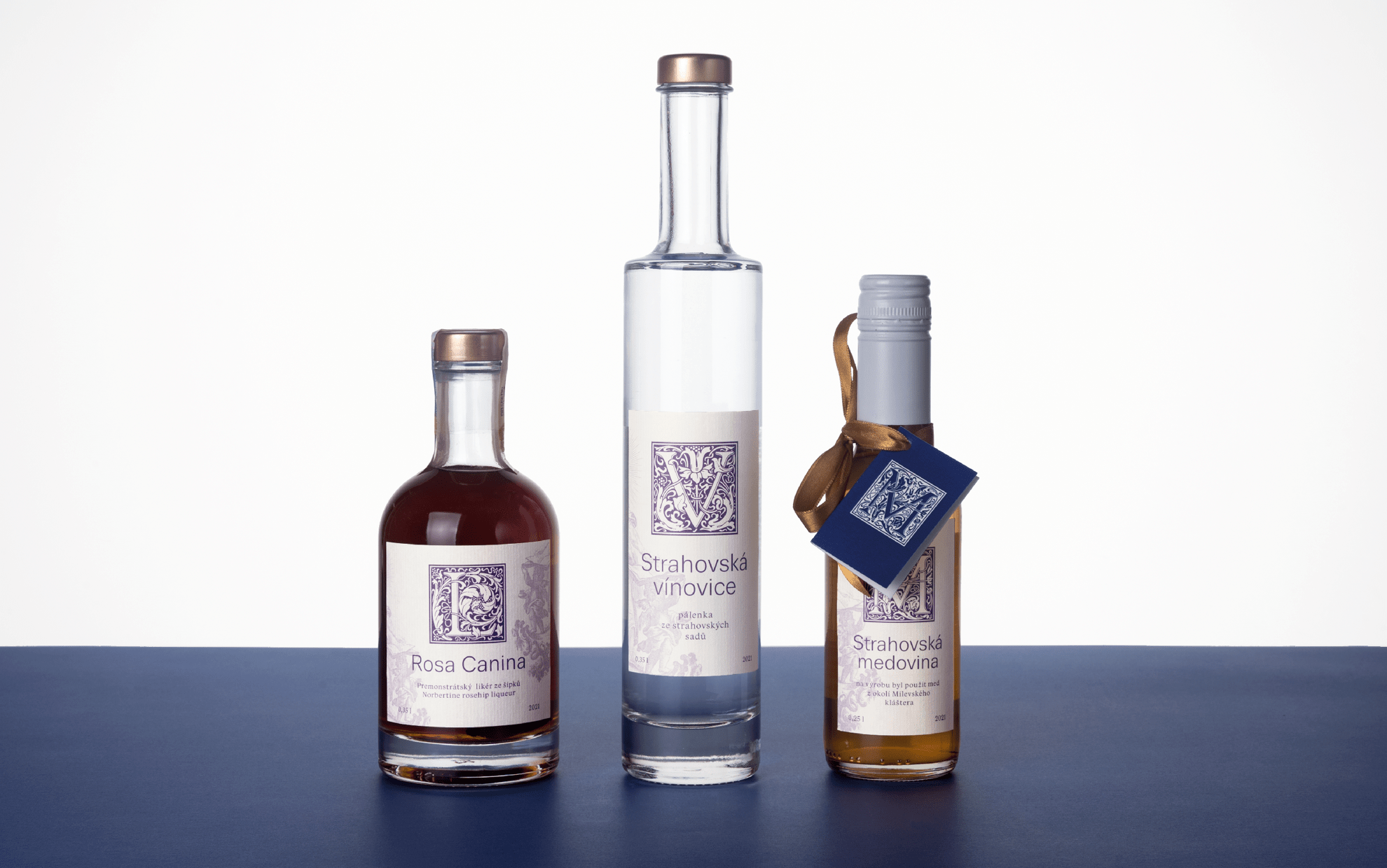
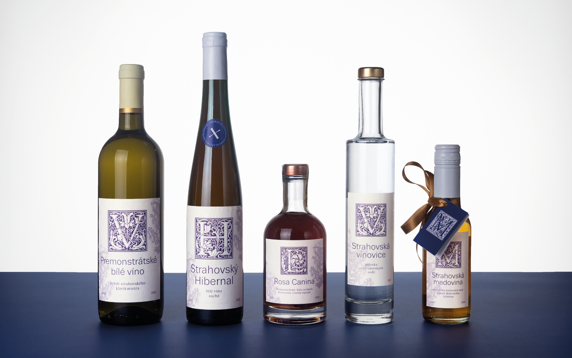
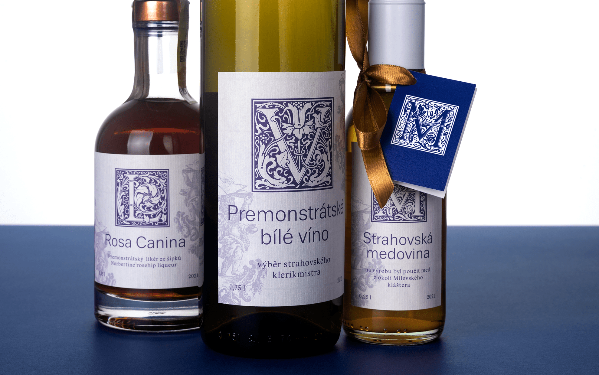
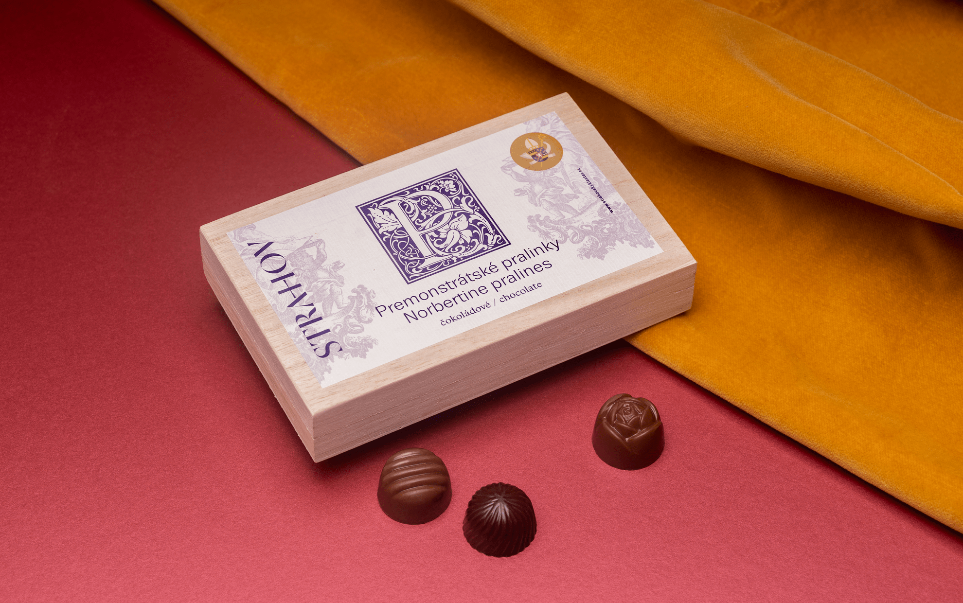
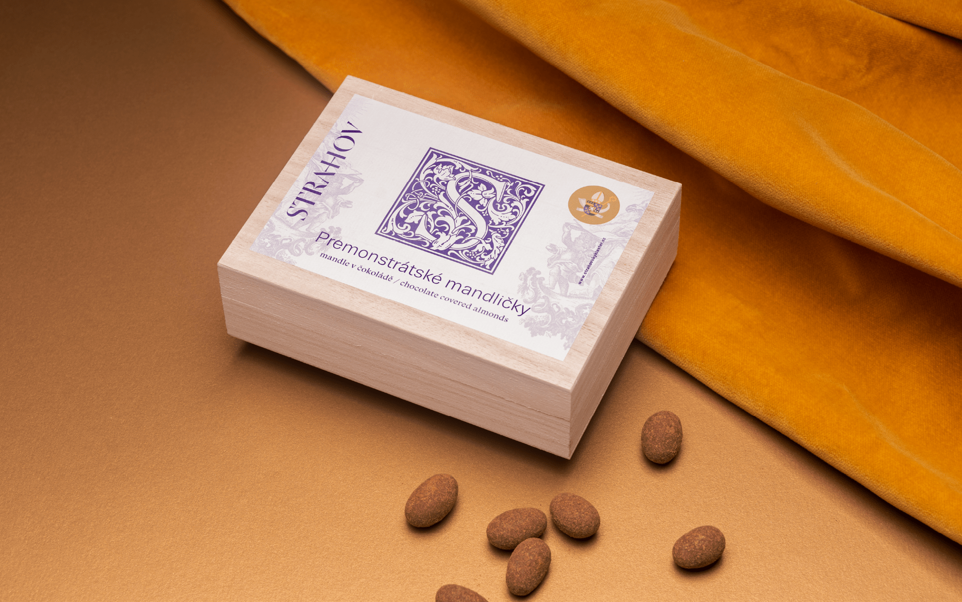
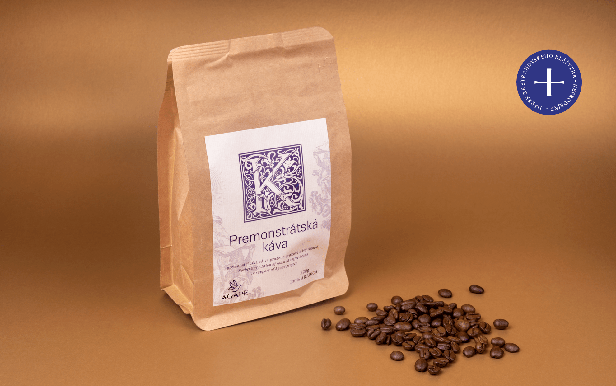
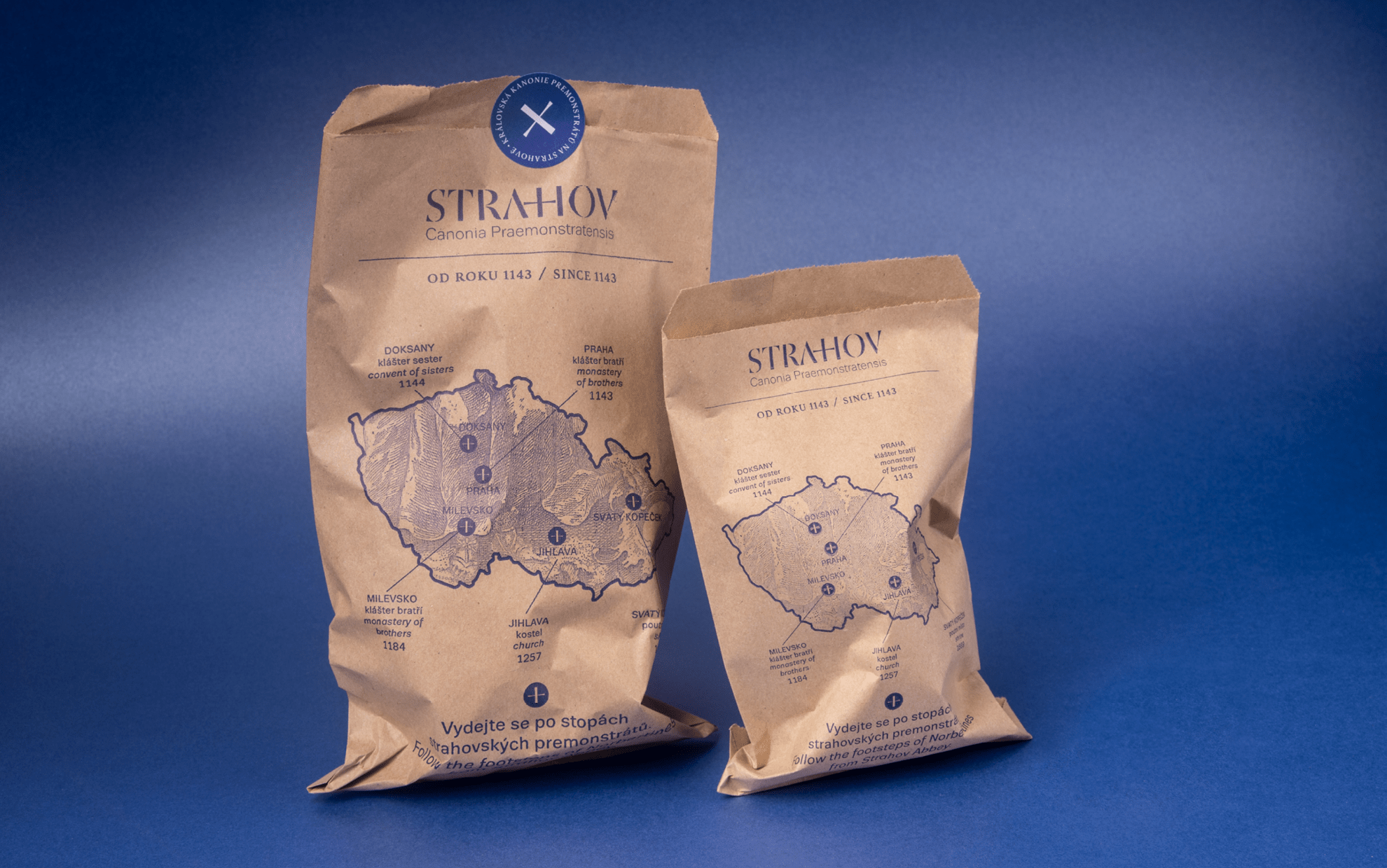
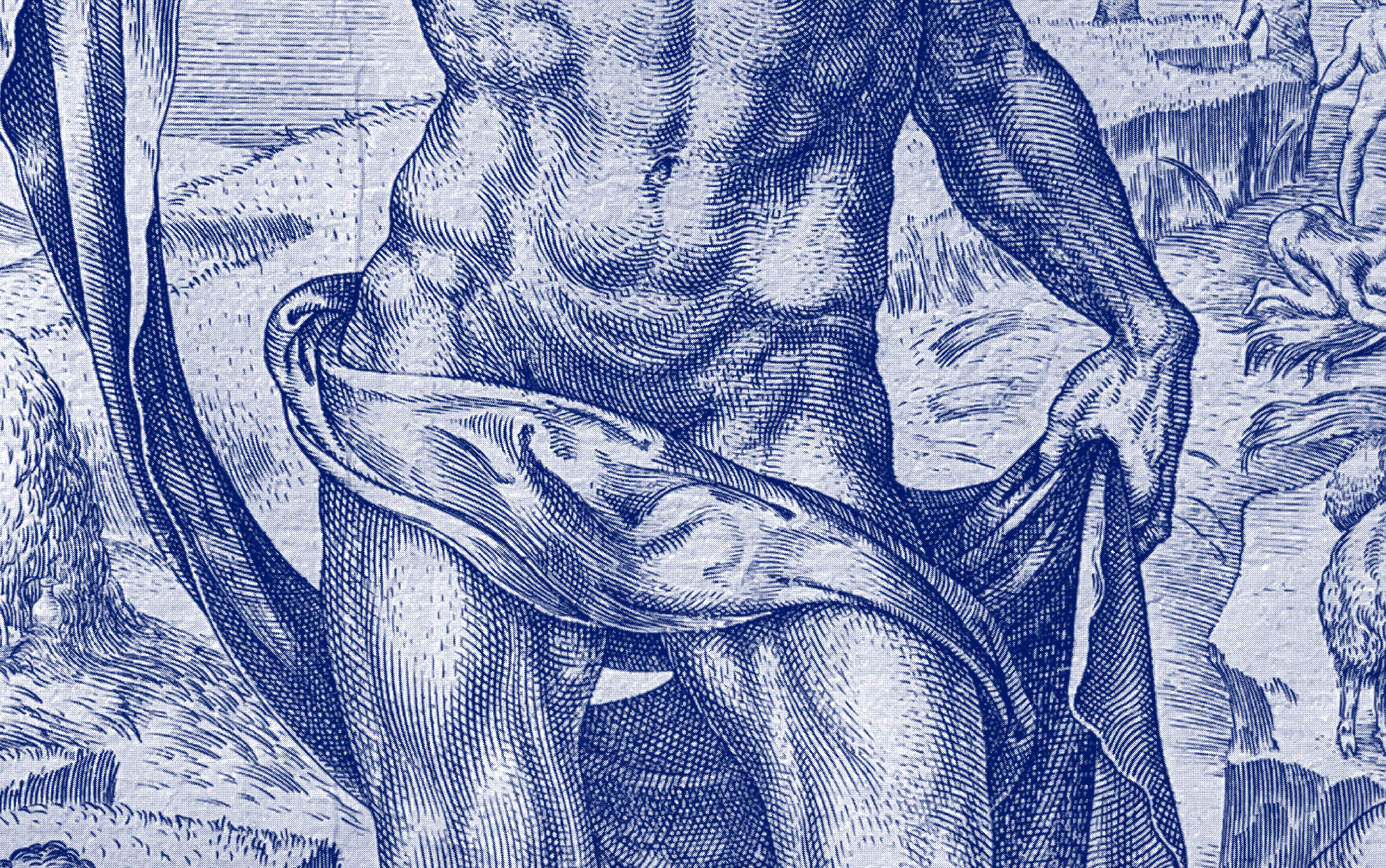
In the monastery shop on the Strahov campus you can buy original products such as Premonstratensian pralines, chocolate or wine. Our goal was to create a universal graphic principle that would present the Premonstratensians and their work in different variations on the packaging. We chose the Goudy Initials font as the main motive, which features initials in squares embellished with a floral motive. The initial letters, together with the blue colour scheme, form the main visual element of the product labels. Combined with the simplicity of Trivia font in the Book cut, it creates a timeless design that suits the non-commercial and enlightened producer.
Client: the Royal Canonry of Premonstratensians at Strahov
Author of the logotype: František Štorm
Design: Klára Kvízová, Matyáš Bartoň
Collaboration: Ambrož Petr Šámal, O.Praem, Hedvika Kuchařová
Typefaces: Trivia Sans, St Croce
Materials: Strahovská knihovna
2022