WorksCorporate Identity
L&SCAPE 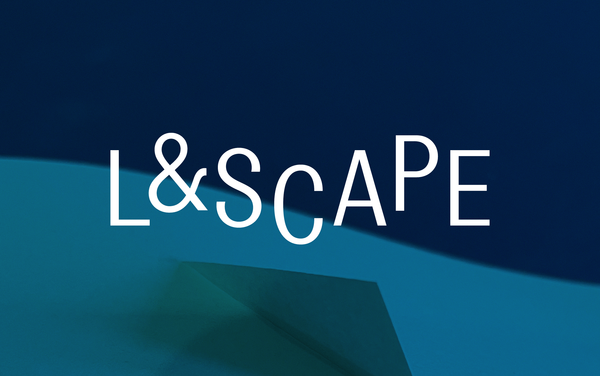
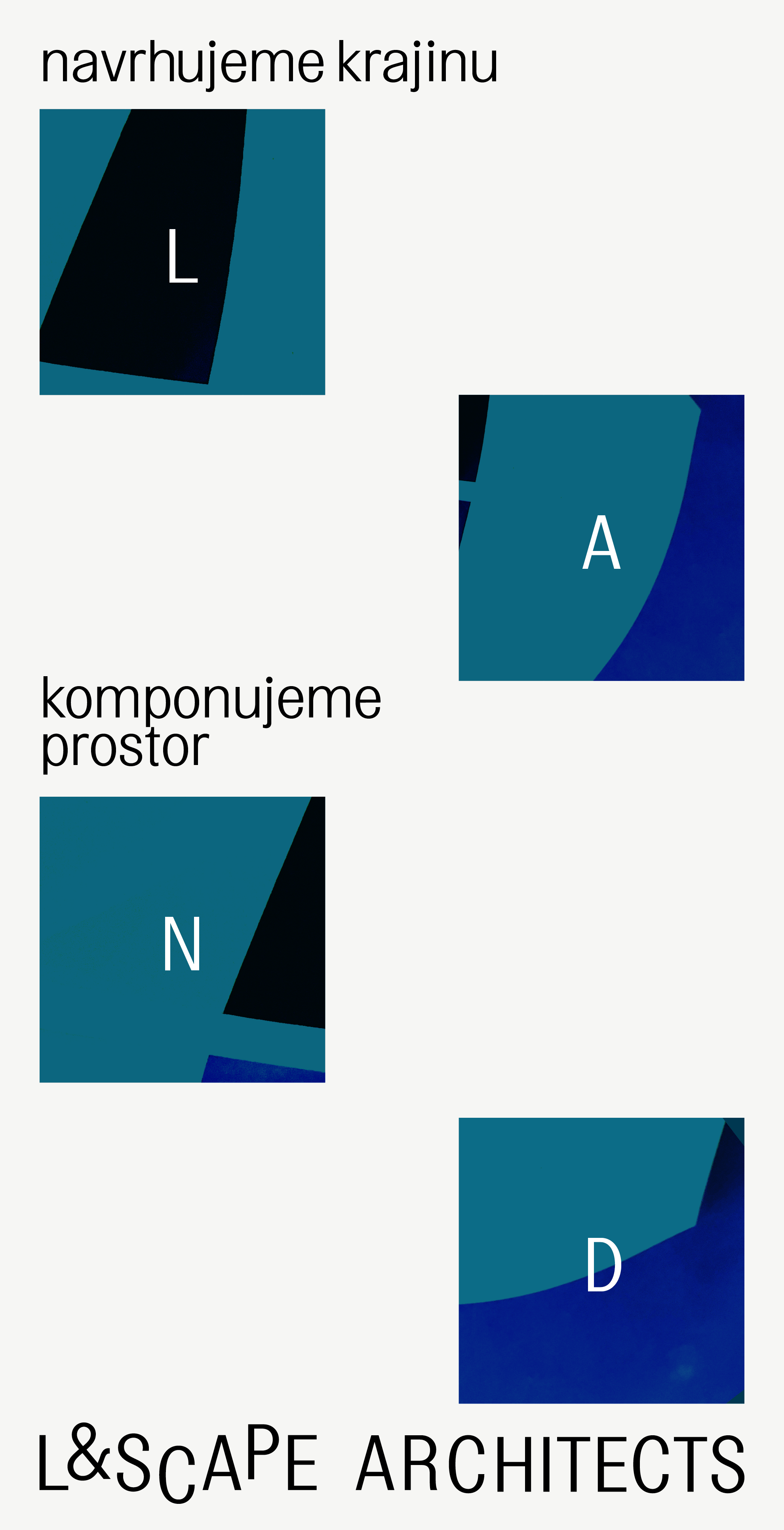
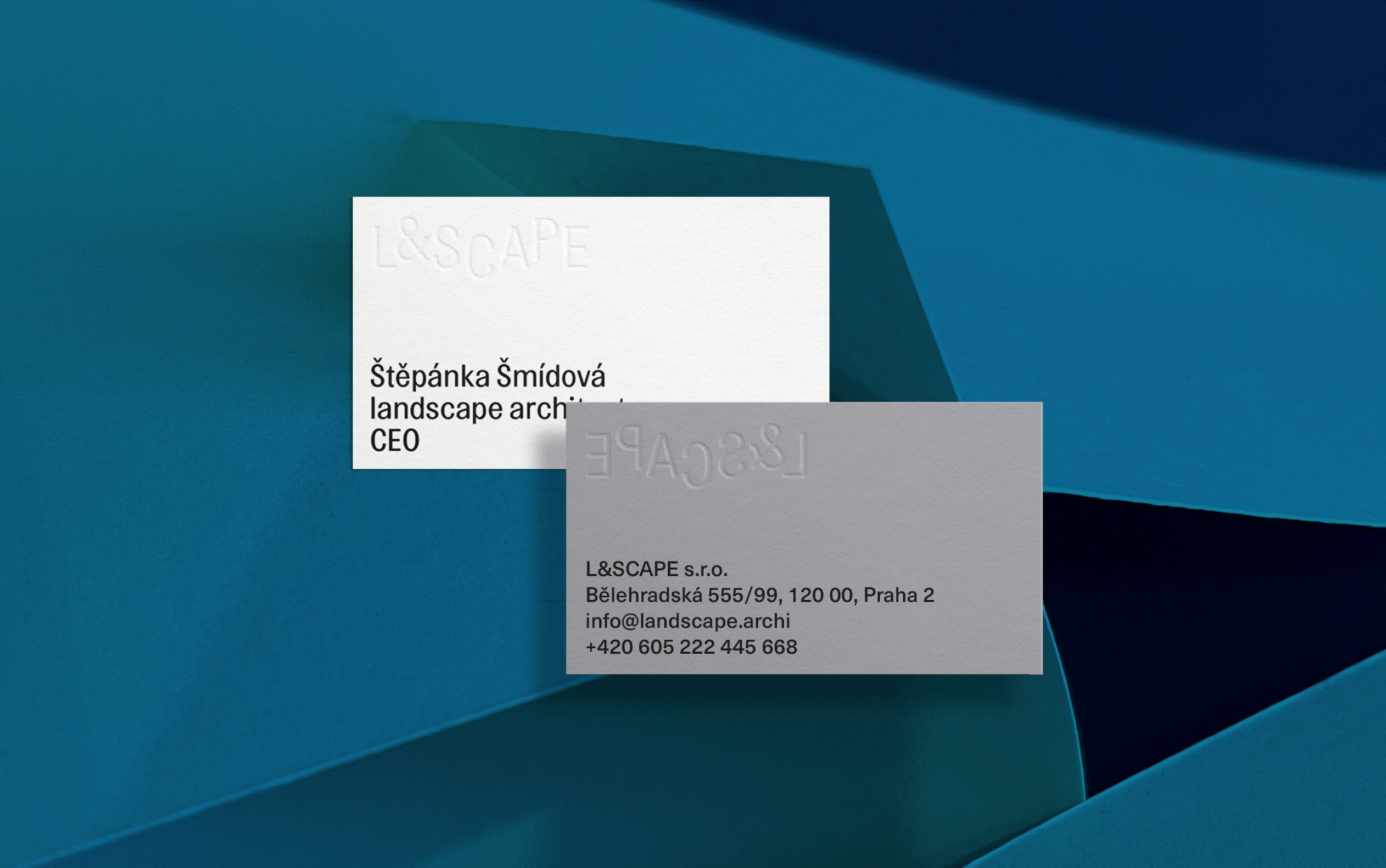
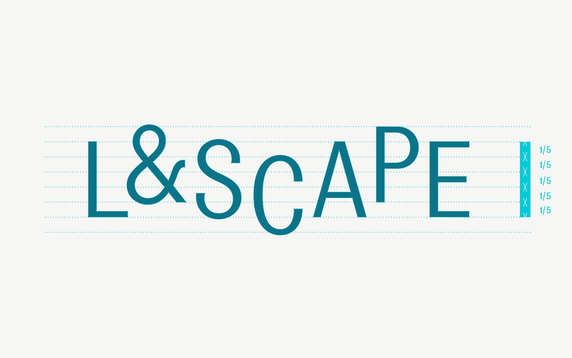
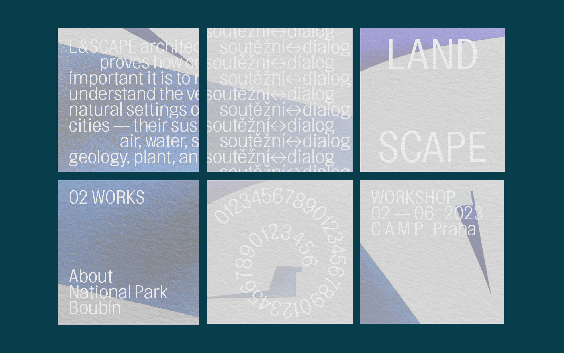
Brand new company name and new logo at the same time! L&SCAPE architects are a studio that deals with landscape architecture in a meaningful, sustainable and ecological way. As we learned during the work, they prefer a distinct minimalism in their work, and the same was expected from us. The brand is a combination of the letters L&SCAPE set in Topol typeface, whose elegant structure is hard to be tired of. It is timeless. As an artistic addition to the launch of the brand, colorful surfaces were created, that we conceived as landscapes. In the same way, the visuals are complemented by a simple line stroke used in the design of social networks.
Client: L&SCAPE
Design: Klára Kvízová, Matyáš Bartoň, Jakub Šilhavý
Animation: Jakub Šilhavý
Typefaces: Topol, Neue Haas Grotesk
2023