WorksCorporate Identity
Krnov Municipal Spa 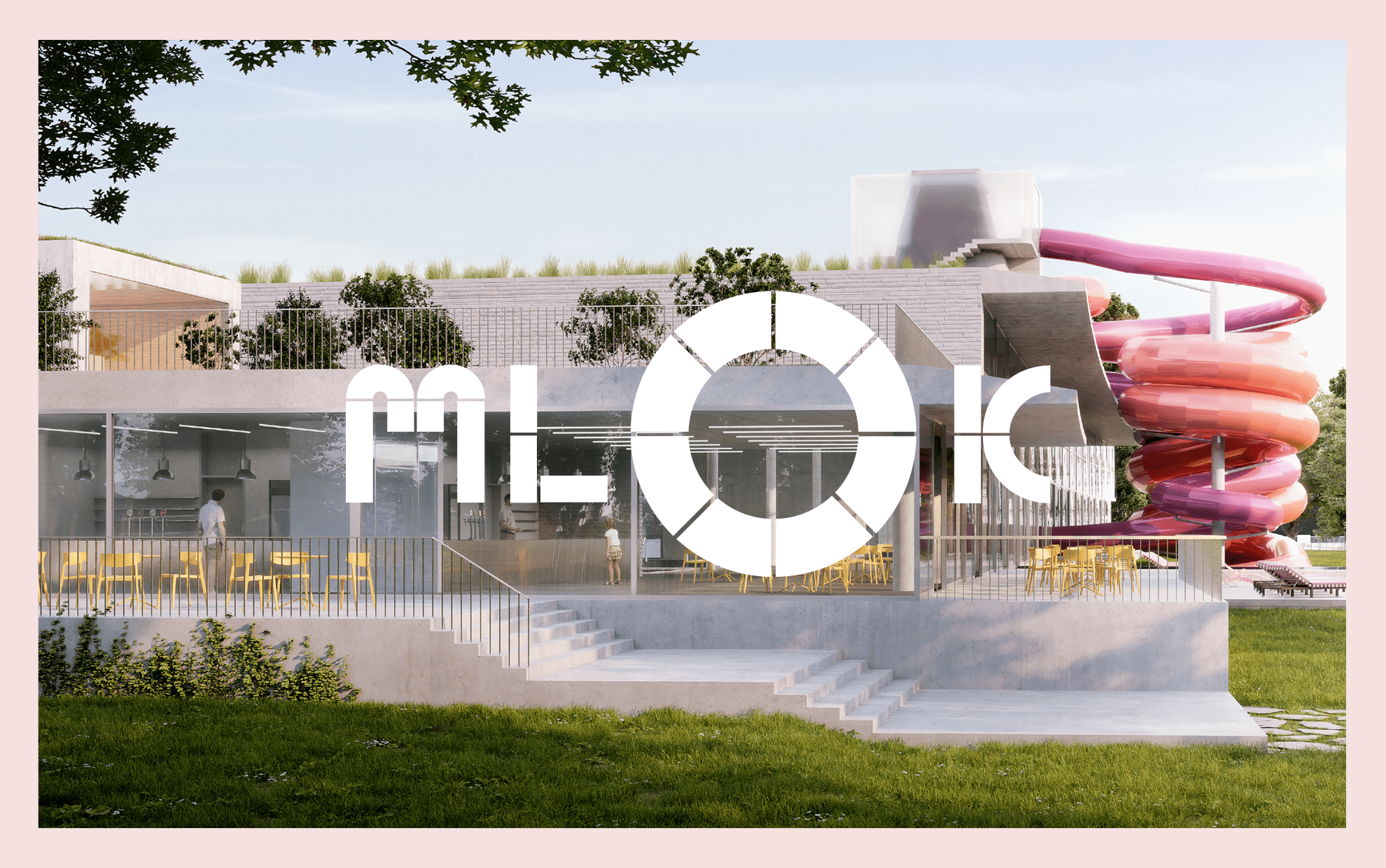
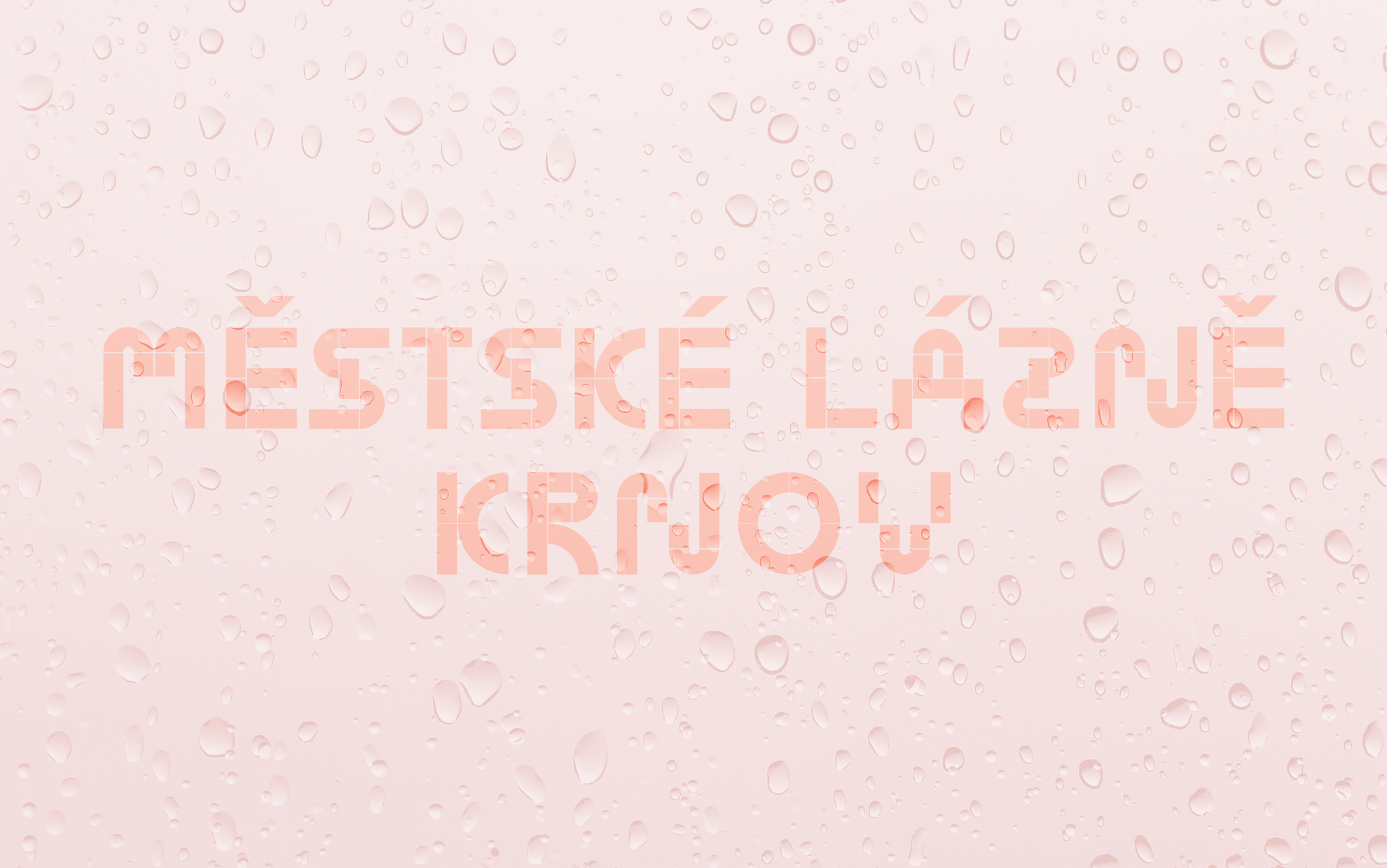
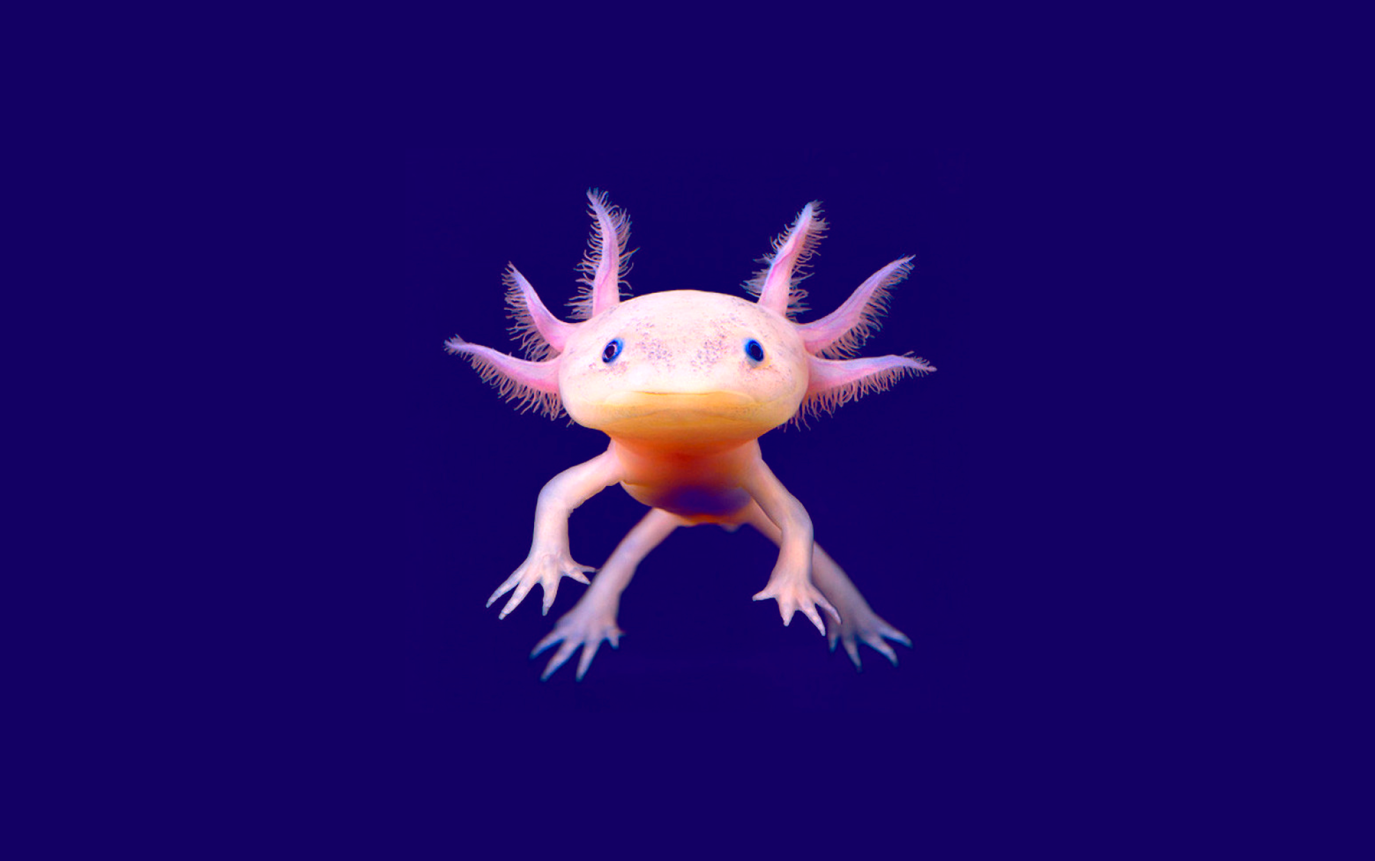
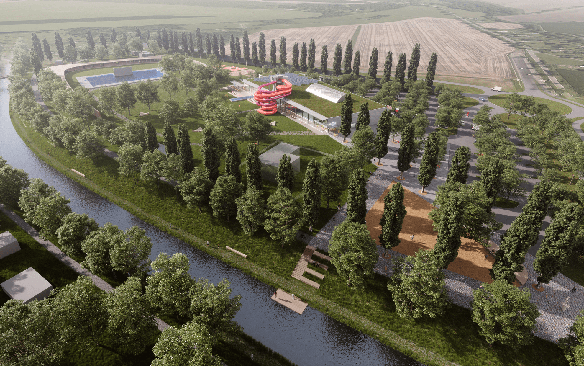
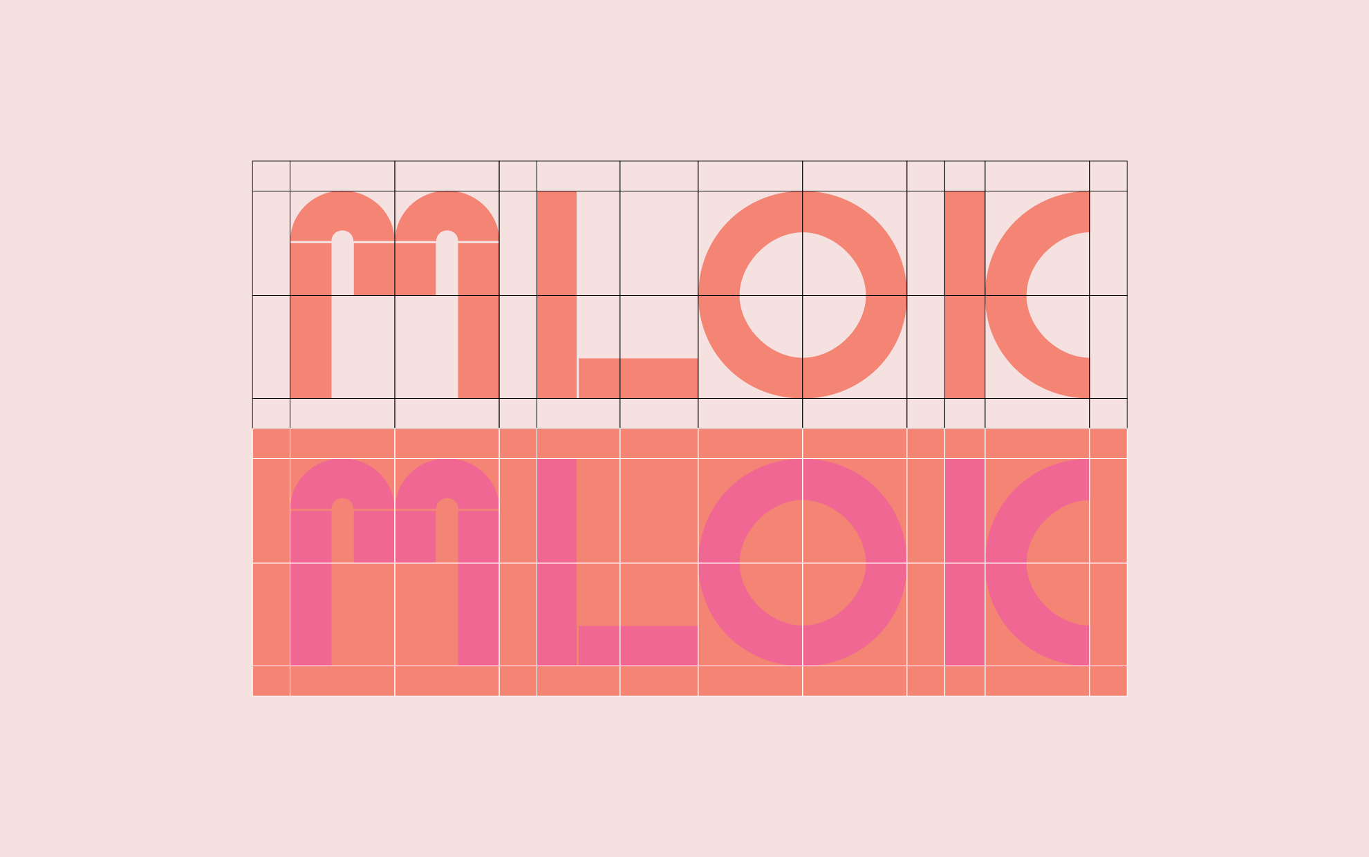
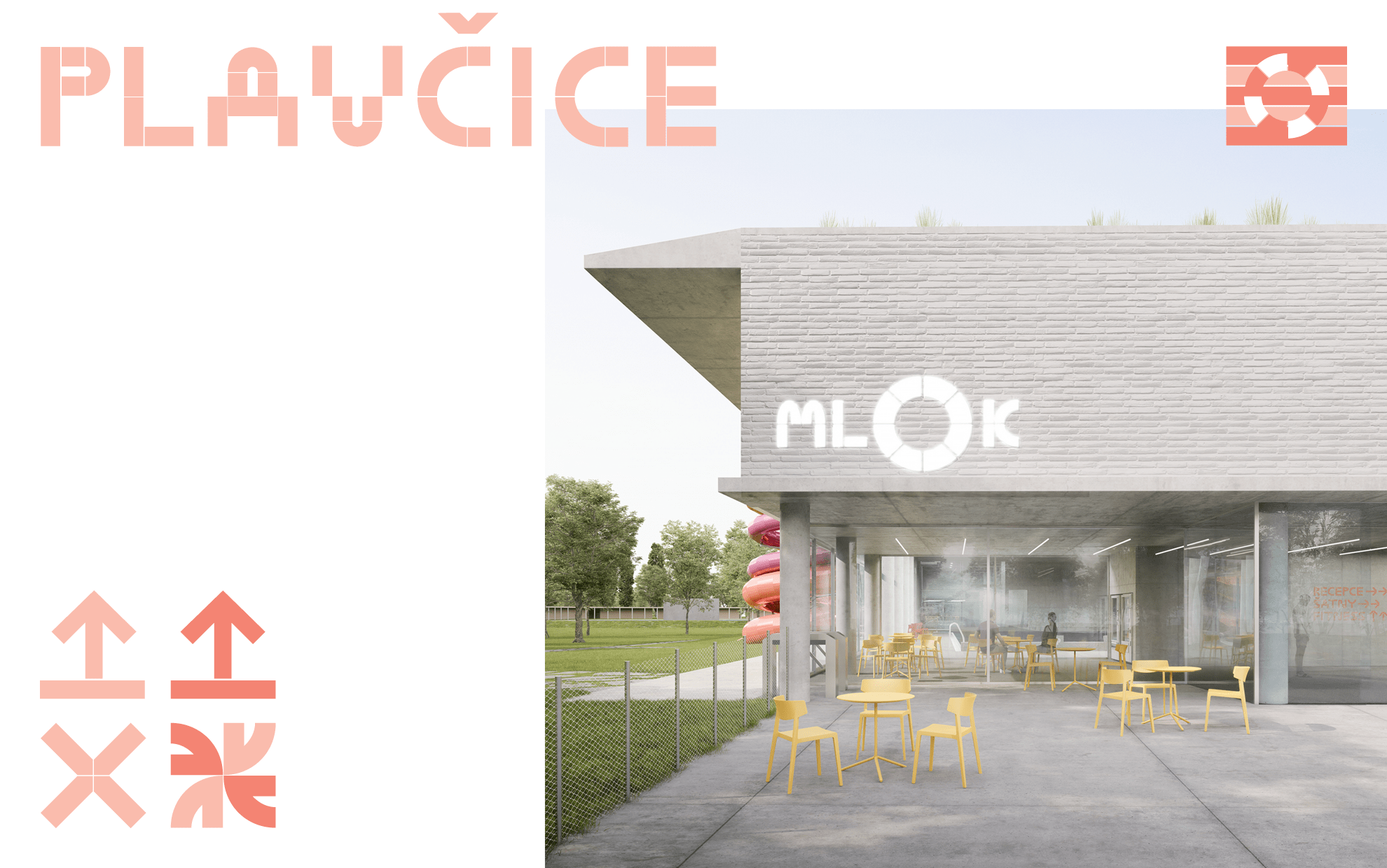
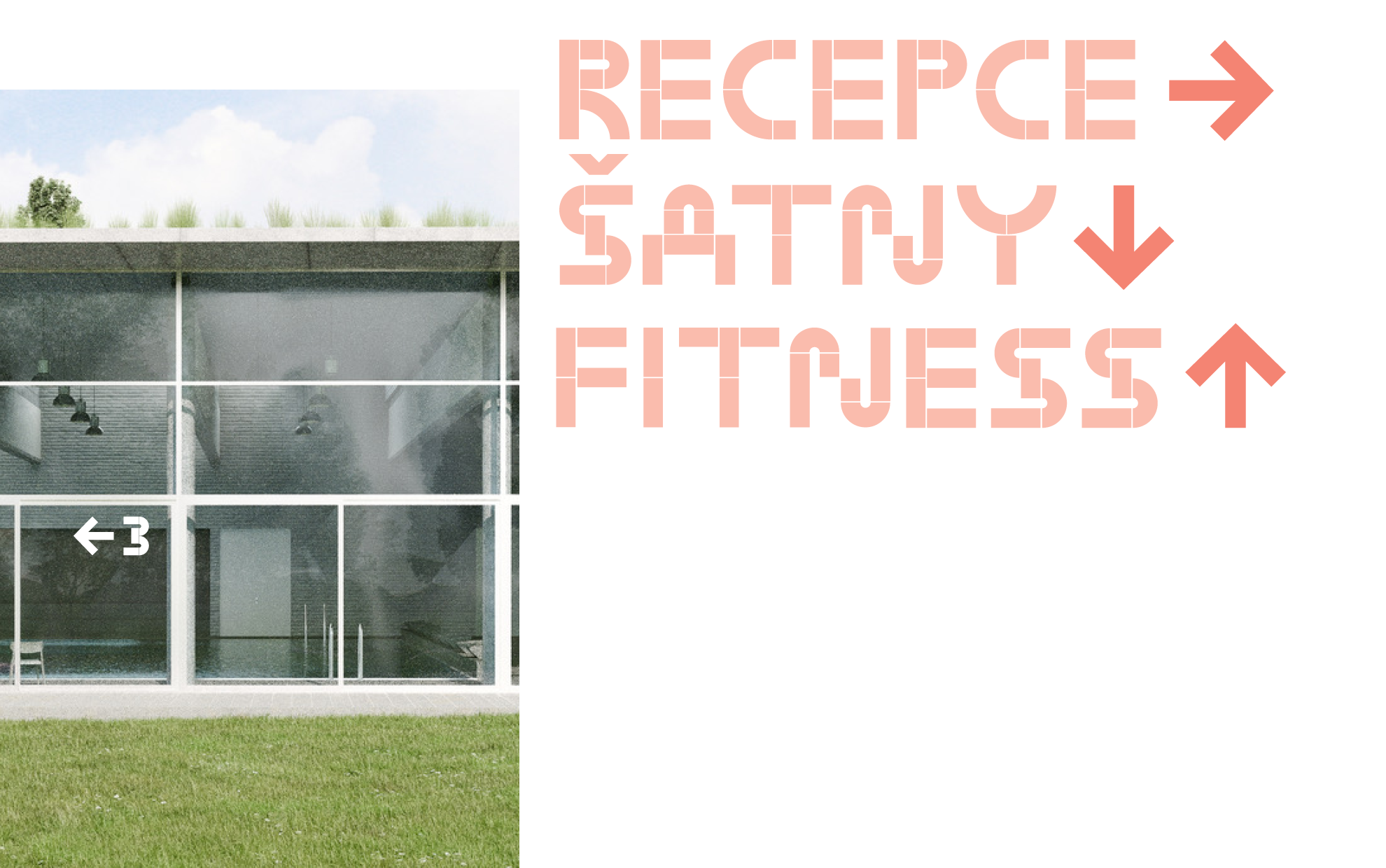
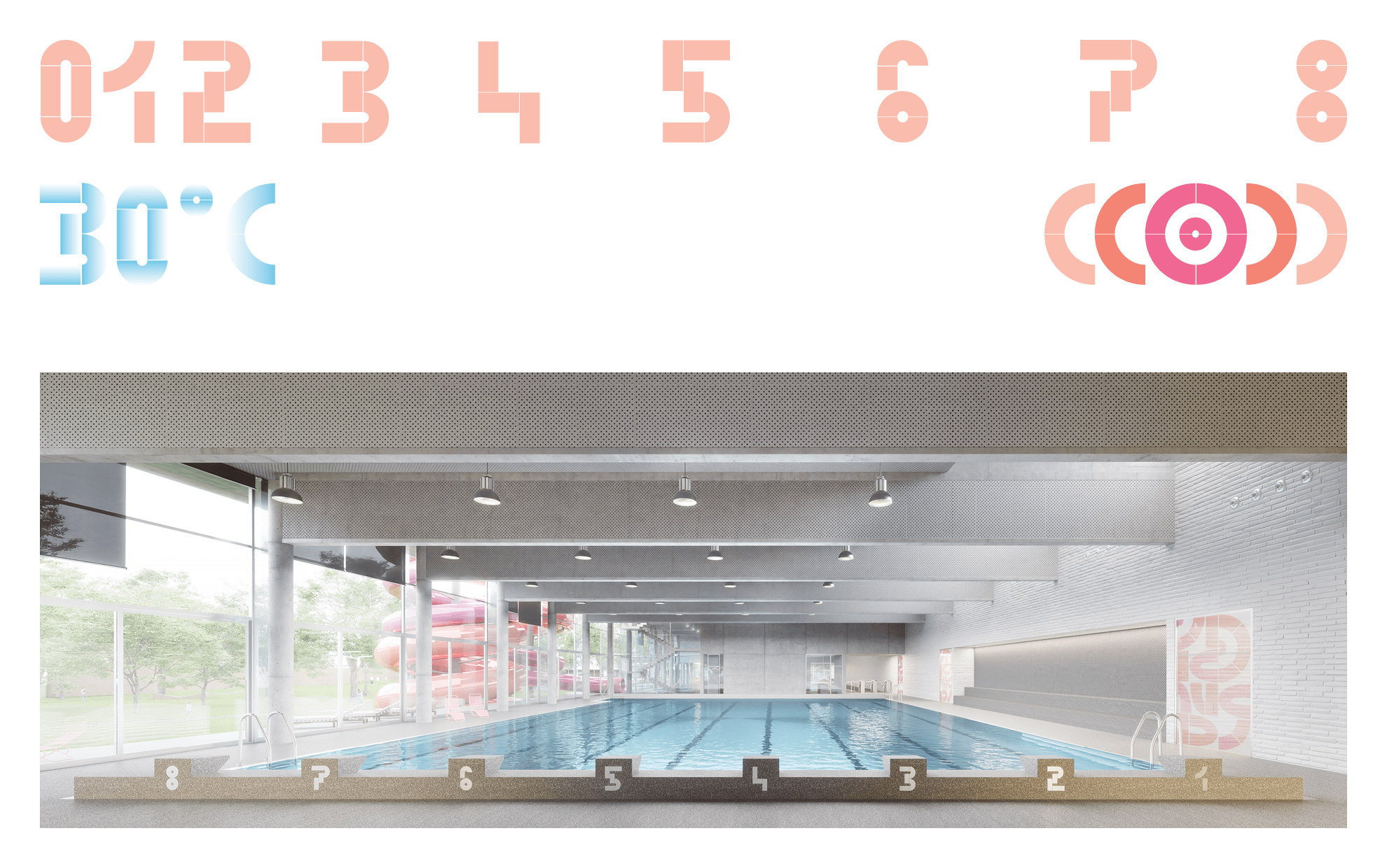
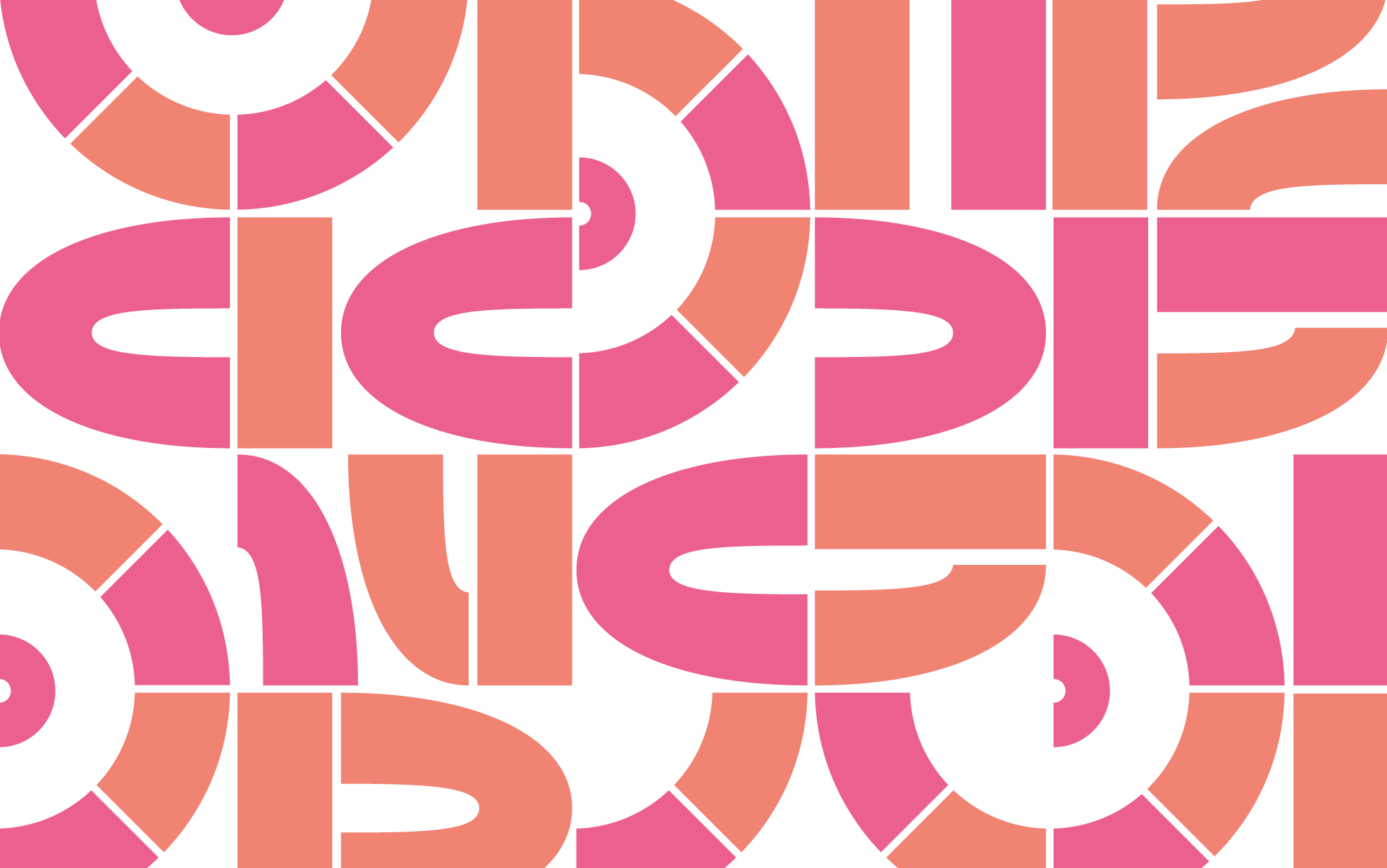
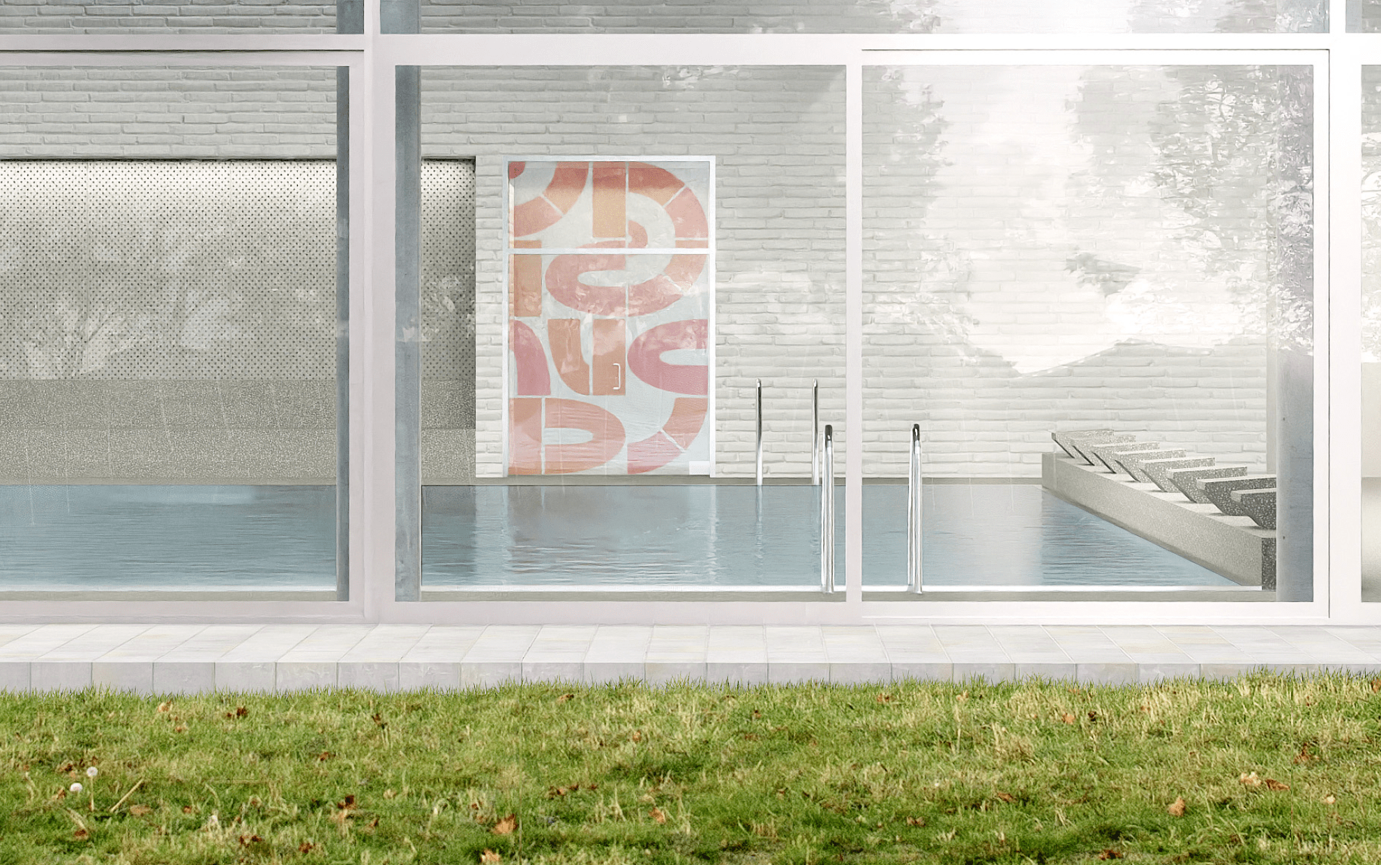
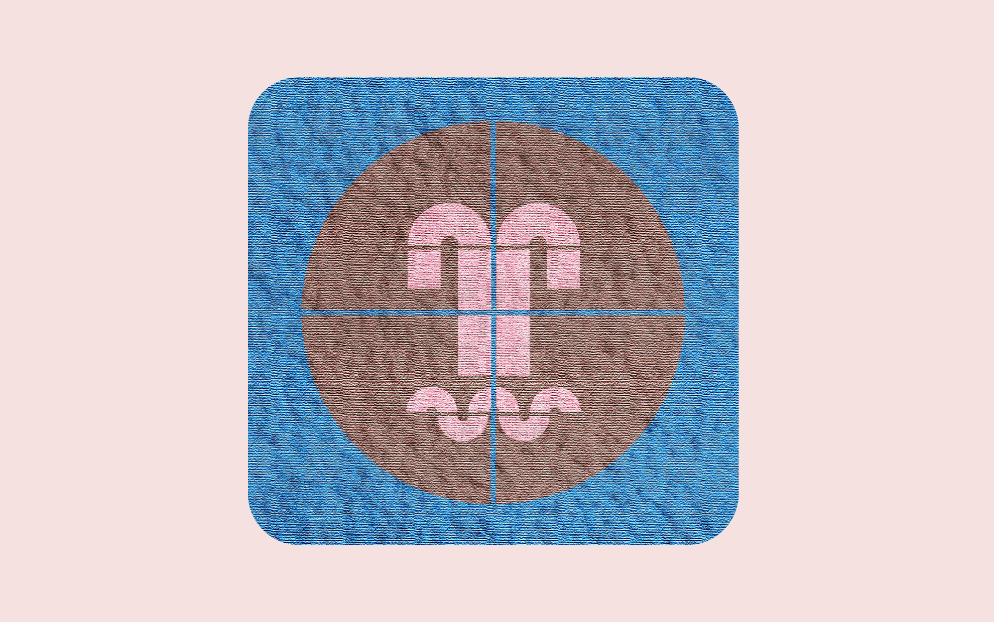
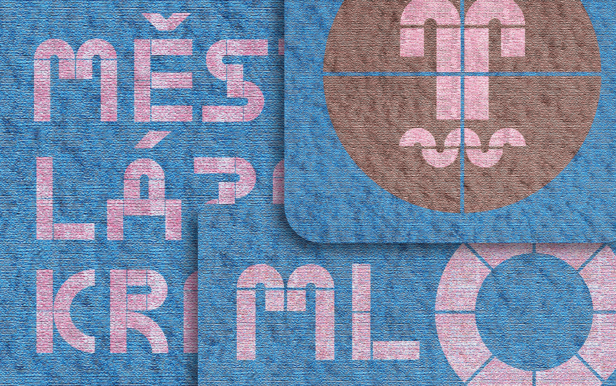
ML (O) K = Městské lázně Krnov (Krnov Municipal Spa — abbreviation of "salamander" in czech). The idea of naming a public bath was actually born right away. The typography is part of the winning architectural design of the competition for the new town spa in Krnov, which was won by the Aoc studio. We are glad that our rosy designs will be part of the new architecture sometime in the future. The plan is to implement a custom font and all accompanying pictograms. The design of the font itself is composed of geometric shapes. The composition of the shapes creates imaginary tiles, which we want to work with as a mosaic, an artistic element in architecture. We chose the specific tones of pink and orange, which are close to the colors of the designed water slide, but also to the pink salamander. The water dragon salamander axolotl is not yellow-black, but pinkish. Rush into the water!
Design: Matyáš Bartoň, Klára Kvízová
Collaboration: Aoc architects
Visualization: Dymytro Novikov, Aoc
Photo of Axolotl: Tim Flach