WorksCorporate Identity
TUL competition 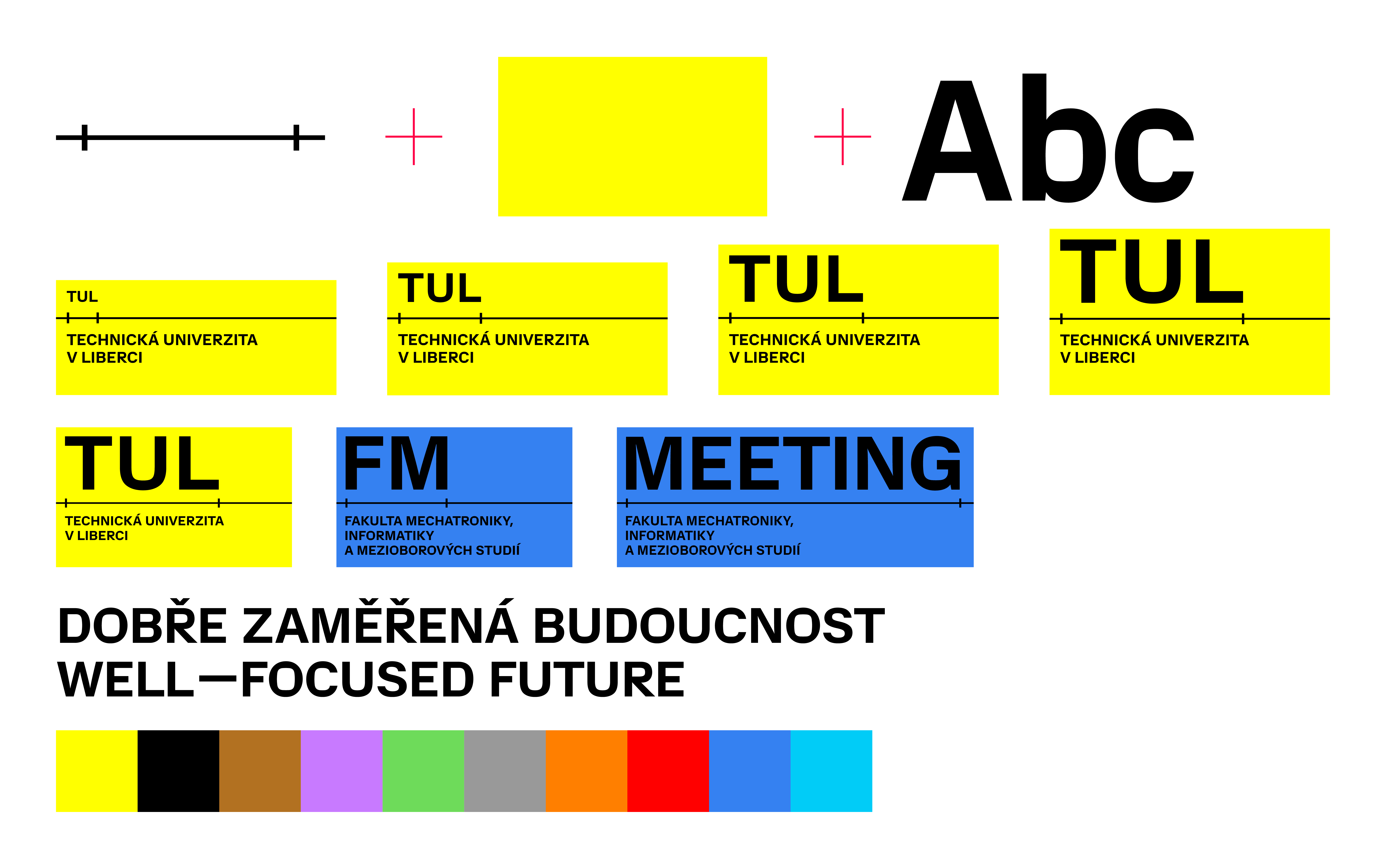
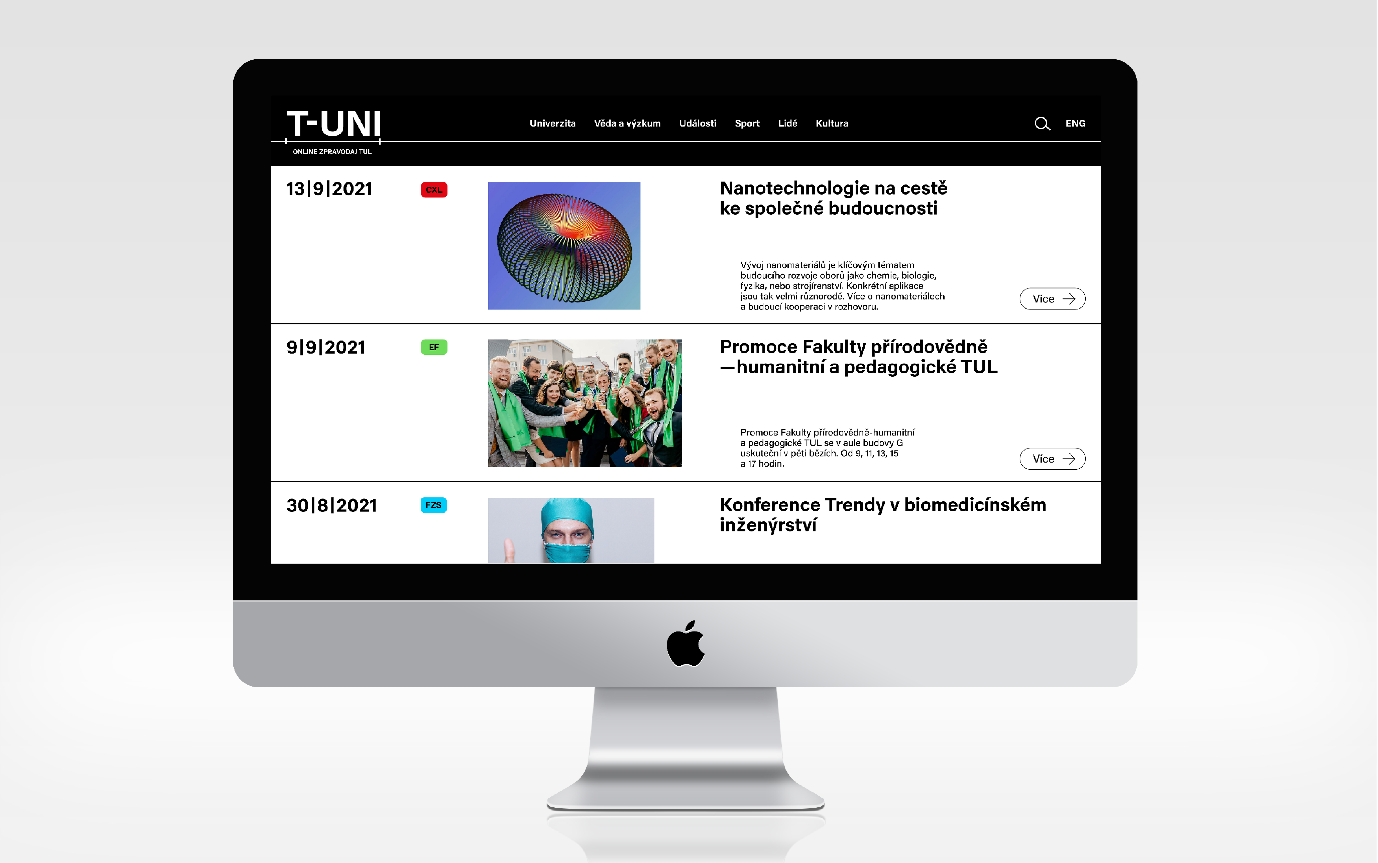
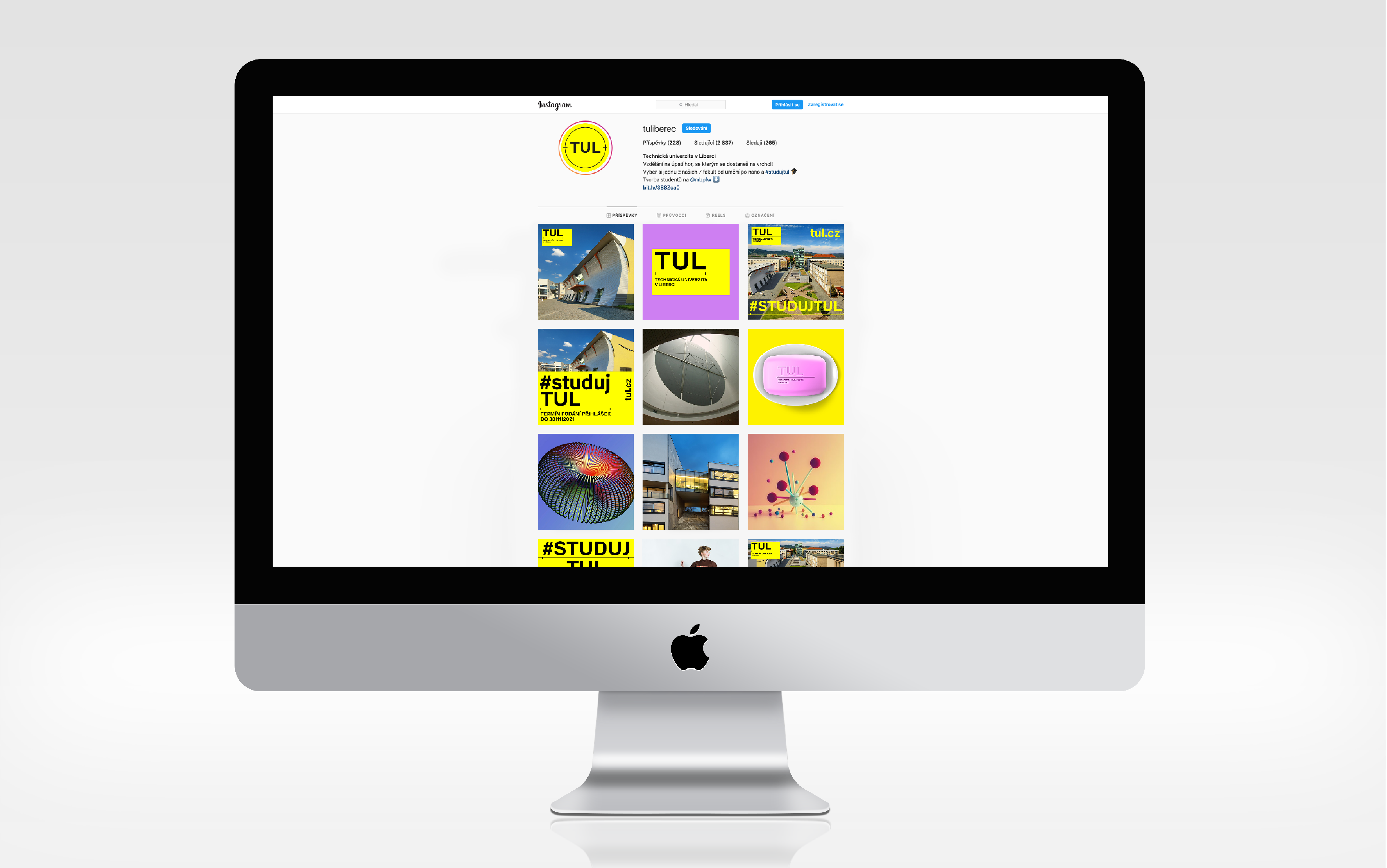
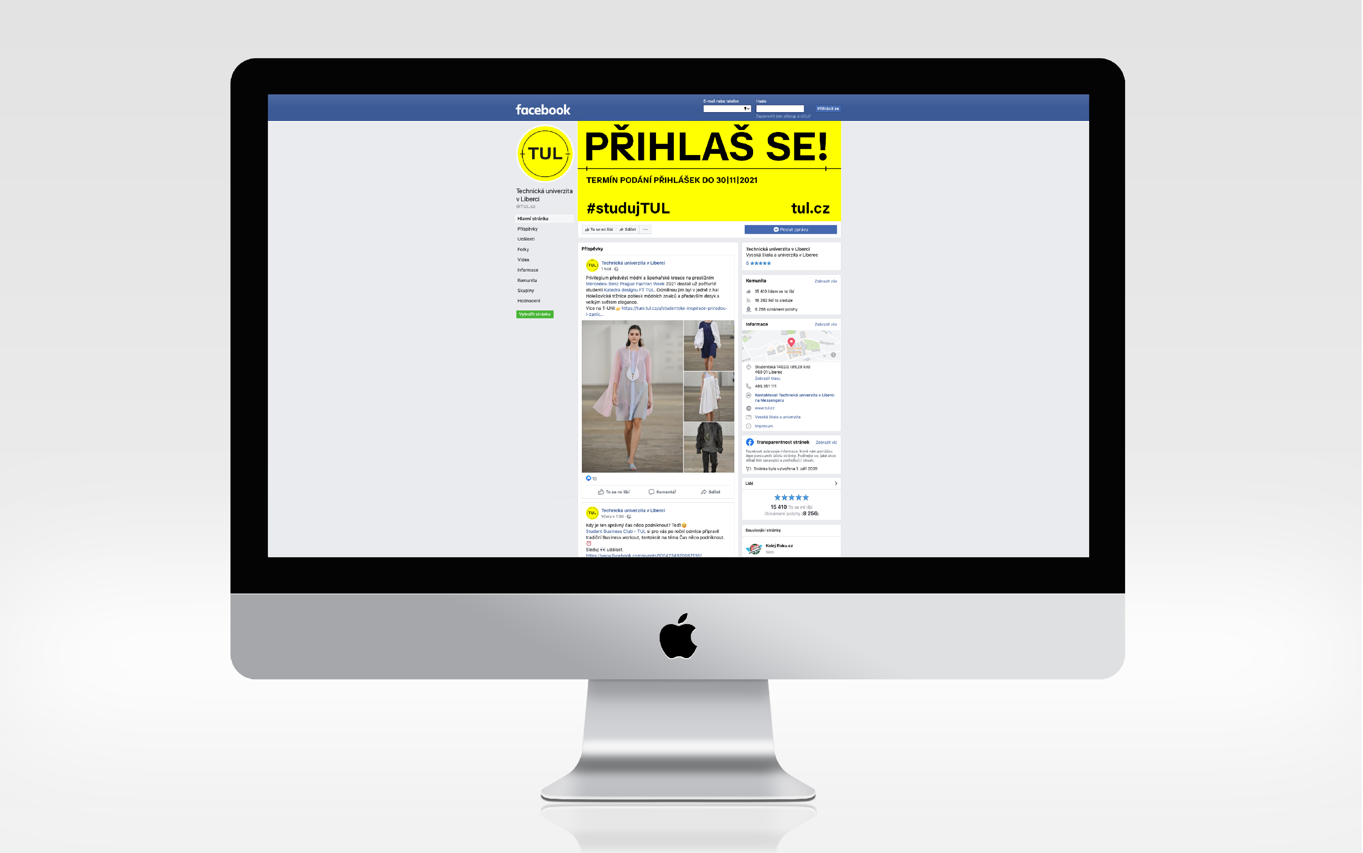
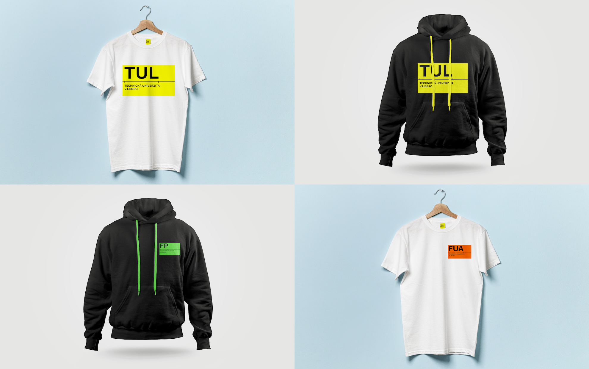
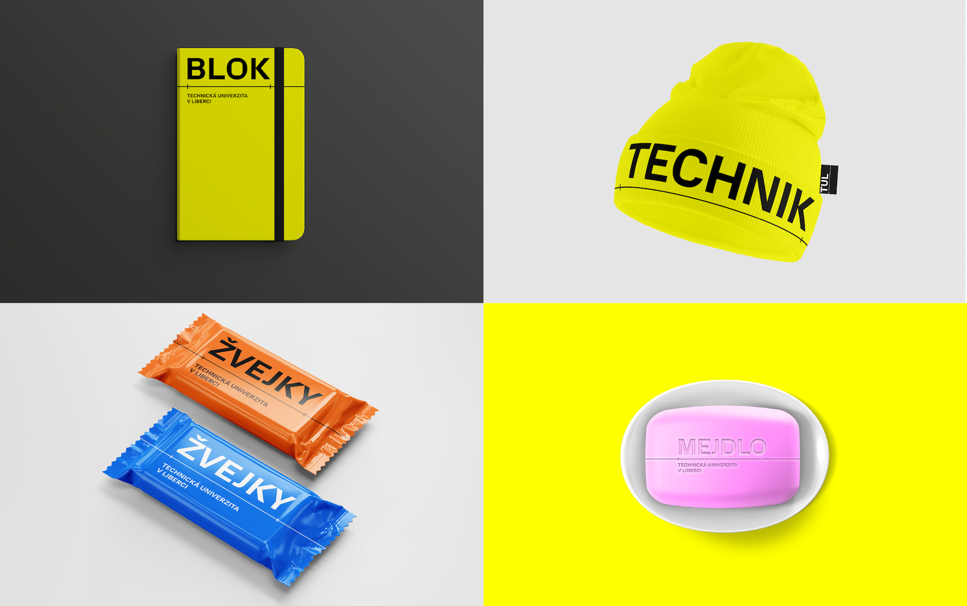
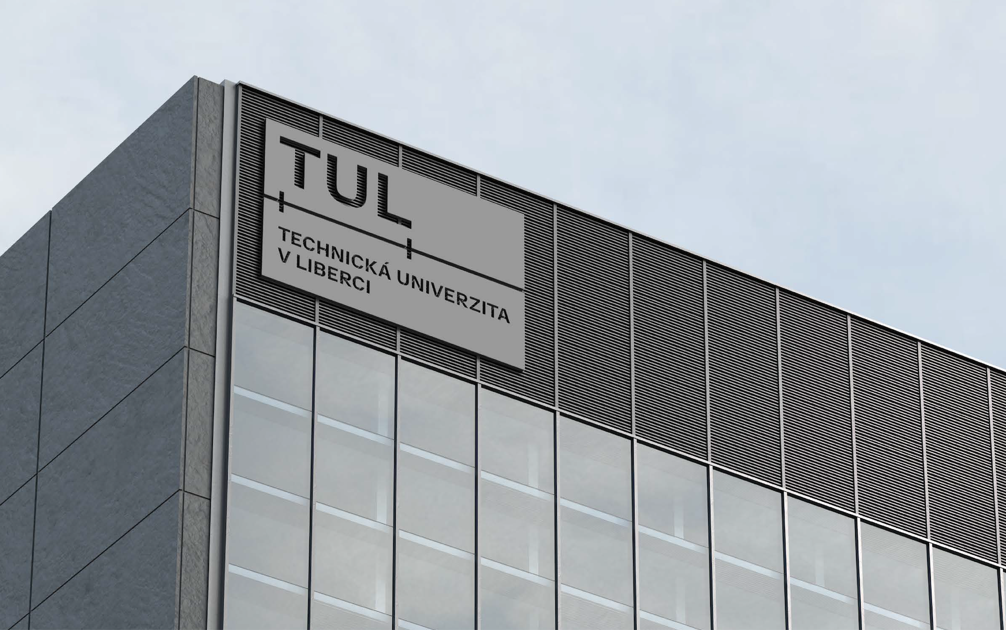
A well-focused future
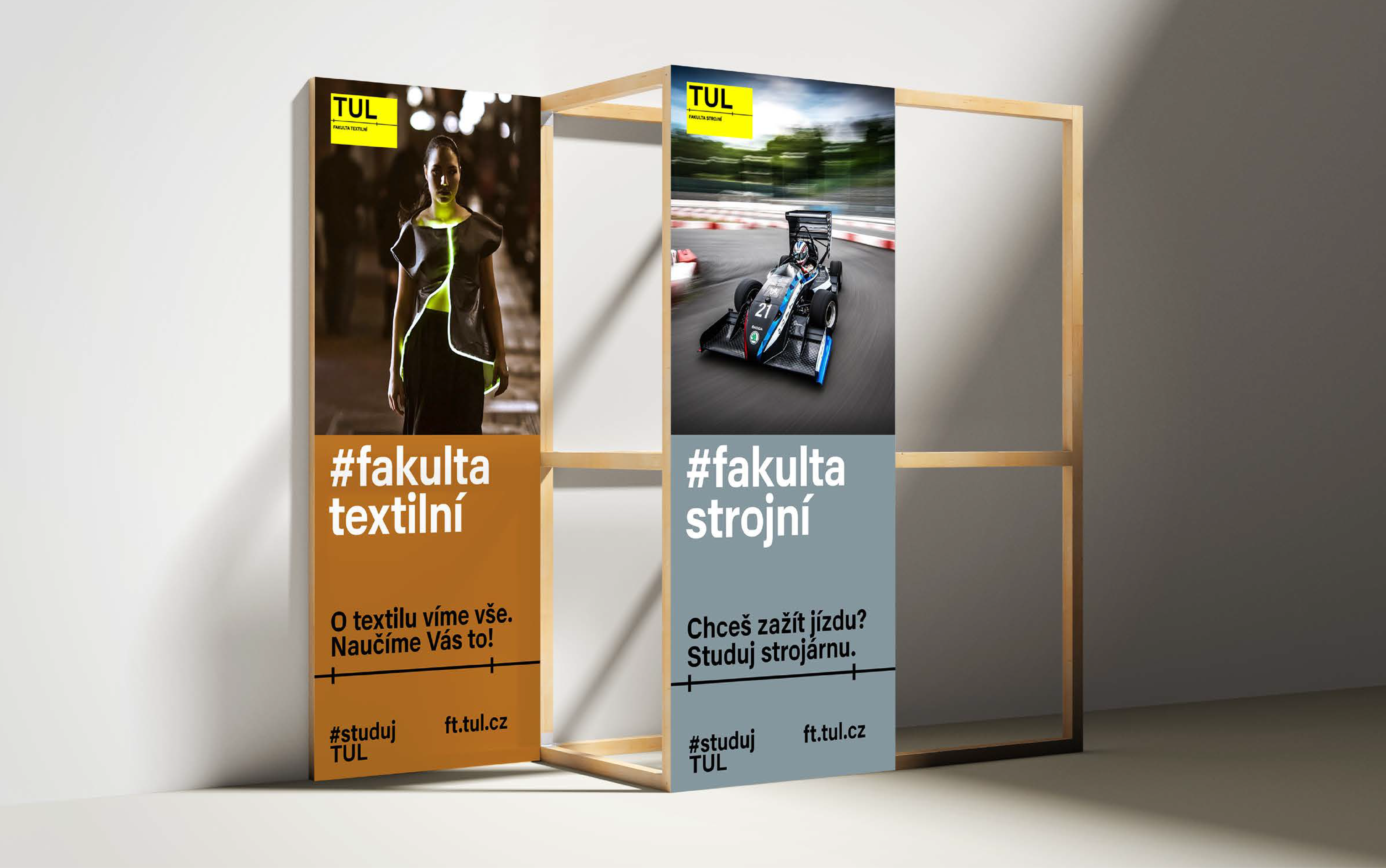
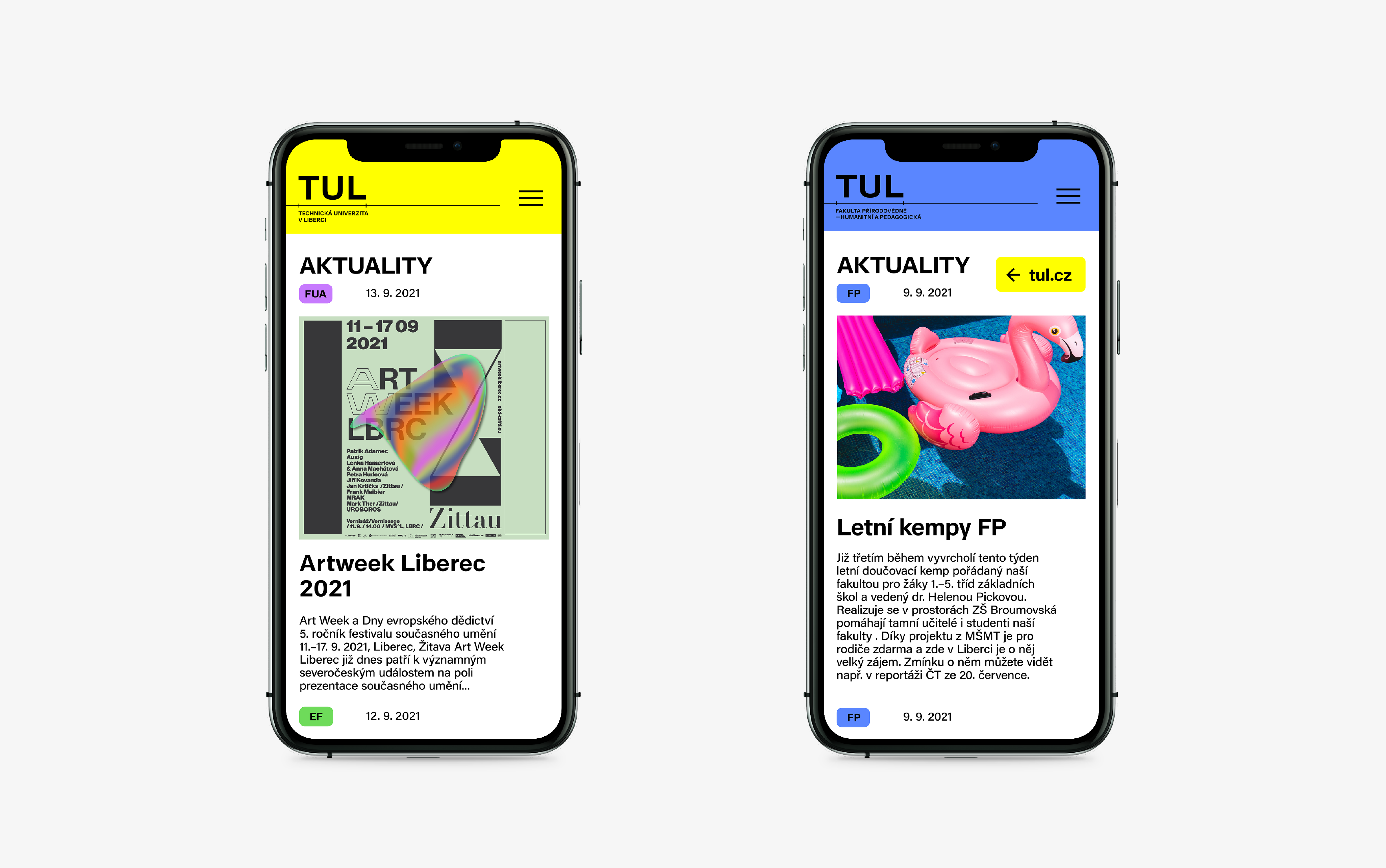
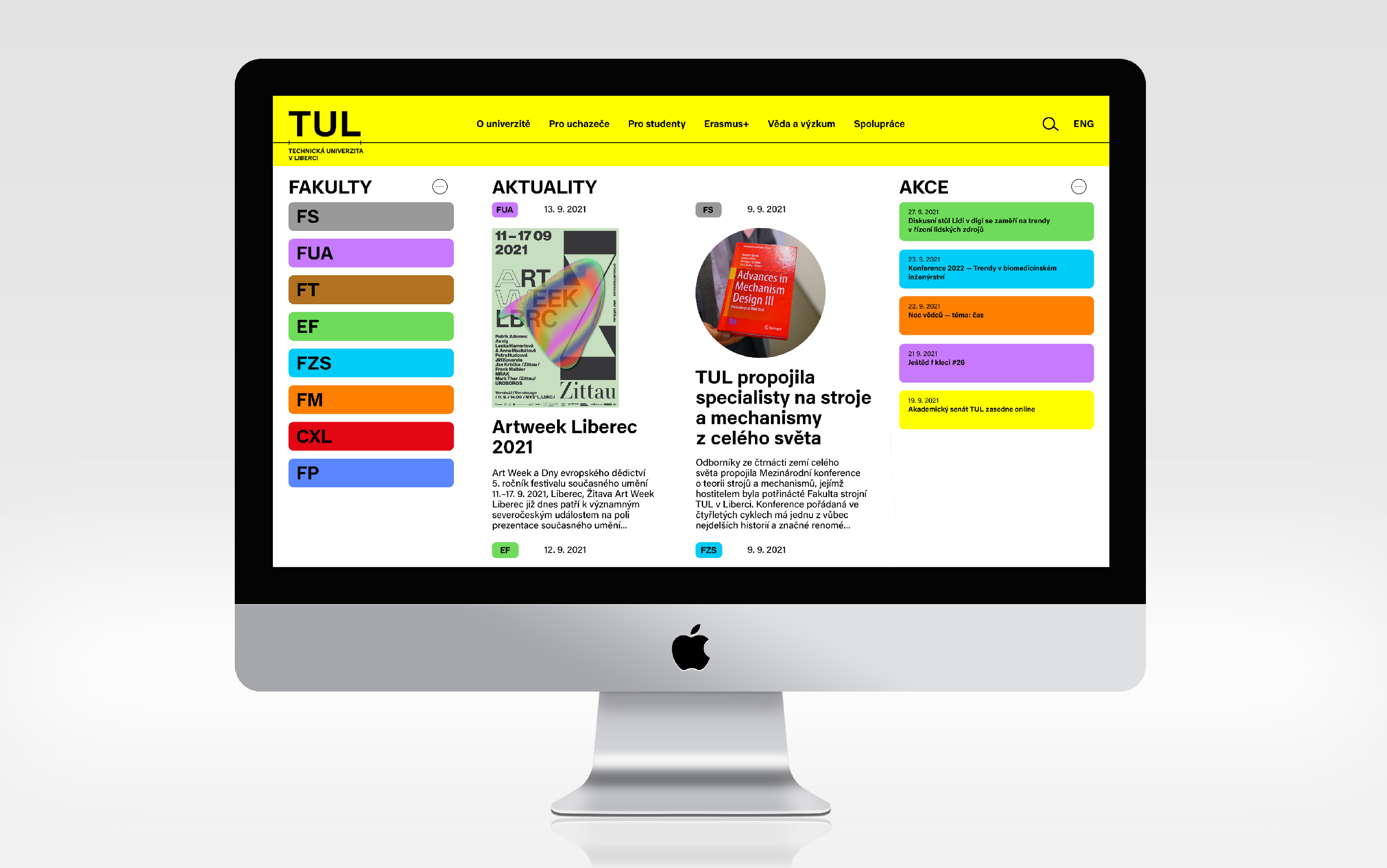
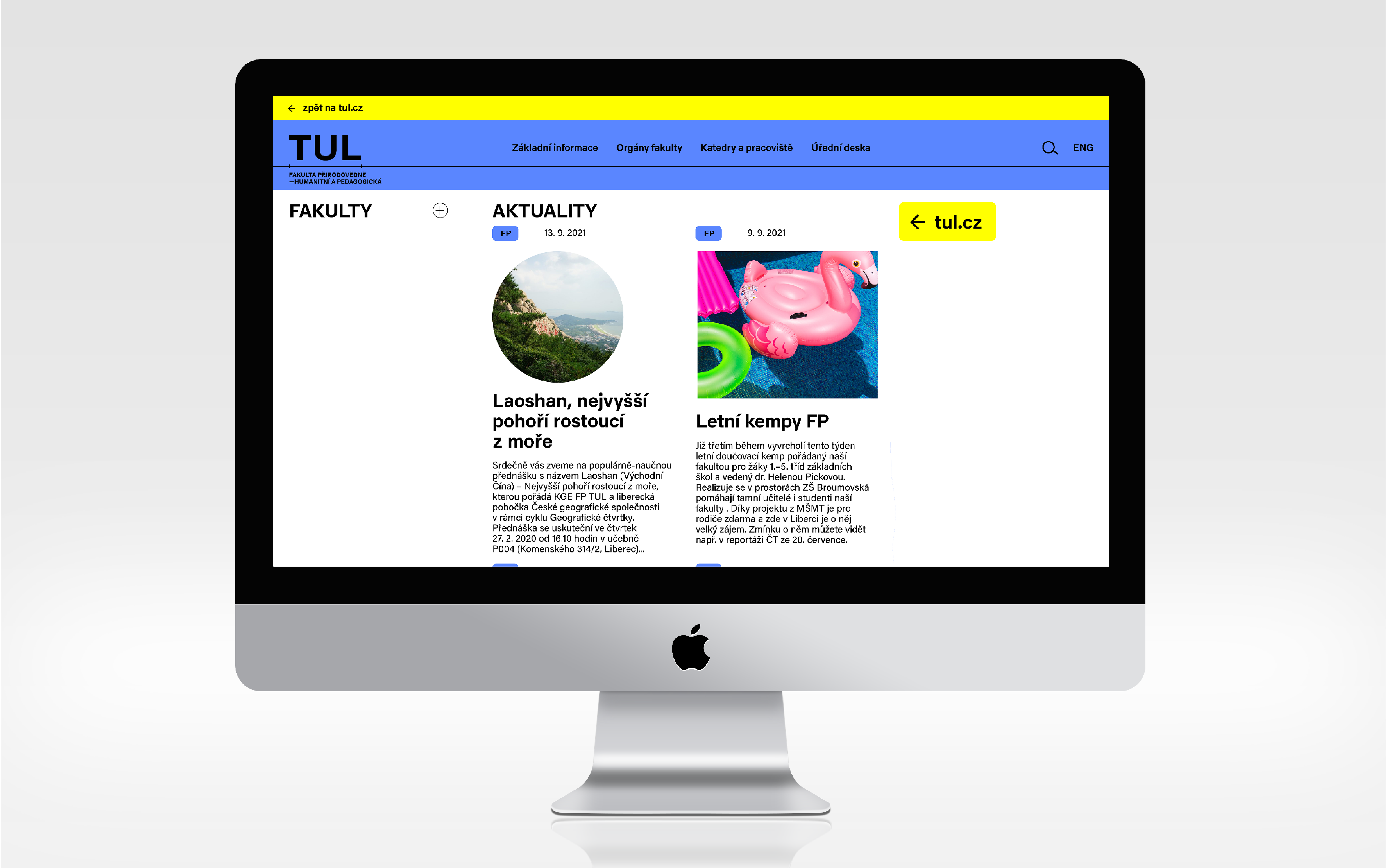
Time is complicated — so why not to simplify it? The problems are complex — let's break them down, measure them, solve them. Quality education, especially technical education, serves this purpose. And this is where our concept for TUL's new visual identity comes from, which we called the well-focused future.
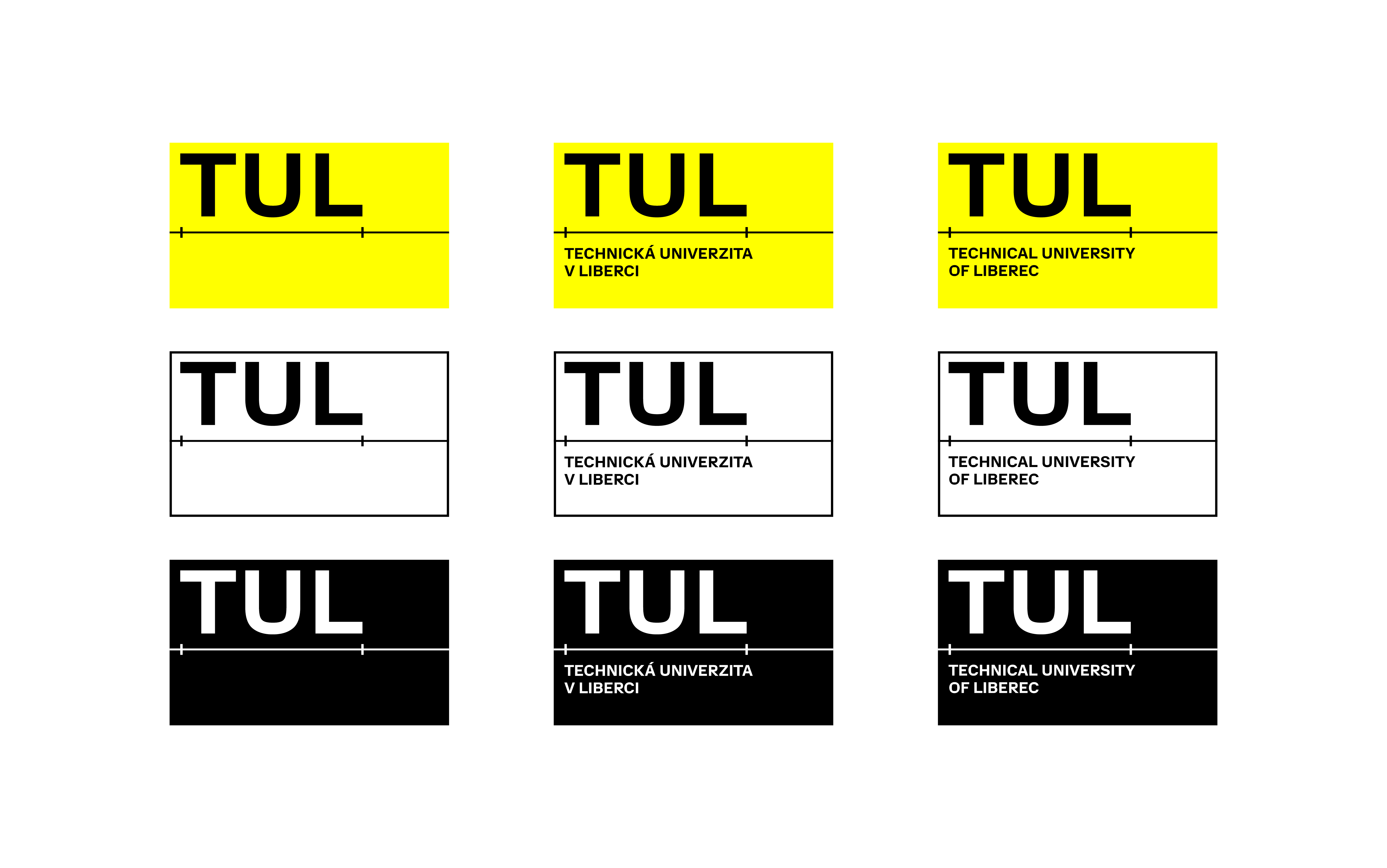
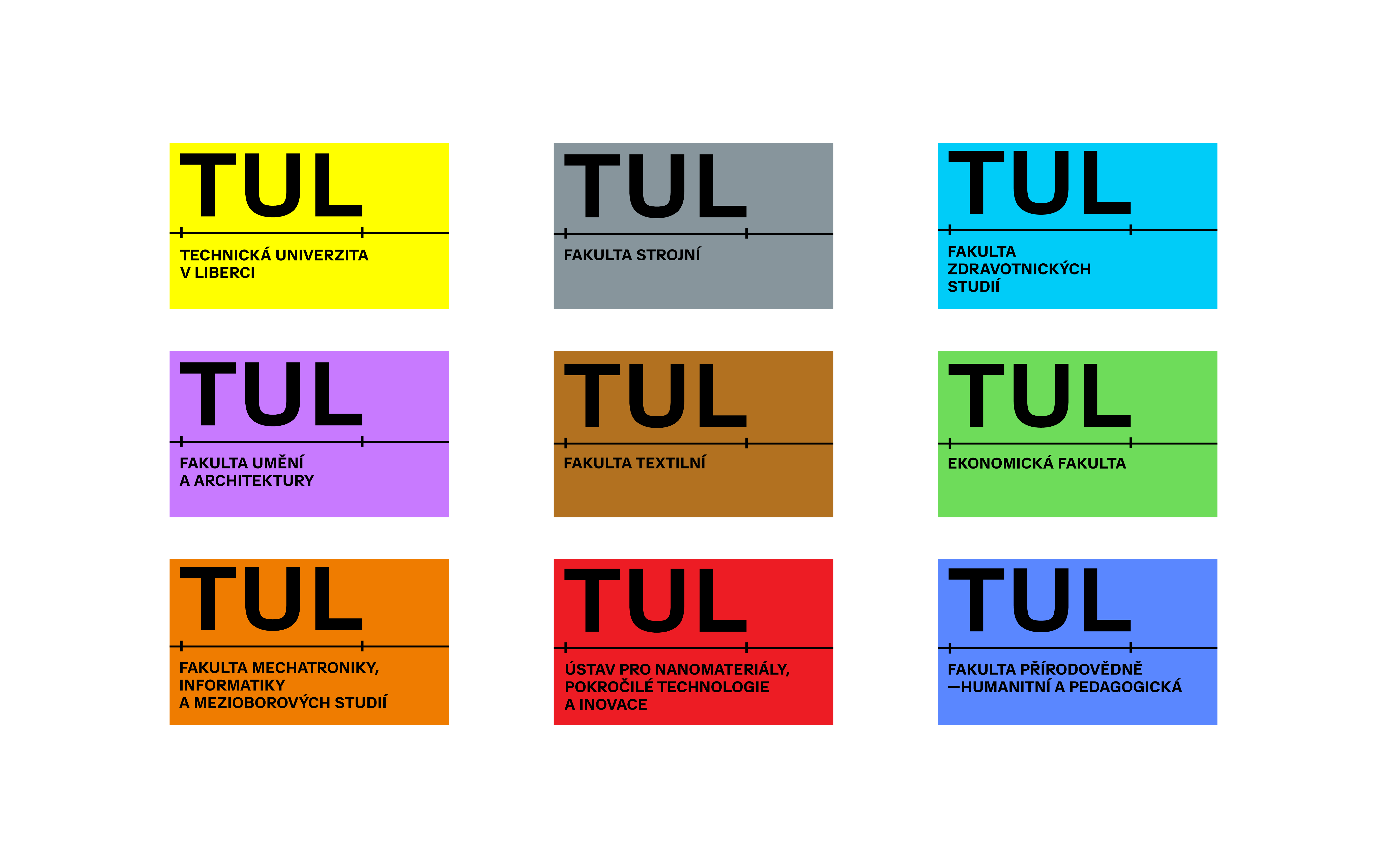
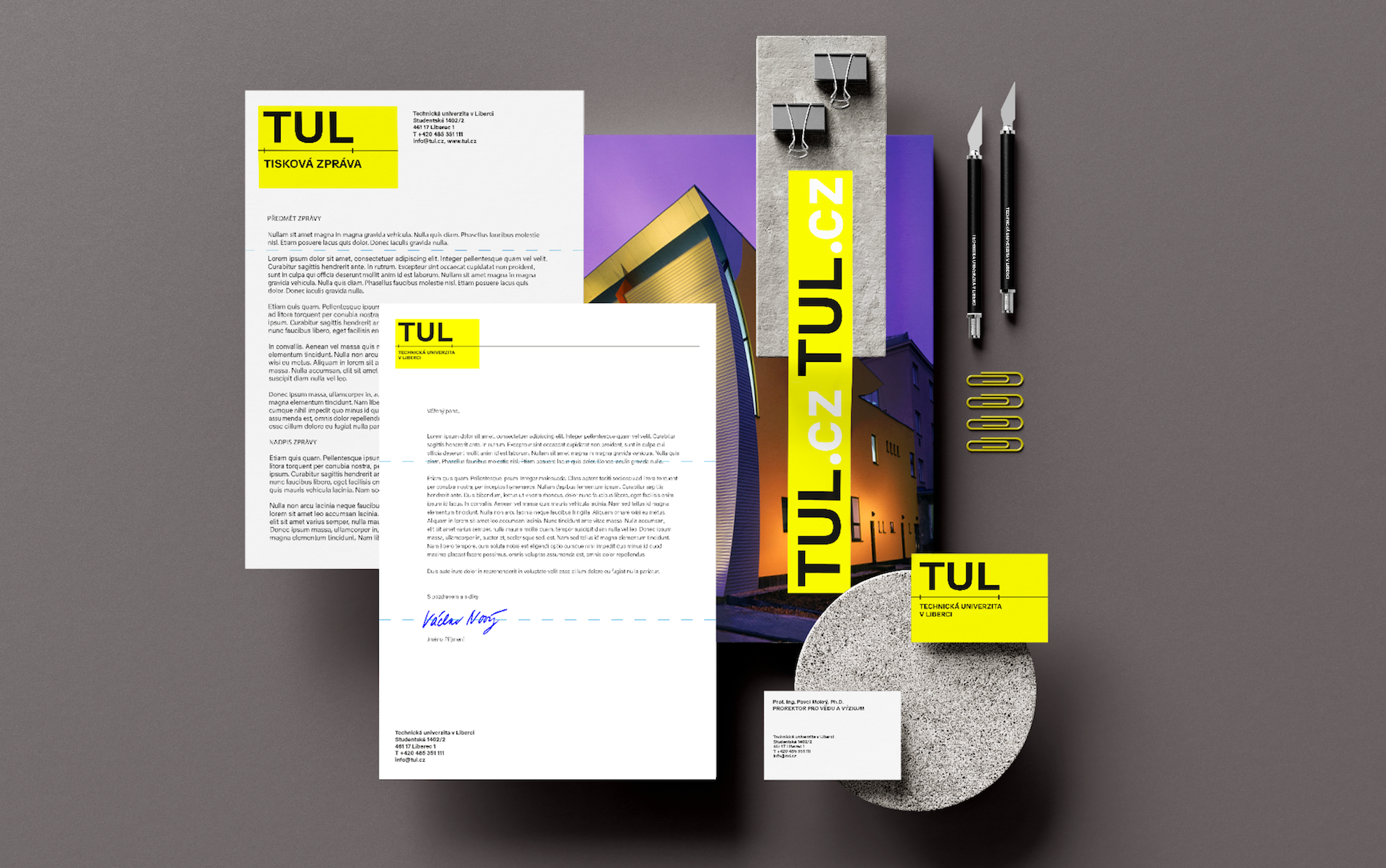
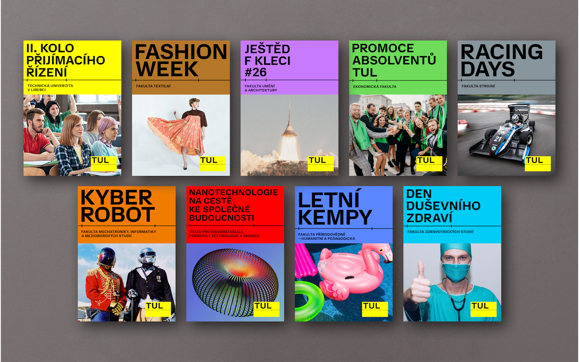
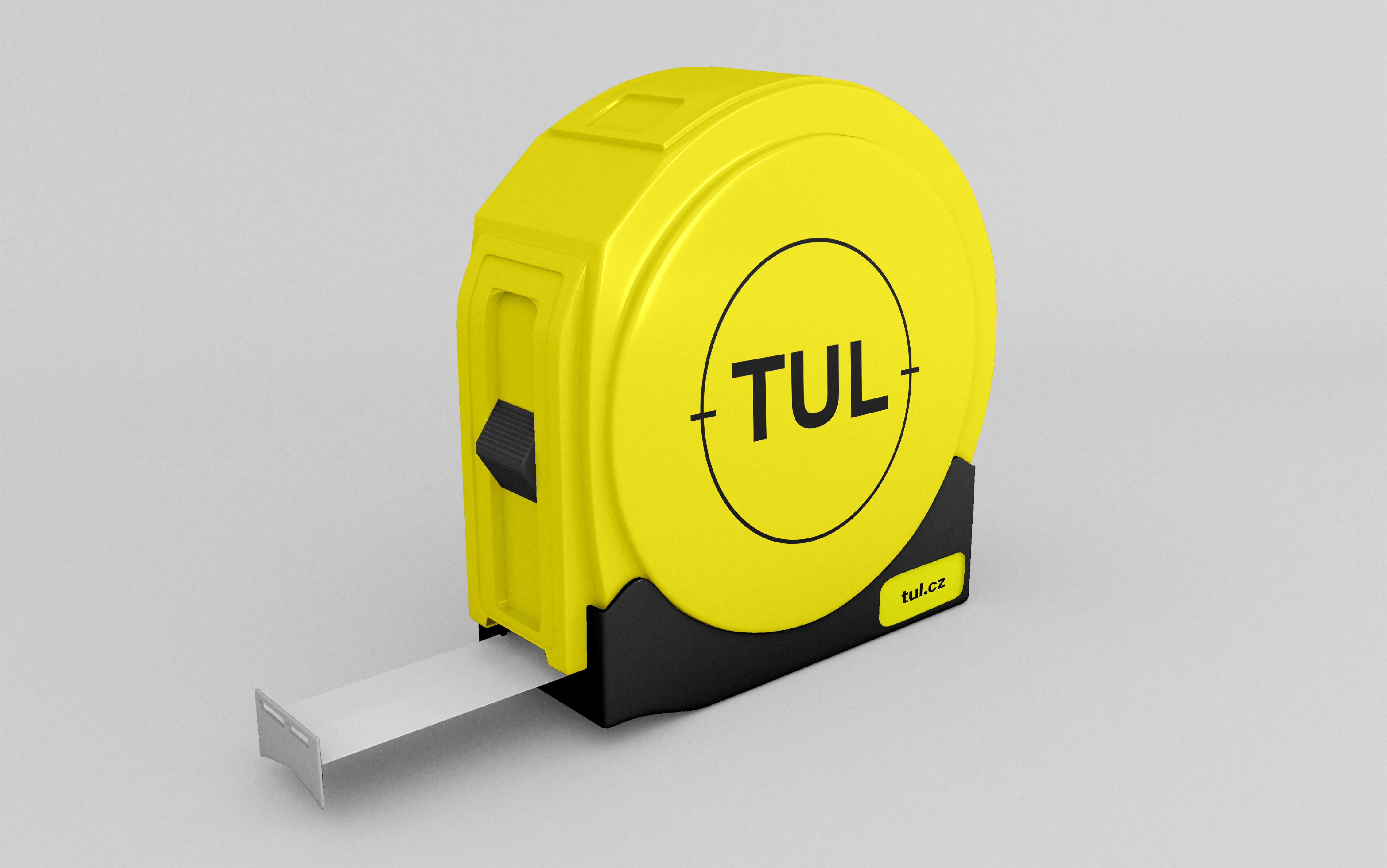
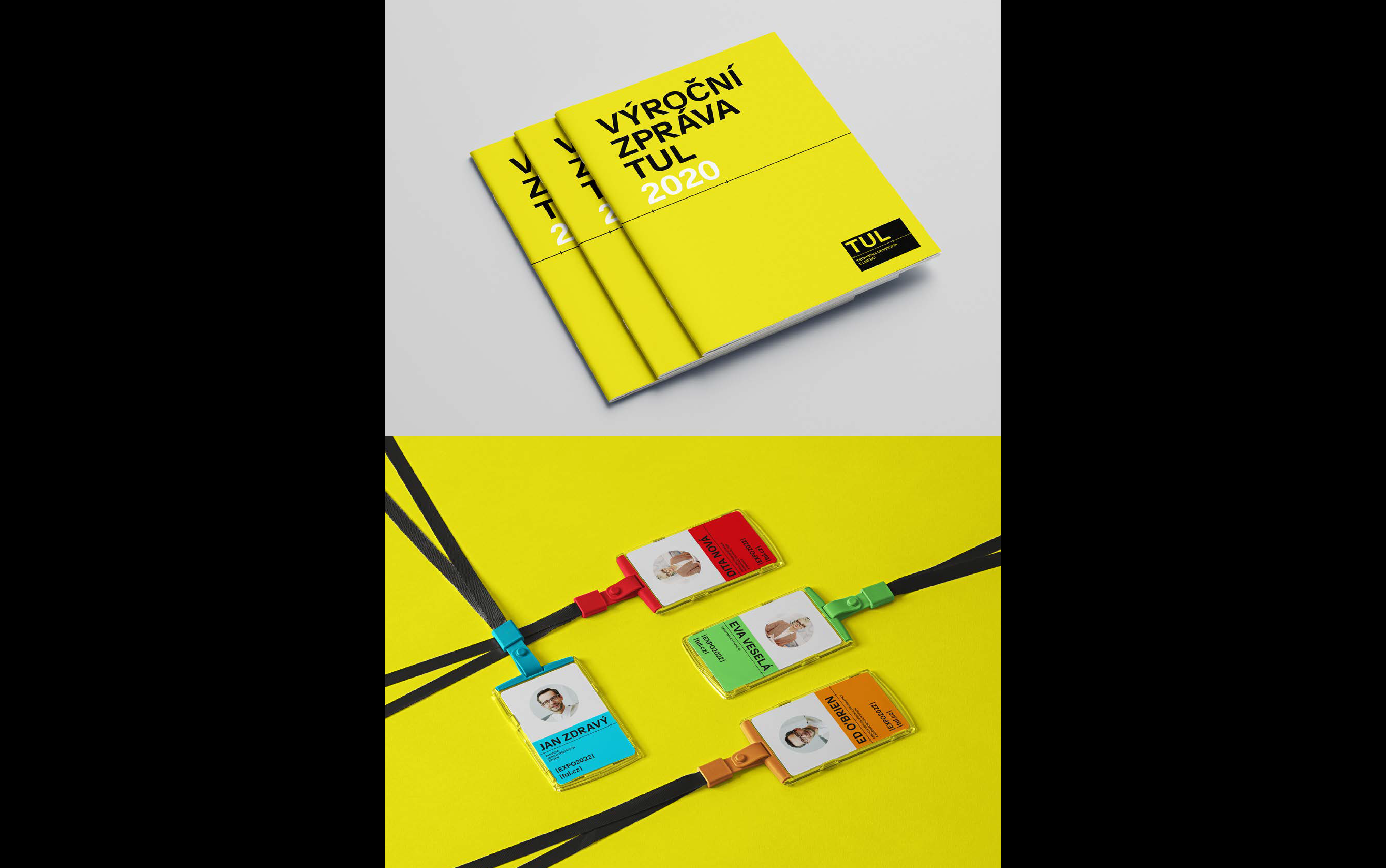
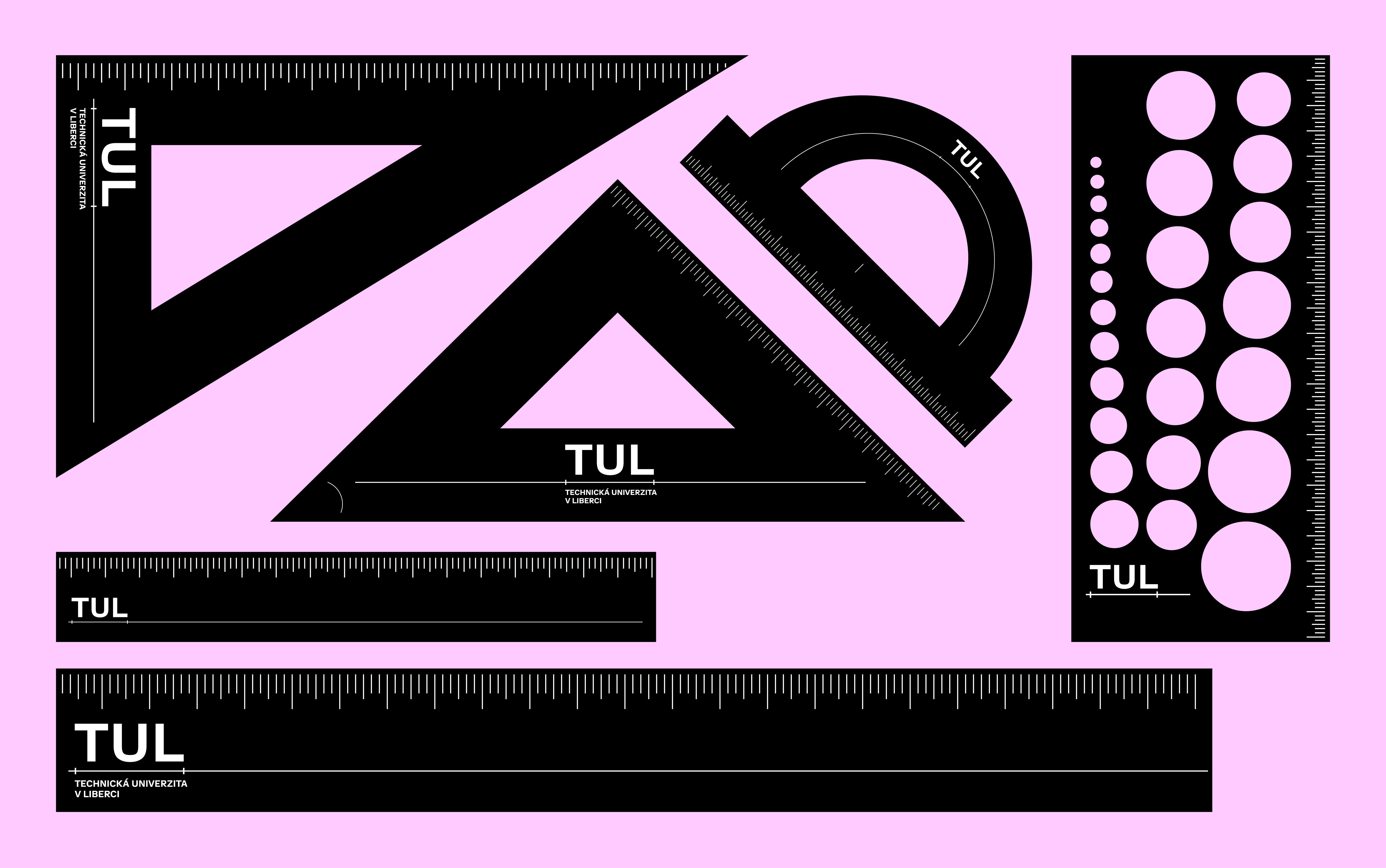
The symbol is a line segment. Precise, bounded, measurable, understandable. It symbolizes trust in good solutions, (techno) optimism, certainty in uncertain times. Of course, we suspect that a world reduced to numbers and line segments would be a bit boring, so we play with it, shorten and lengthen it, place it on a colorful background — education at TUL is also fantasy, inventions, the aha effect and the joy of knowledge.
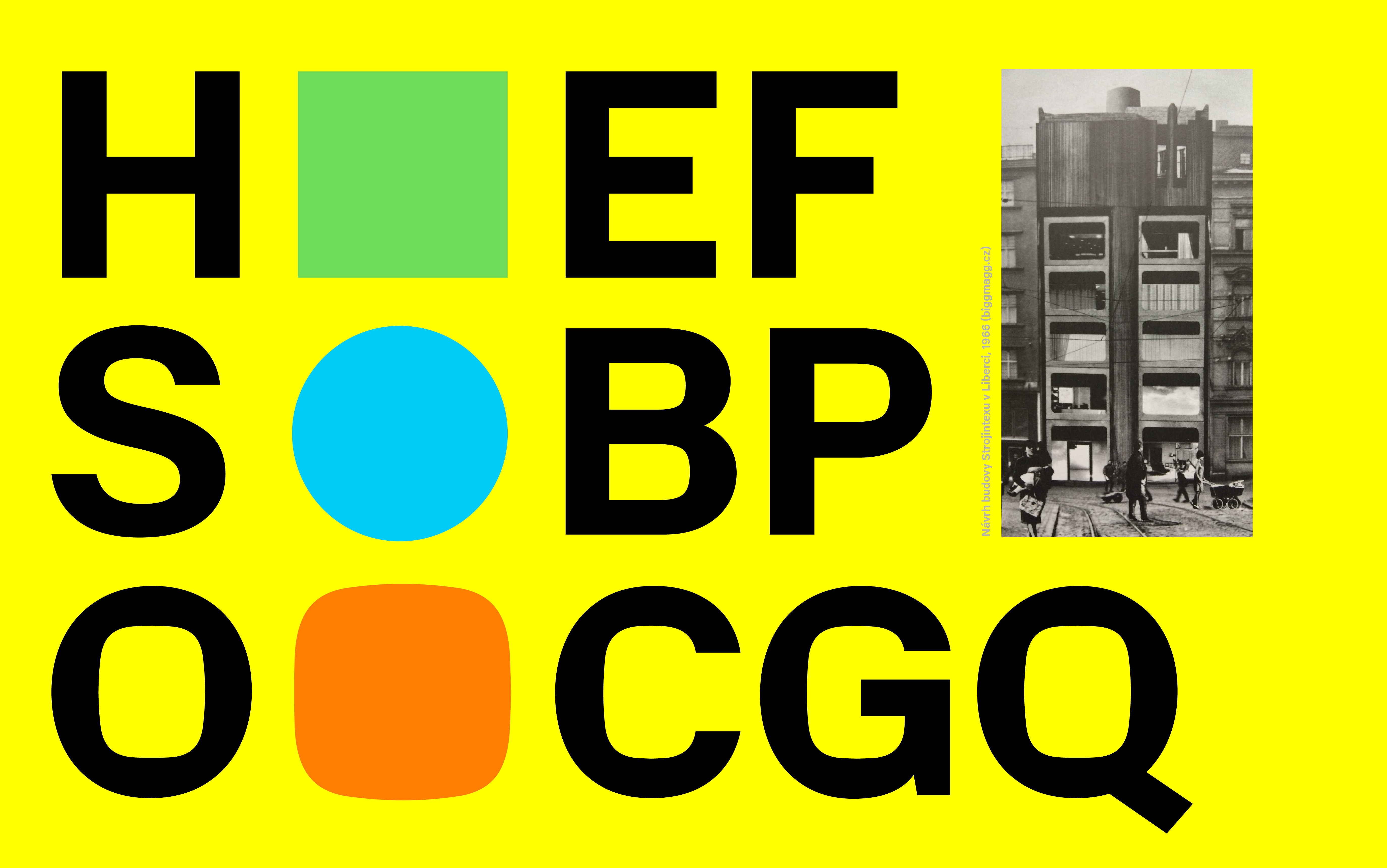
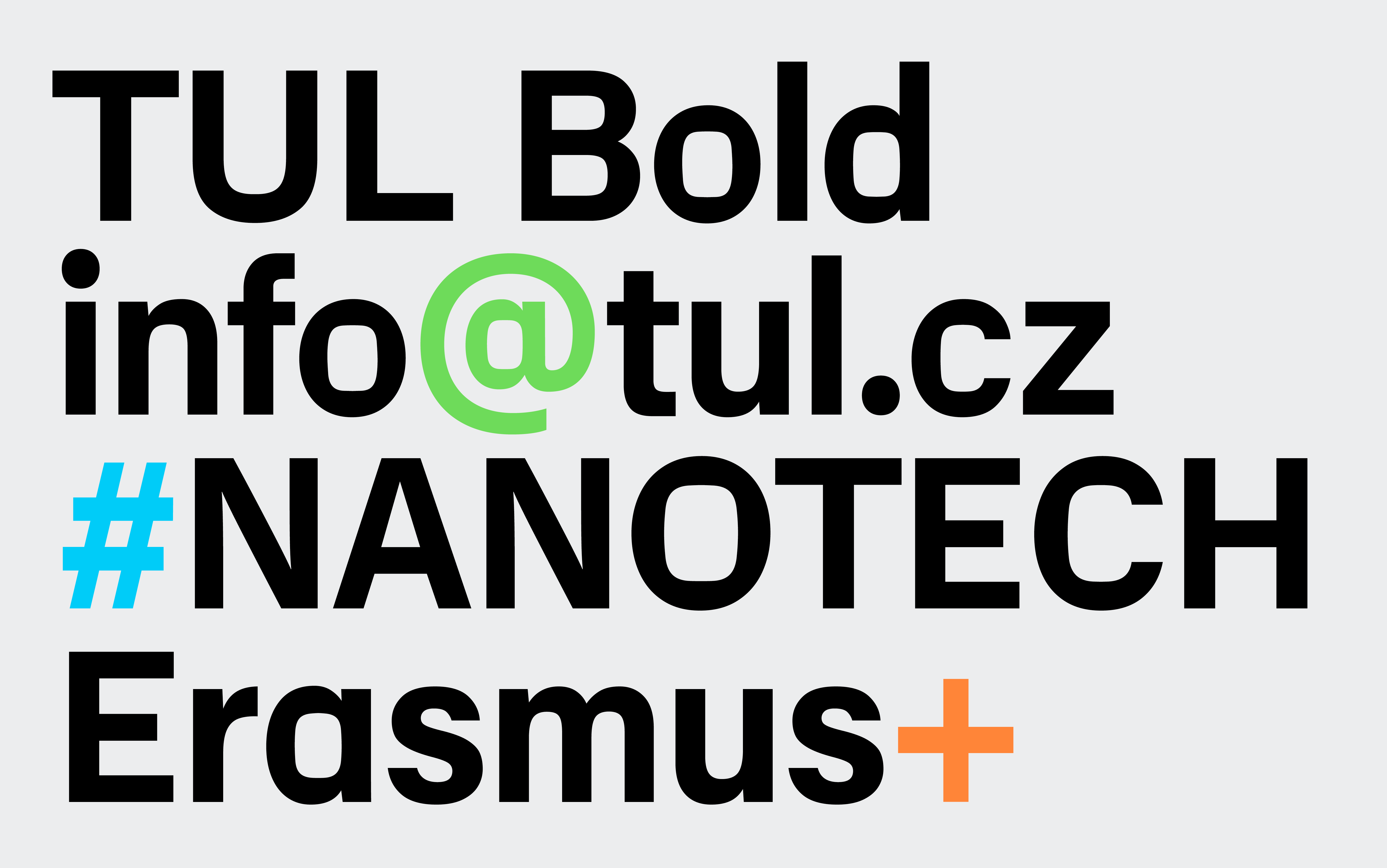
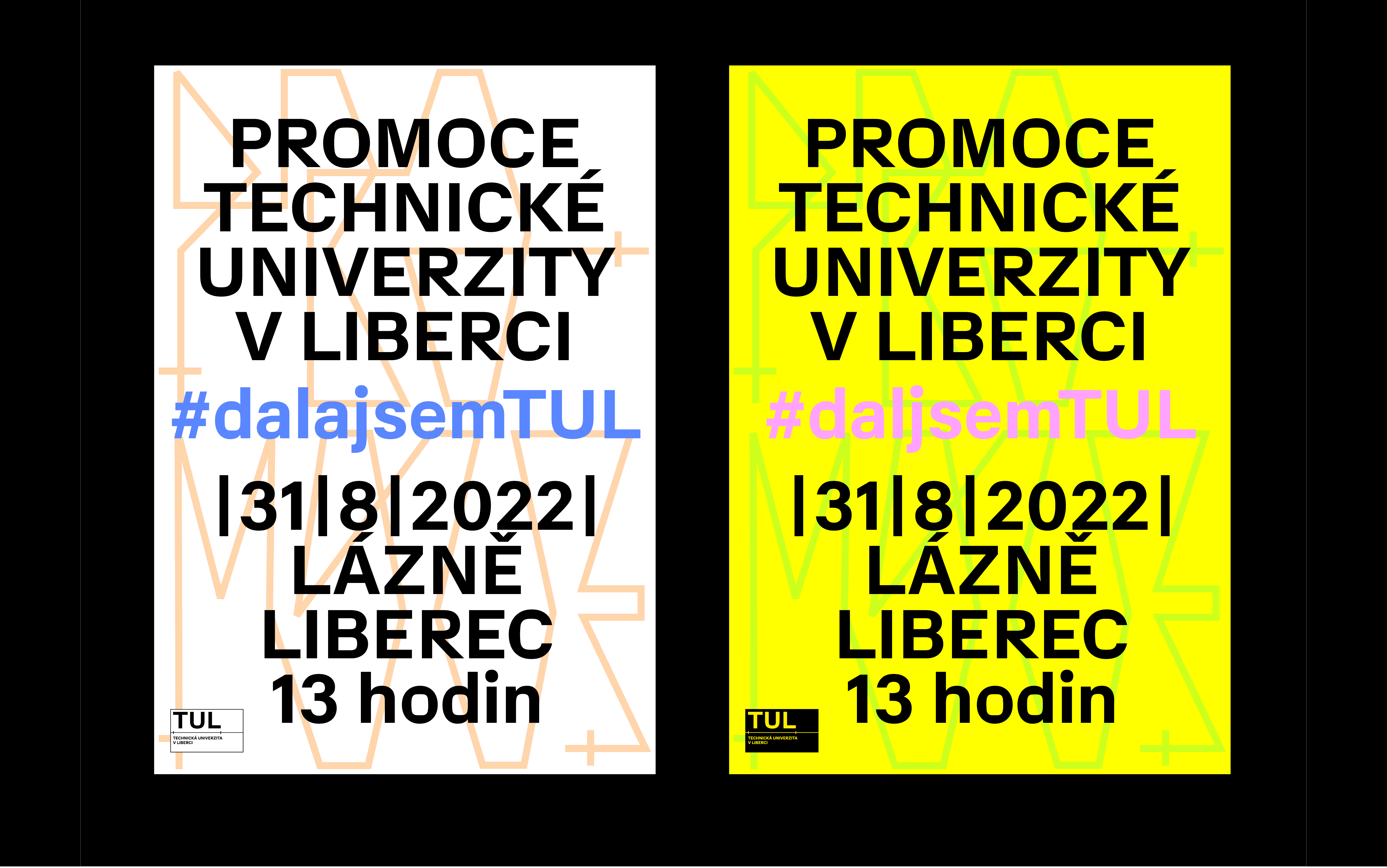
We have supplemented the line segment symbol with the custom alphabet. It is technical, geometric, precise, mechanical. But it also reminds a little of the aesthetics of the old scripts and the fantastic technicians of Sial.
Client: TUL in Liberec, in cooperation with CzechDesign
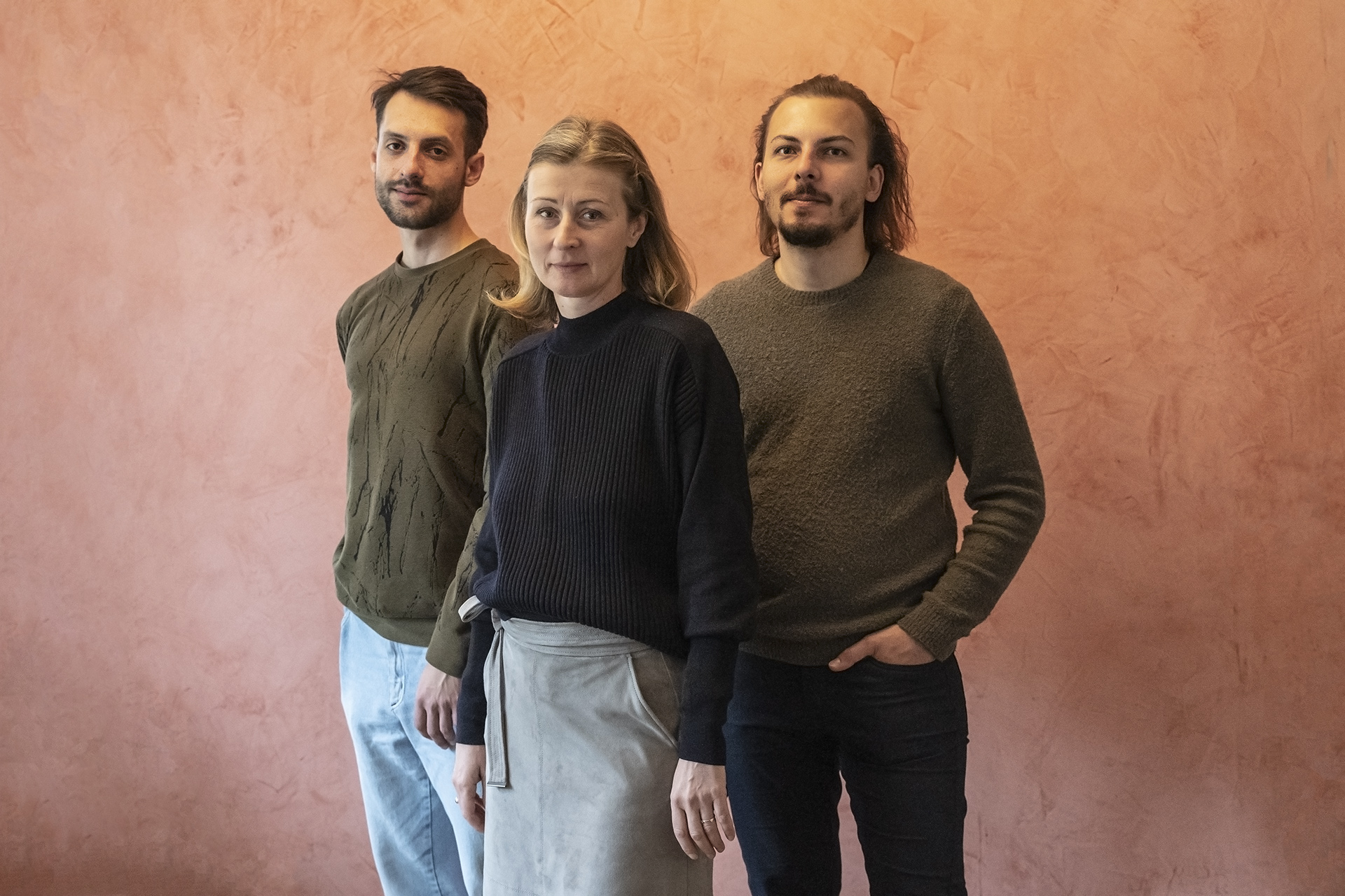
Team: Klára Kvízová, Jakub Novotný, Matyáš Bartoň
Collaboration: Karolína Vránková (texts), Tereza Boturová (video)
Competition design
2021