WorksLogotype
Aoc Slavia 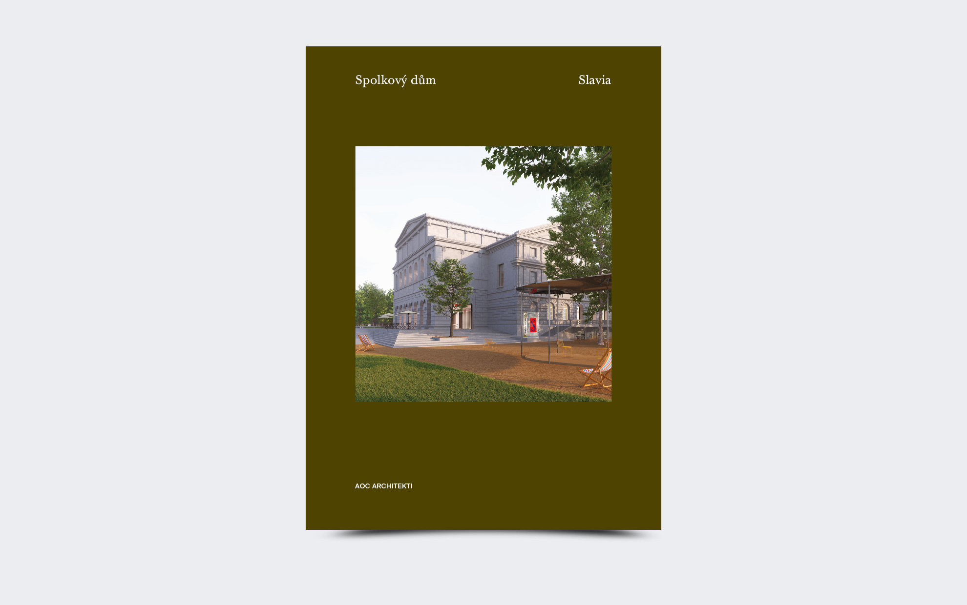
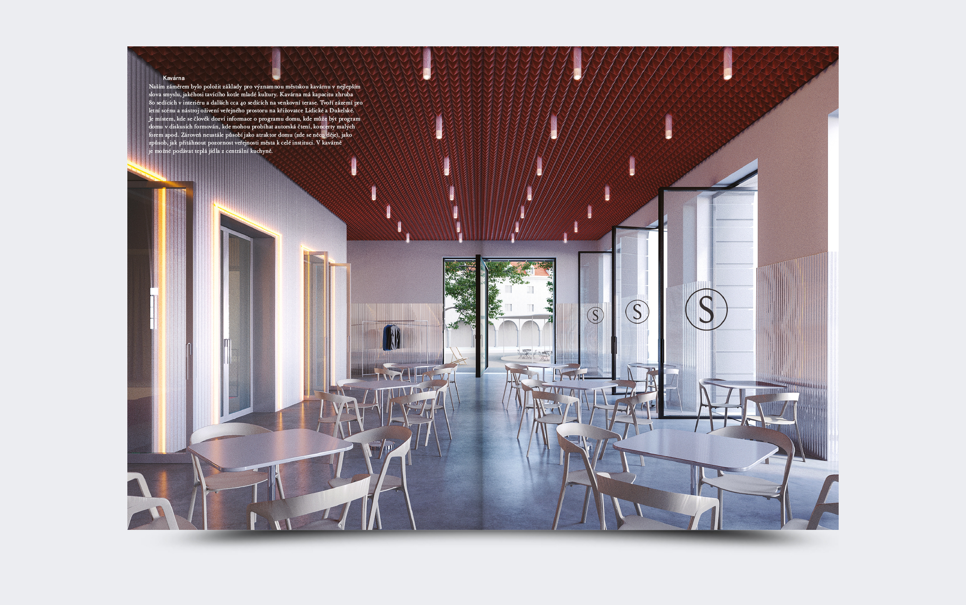
The publication is conceived as a guide through the building of the Federal House Slavia in České Budějovice. It was created as an accompanying material to the reconstruction proposal, which the Aoc studio presented in an architectural competition.
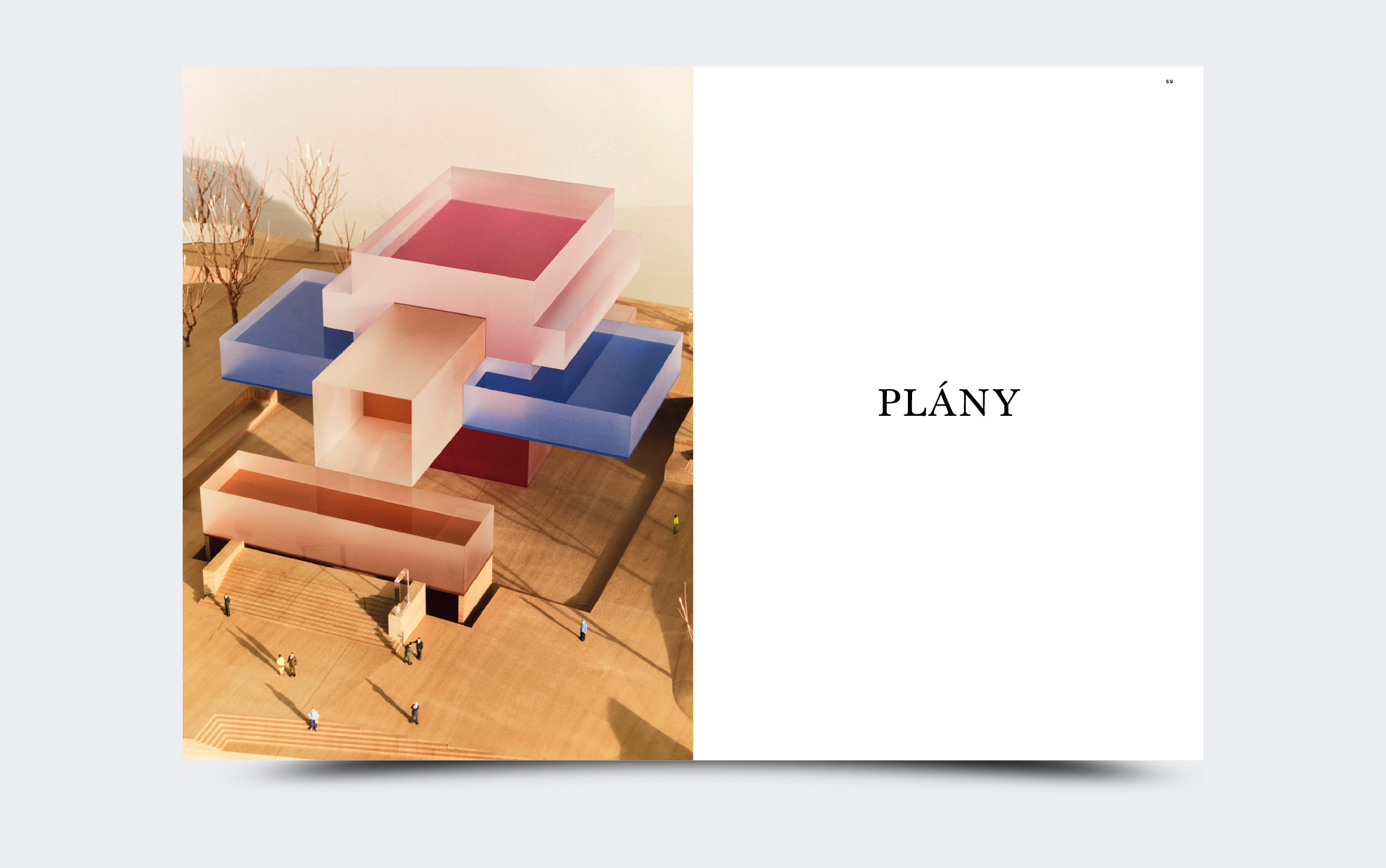
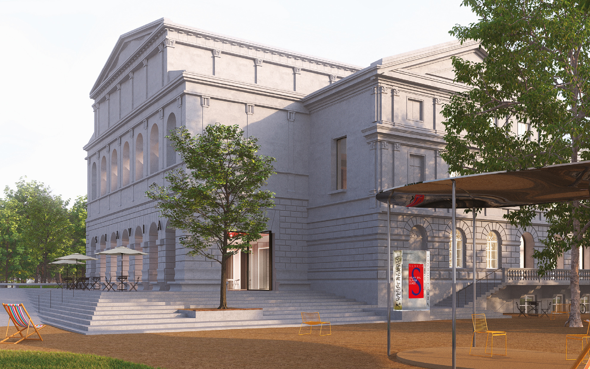
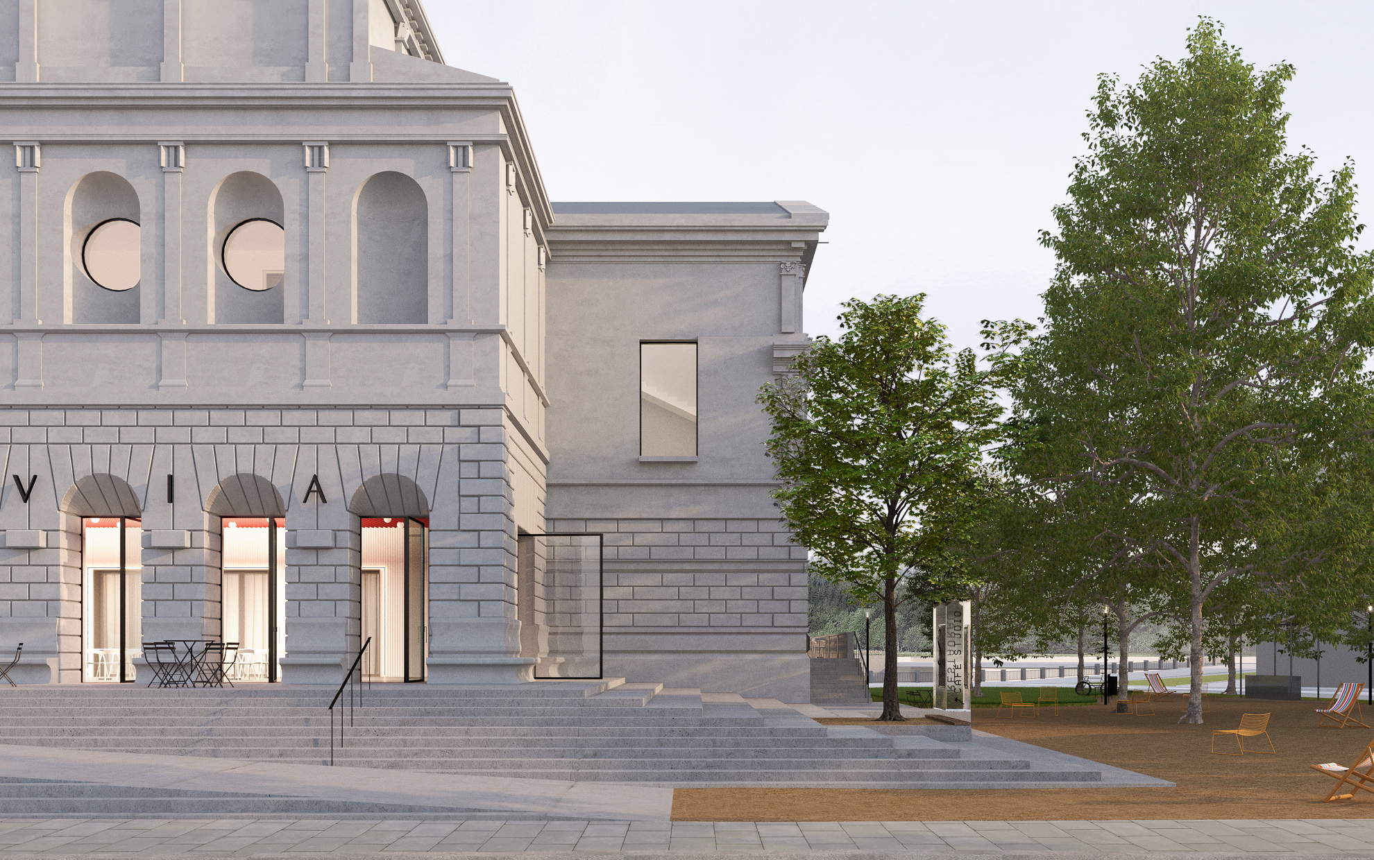
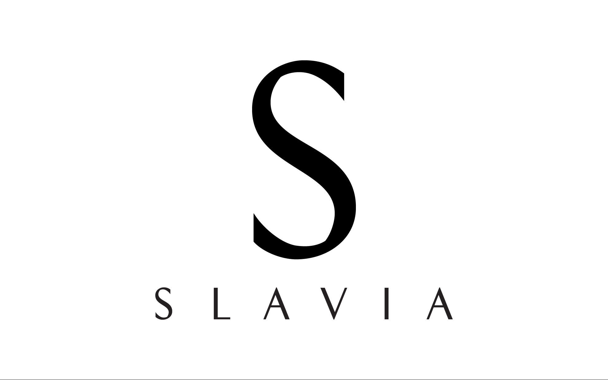
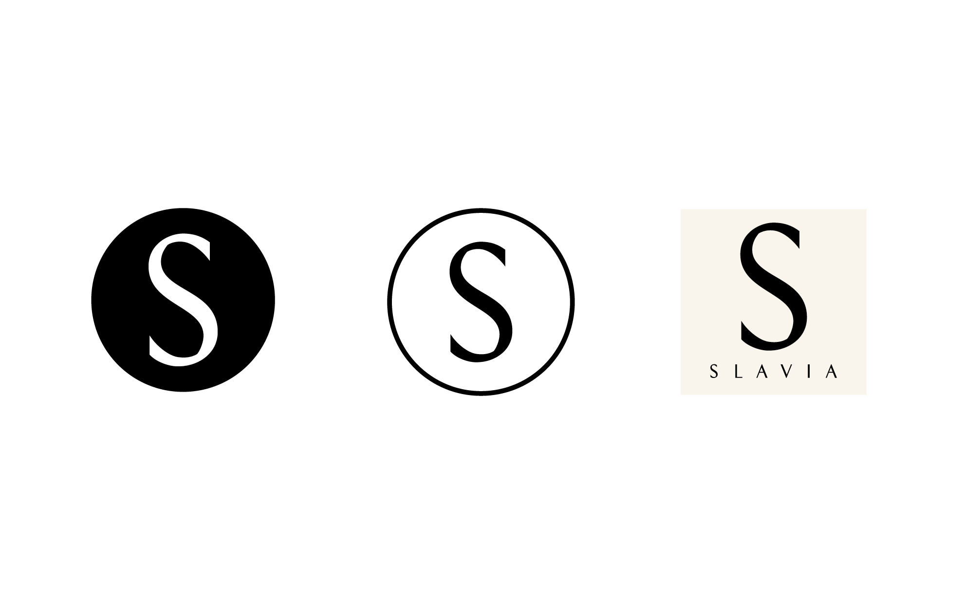
Thanks to realistic renders and a wooden model, we find ourselves literally “in front” of the house and “in the house”, we look at the layout of the building and its layout with an imaginary peephole. The design also addresses the name and logo of the house, which was slightly changed. Slavia became more monumental and for us also more cultural.
The logotype is then created using a modified History font, which is based on Roman capital. It is the choice of conservative, timeless and at the same time contemporary writing that is connected with the expression of the house itself. The typography of the printed matter is moderate and properly classic. We used the Baskerville Pro font, which complements the static facades beautifully.
Client: Aoc architects
Photo model: Jiří Hroník
Font: Baskerville Pro
2020