WorksLogotype
Fair-market Competition 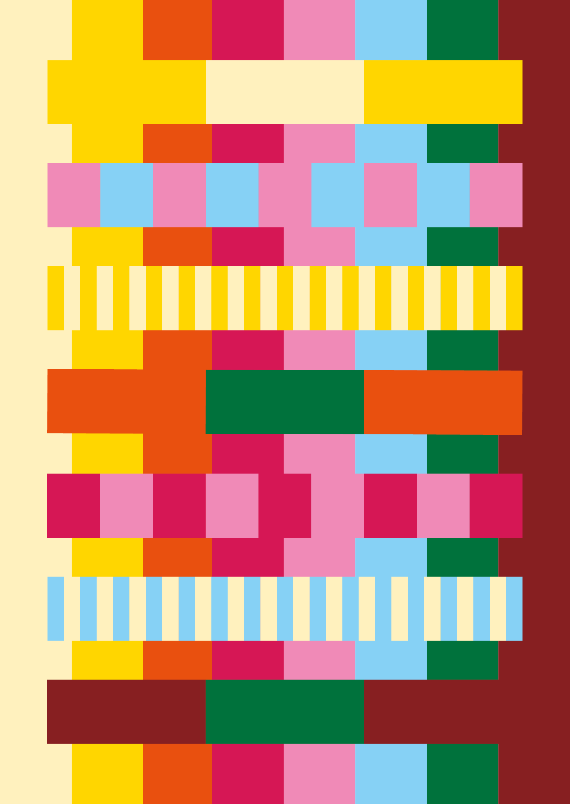

The fair-market is waiting, come in, please!
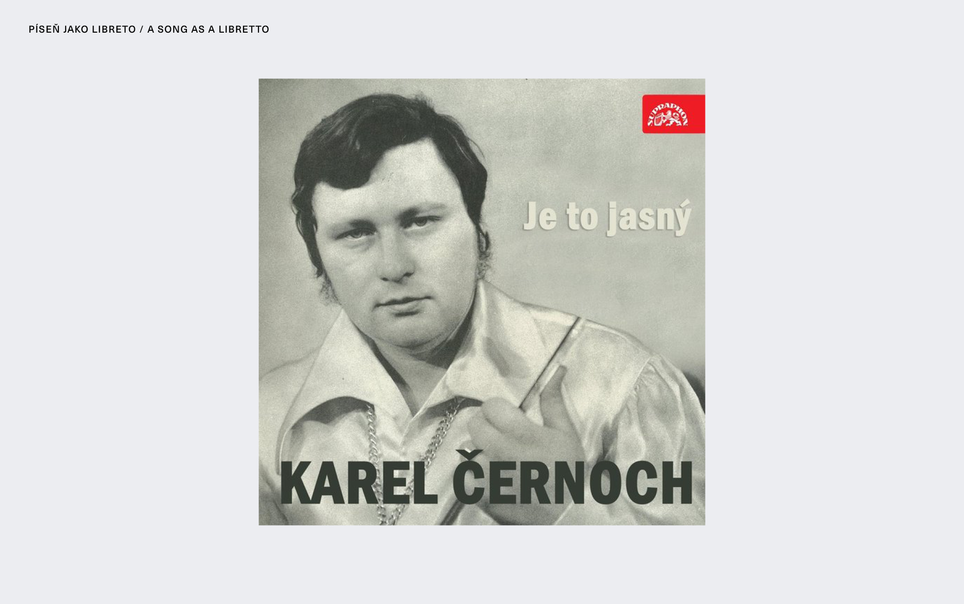
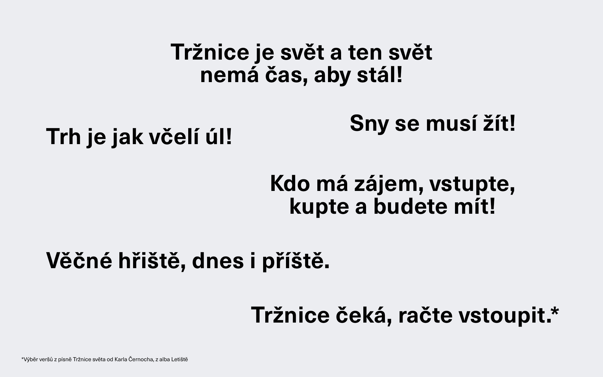
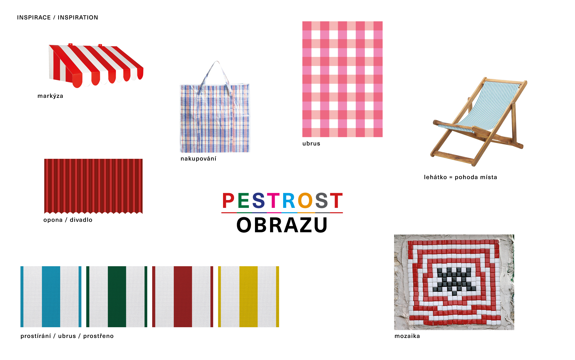
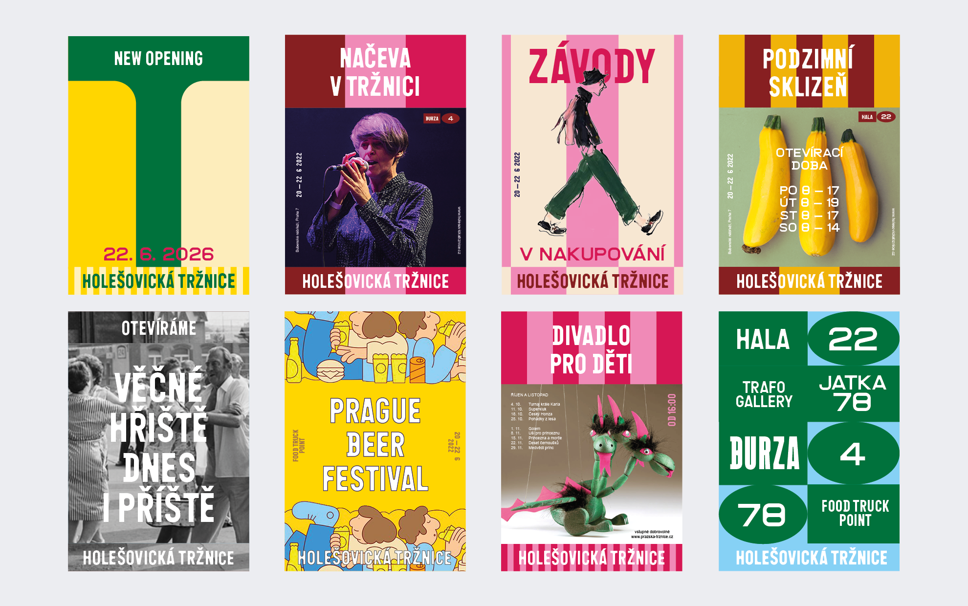
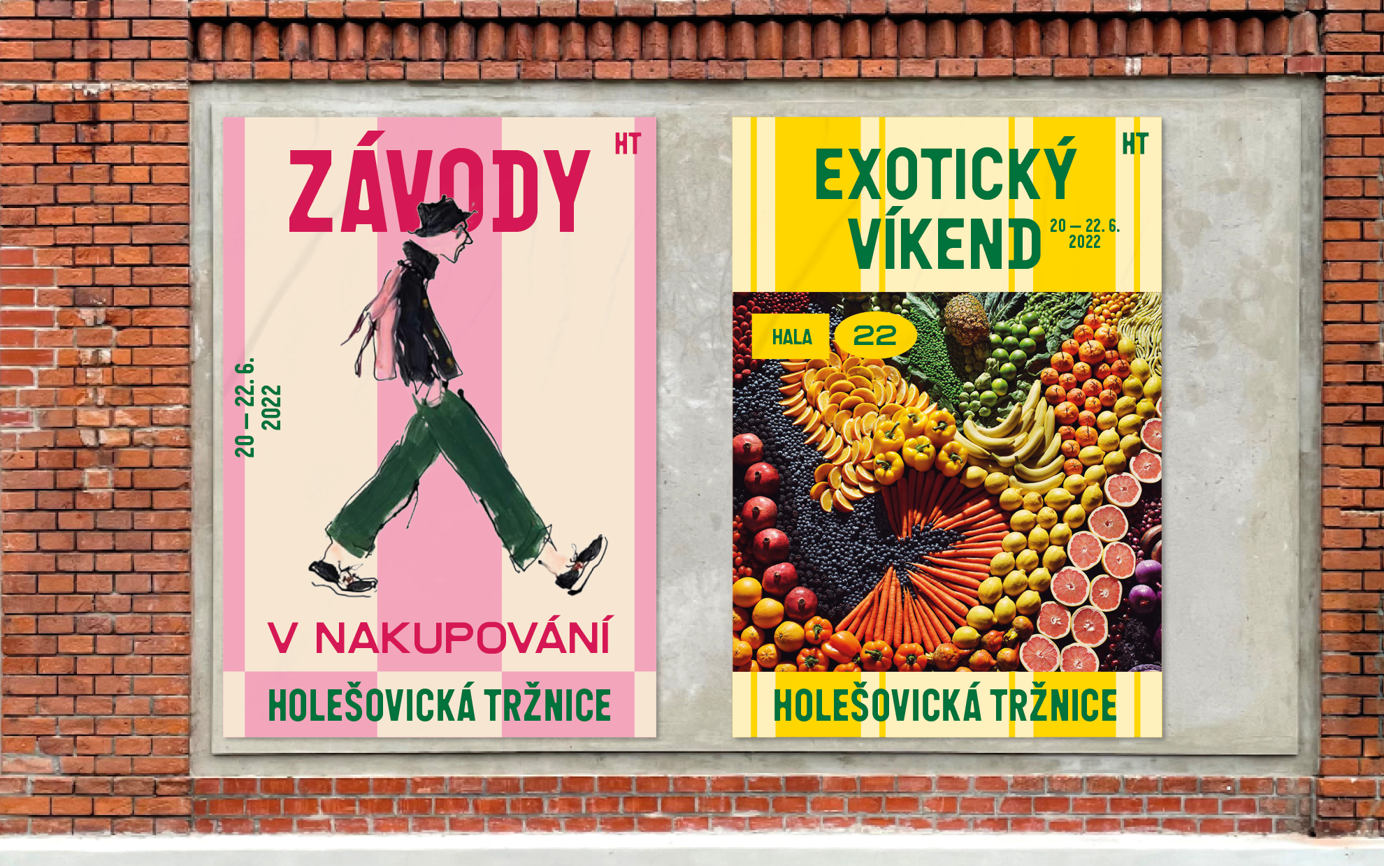
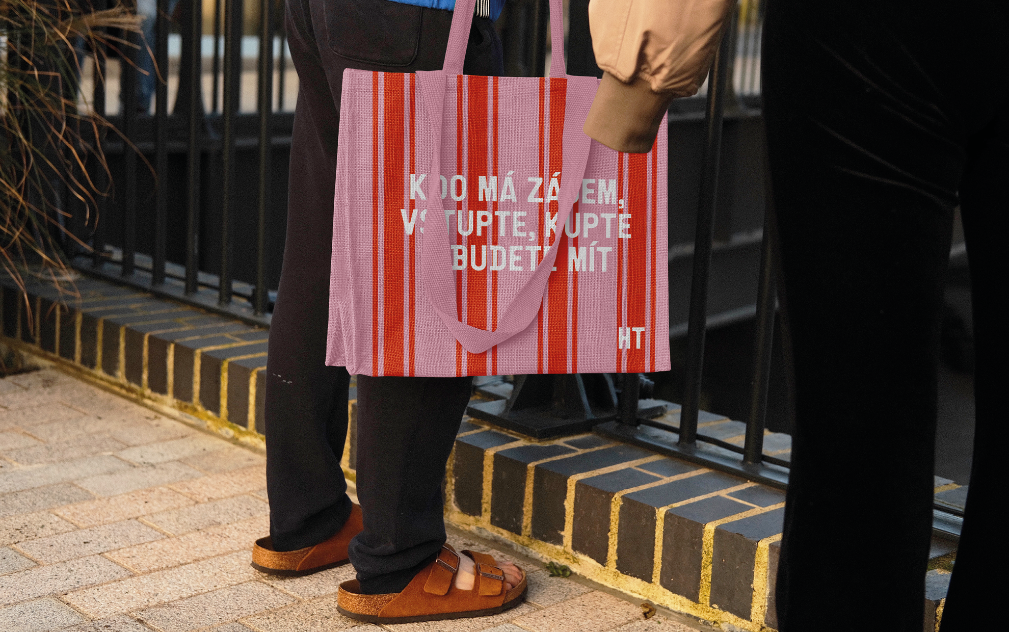
INSPIRATION: The visual design of the new Holešovice Market Hall brand is inspired by several influences. The first one is a song called "Tržnice světa" by Karel Černoch*, which has a cheerful melody and became a libretto, which we graphically processed . This pop song and the lyrics themselves are about comparing the marketplace to a "big game plan" where one can shop, barter, play theatre or tennis, sing, haggle, poem... What is inspiring is the way the song treats the lyrics, we borrowed selected verses as verbal accompaniment for our graphic concept. The stanzas of simple poems are a good illustrative theme for our design, as they are easy to read and can be understood by everyone. This gives to an ordinary shopping a poetic overlay. The differently chosen parts of the song are suitable, for example, to launch an online campaign, where the variation and combination of texts creates a complete communication campaign, and the right timing brings the desired effect.
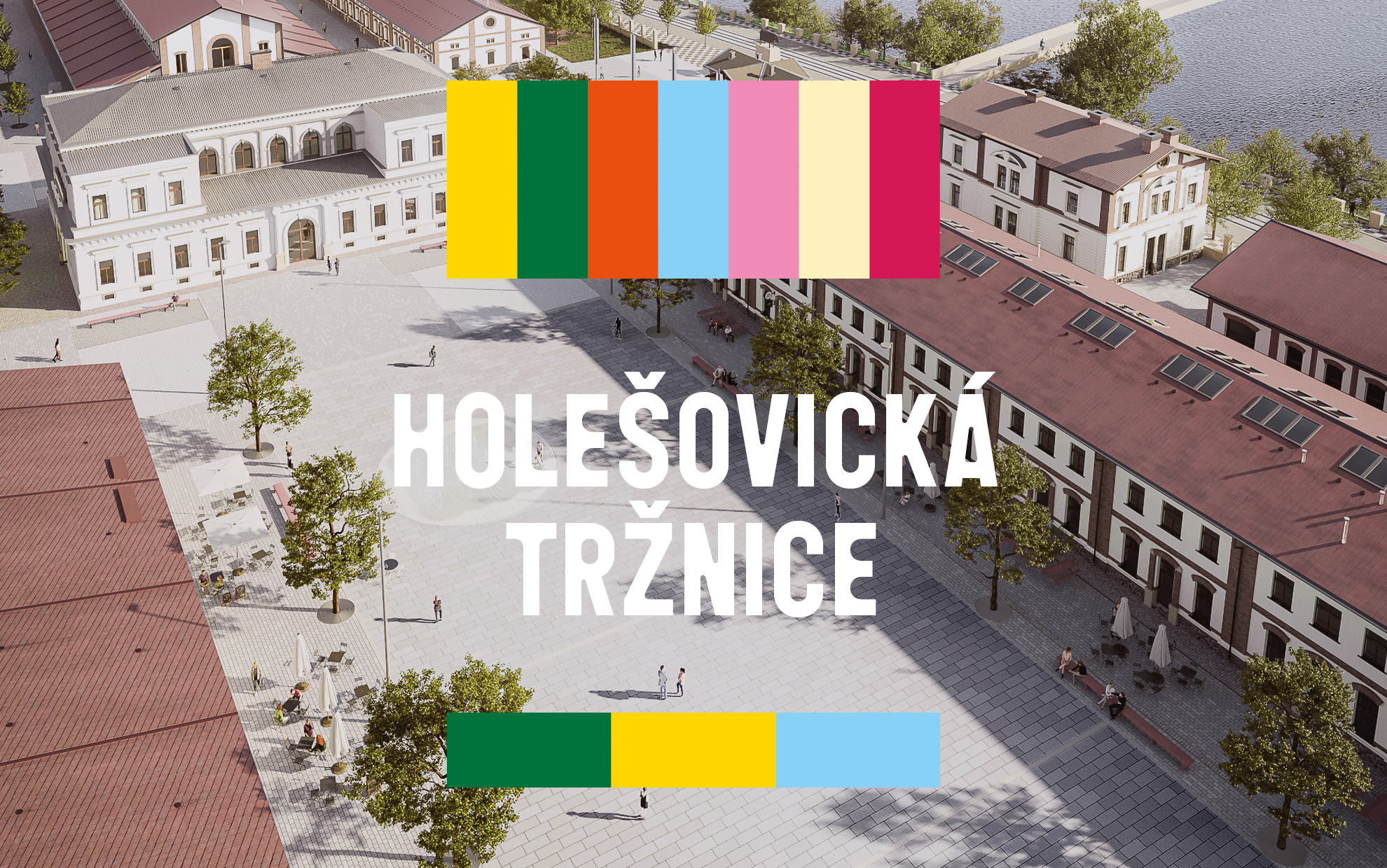
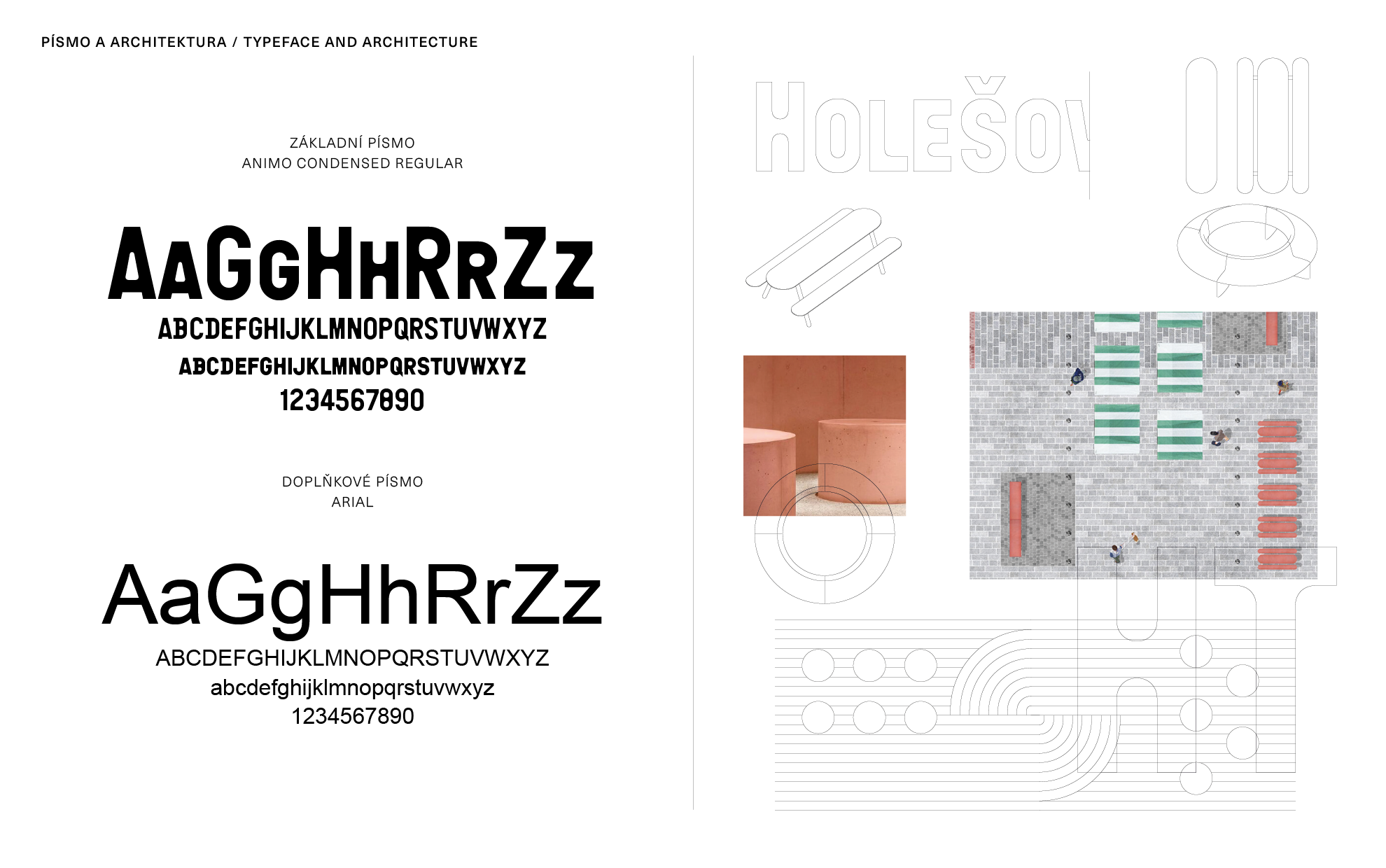
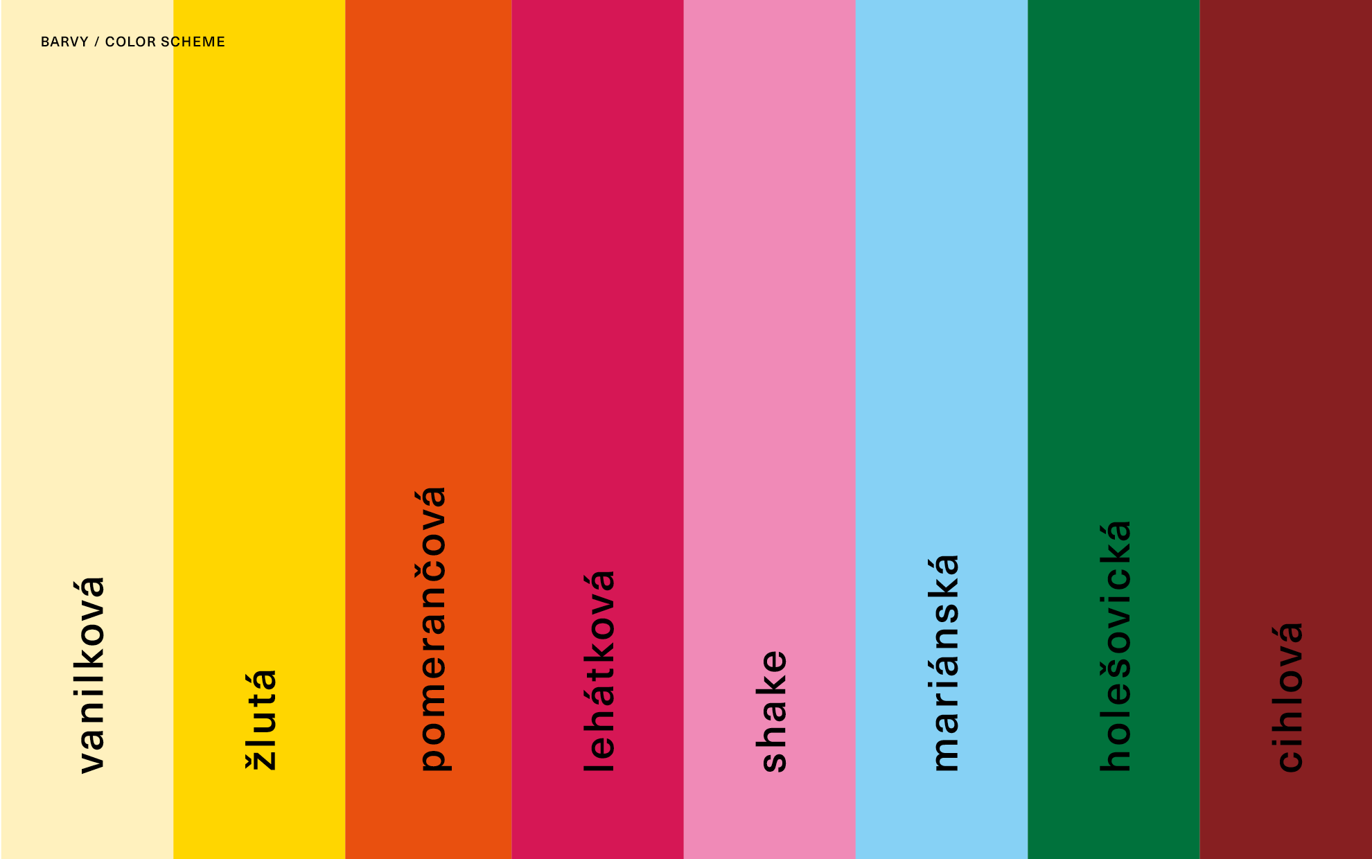
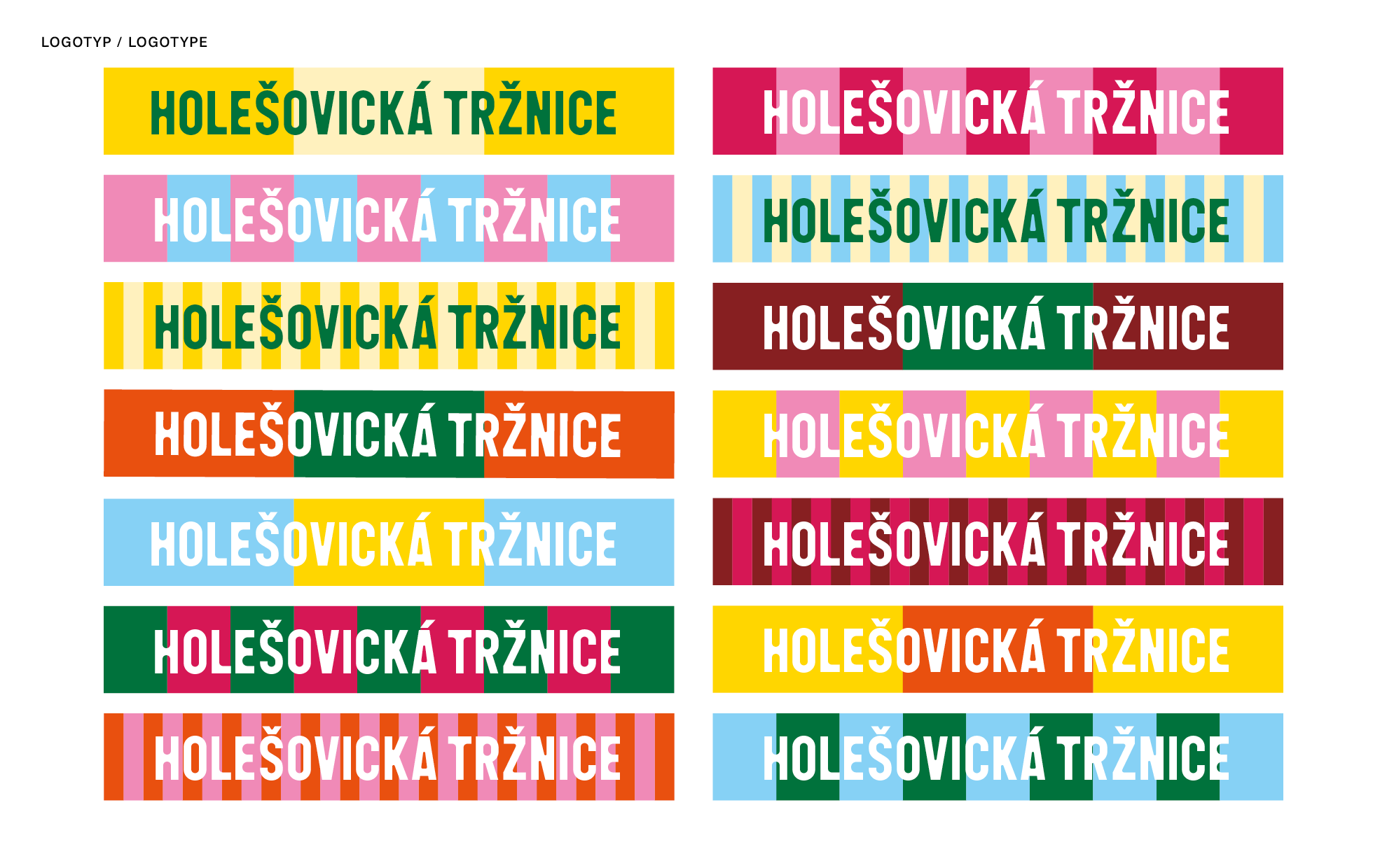
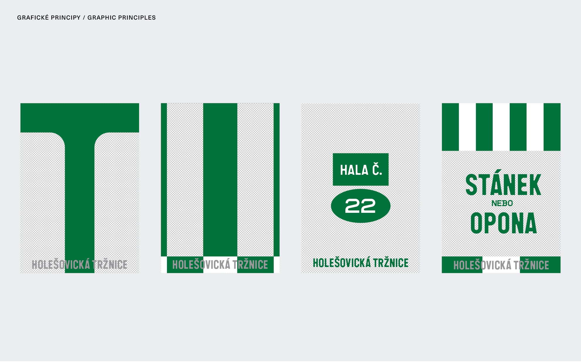
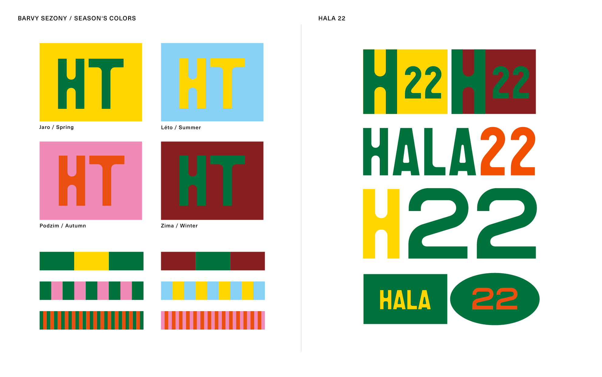
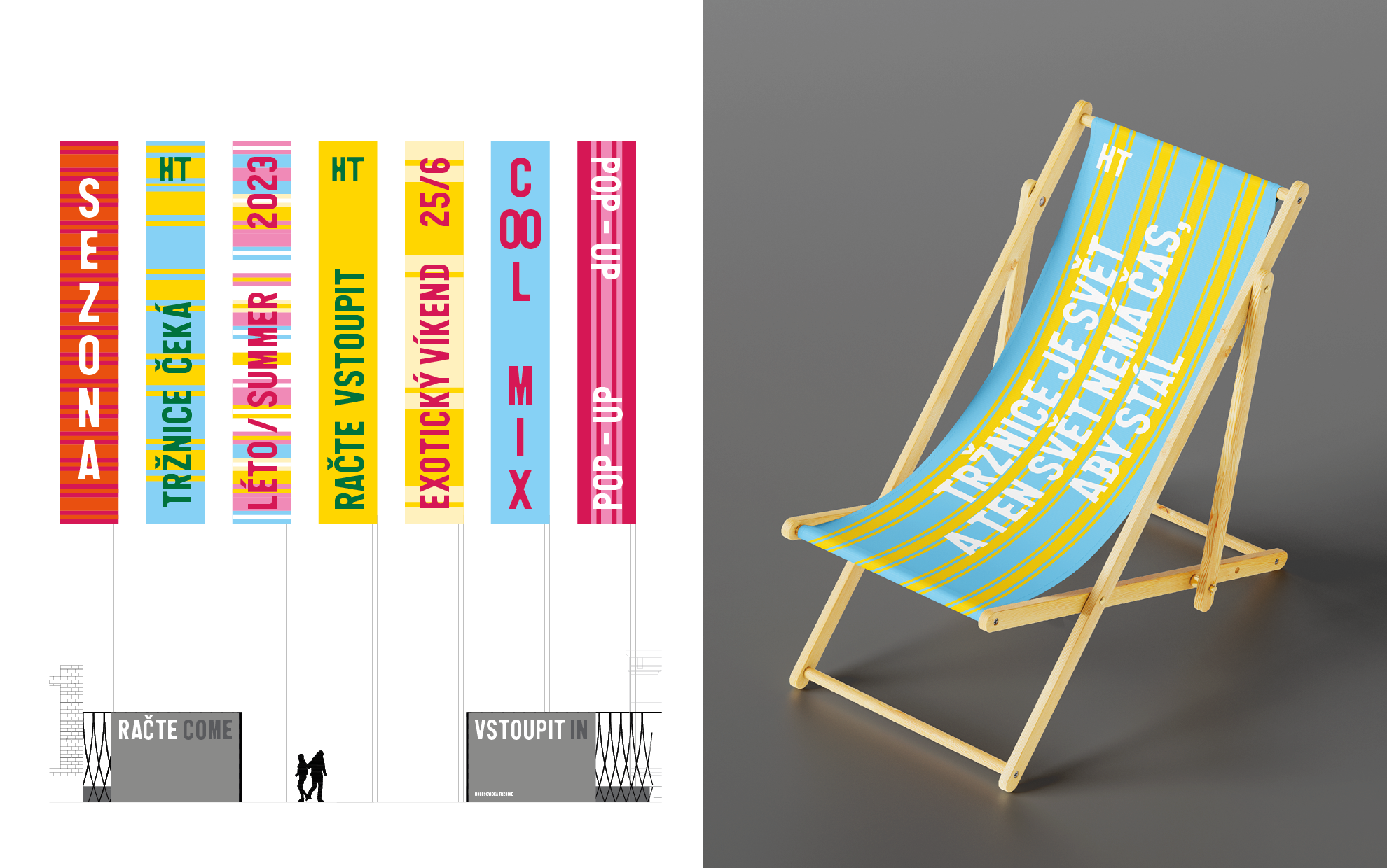
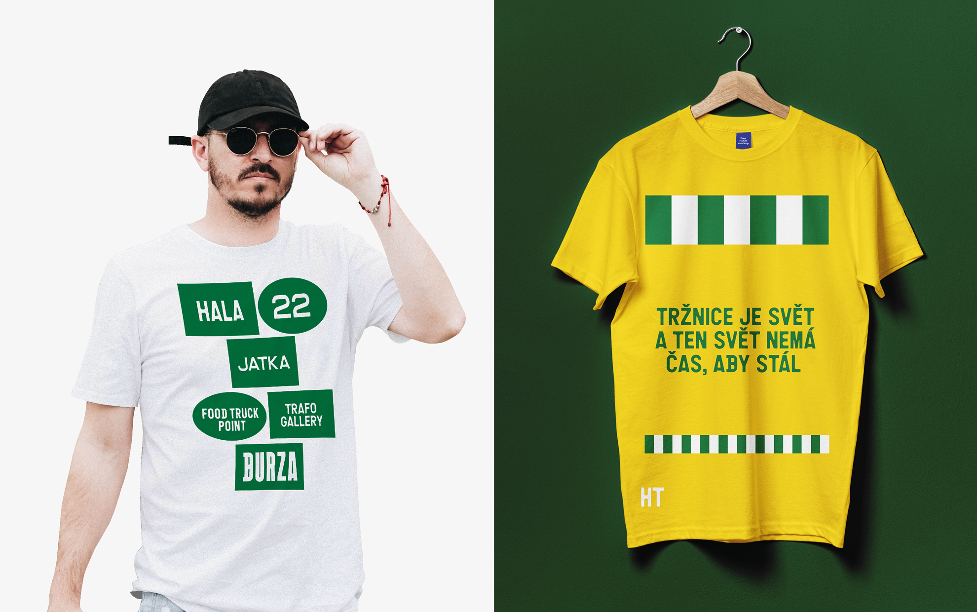
TYPOGRAPHY AND DESIGN: The design is based on the diversity and variability of several elements: the key is the fresh colour scheme and the use of Animo typeface by Heavyweight. Its Condensed Regular section is appropriate because of the long name that is worked into the logo. Therefore, it is also possible to use the abbreviation HT (T), which in different colour combinations characterizes the seasons. Seasonality is one of the possible guiding principles of the visuality. The drawing of the geometrically constructed font cites in detail not only elements of the atypical furnishings of the site, but also the paving method and its structure designed by the Perspektiv studio.
Another supporting element used in the design are the coloured) stripes that line the individual visuals. Again, this is an element that can be well developed on future materials, from posters to banner advertising and mobile apps. By combining these elements — distinctive font, stripes and colours - we get a strong visual that, accompanied by photos, illustrations or even just text information, can appeal to a wide range of Prague residents and tourists.
By designing flags and outdoor banners, we draw attention to the vertical elements to the site, which is designed horizontally due to the original layout. This healthy contrast (in relation to the newly constructed tower) is intended to help with orientation within the site.
Client: Holešovice fair-market, together with Czech Design agency
Team: Klára Kvízová, Matyáš Bartoň
Competition only
2022