WorksPoster
Brutalism 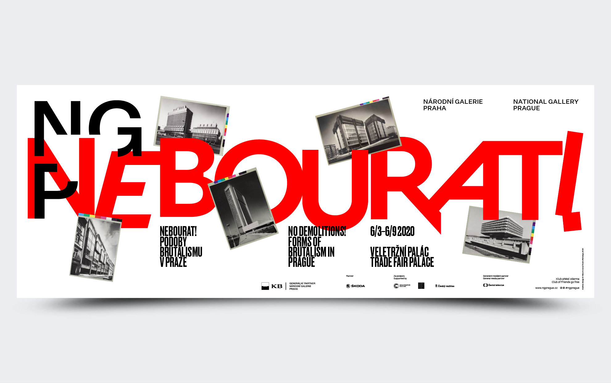
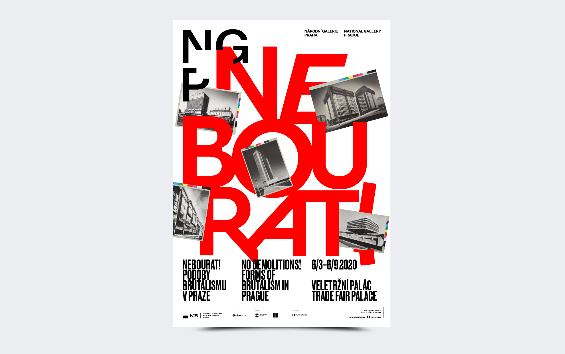
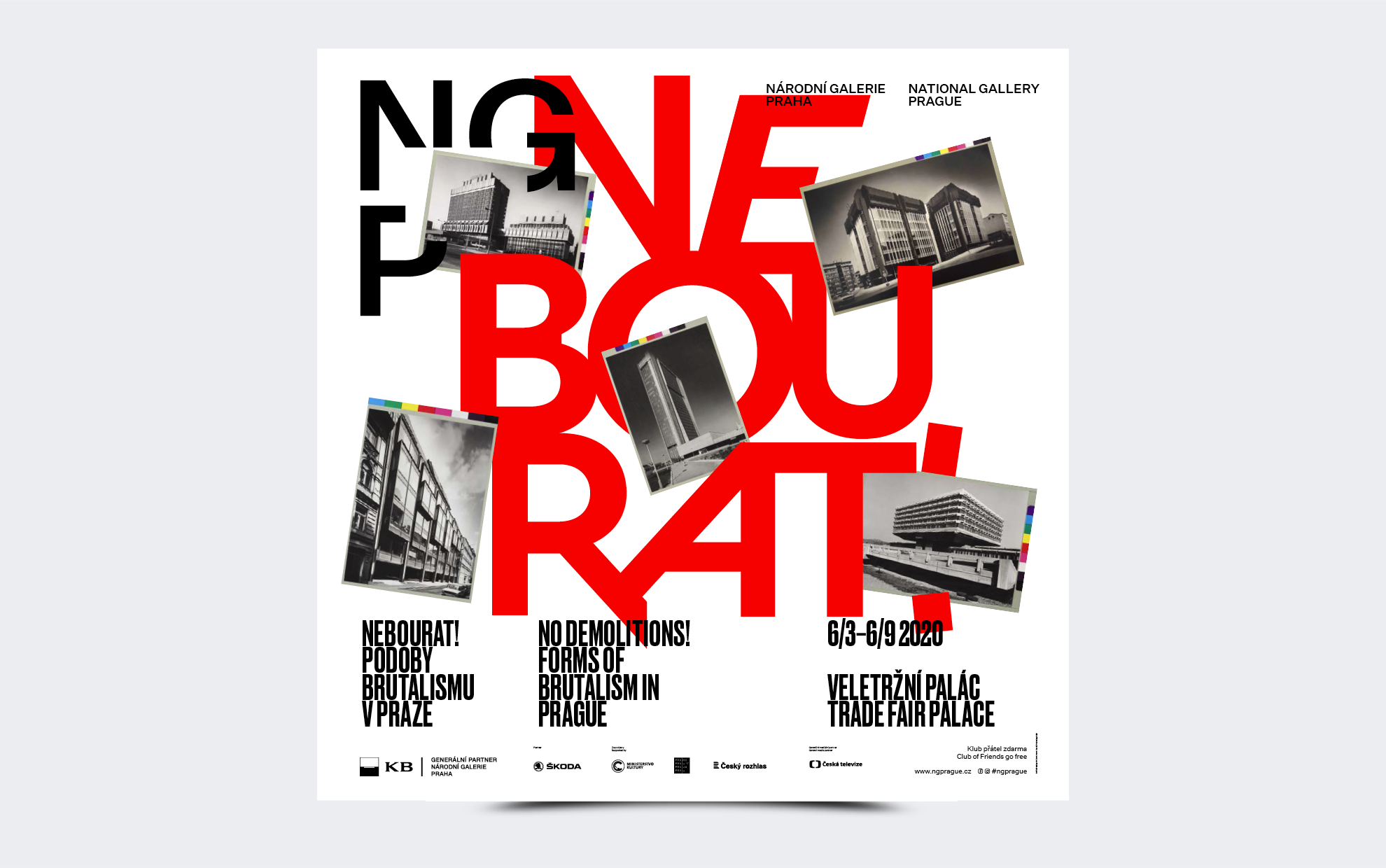
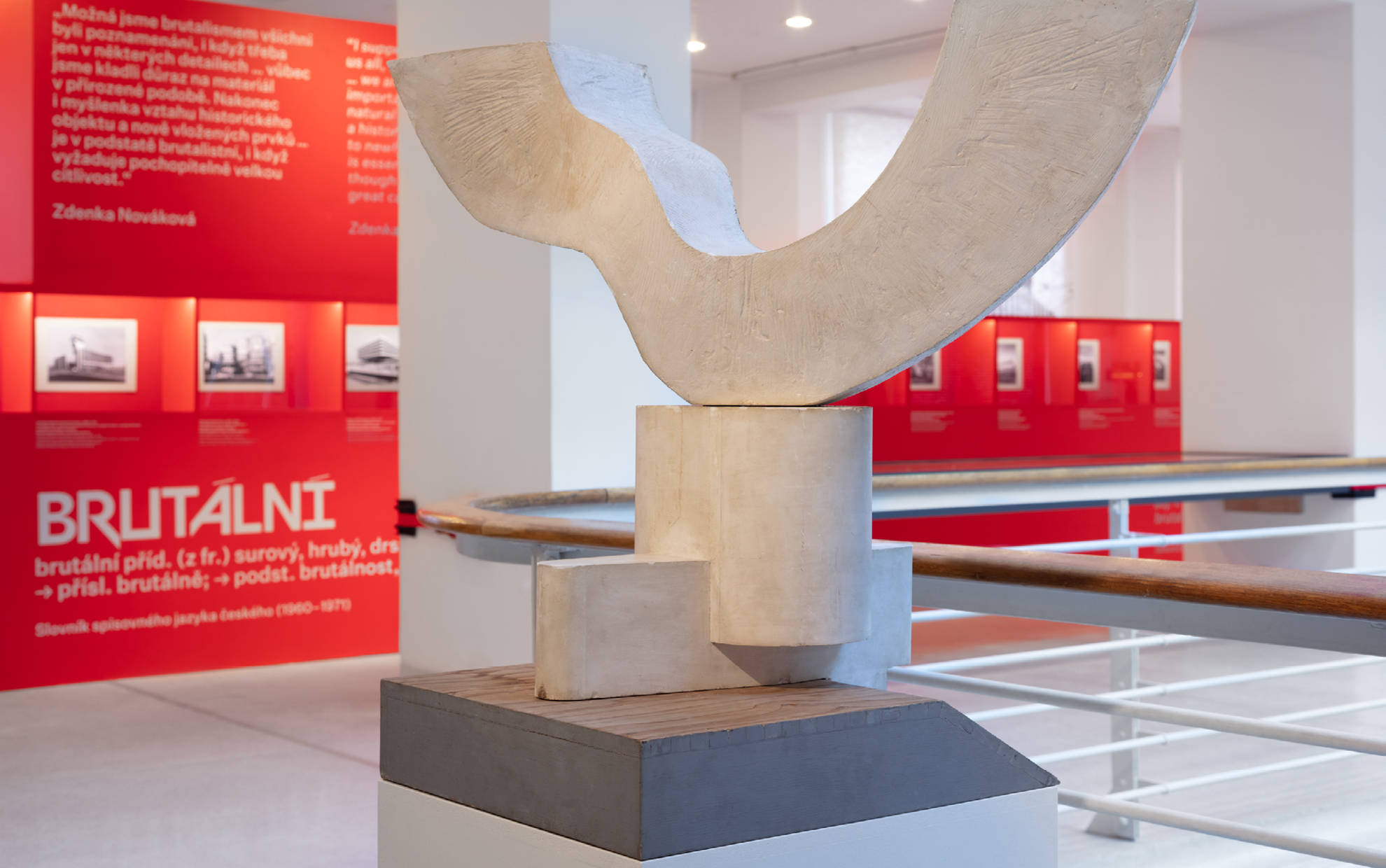
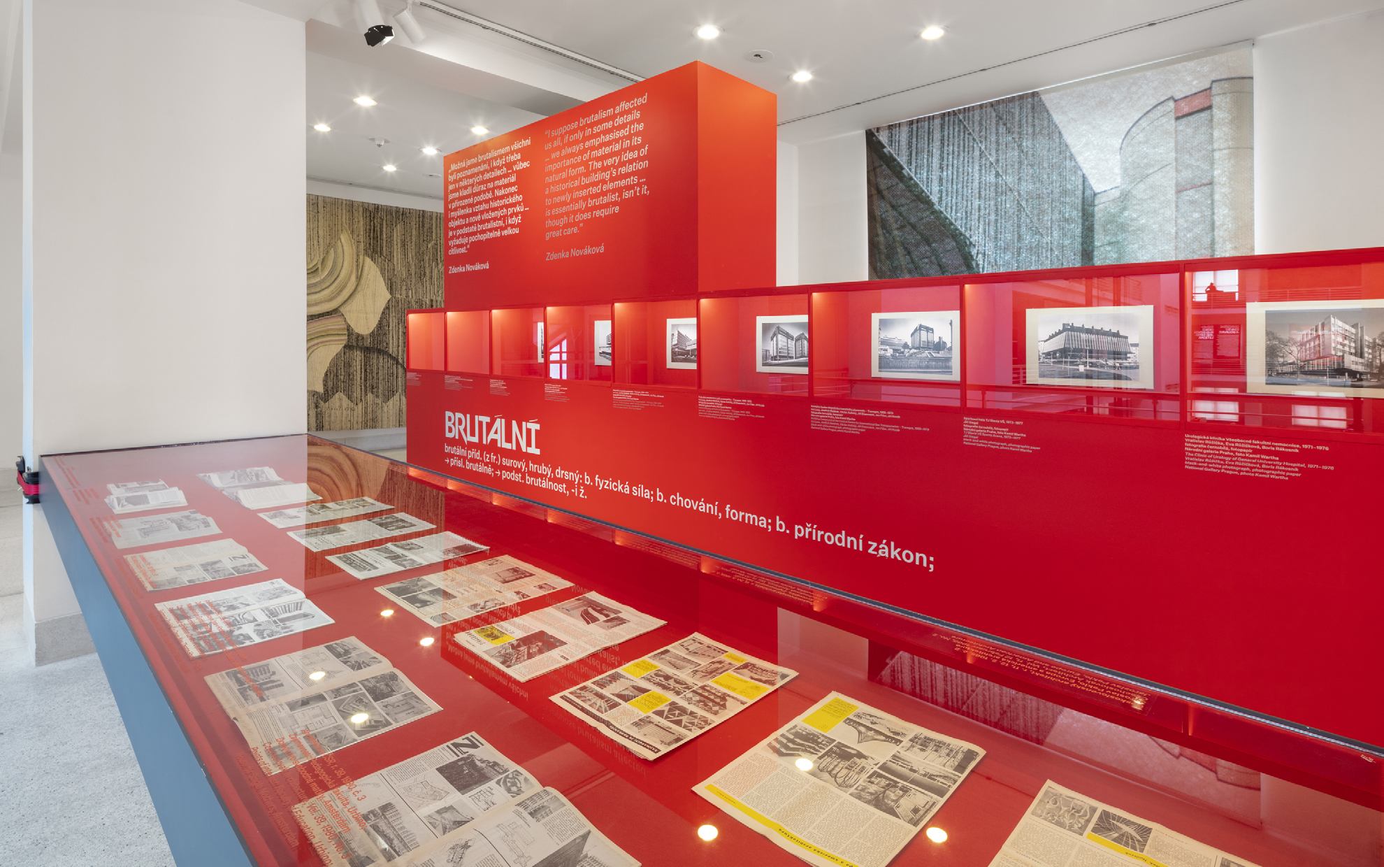
The name of the exhibition on brutalism in Prague was invented in about fourteen days. In the end, we came up with the name “Nebourat!” – although many citizens of the metropolis might prefer to replace it with “Demolish!” after watching the exhibition.
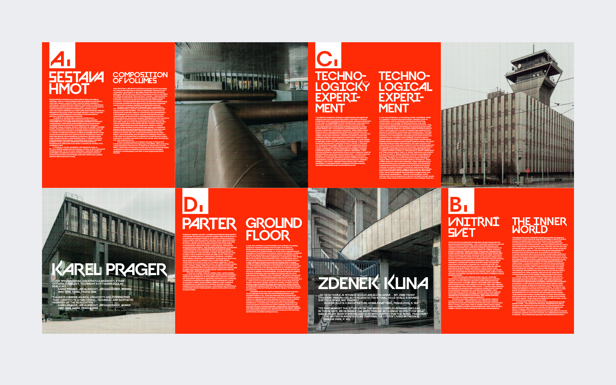
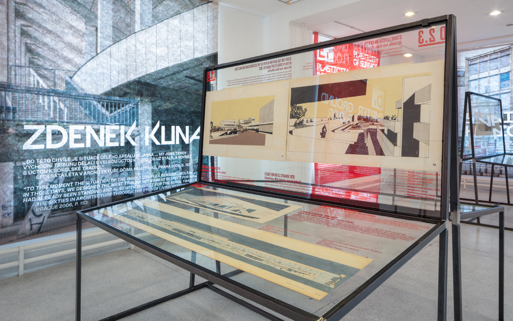
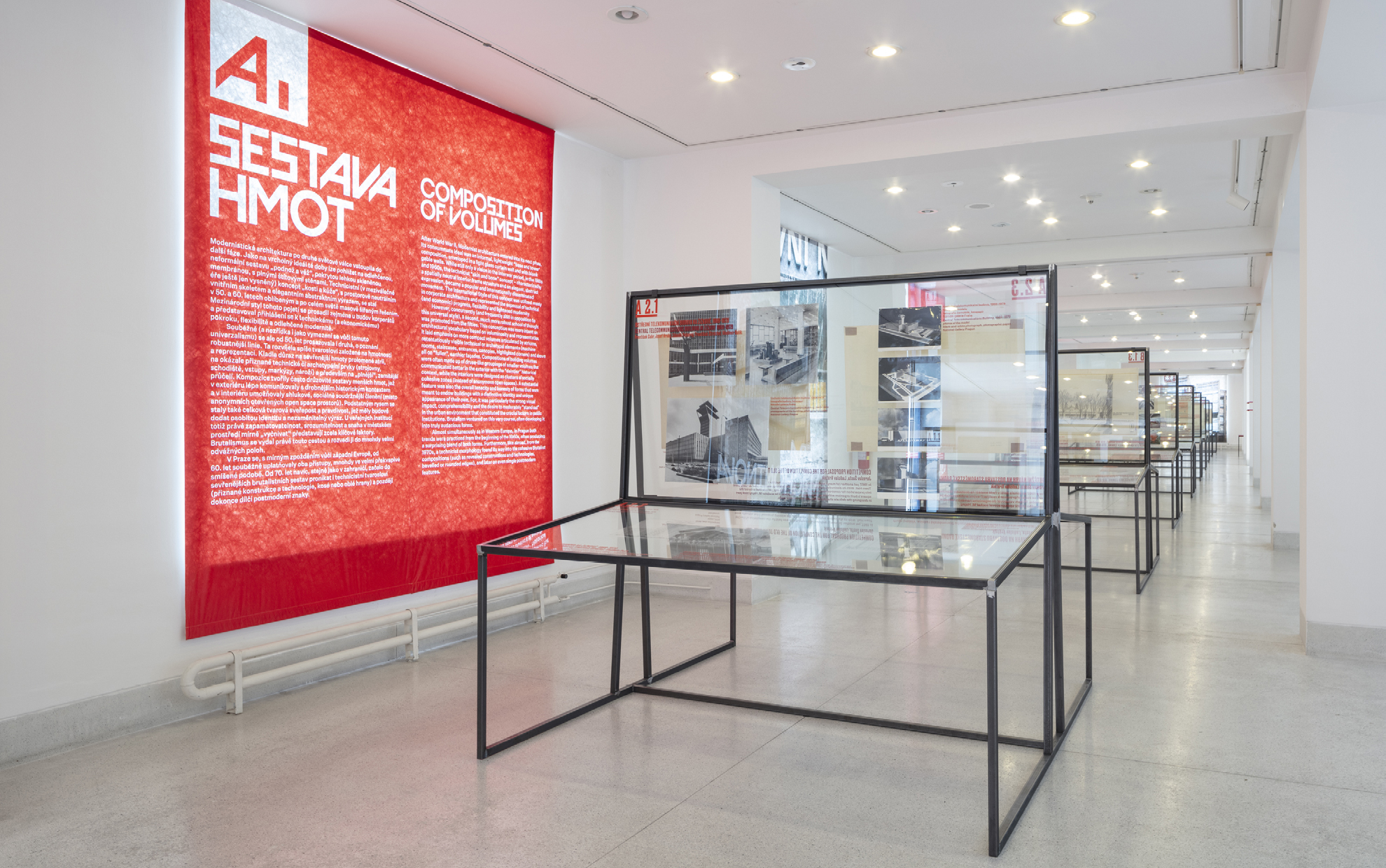
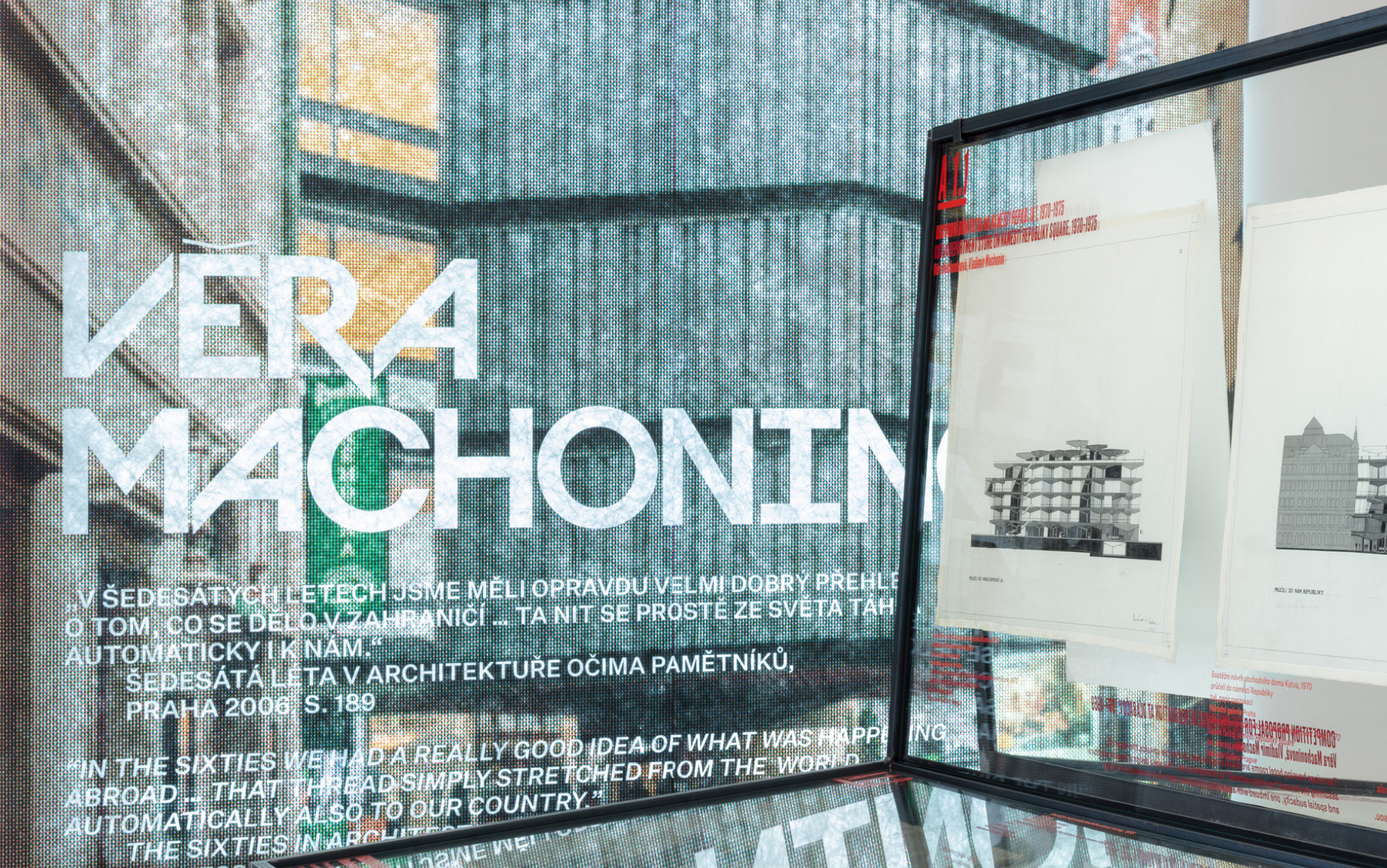
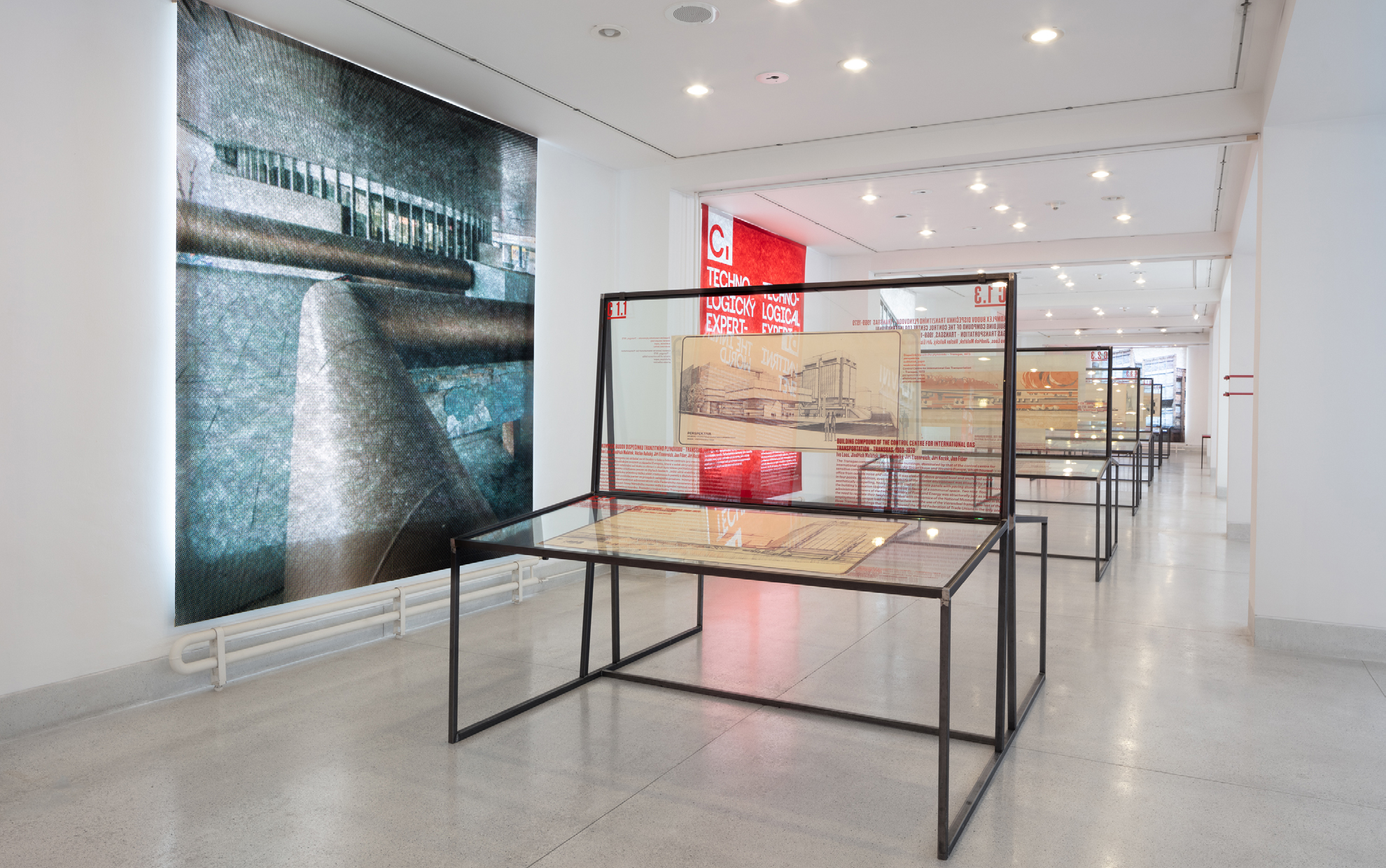
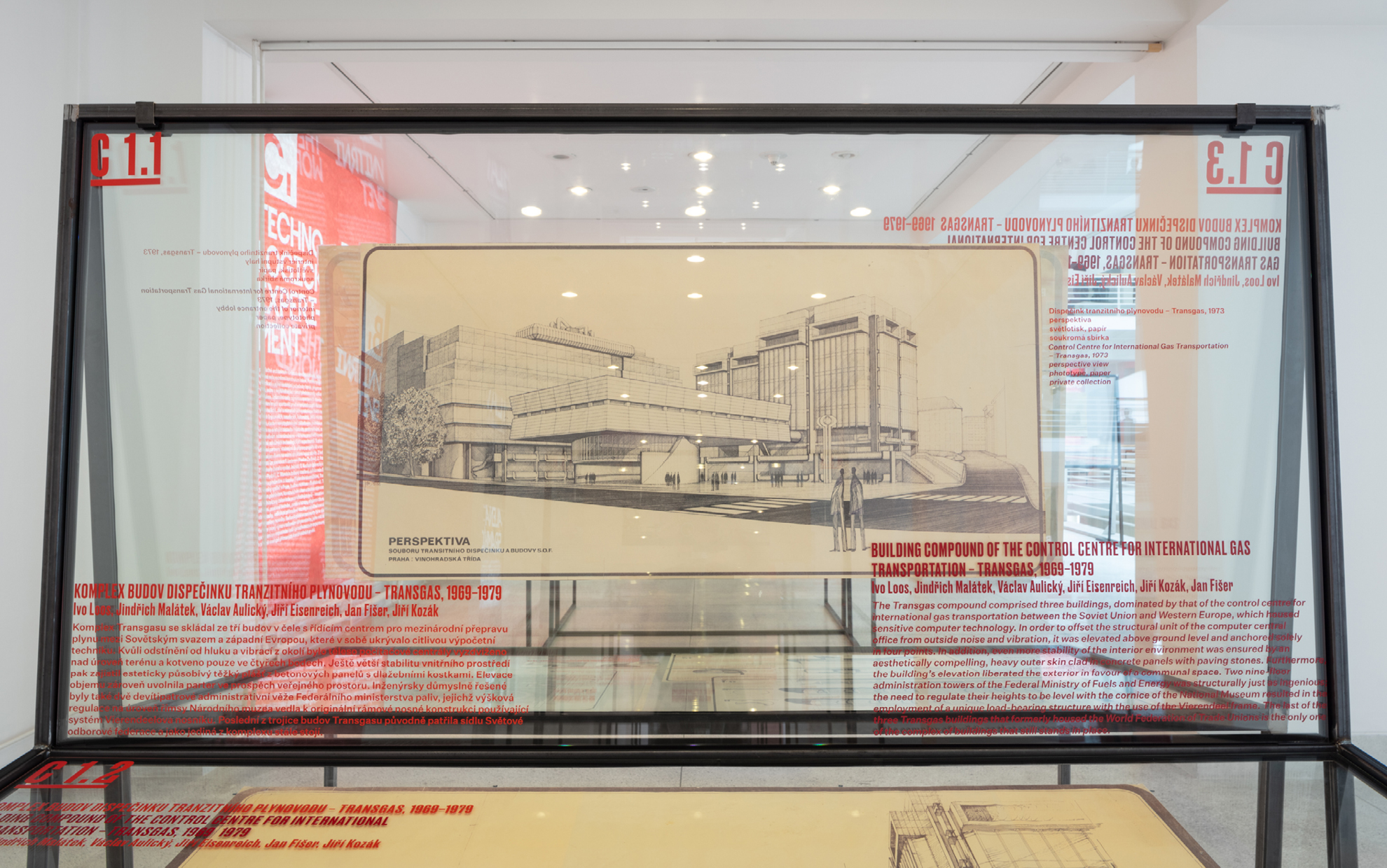
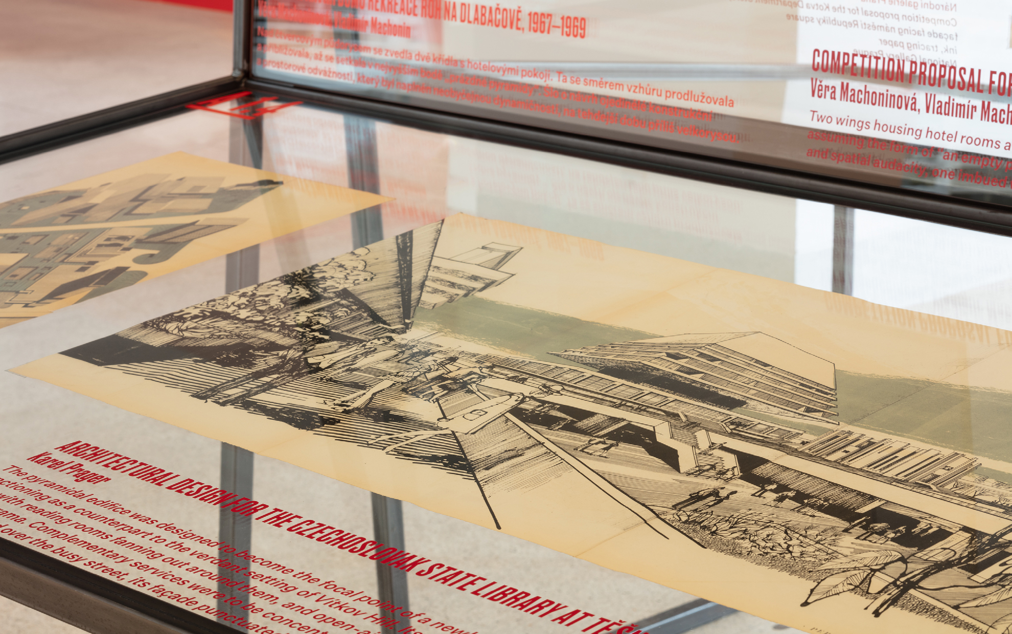
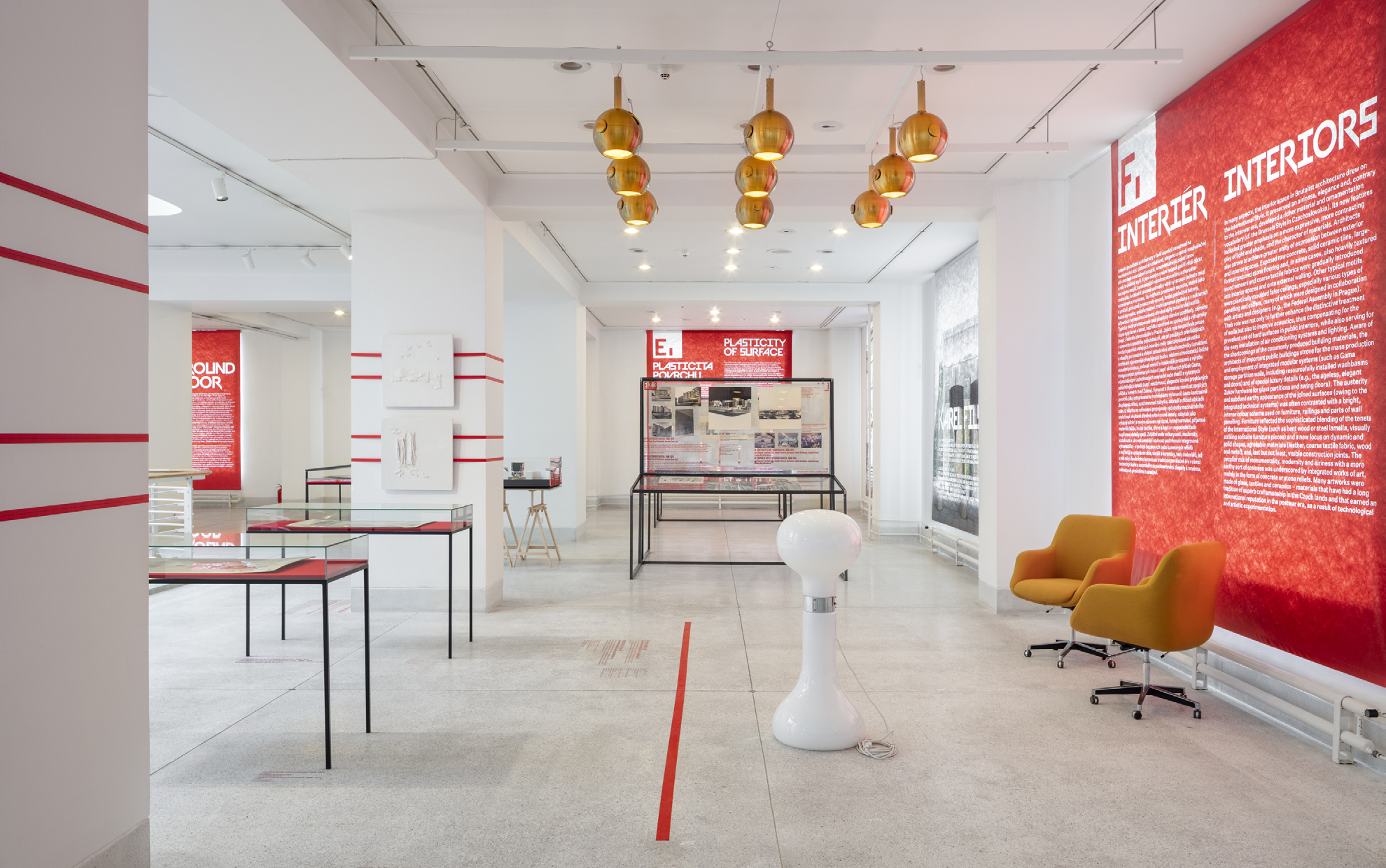
The exhibition brought photos and plans of controversial buildings, which for many of us are forever the embodiment of the terrible communist era. At the same time, however, it showed that many of the buildings from that time are monumental, without design examples, and the architects of the 1970s were distinctive and original in many aspects.
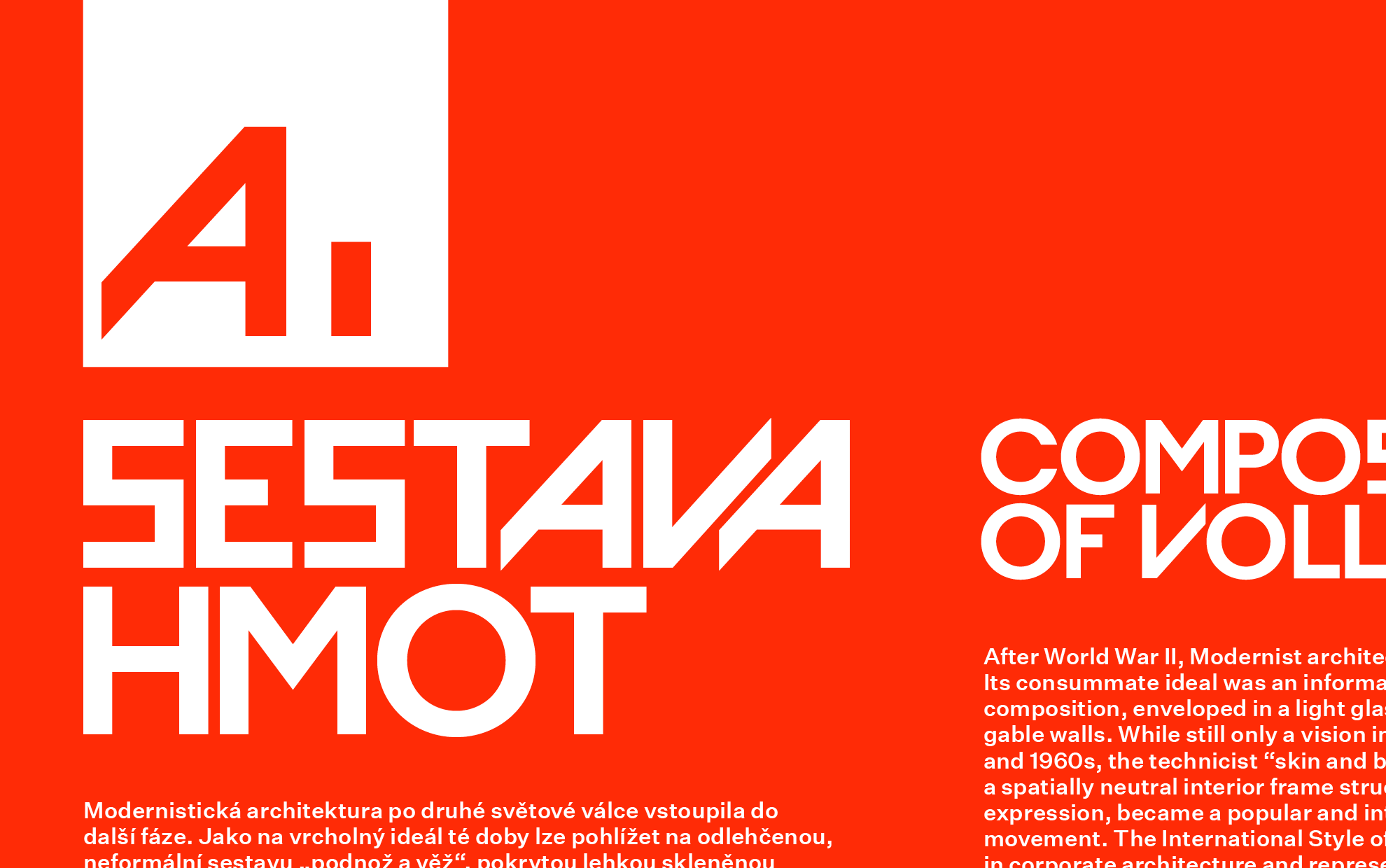
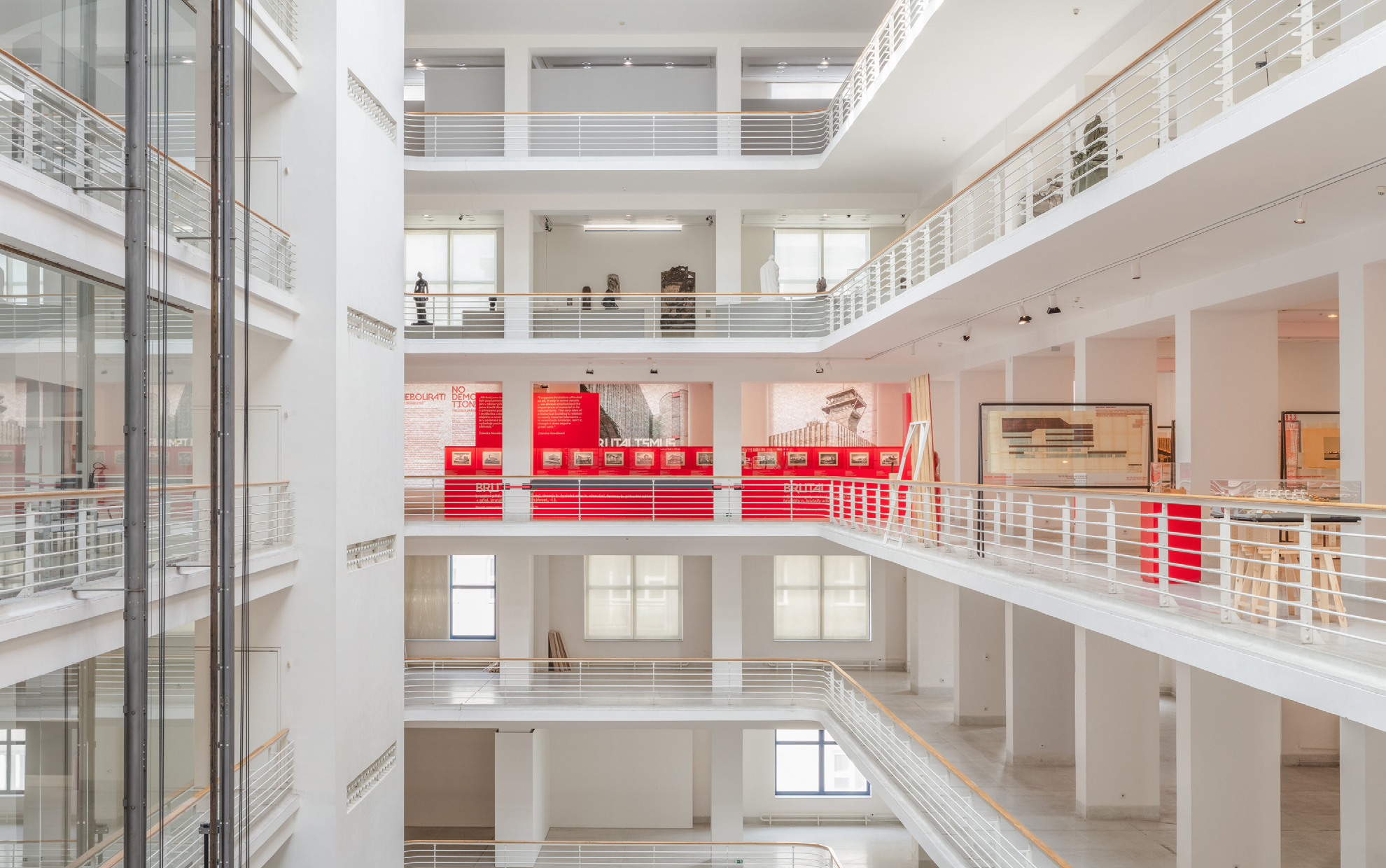
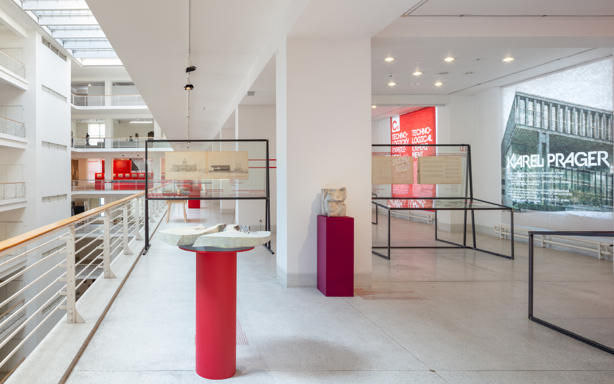
As its main graphic element, we chose a “distinctive” font, which, like the buildings of that time, is so repulsive that it is also beautiful. For the exhibition, the windows of the Trade Fair Palace in Prague were covered with special blackout sheets, creating space for large posters, with quotes from architectural giants such as Karel Prager, Alena Šrámková, or Karel Filsak.
Architect of the exhibition: Ondřej Císler, Aoc architects
Curator: Helena Doudová
Client: NG Praha, Veletržní palác
Font: Krsna, Untitled Sans, Druk
Photo of the realization of the exhibition: NGP, Katarína Hudačinová
2020