WorksPoster
Prague Spring 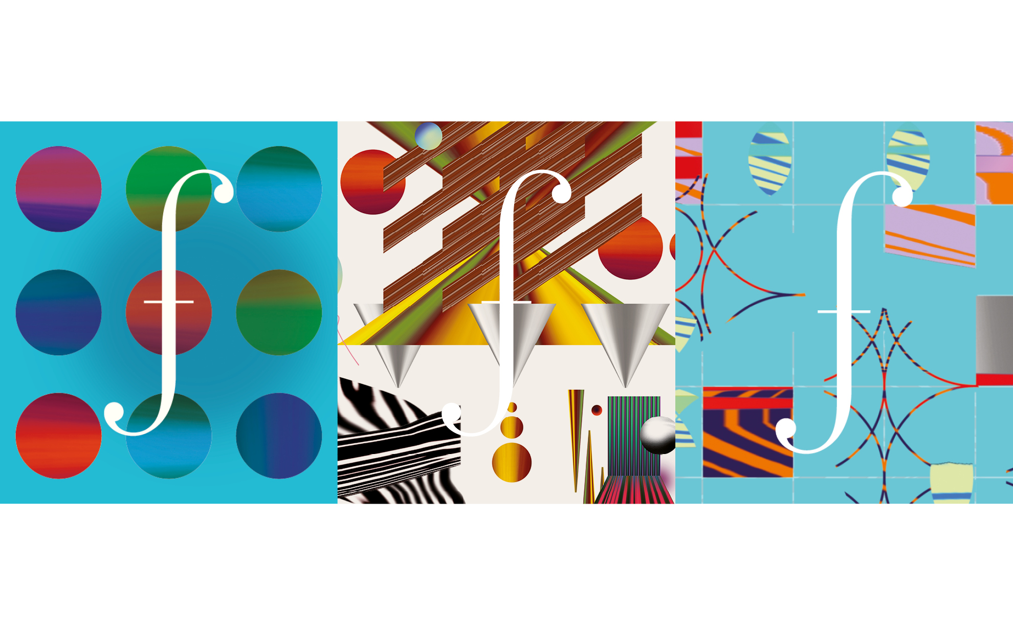
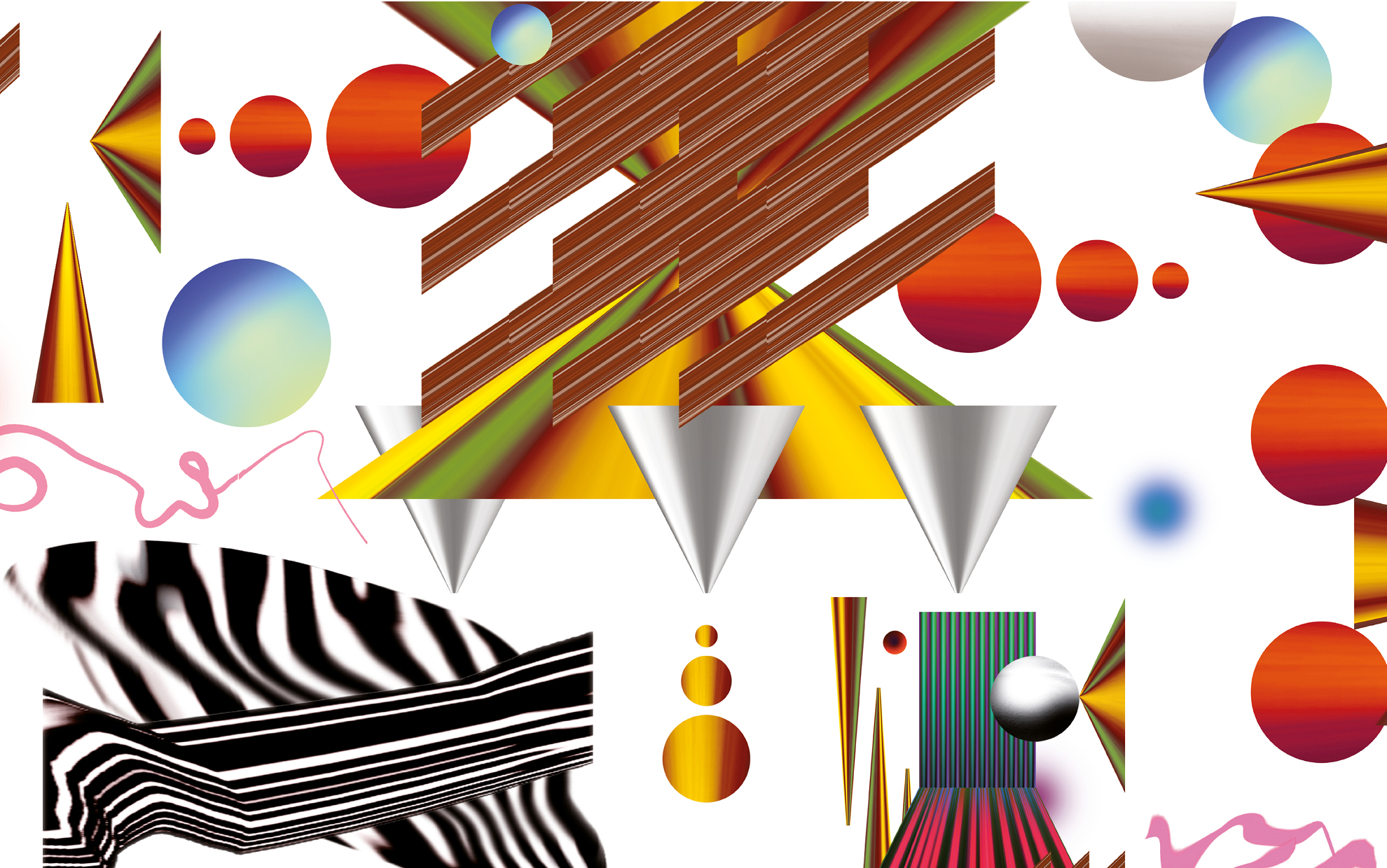
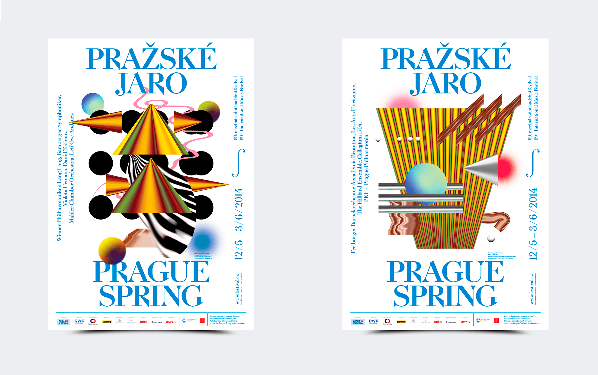
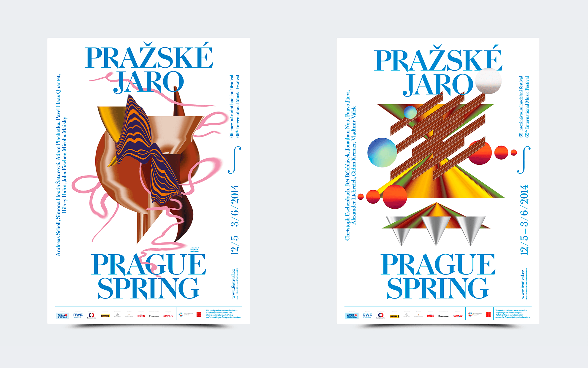
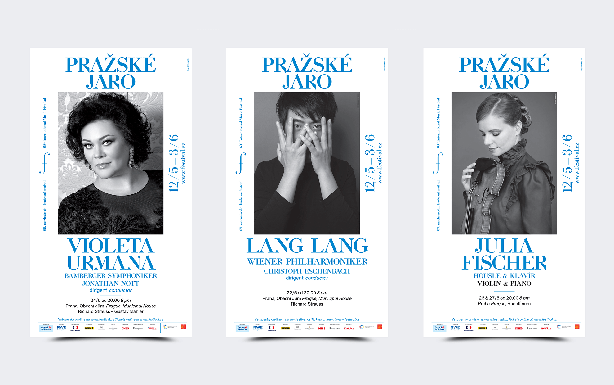
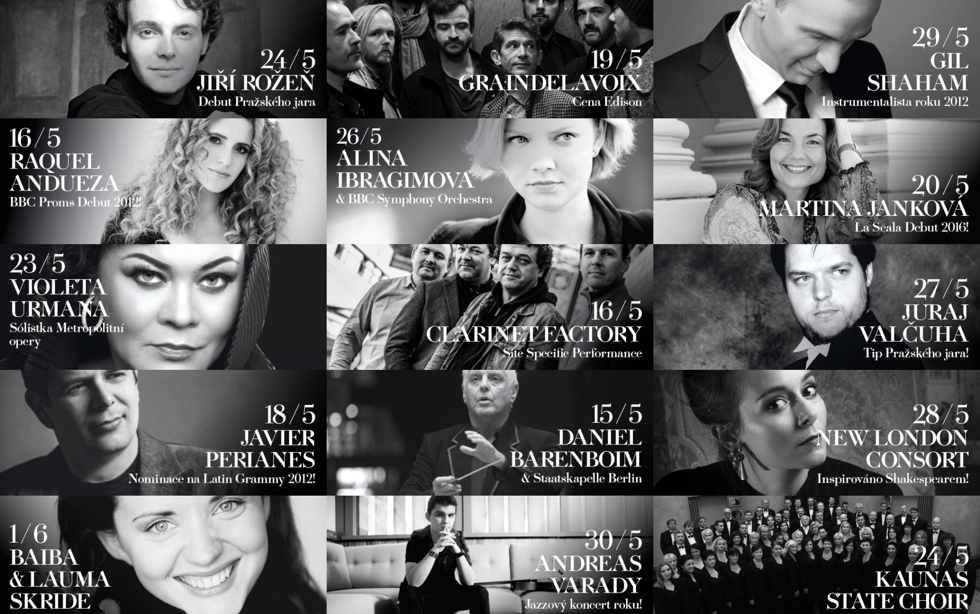
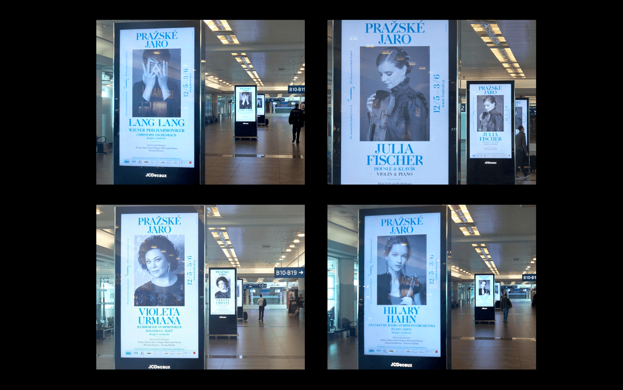
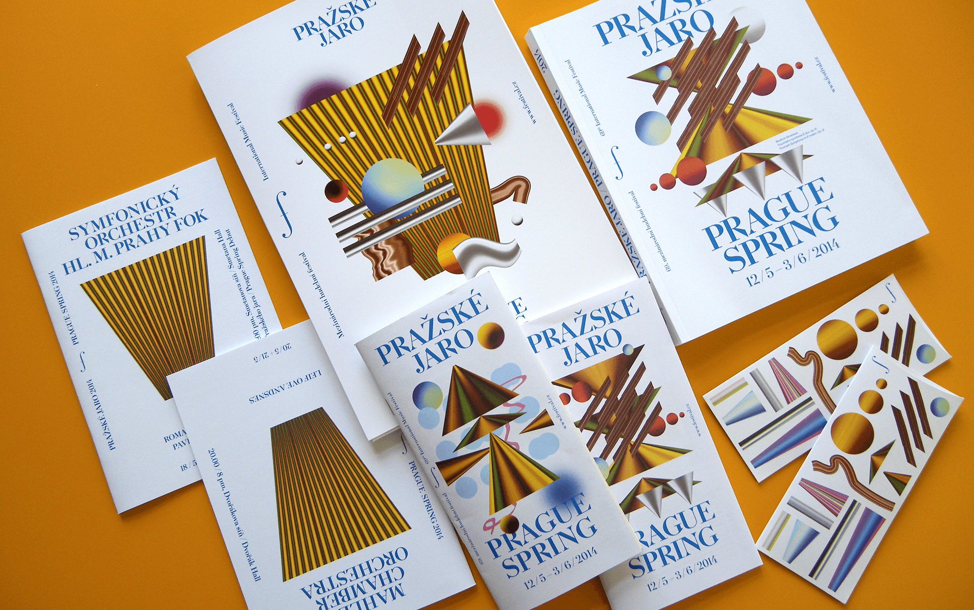
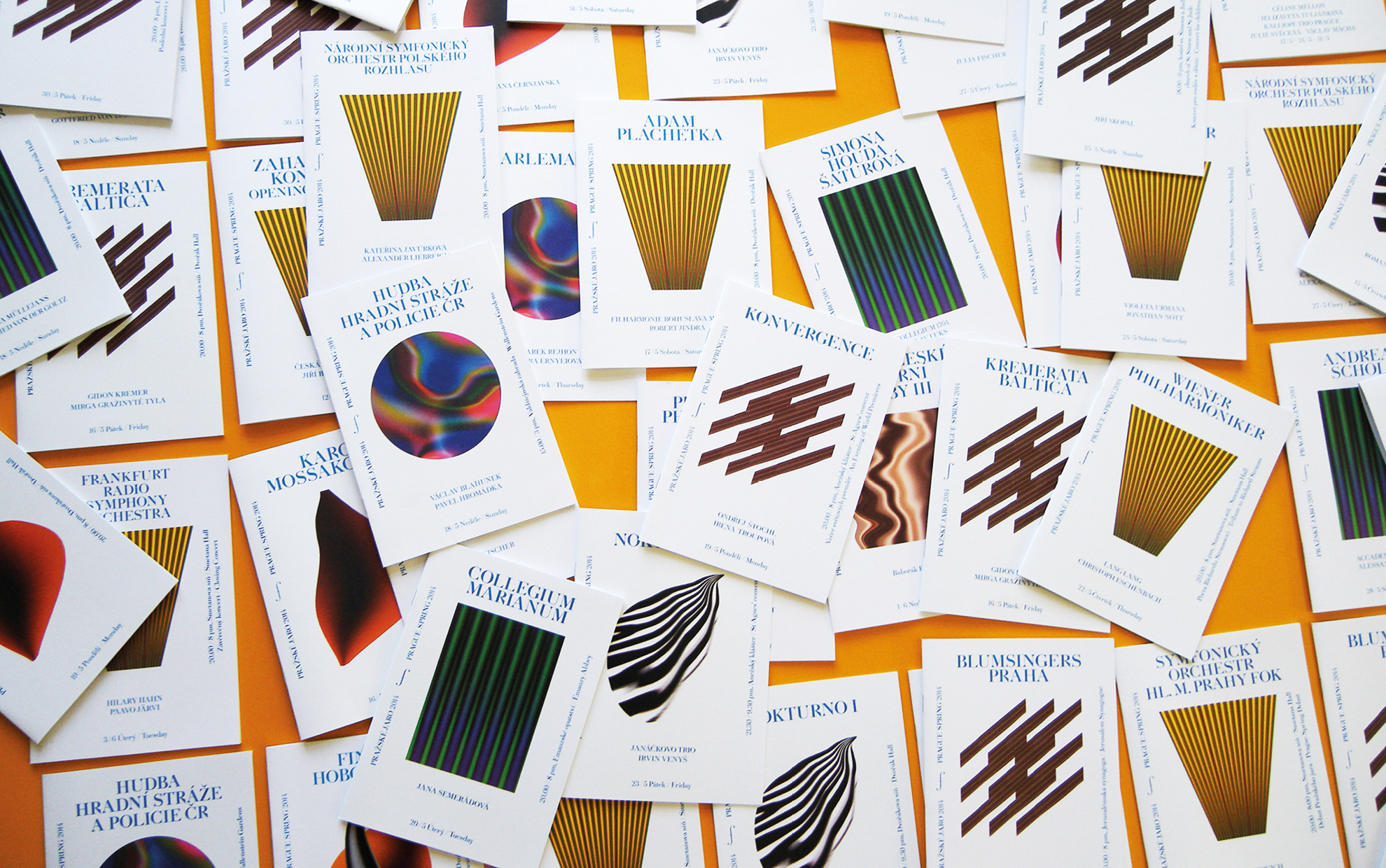
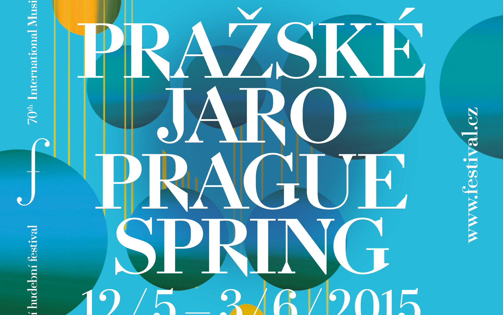
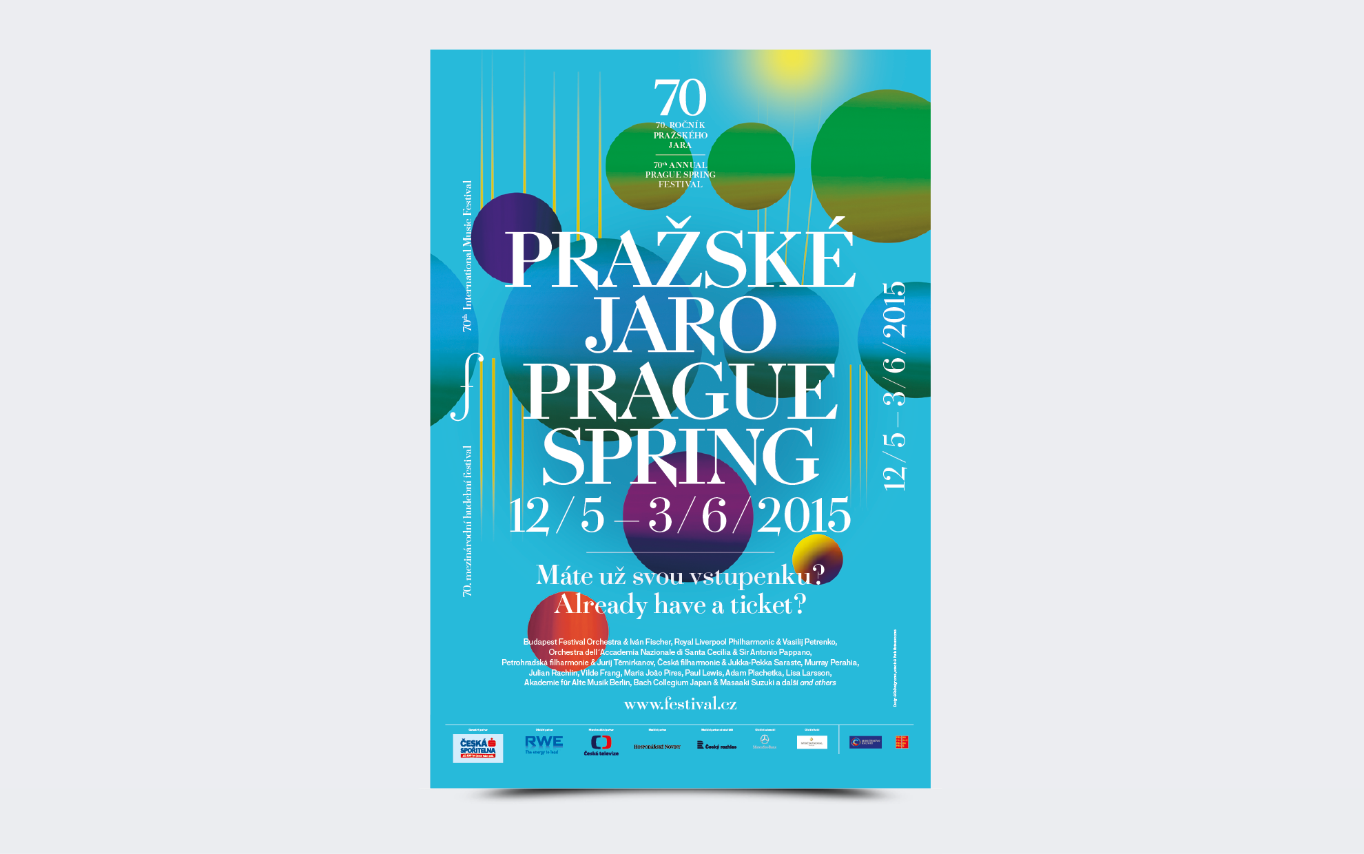
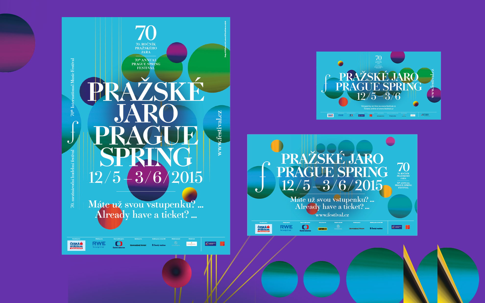
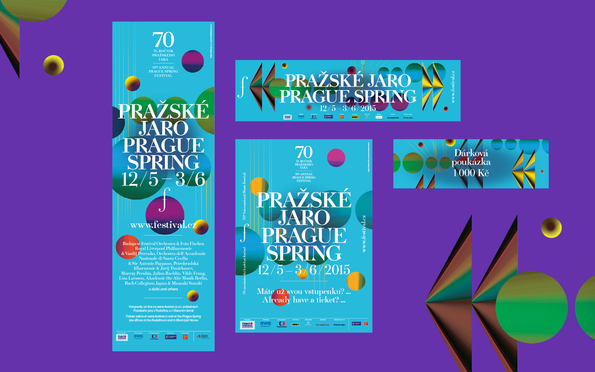
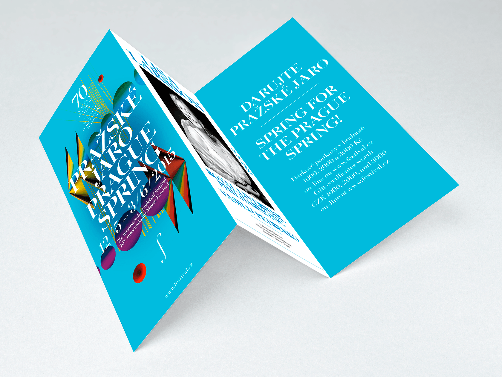
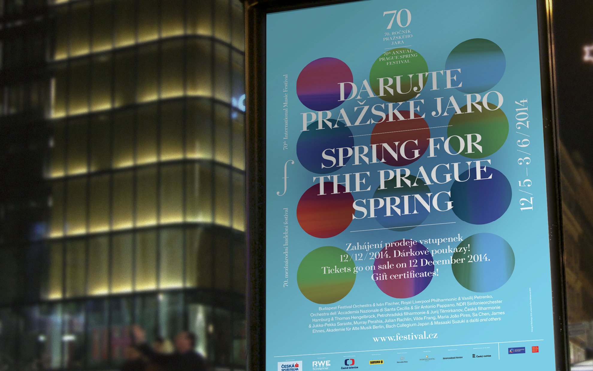
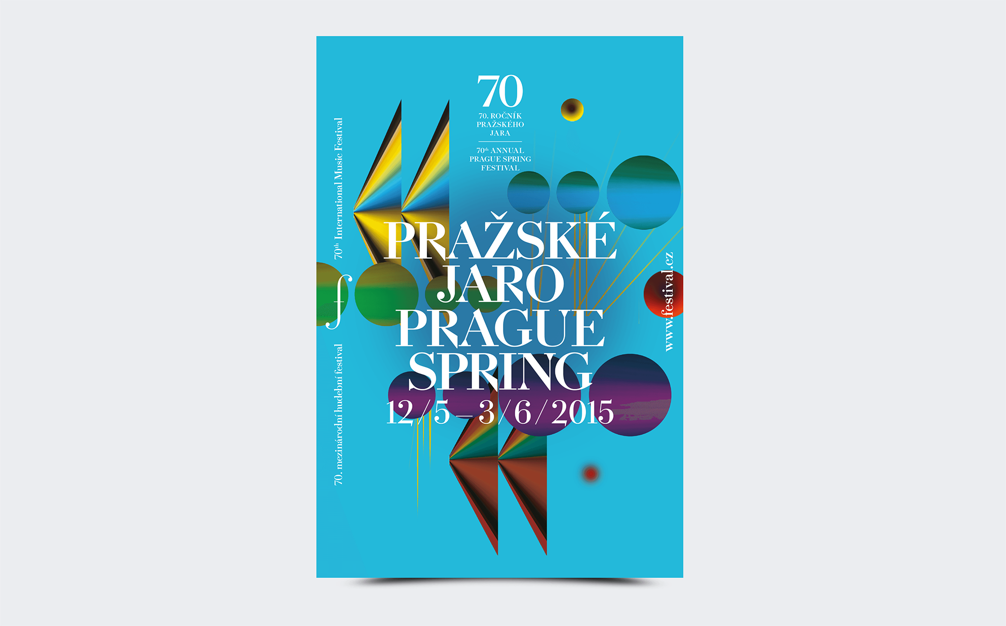
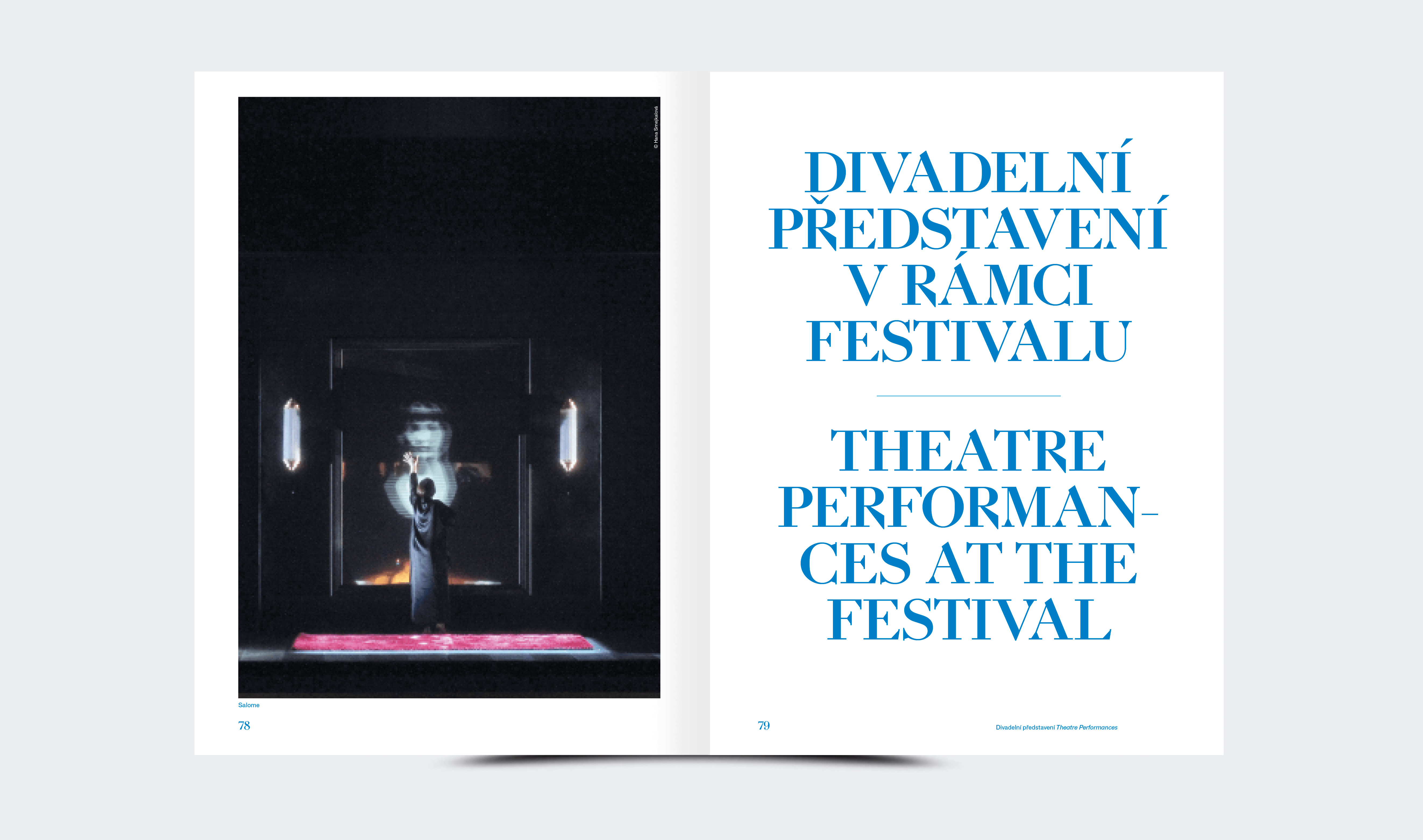
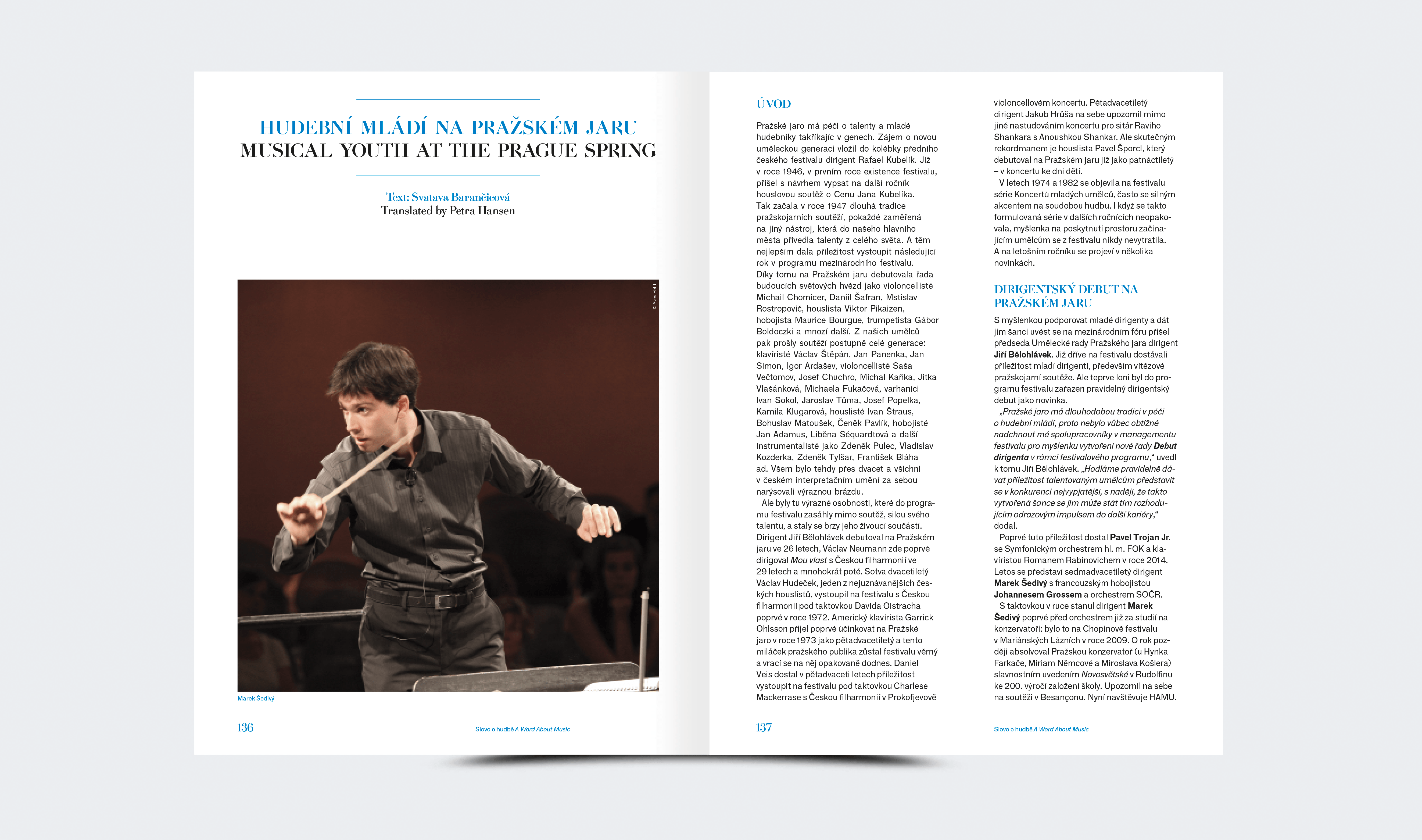
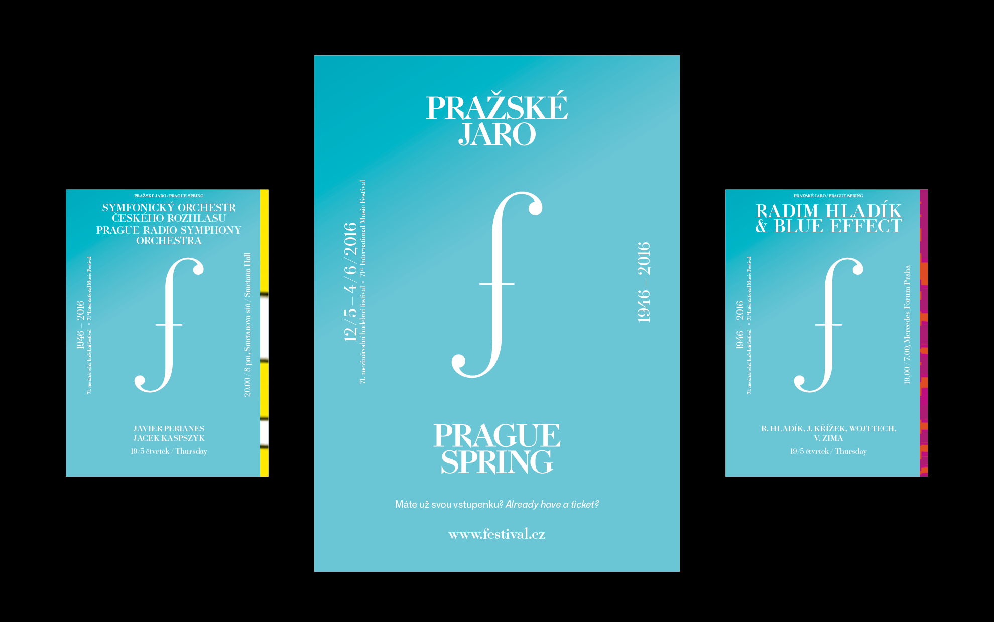
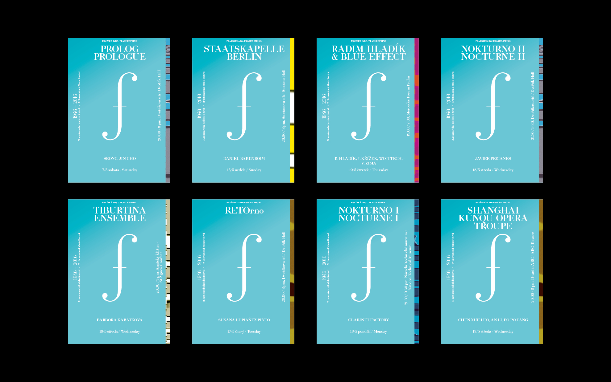
At the beginning of the concept is the idea of music transferred into the form of abstract visual emotion. As a co-creator of the visual, we chose Pavla Nešverová, who graduated in 2013 from the Academy of the Arts Architecture and Design in Prague at Professor Rostislav Vaňek, with the project Suita Animata. In it, she convincingly showed that the perception of music can also be expressed in visual form.
This is how we proceeded. With the help of a system of graphic elements, we first created a swatch of individual musical instruments, including a tonal color scale – we were inspired by avant-garde artists inclined to musical abstraction (orphism, kinetics, Kupka, Pešánek). From the graphic symbols, we then created visual compositions parallel to the musical ones. Since the festival is associated with the spring period, we let the visual play out in vivid colors and created a kind of “concerts for the eye”.
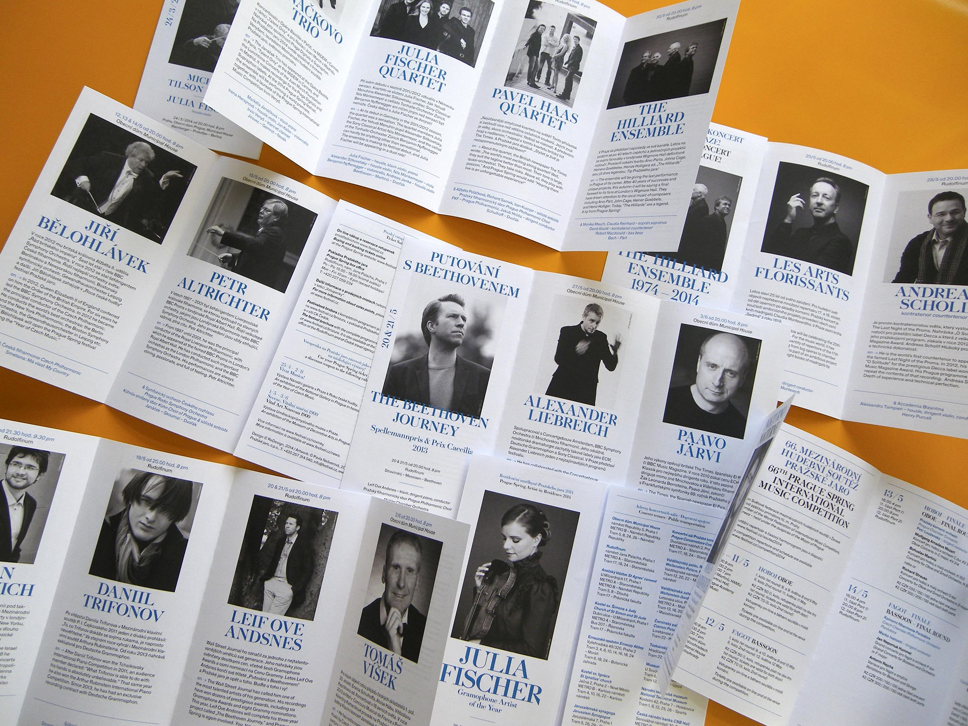
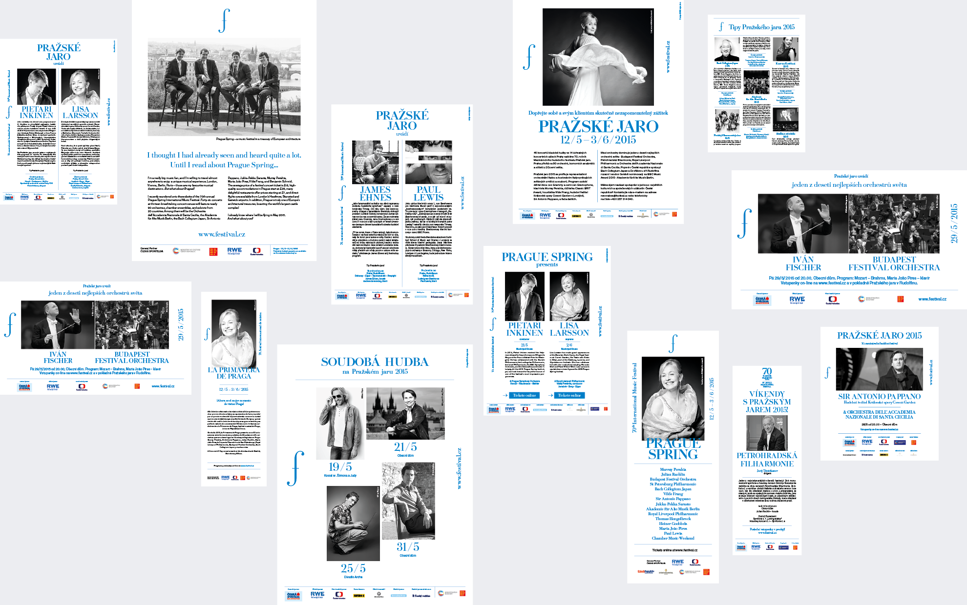
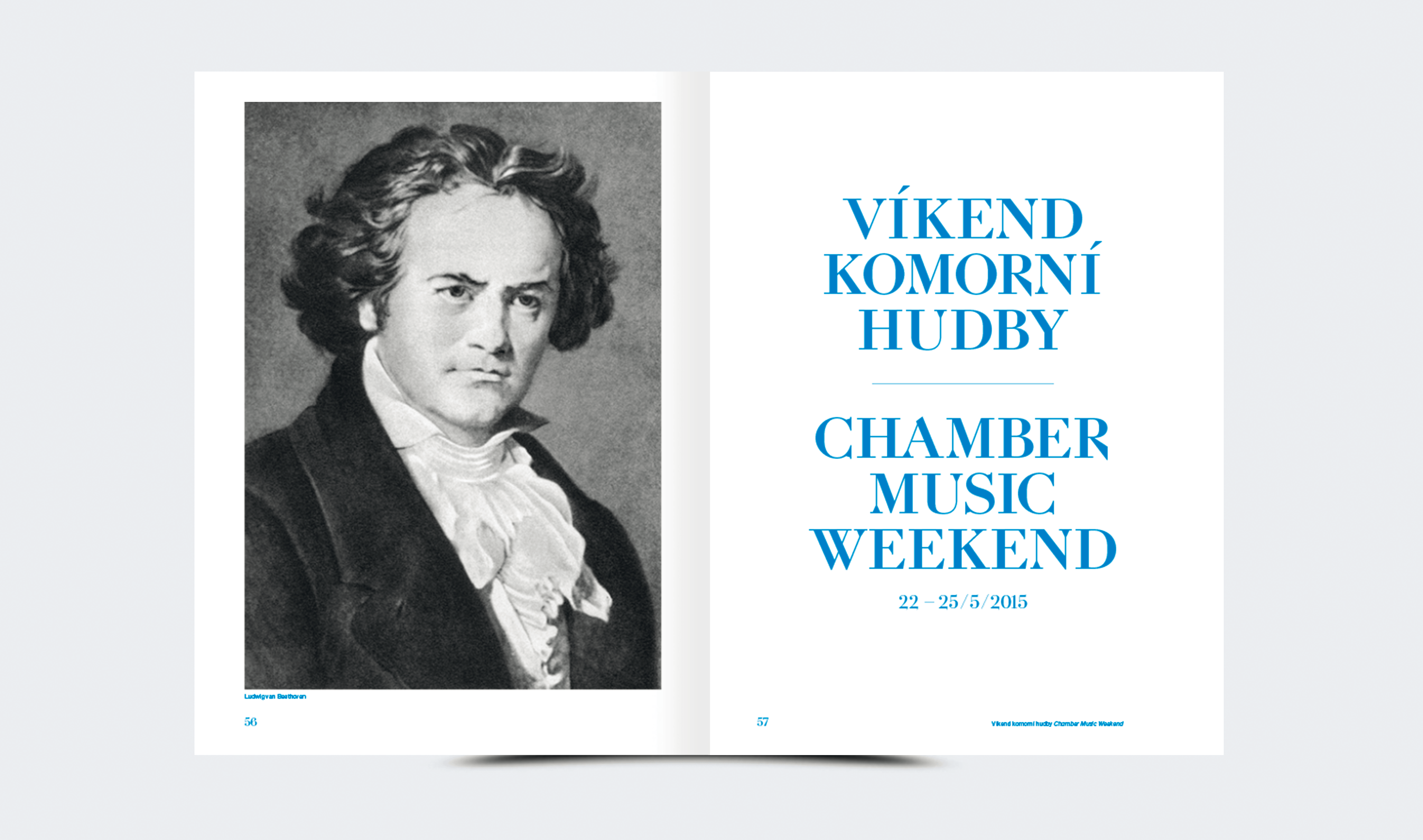
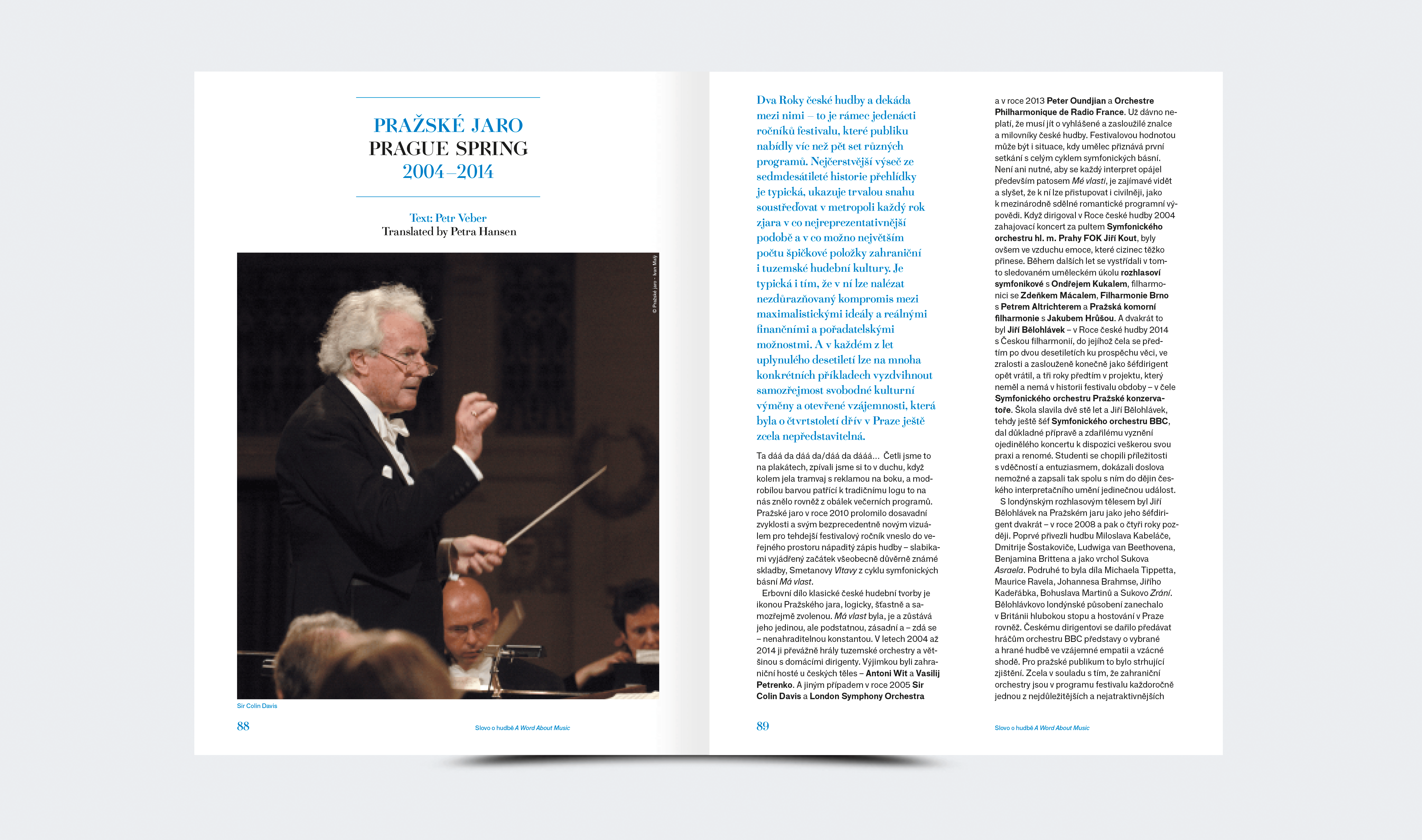
For the year 2014, the compositions are based on the basic white color. We combined them with black-and-white photographs of the performers and used blue font. The logo sticks to the corporate colors of the Prague Spring – blue and white.
Artwork: Pavla Nešverová
Collaboration: Anežka Ciglerová, Petr Krejzek, Martin Groch, Jan Horčík,
Jan Košátko, Barbora Klimszová, ReDesign
Font: Gletscher, F Grotesk
Client: Prague Spring ops.
2013