WorksWeb Design
Brick web 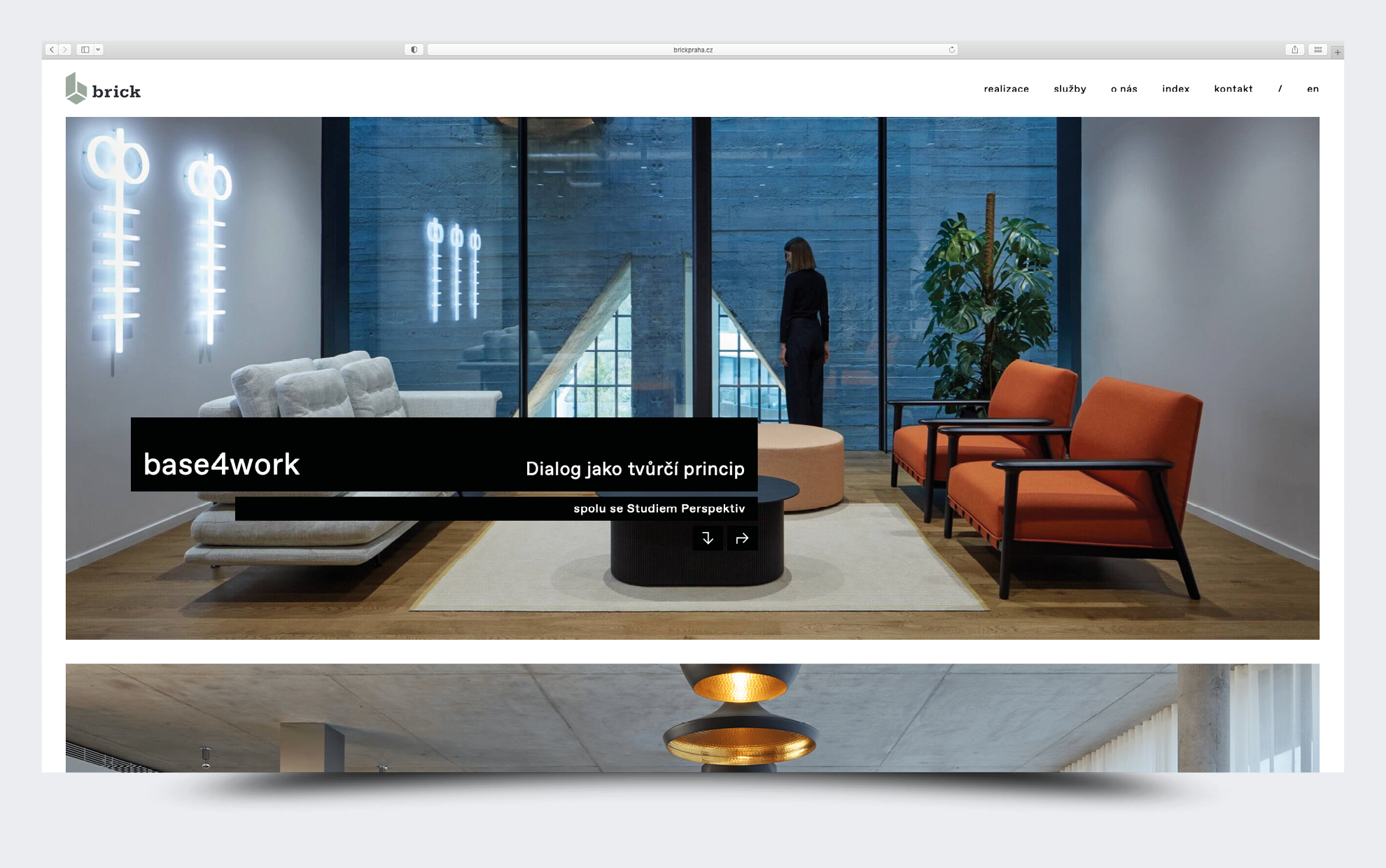
The new graphics for the Brick website came out of the company's needs. Brick has had many beautiful implementations, but they were poorly presented. We wanted to design an adequate image gallery. We were inspired mainly by the websites of architectural studios, which we know from the Scasacia studio website.
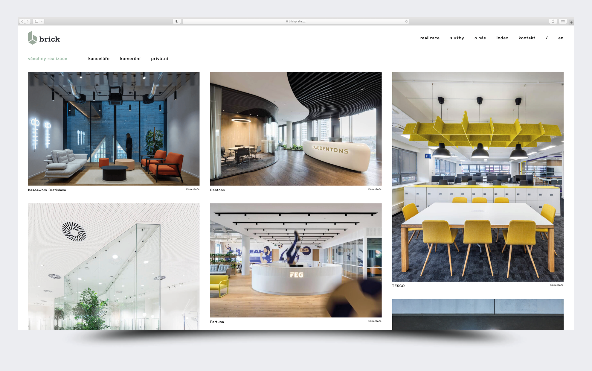
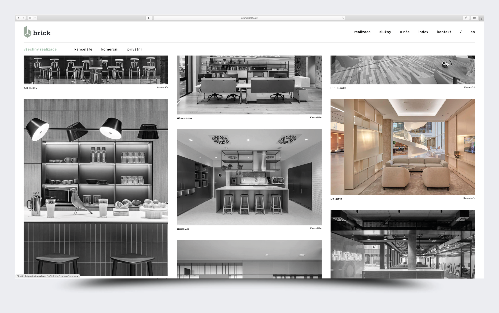
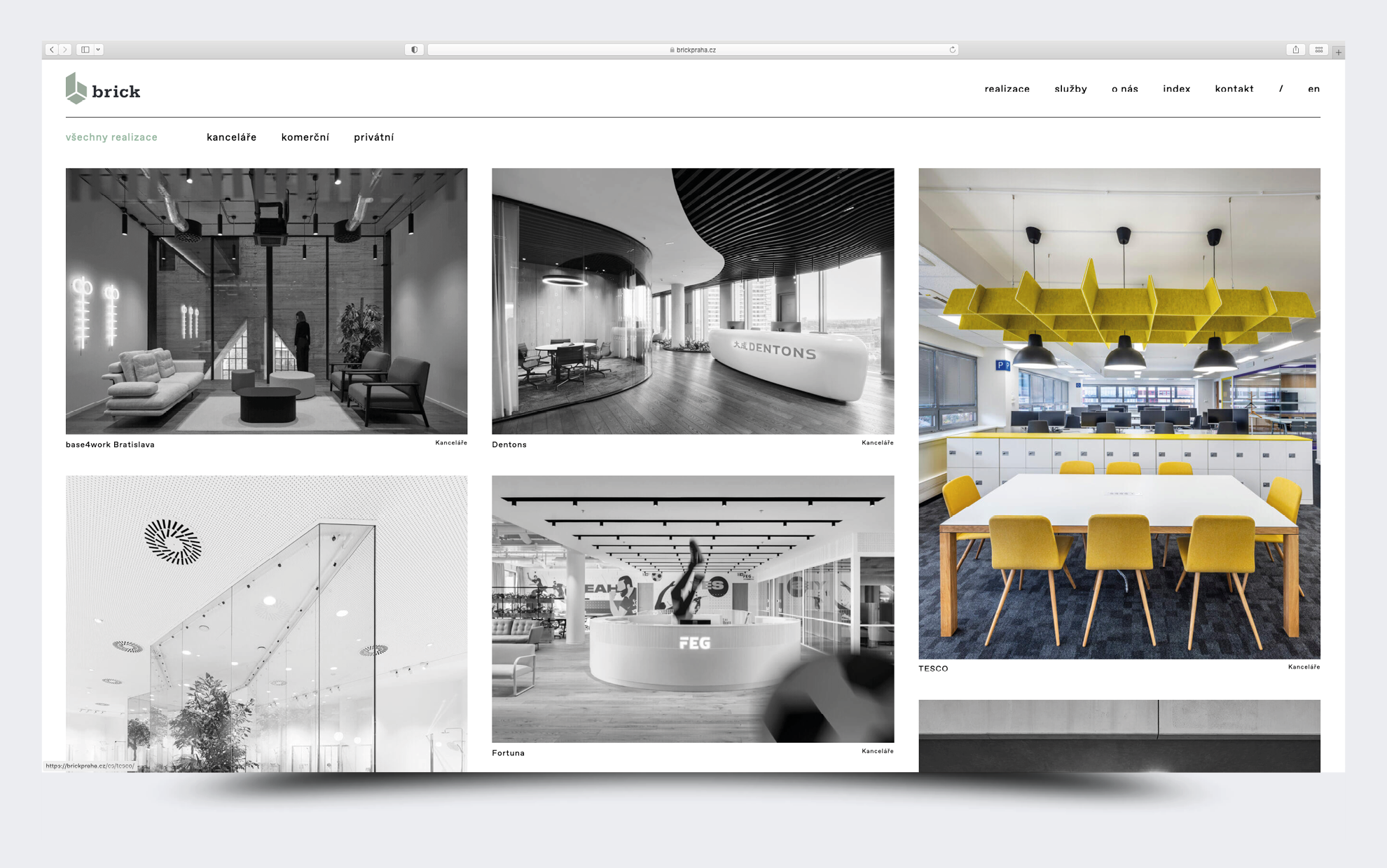
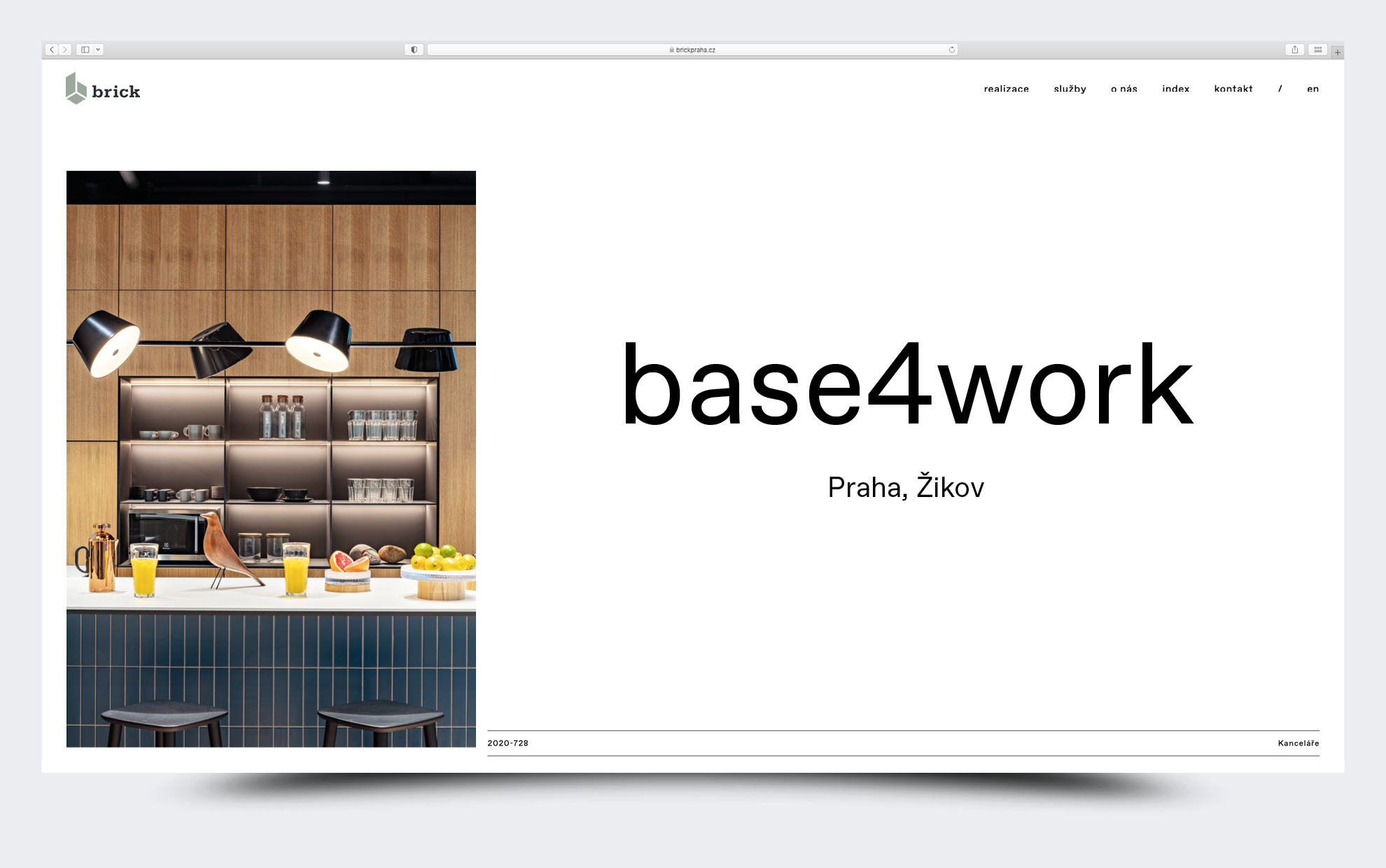
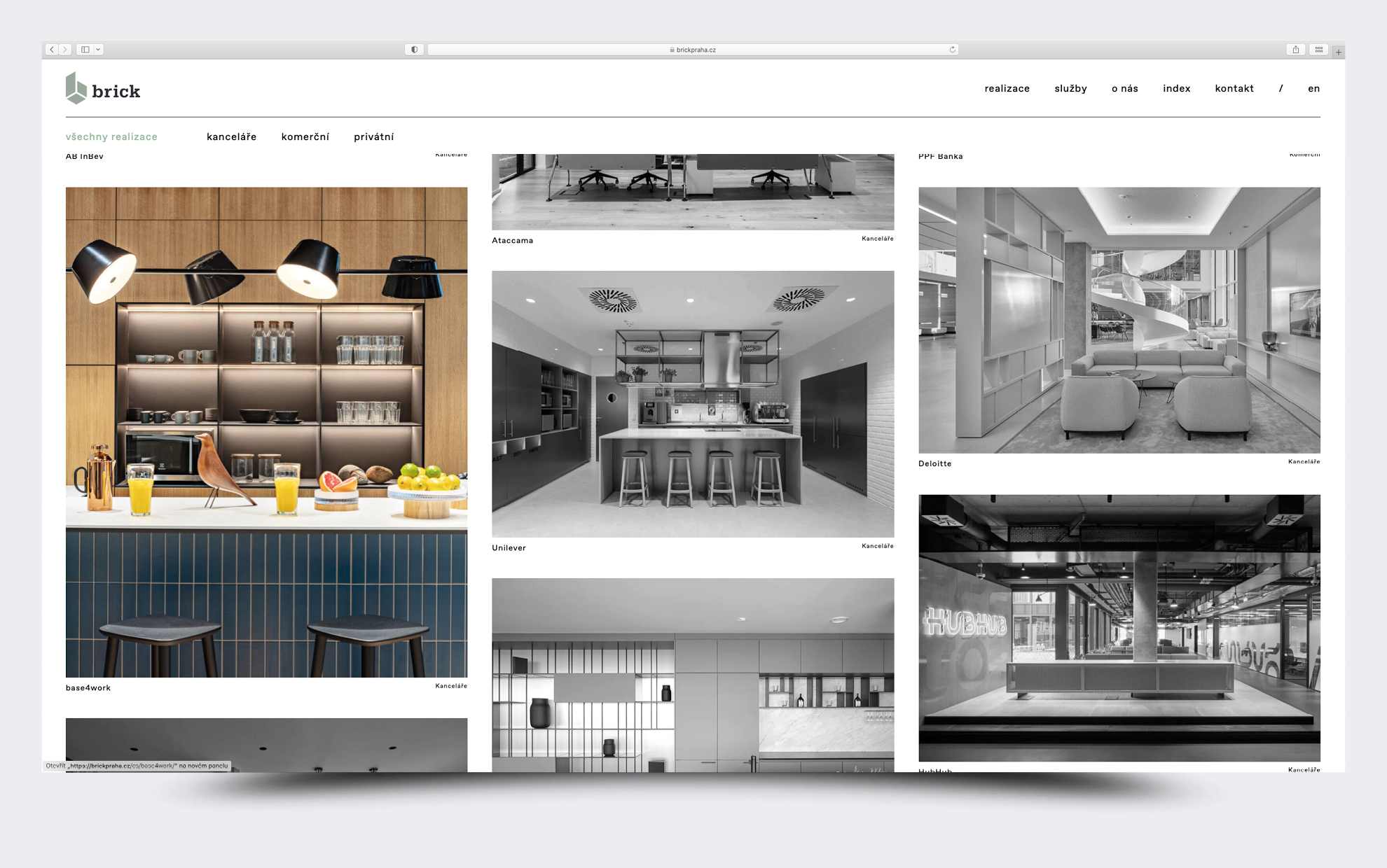
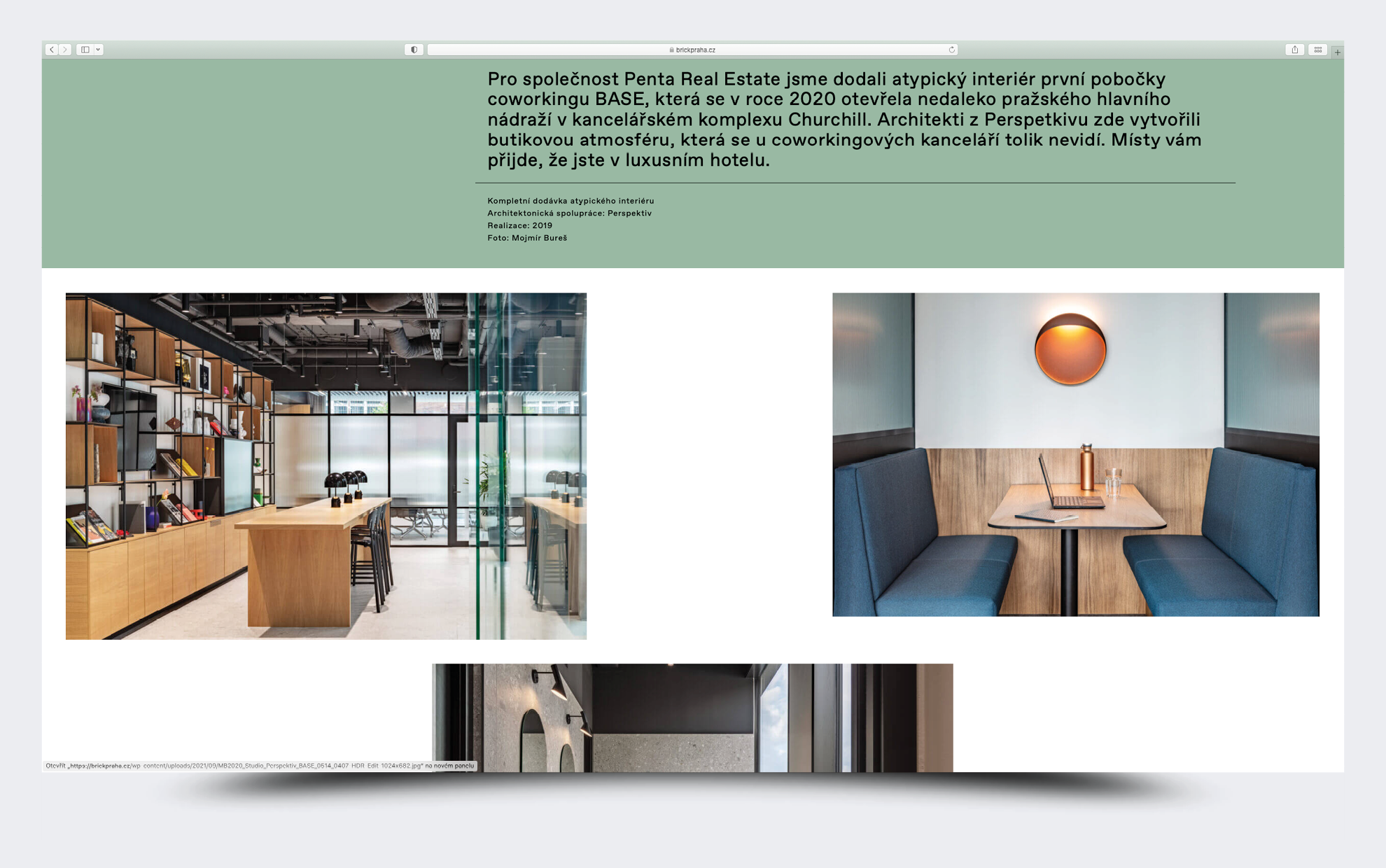
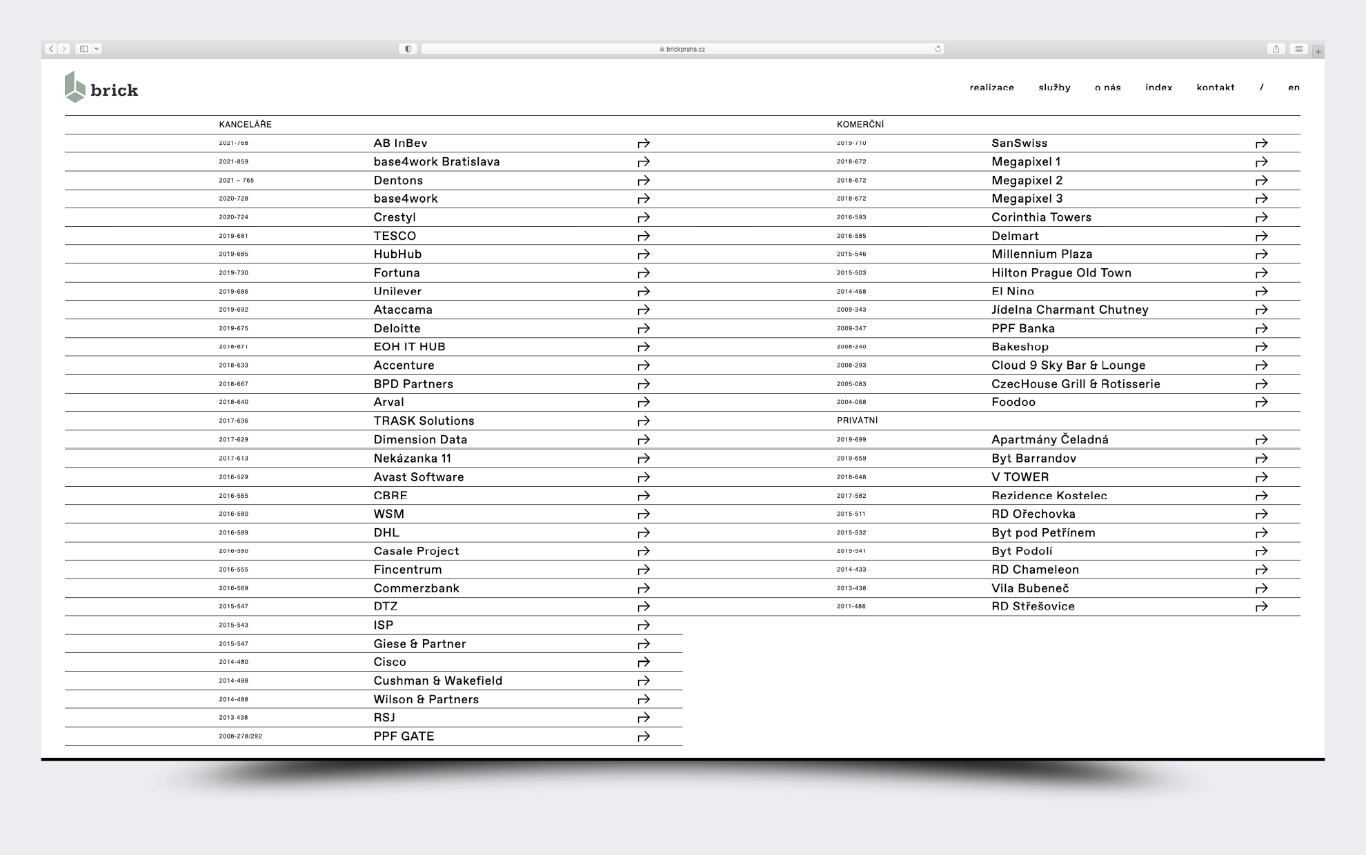
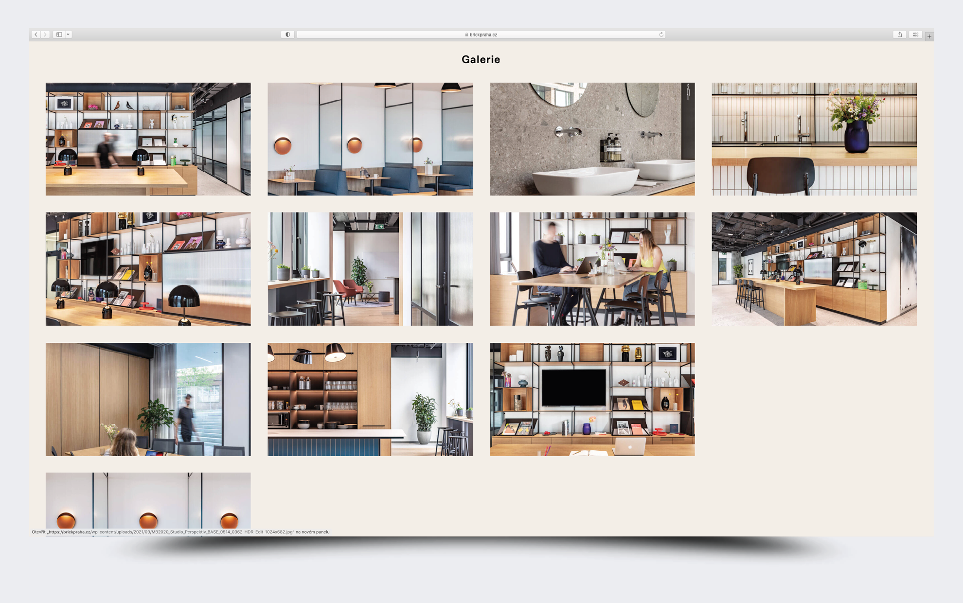
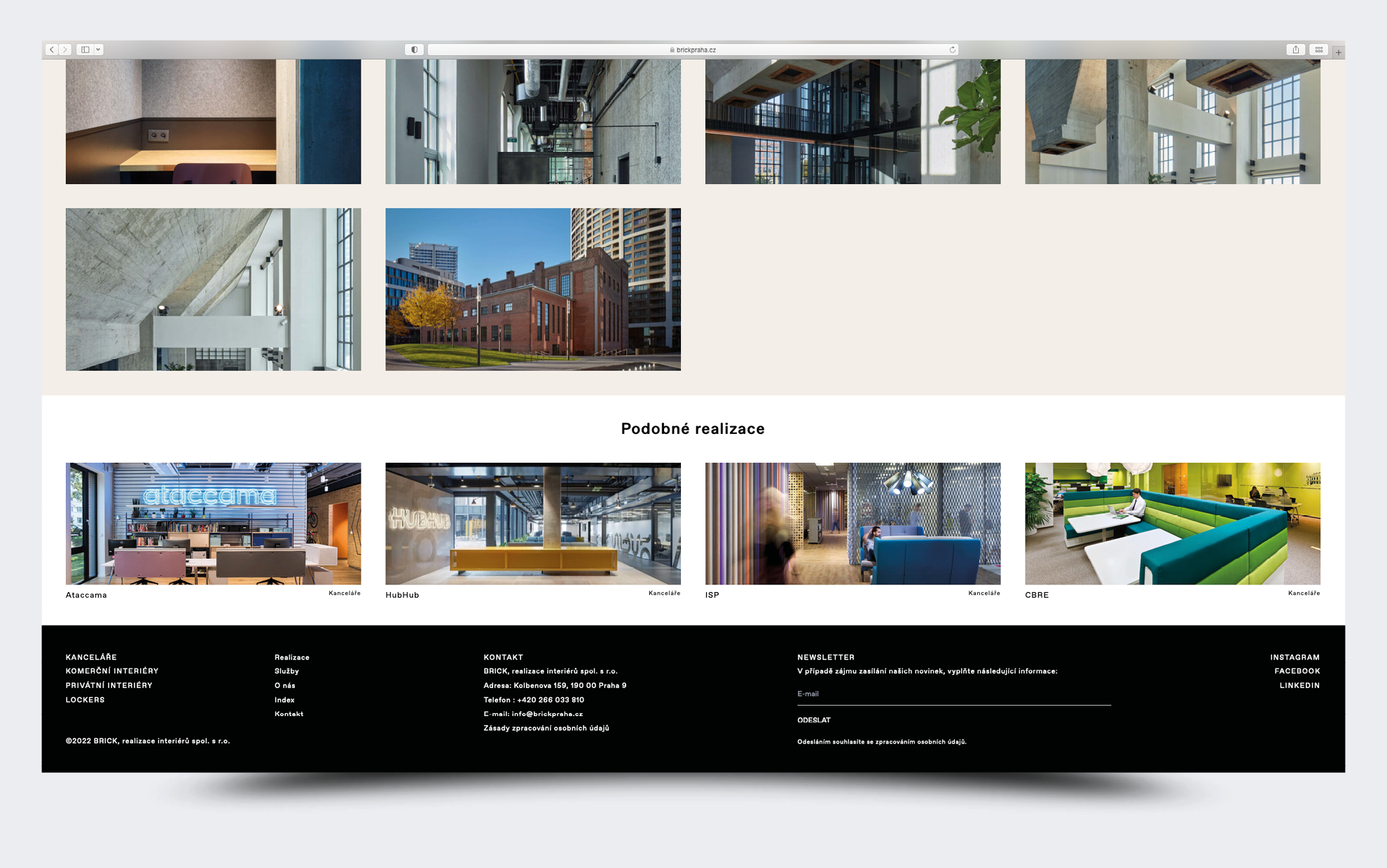
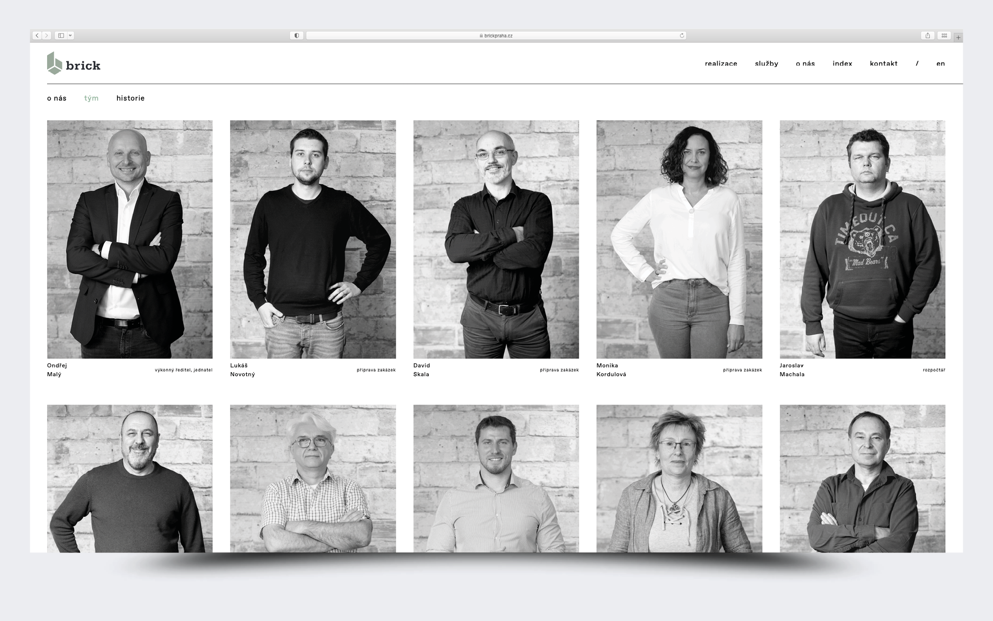
The website is designed on several levels. From the initial scrolling Home page, where animated captions are gradually added we get to the Gallery using graphically designed arrows. There we can clearly see the list of realisations side by side in a mosaic that changes colour when we click on a specific project, while the other projects remain in black and white. We alternate the height and width, it's more dynamic. Each realisation still has its own dropdown where the project detail is. The team of the company is beautifully photographed in black and white. The page contains additional layers of subpages, including an easily legible index. The website is a result of cooperation with Lebedová-Inger studio, which programmed the website.
Client: Brick
Web code: https://lebedova.inger.cz
Font: Favorit Pro
2021