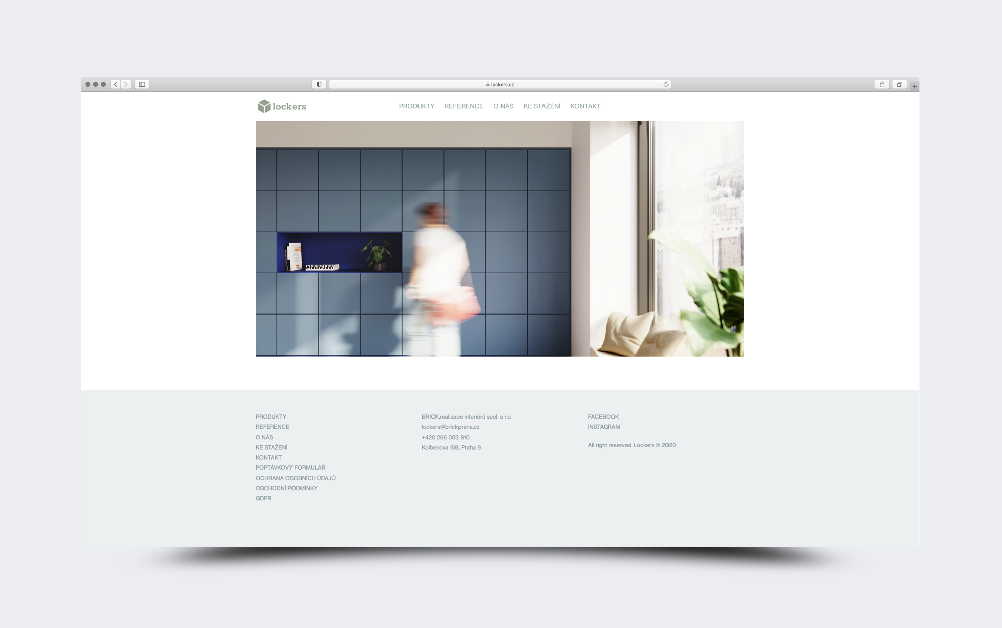
WorksWeb Design
Lockers 
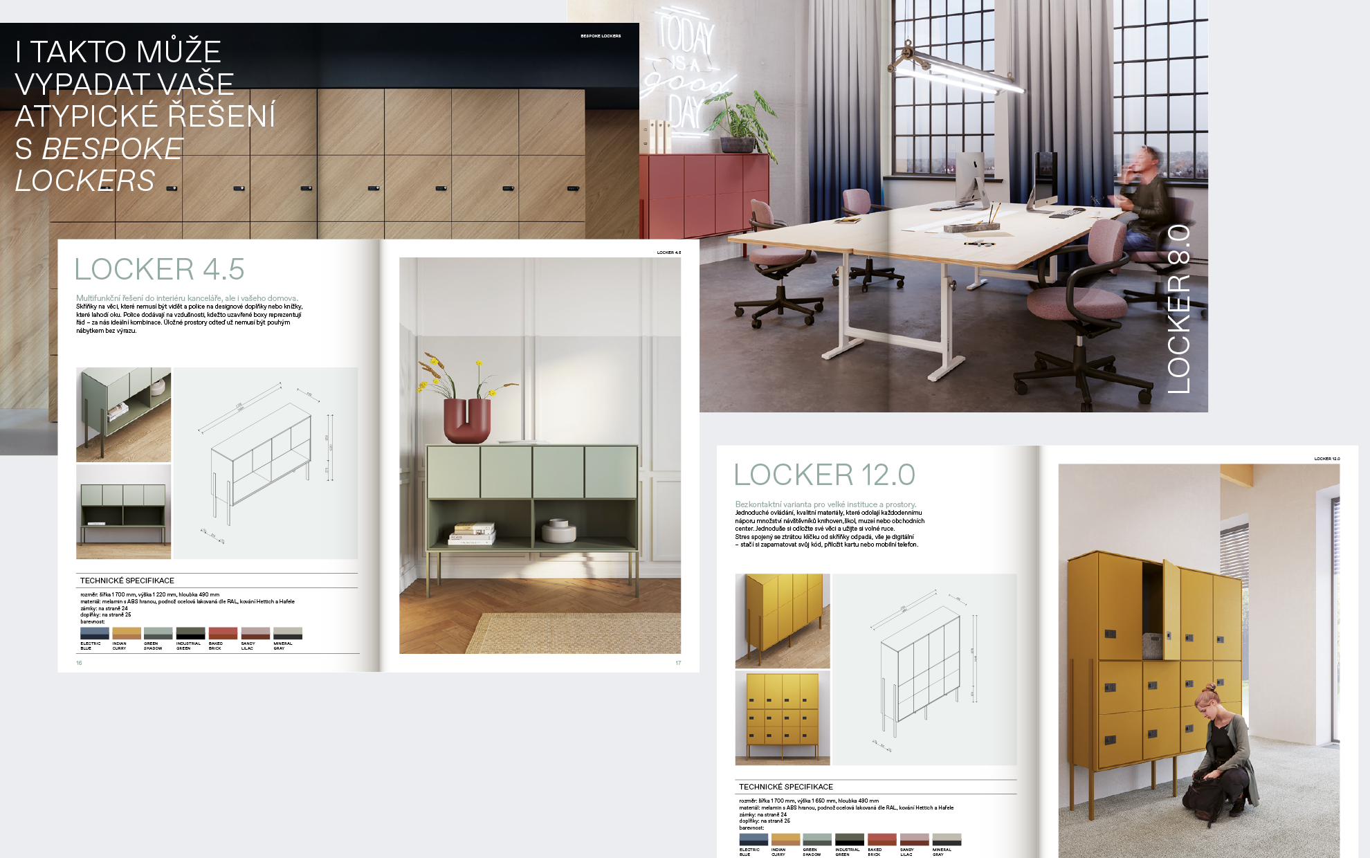
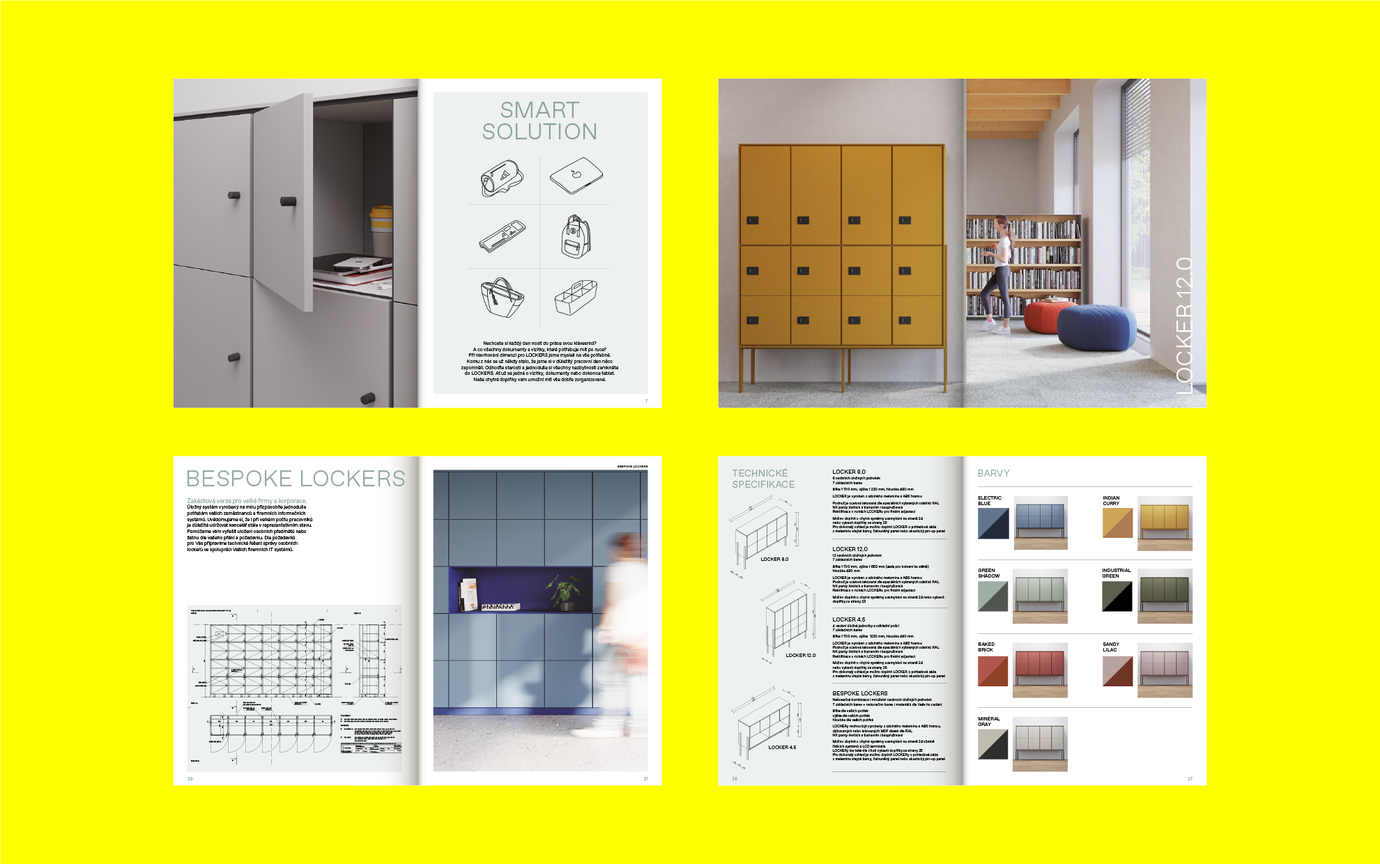
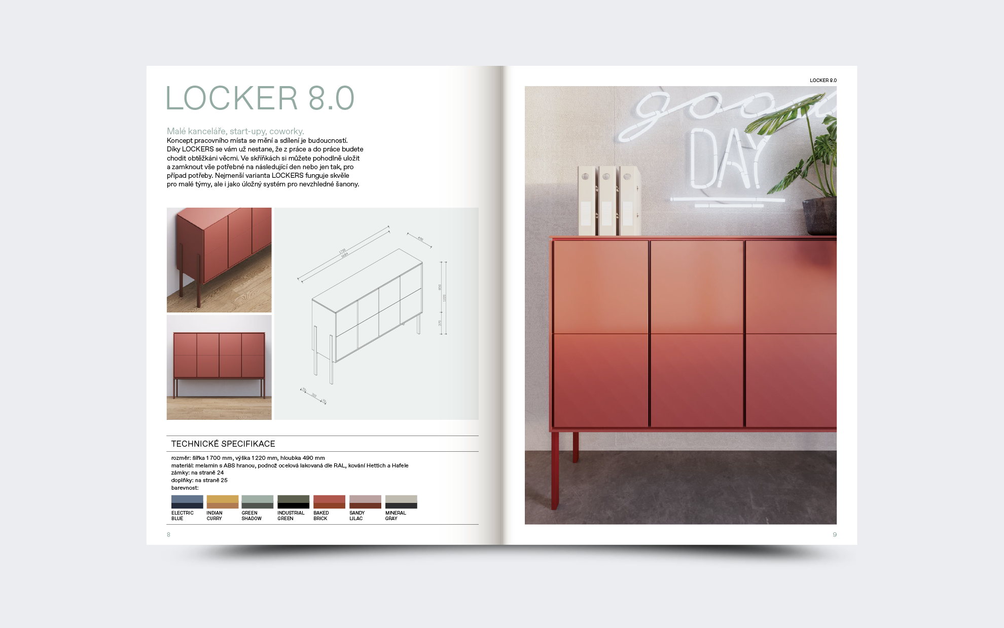
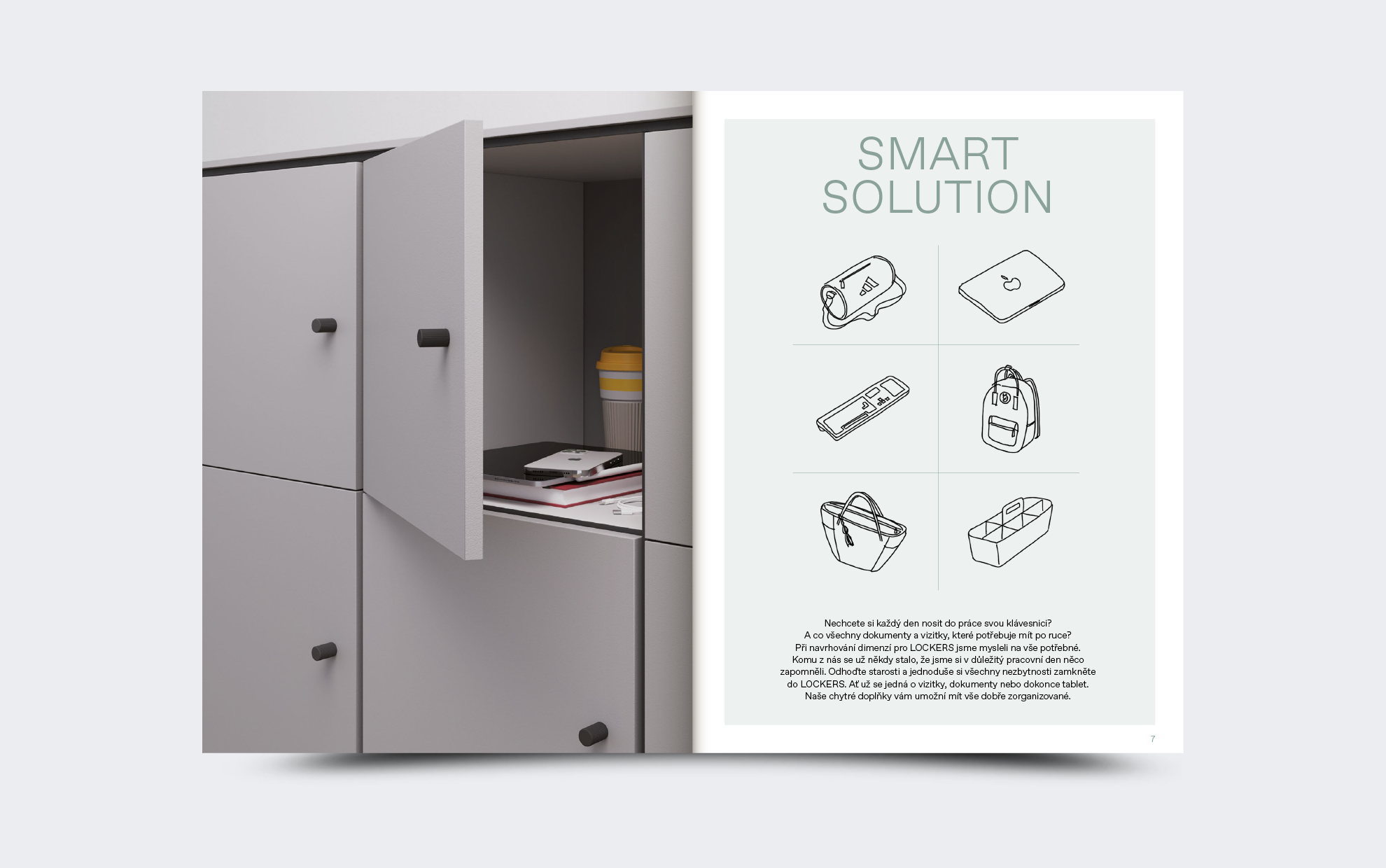
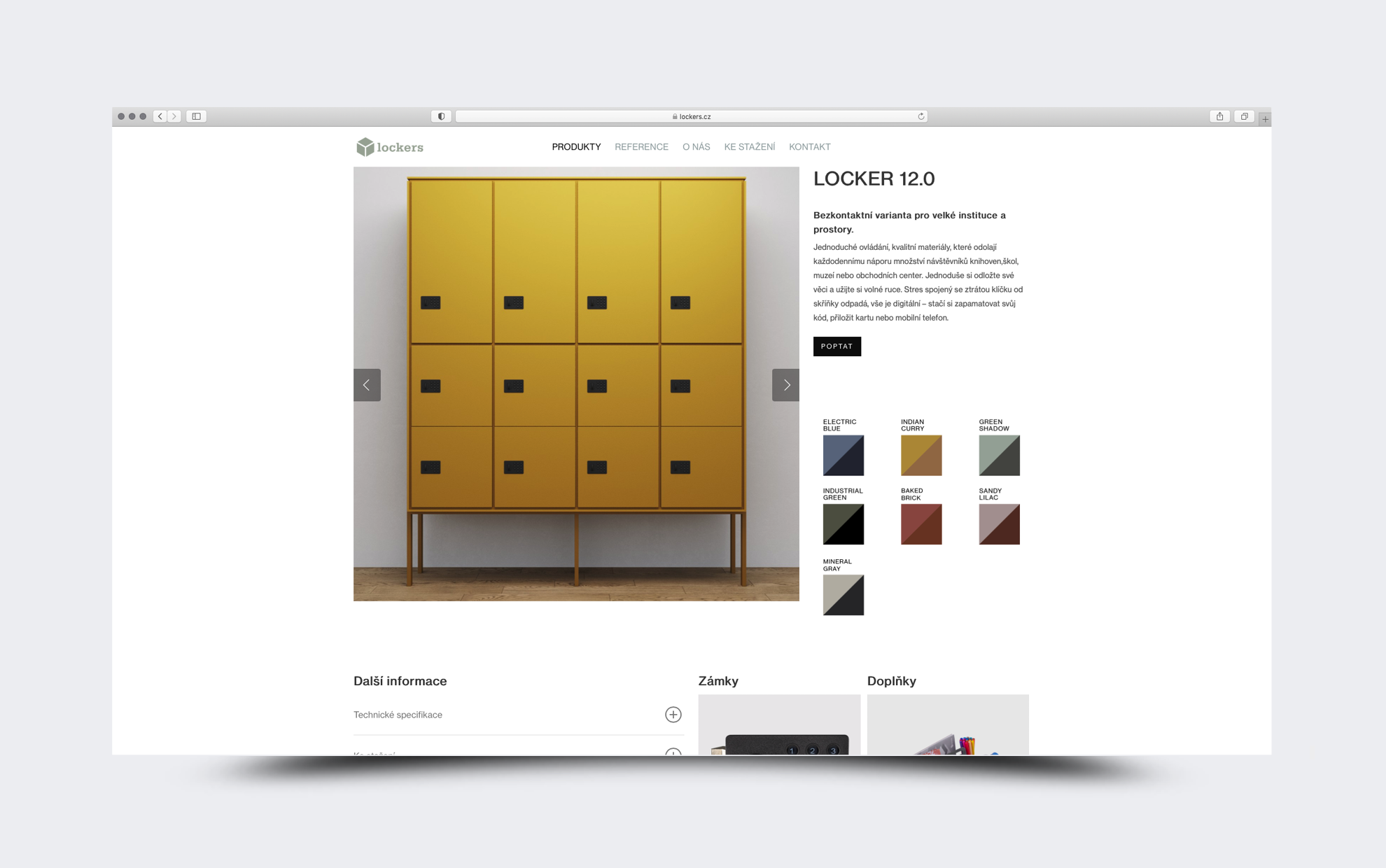
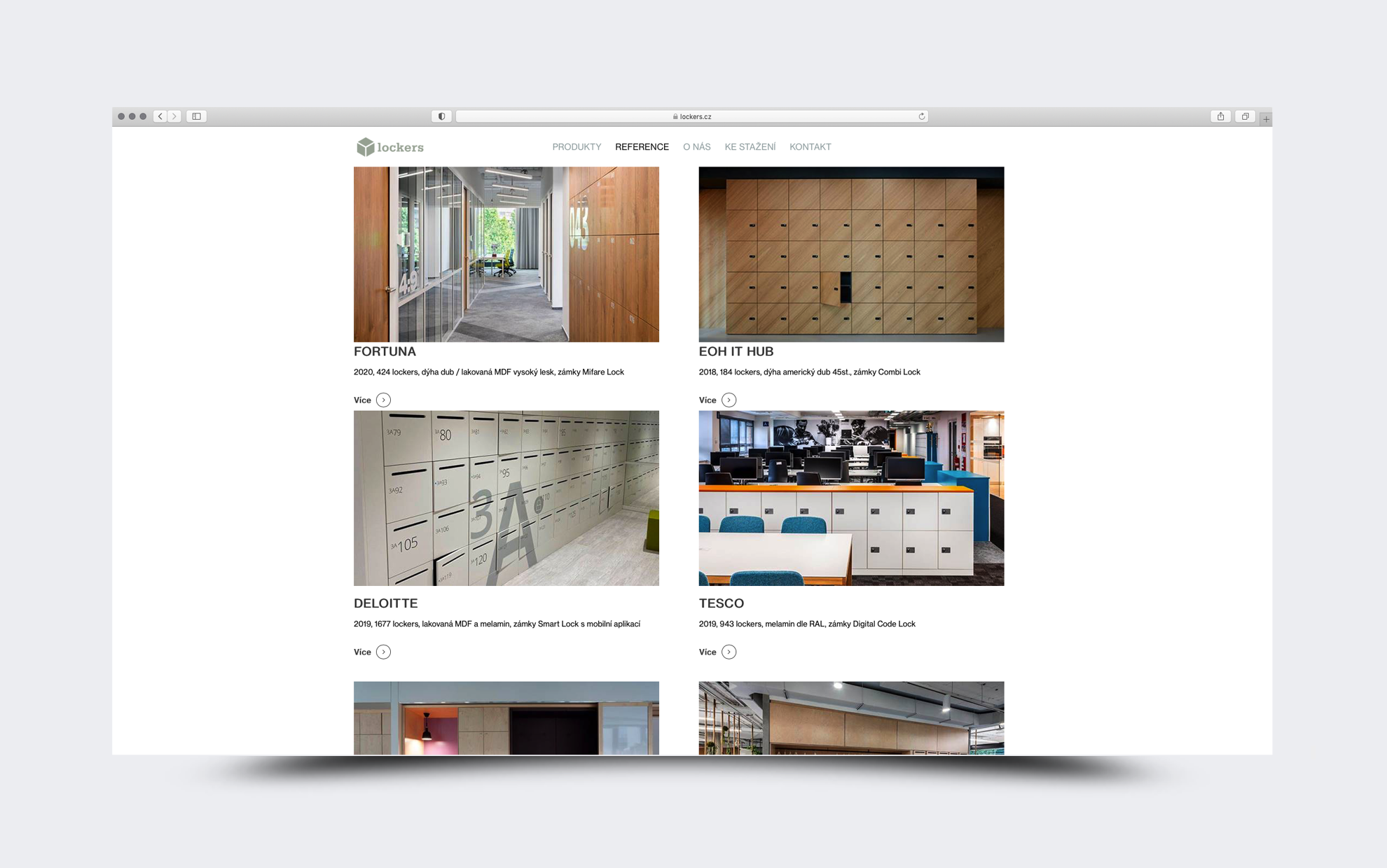
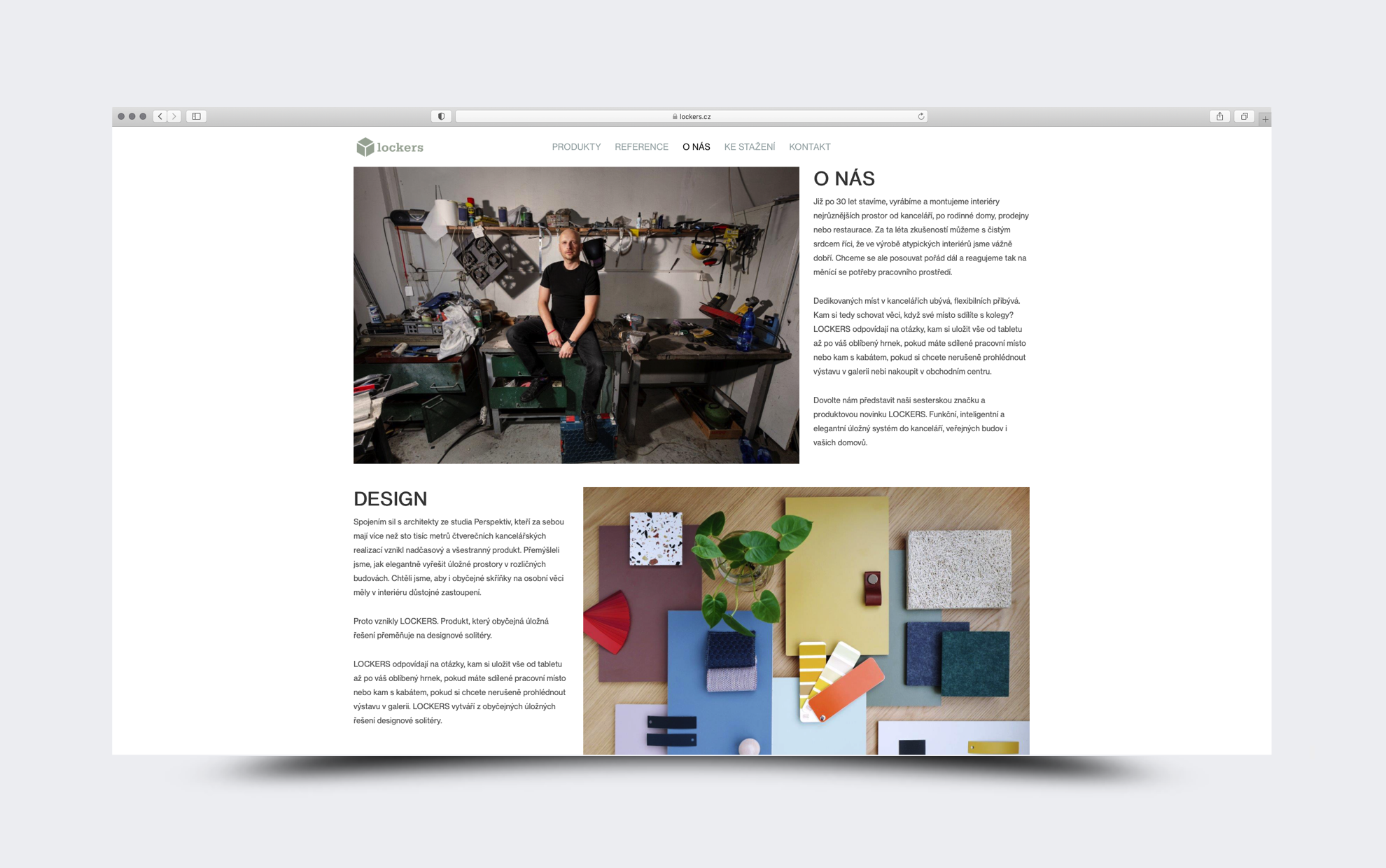
Lockers is a sister brand of Brick, focused on new atypical storage systems. The company is responding to the increase in the number of flexible jobs and has developed a functional, intelligent and elegant storage system for offices, public buildings, and households.
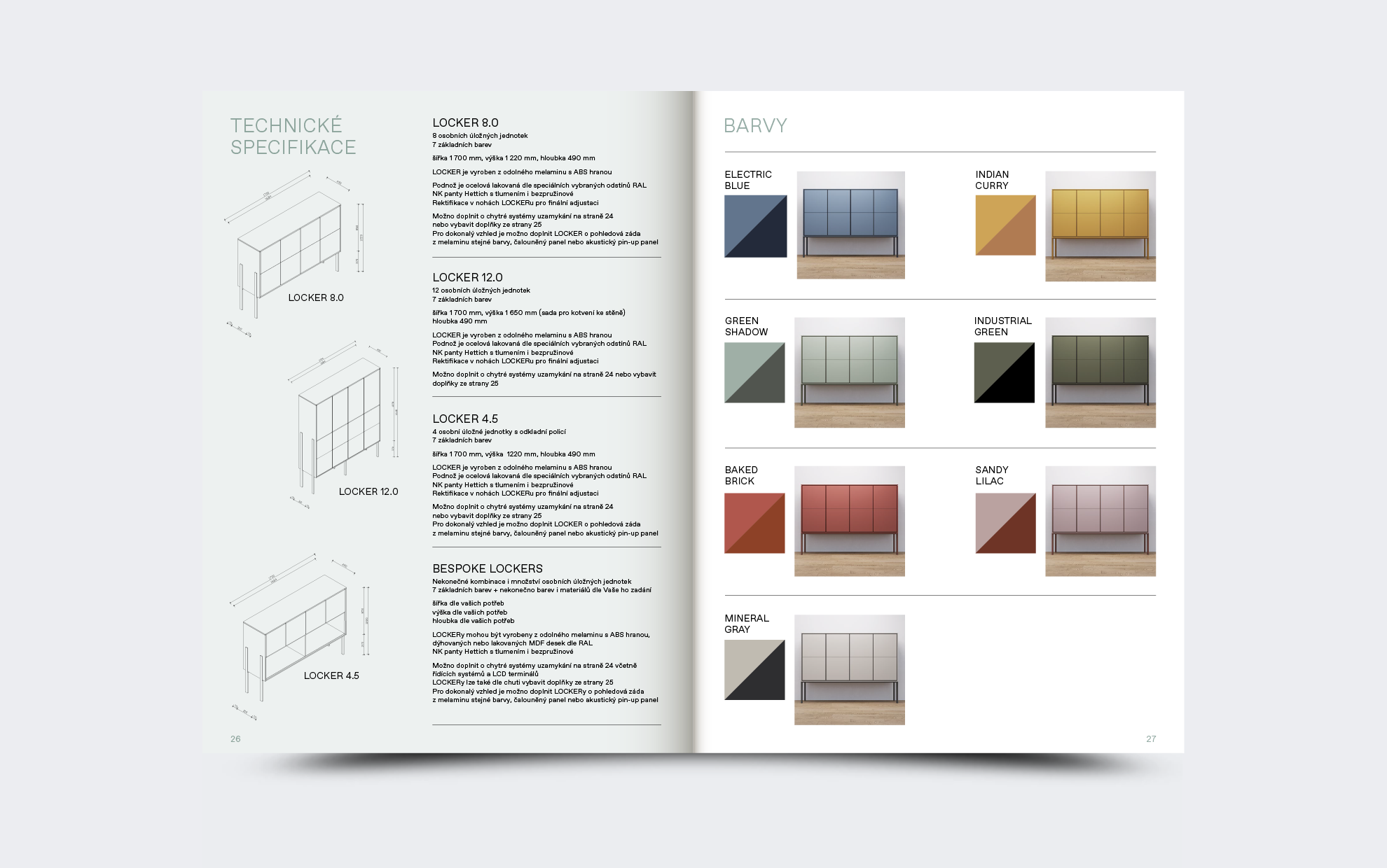
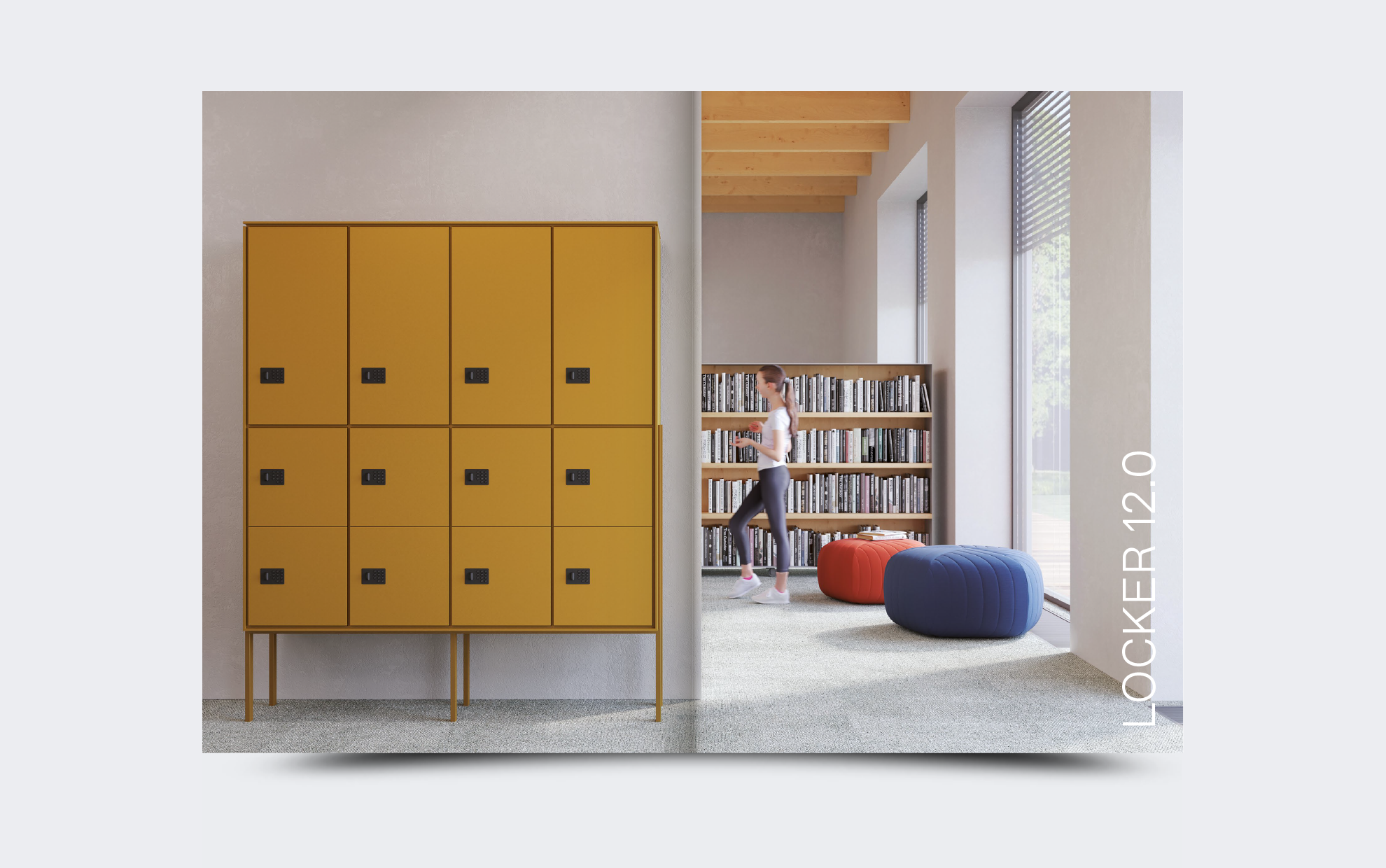
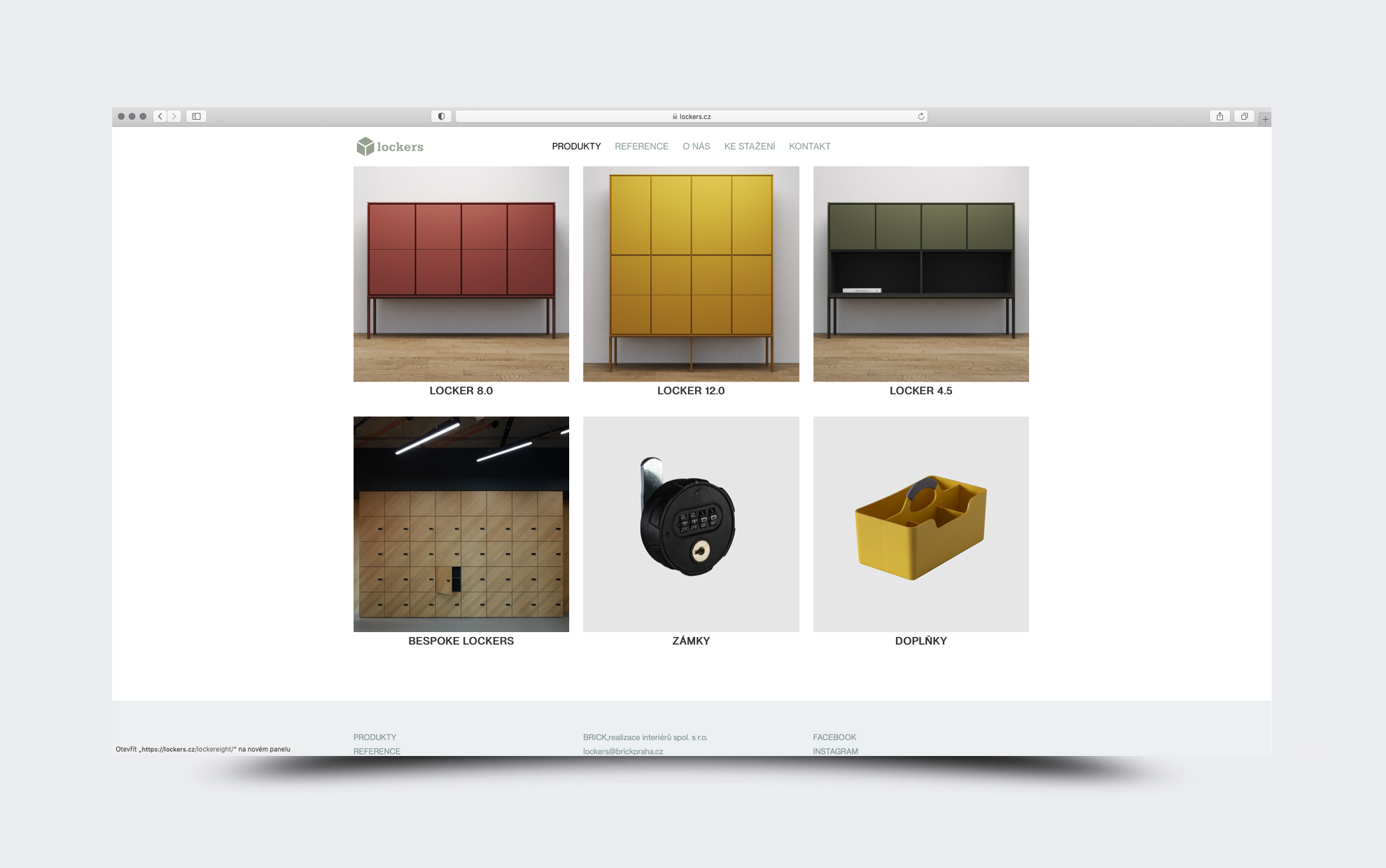
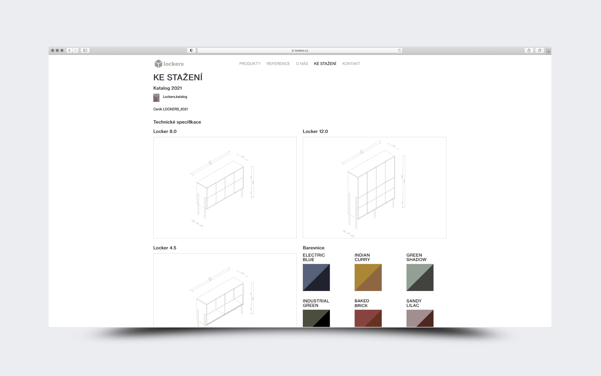
When designing the Lockers brand, we made a logo similar to Brick. We used the same font, only the symbol changed. The catalog is simply sorted by product type, using large renders created by the Perspektiv architectural studio, co-authors of these design solitaires.
Client: Lockers
Font: Favorit Pro
2020