WorksWeb Design
PHAP 
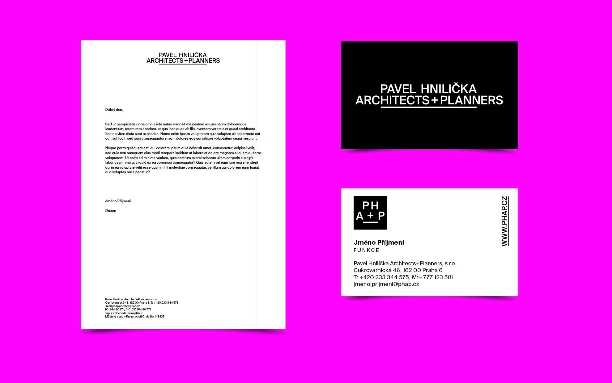
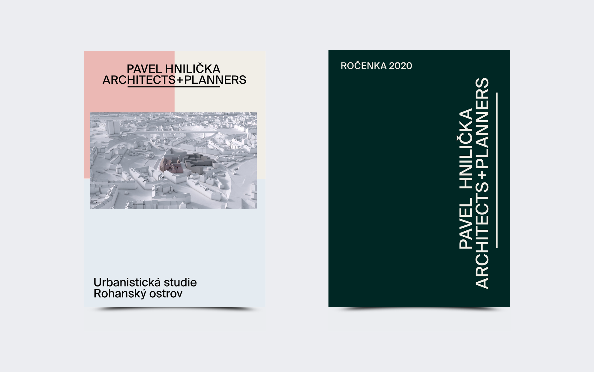
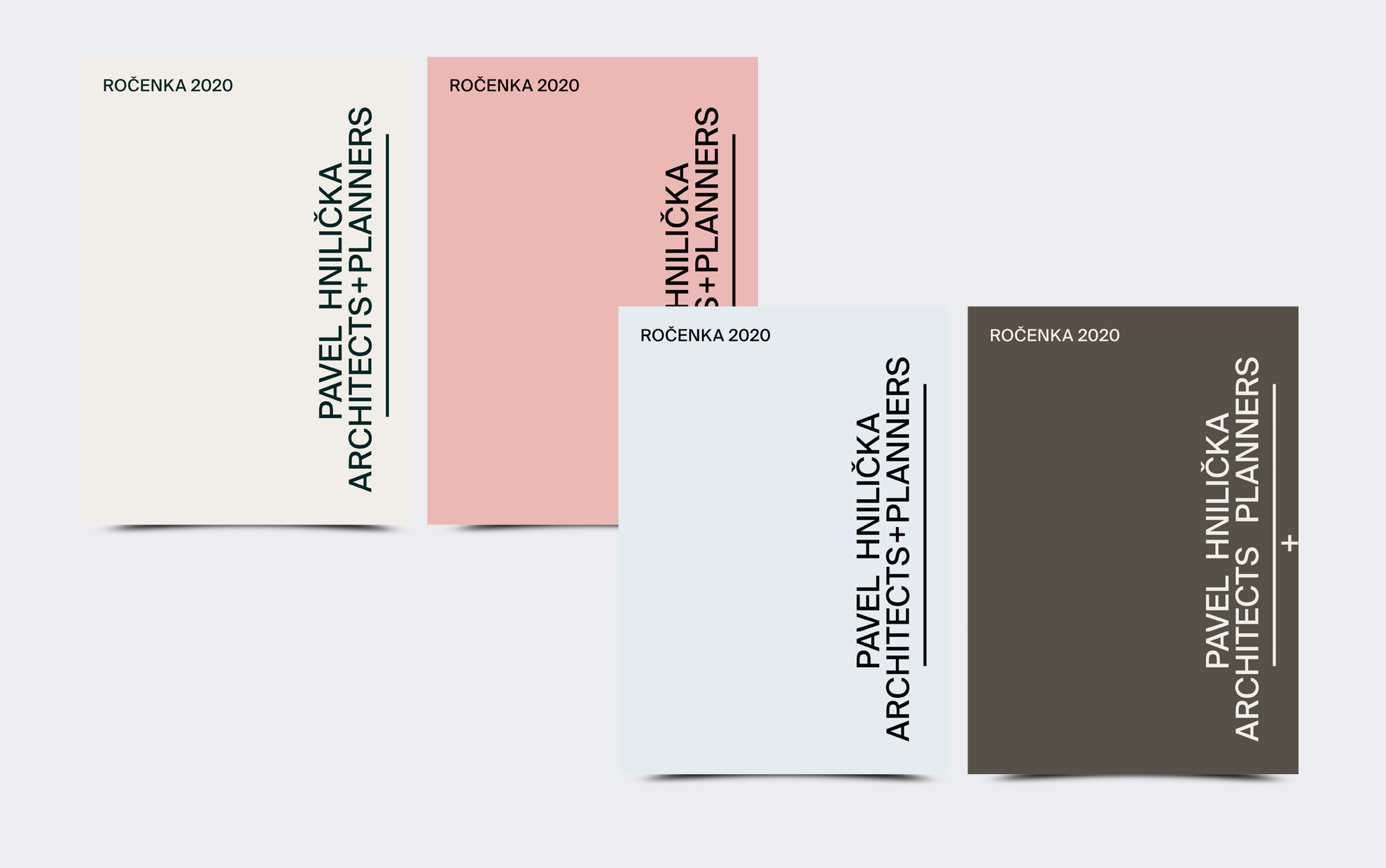
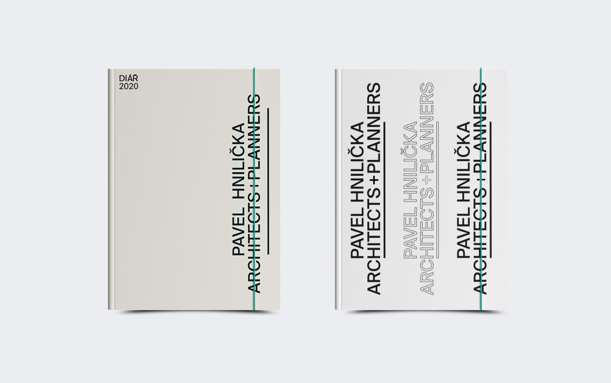
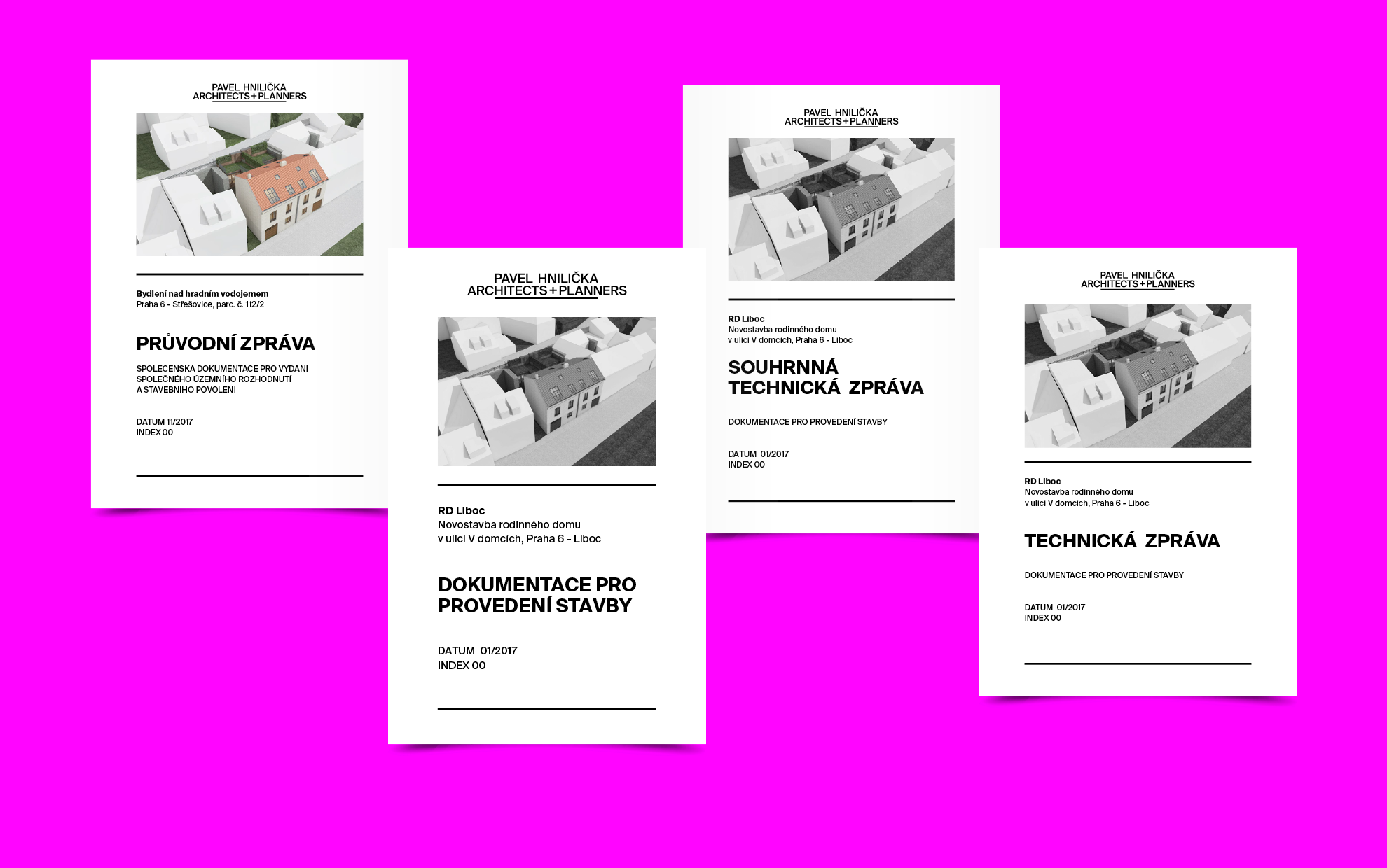
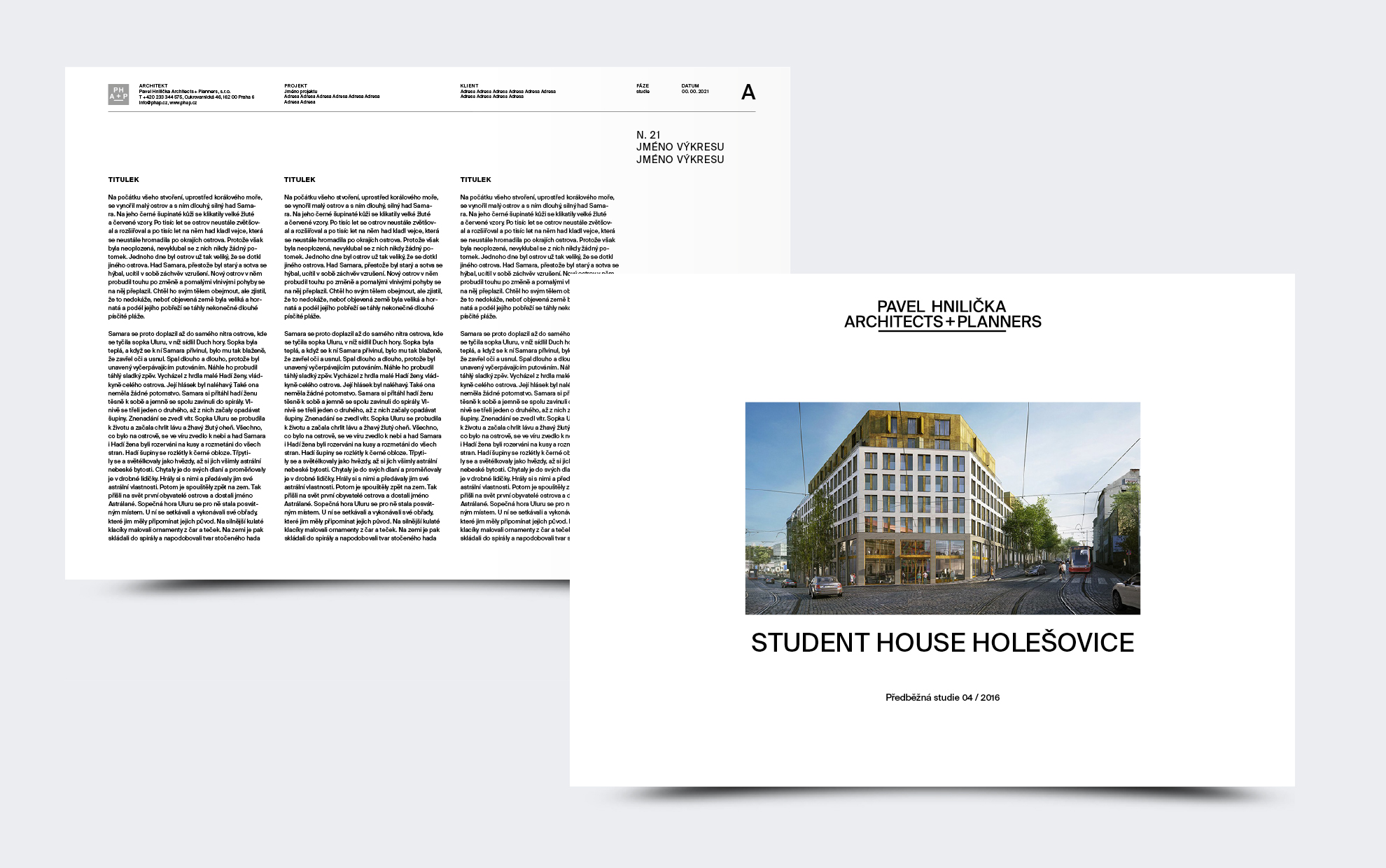
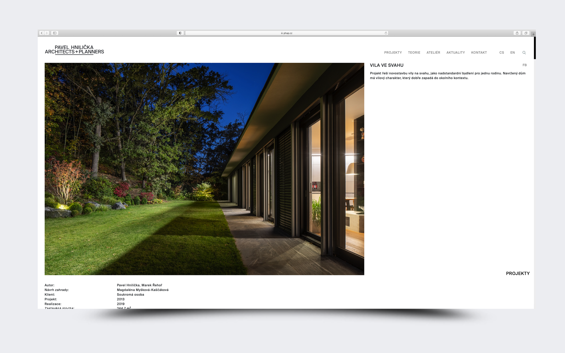
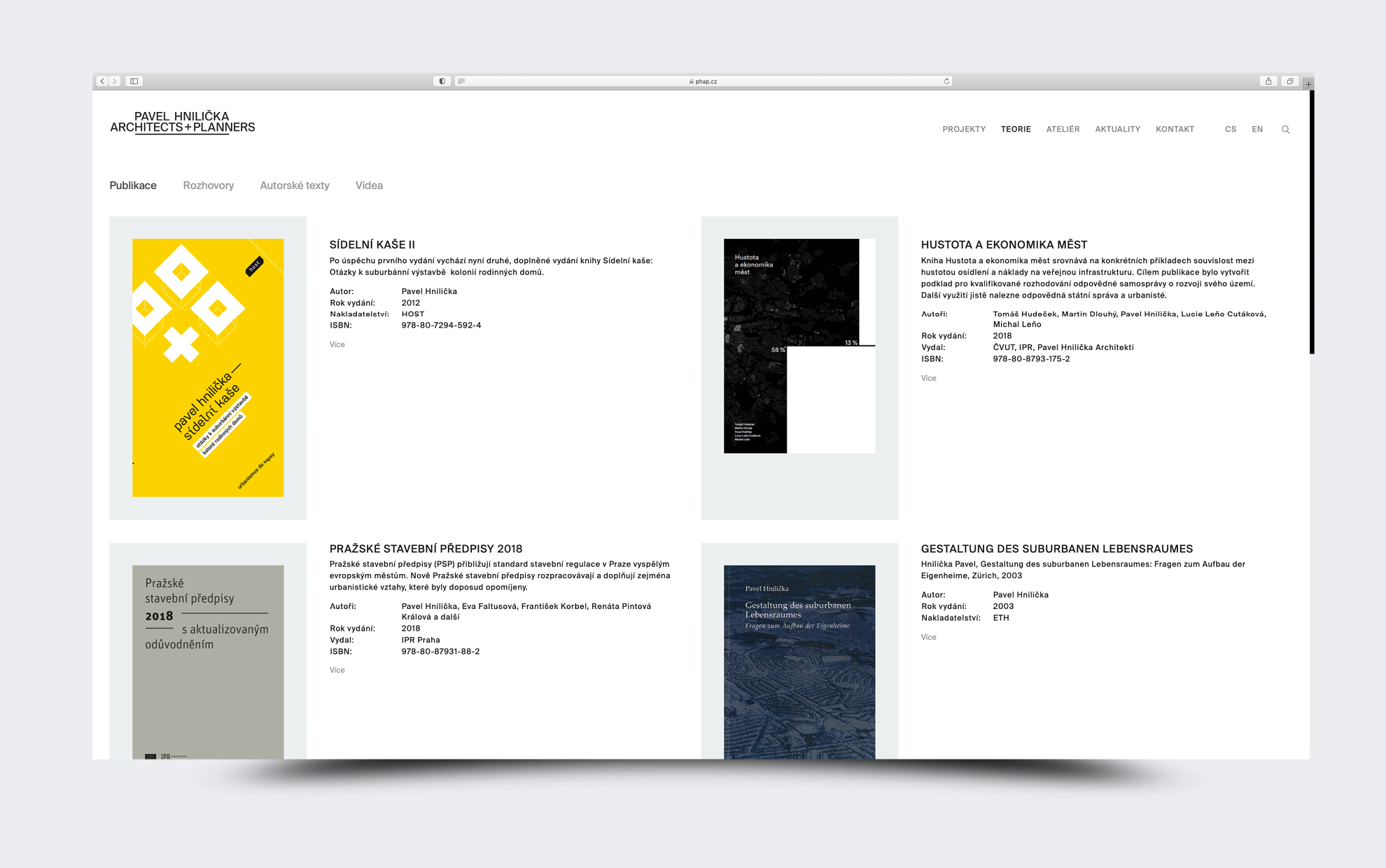
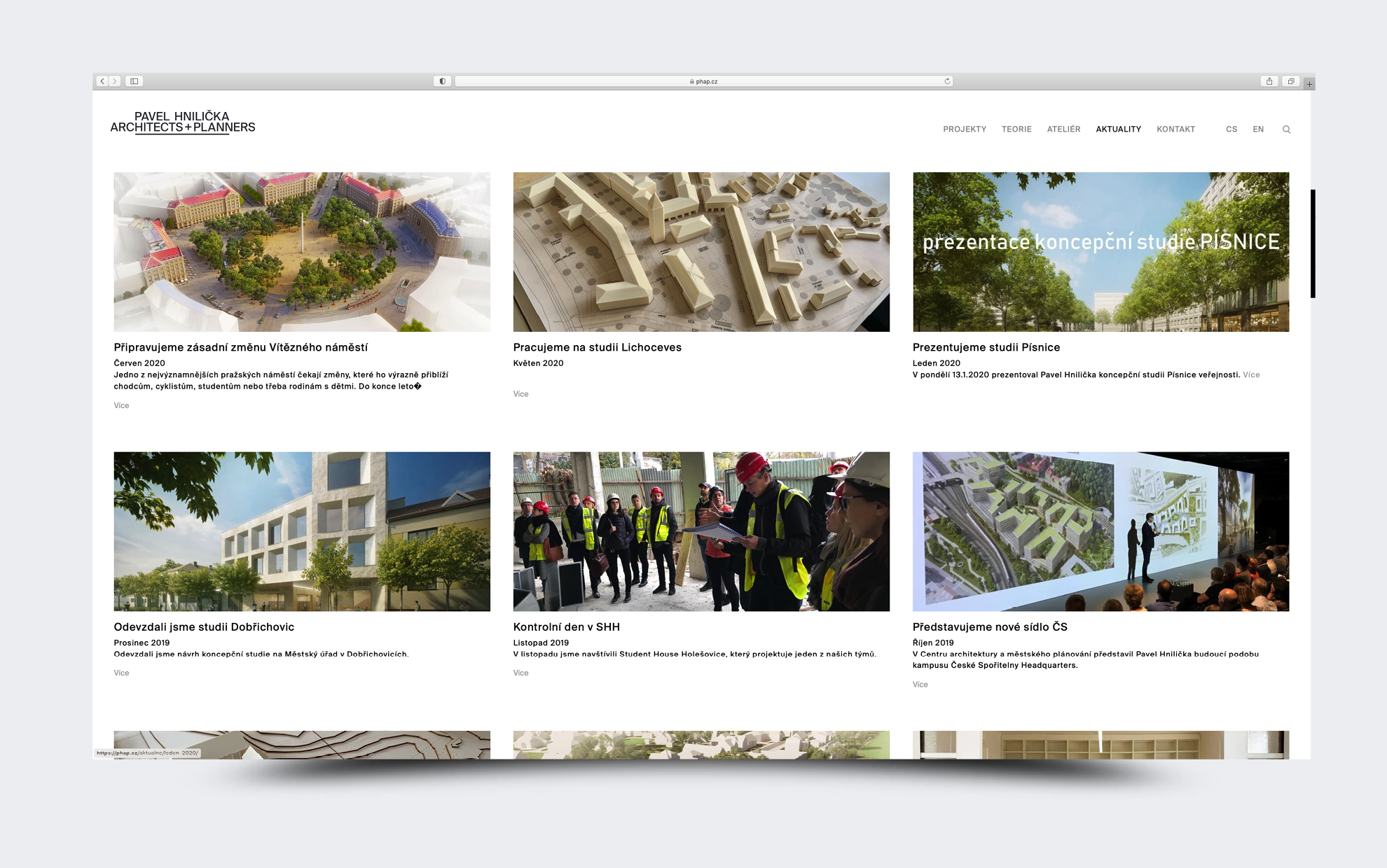
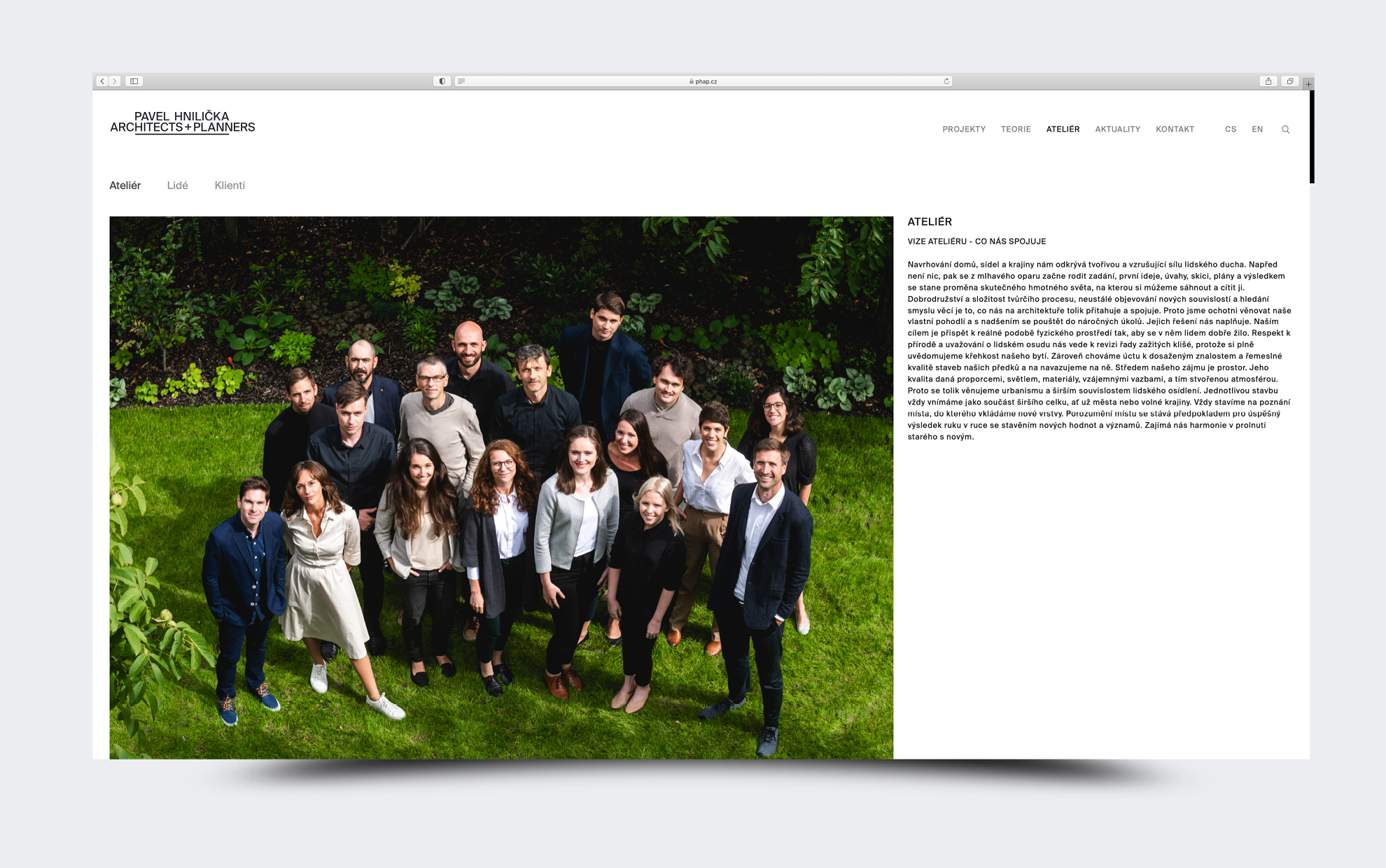
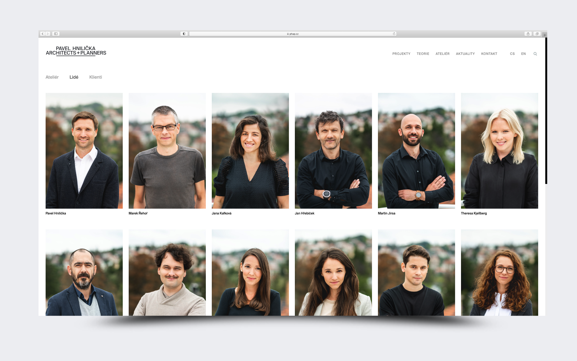
The brand of Pavel Hnilička’s architectural office had a clear development. Behind the new logo was a name change. They wanted it to be more evident that they deal not only with architecture but also with urban planning. The name, therefore, ended as Pavel Hnilička Architects+Planners. We also tried to express their new name by choosing a font. We worked with four fonts which are based on the Helvetica font. Adepts to choose from were New Rail Alphabet, Neue Haas Unica, Favorit Pro, Everett, and Suisse Int’l, which eventually won.
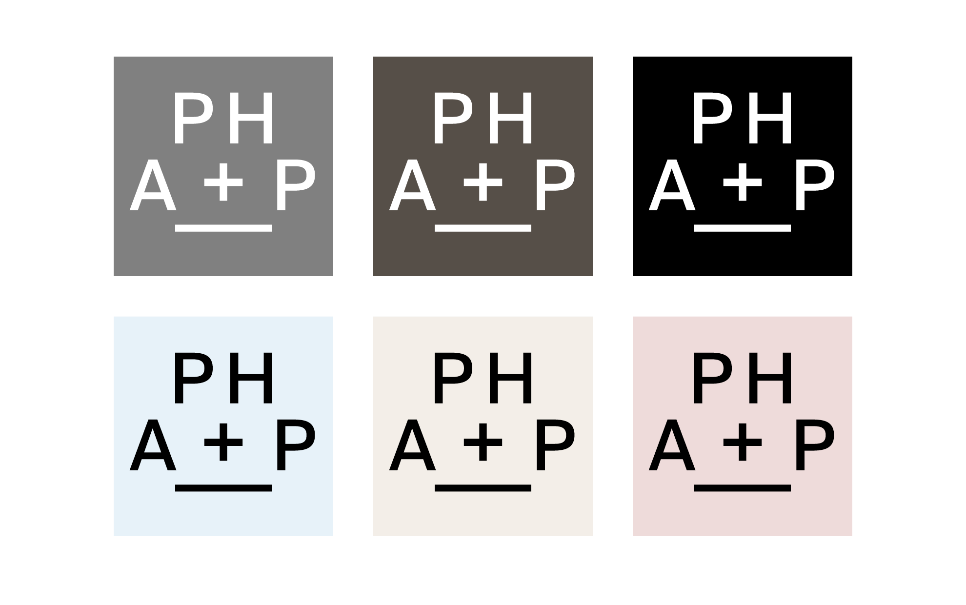
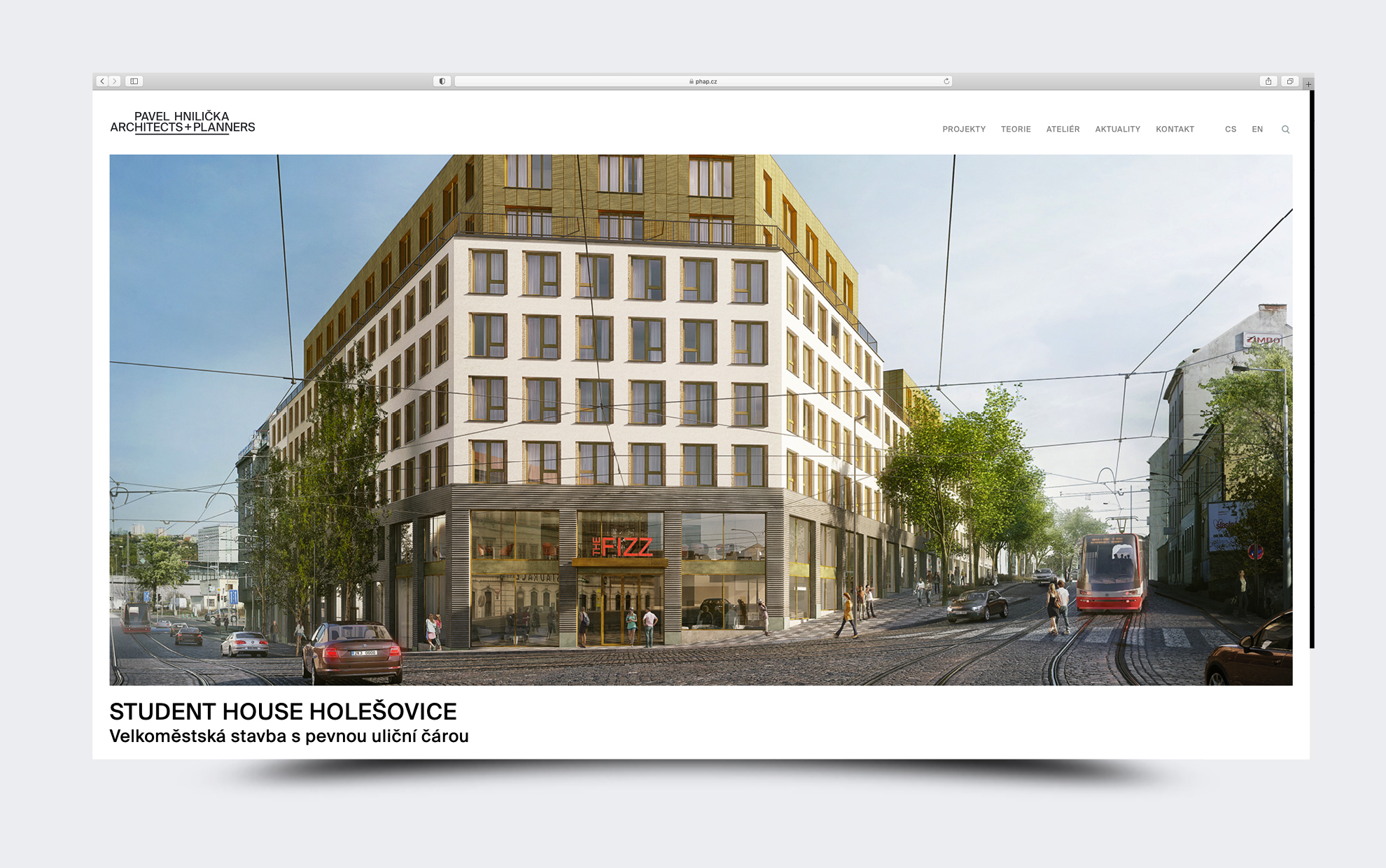
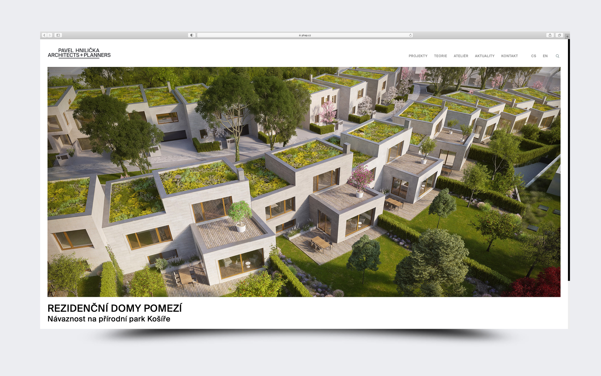
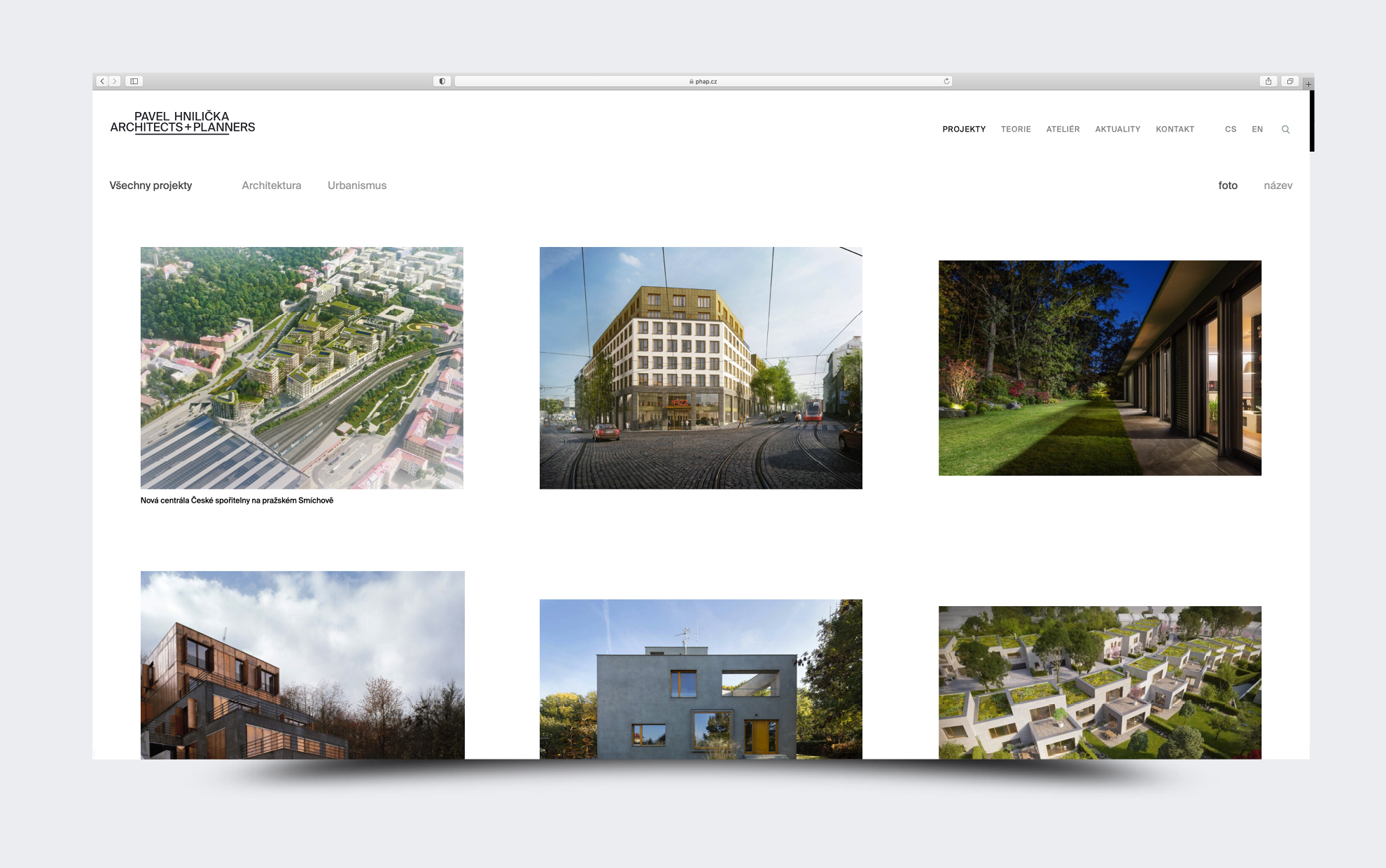
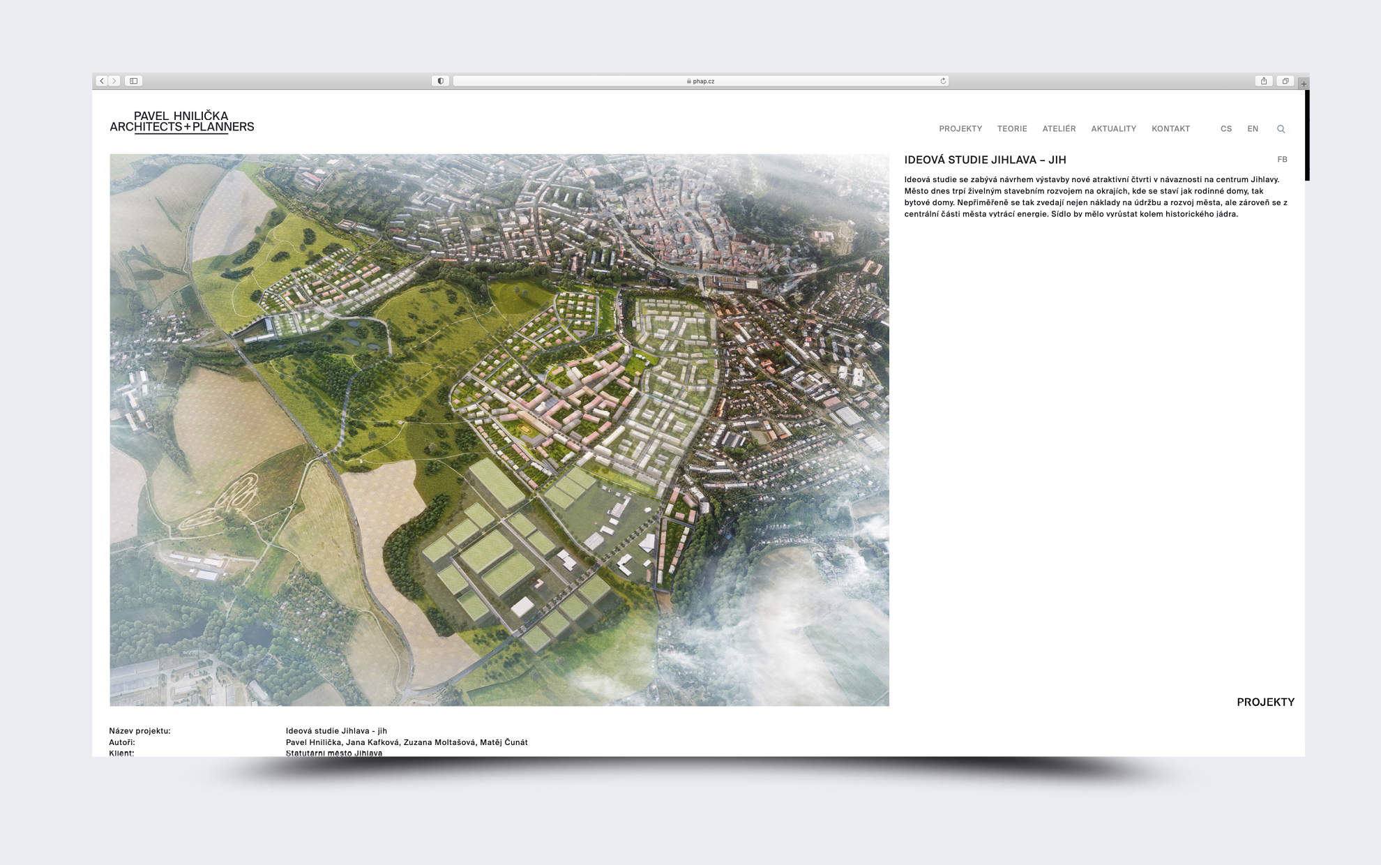
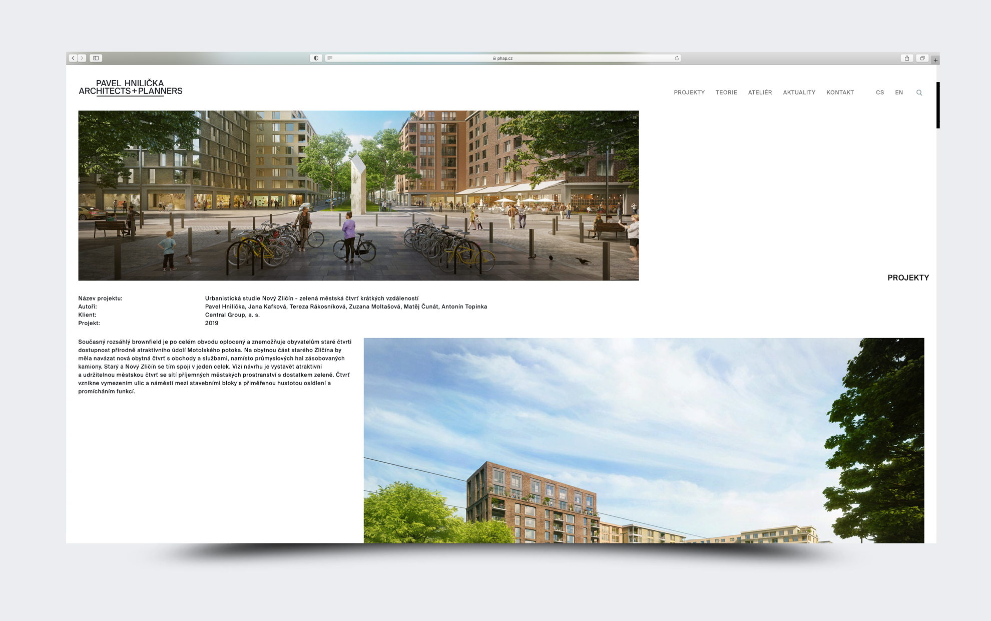
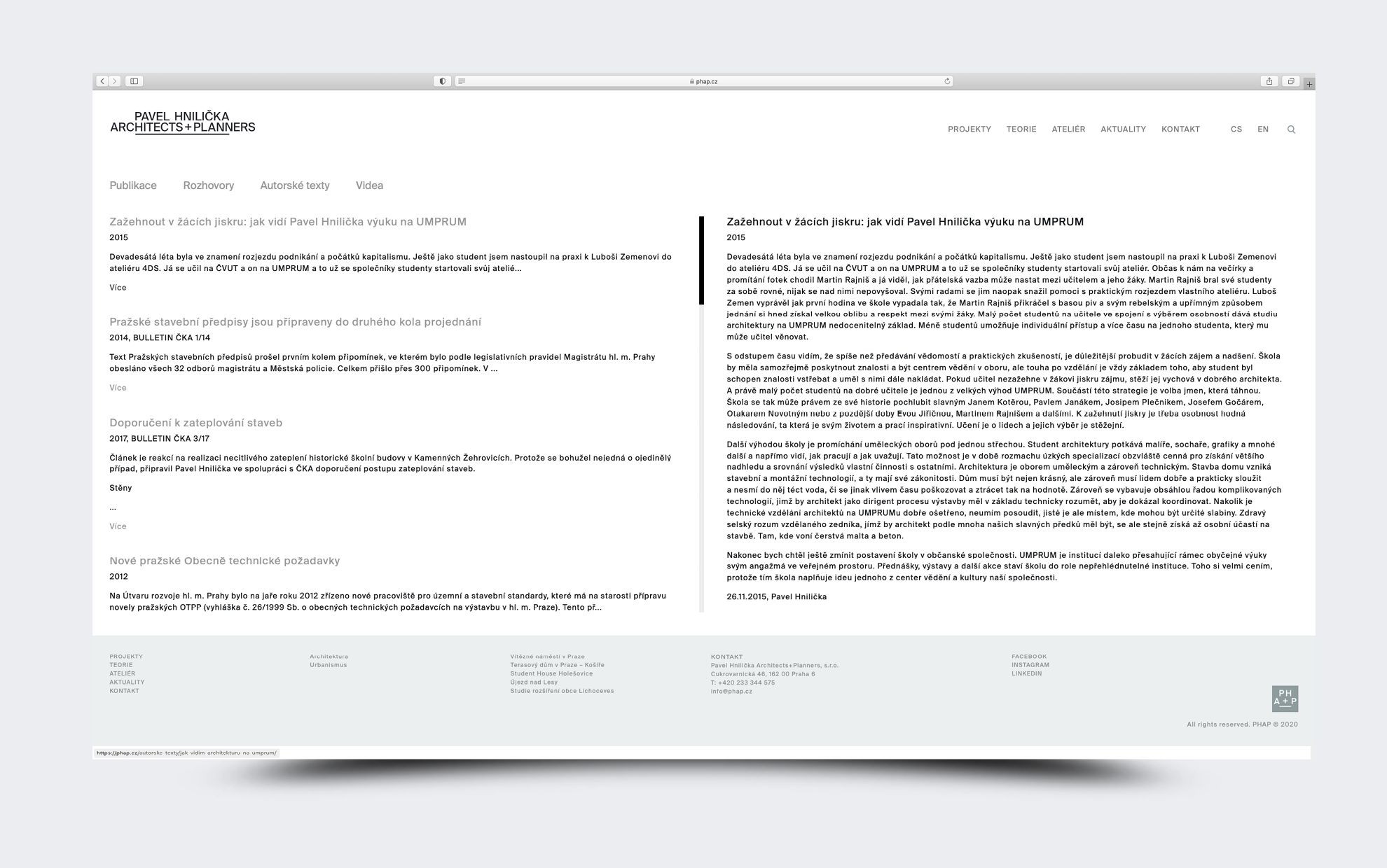
The logo and the proposed shortcut are designed symmetrically. It is the symmetrically built logo of the name that looks good on the web pages and printed materials, the abbreviation PHAP is then applied on social networks or in the favicon. The new graphic identity is largely created using a single typeface. The Bold cut appears in company publications. The website uses one typeface of the Book cut, and we solved the differentiation by using the sizes of capital letters and minuses and adding color, in this case rather “non-color” – gray.
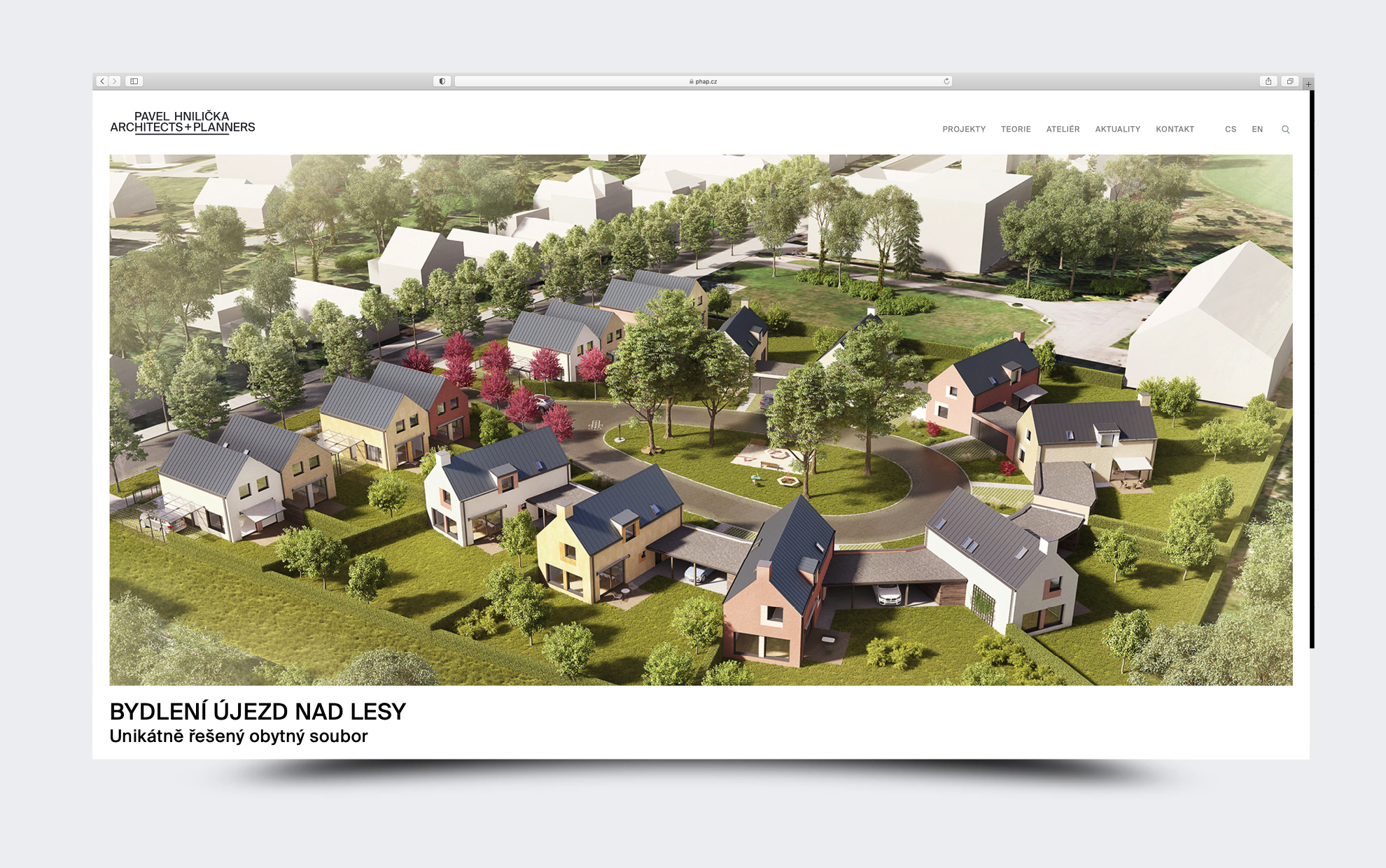
The minimalist website serves as a neutral background for the project presentation. It also gives space to authors texts and interviews, because the studio also focuses on architectural theory. The design remains in the background, letting the work of the studio speak for itself.
Client: Pavel Hnilička Architects+Planners s.r.o.
Font: Suisse Int’l
2020