WorksLogotype
Premonstratensis of StrahovMilevsko stud 
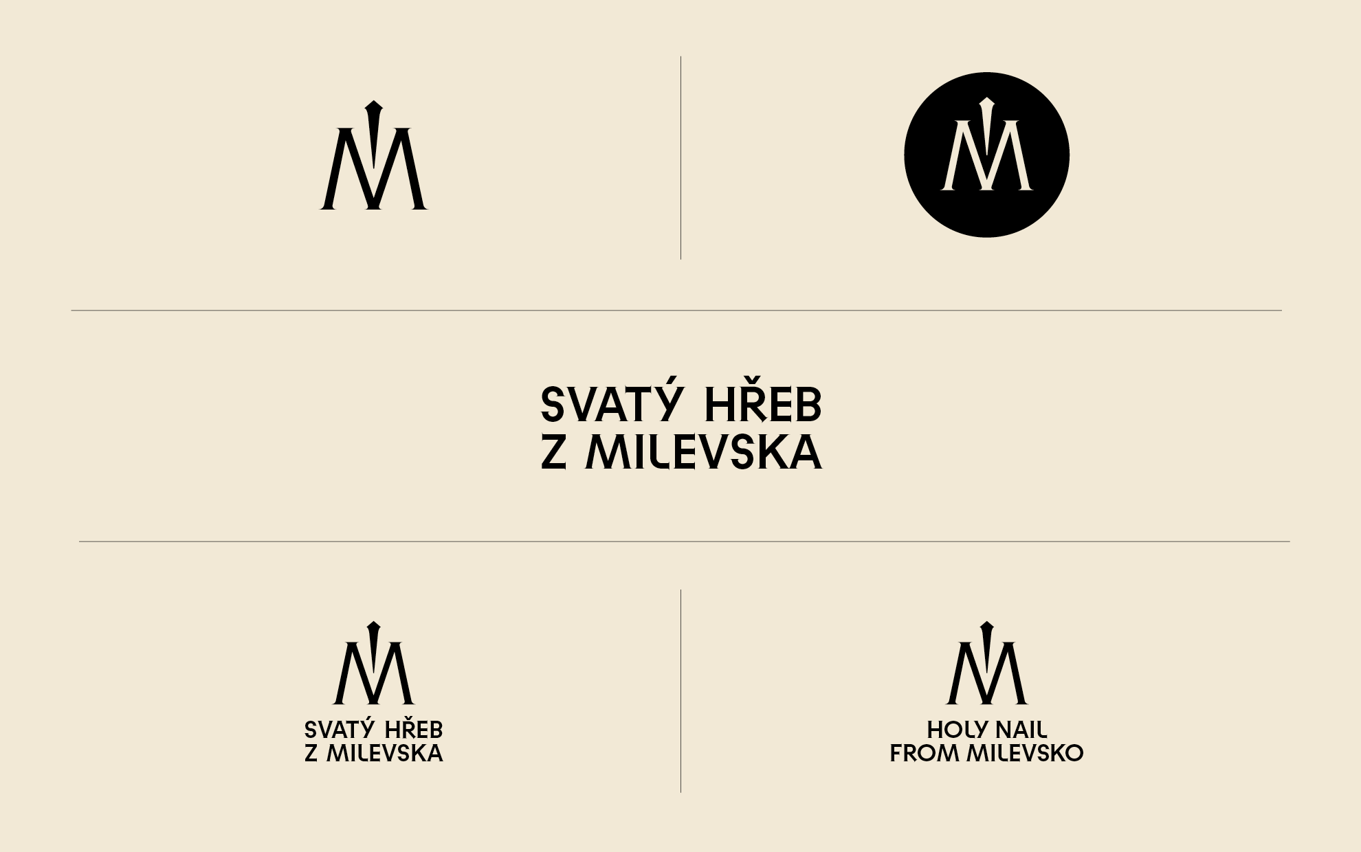


The brand awarded first place in a public competition organised by Strahov Monastery, together with the South Bohemia. The aim of the newly created logotype is to draw attention to a unique archaeological find made in 2019 during archaeological research on the grounds of the Milevsko Monastery. The basis of the brand is the letter M, which represents the name of the place Milevsko. The drawing of the letter is characterized by the "posture" of the letter M, which is firmly straddled and becomes a building in a figurative sense.
The font used is Gradient Gothic Premium, a linear antique with small serifs. Their drawing of the letters can be related to the drawing of the spikes, (studs) which are meant to quote in detail the elaborated topic. The stud drawing is incorporated as a central element, which becomes part of the lettering and thus creates a new, unmistakable symbol. The typography of the lettering is designed on an axis. The symbol can be well used in a circle, which is applicable to social networks and web applications, becoming a "modern-day seal". The mark will have a wide application on gift and promotional items.
Client: Milevsko monastery, South Bohemia region
Design: Jakub Šilhavý
Collaboration: Matyáš Bartoň, Klára Kvízová
Typefaces: Gradient Gothic, Gradient Premium
Materials: Milevsko monastery
2022