Works
Koma City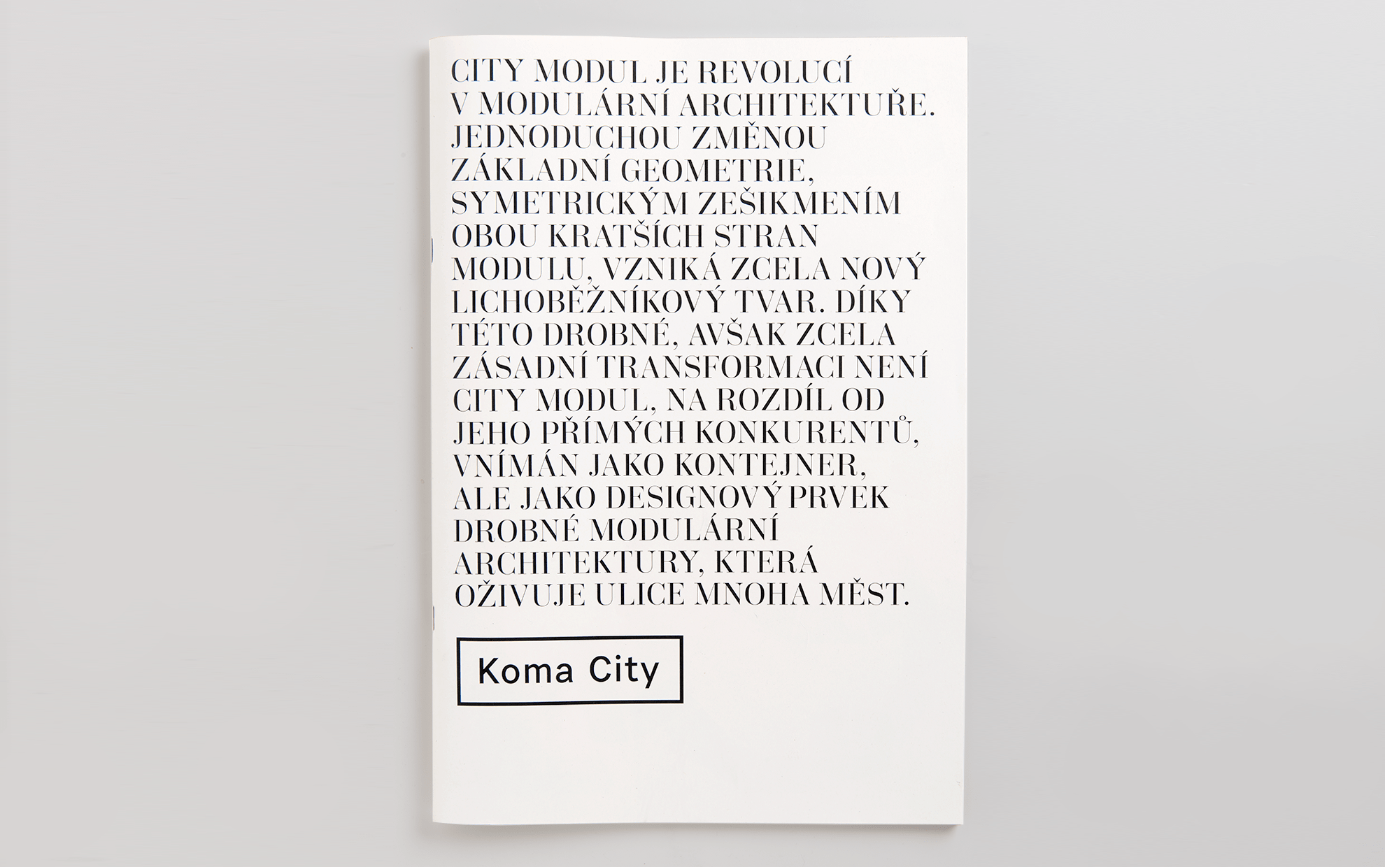
This project has been around for a long time. The result isn’t a brochure about Koma’s product. It’s a story about the company, its products, and mainly the people who use them and the cities we live in.
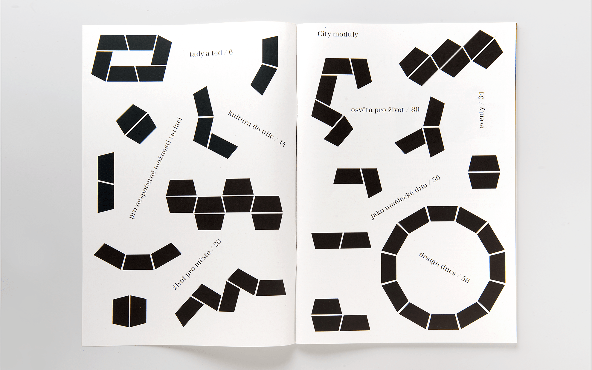
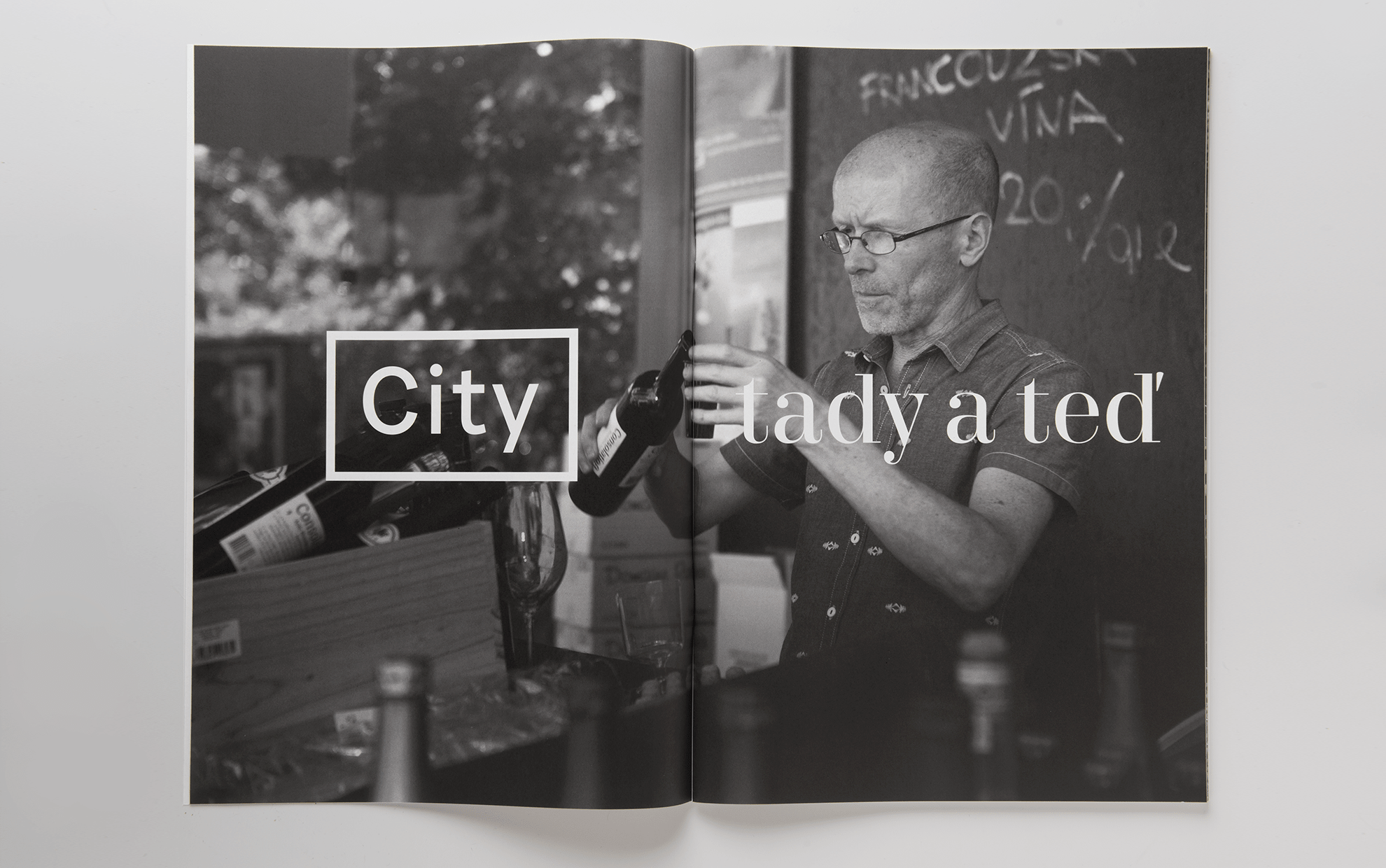
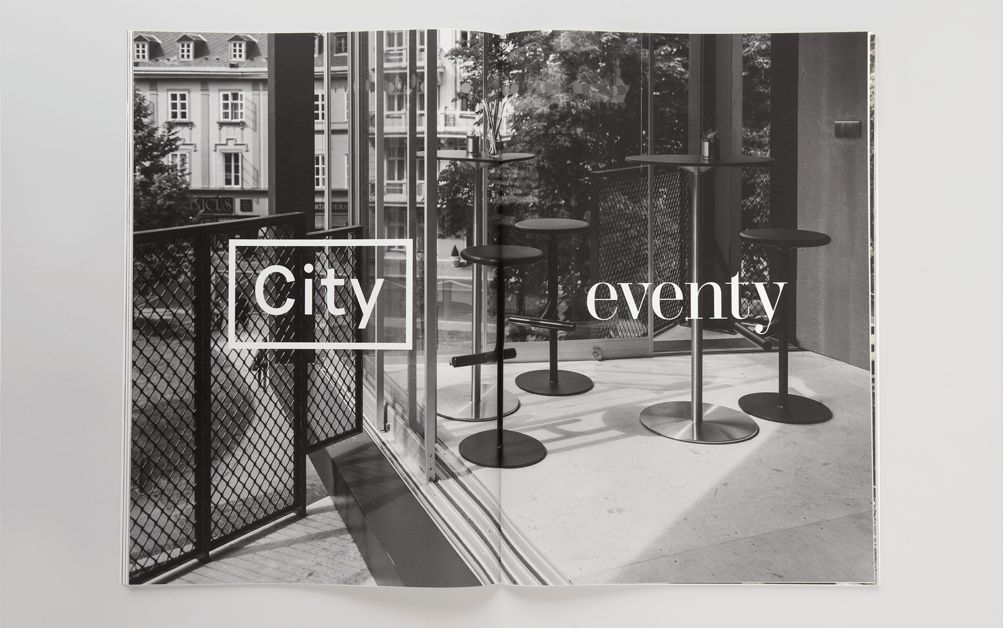
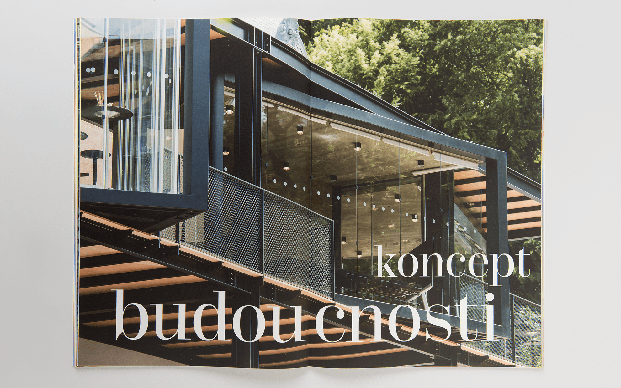
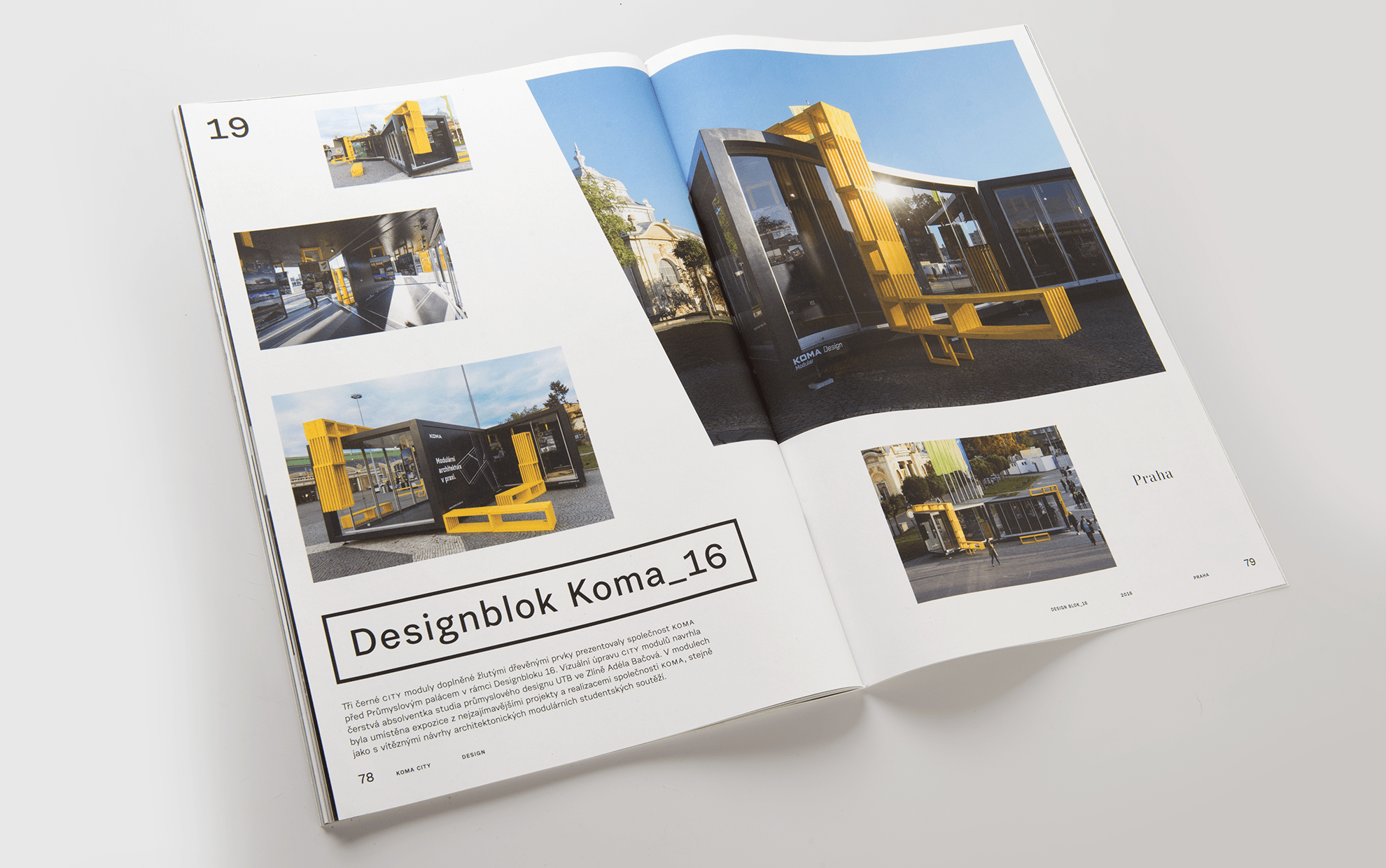
The Koma City module is a revolution in modular architecture. It is not just a container, but a small design element or an architectural intervention. City modules can be seen at festivals and other events of all kinds, so our goal was to do something more like a newspaper about what was happening. We accordingly adjusted the format, photographs, and paper.
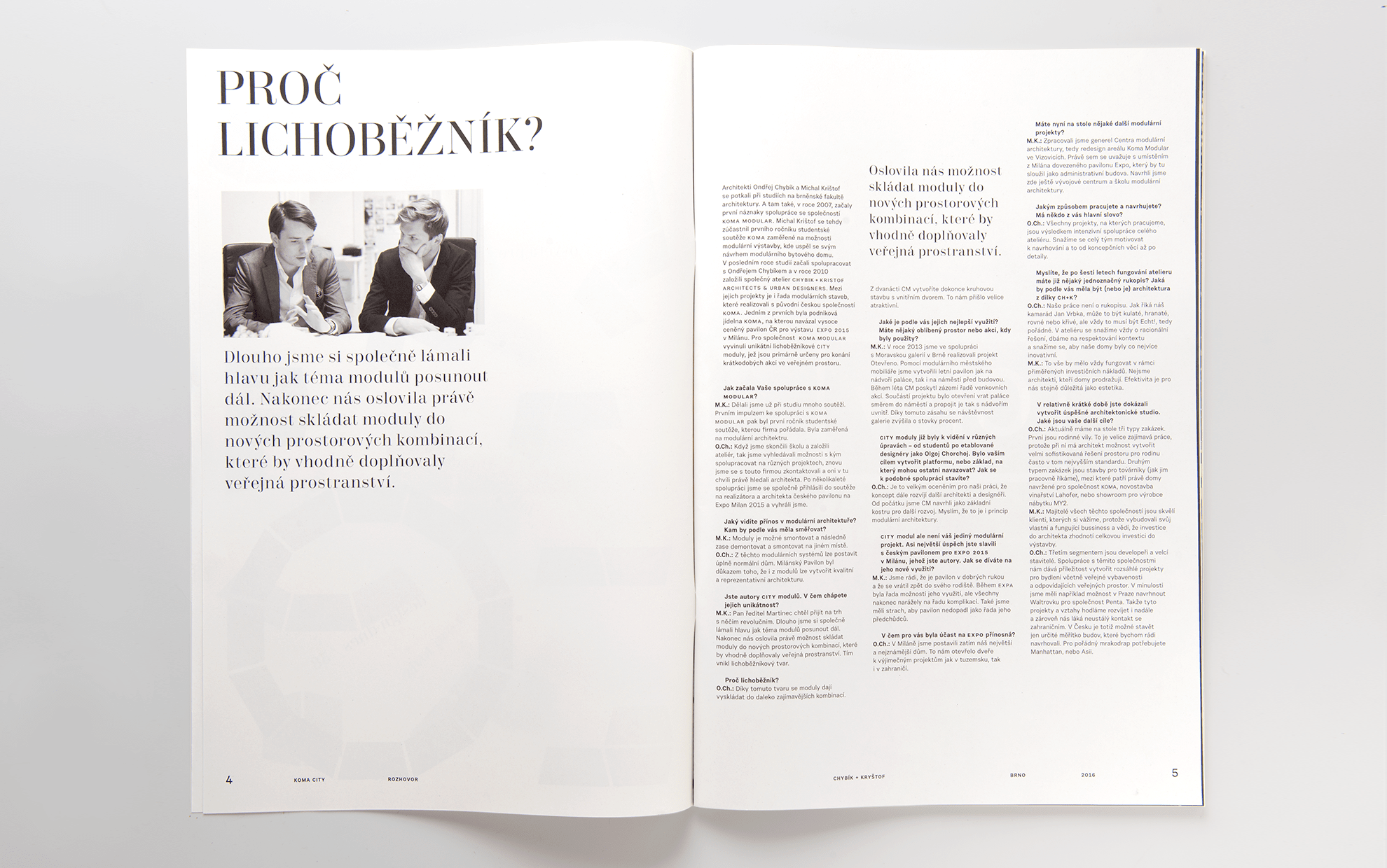
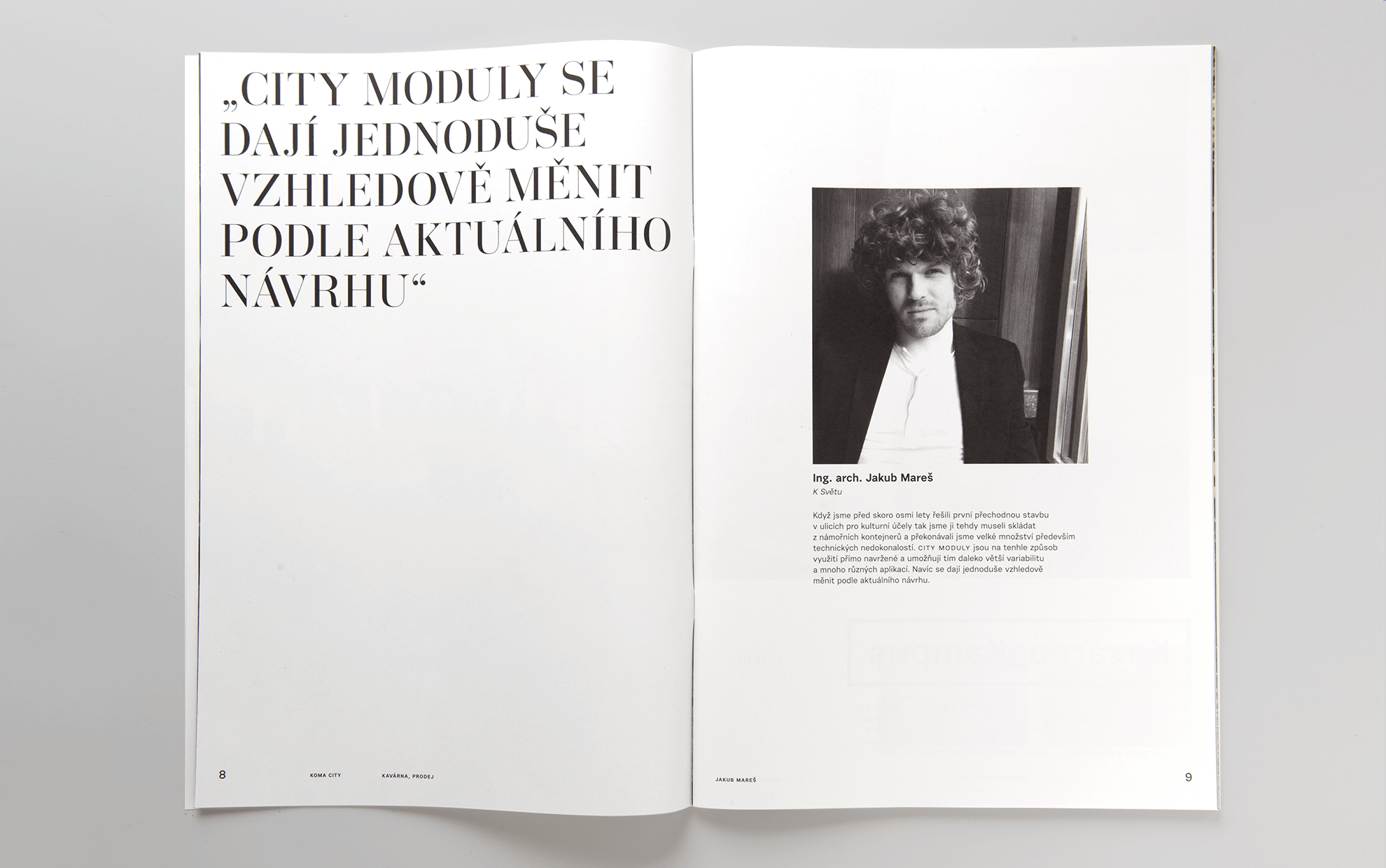
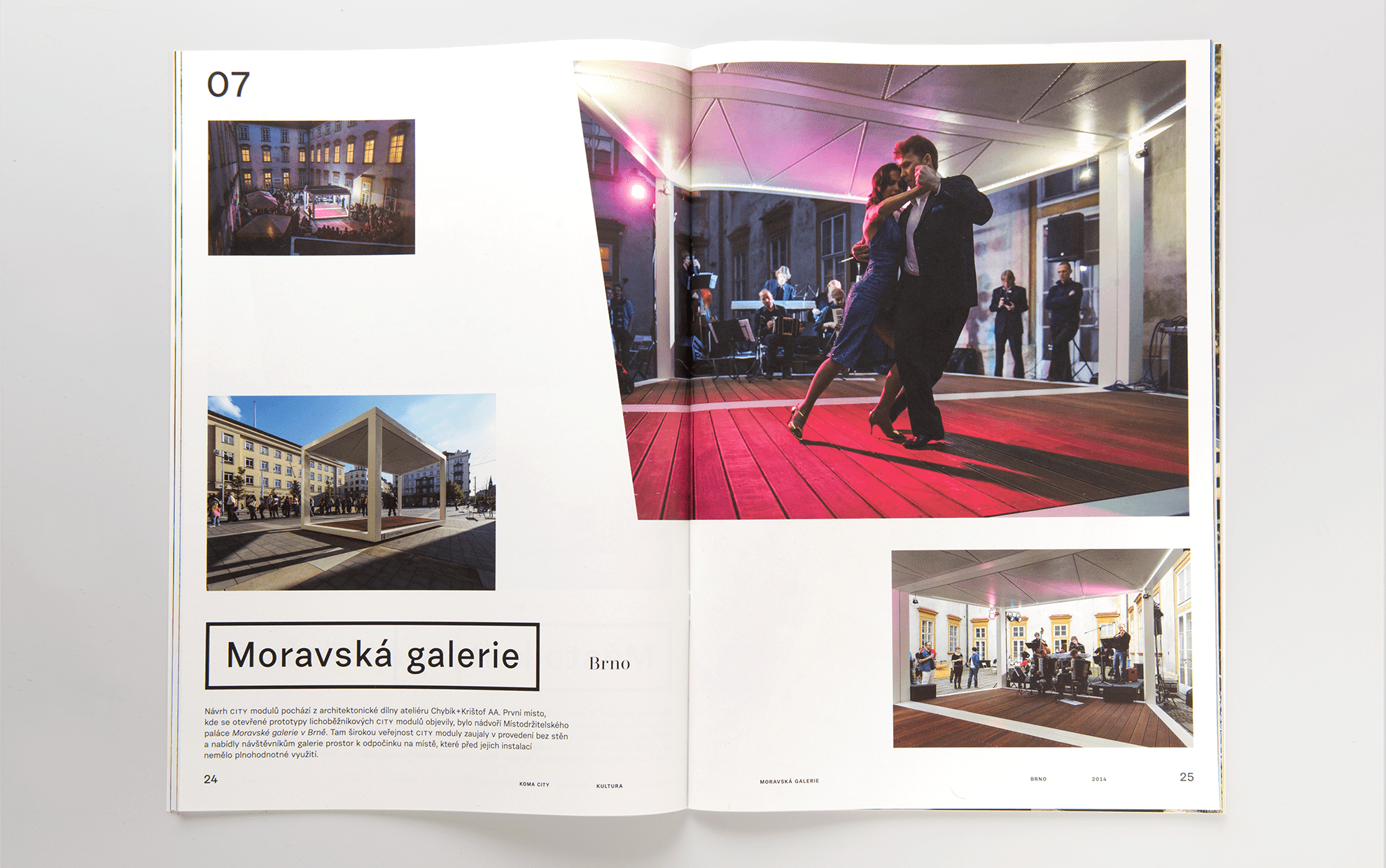
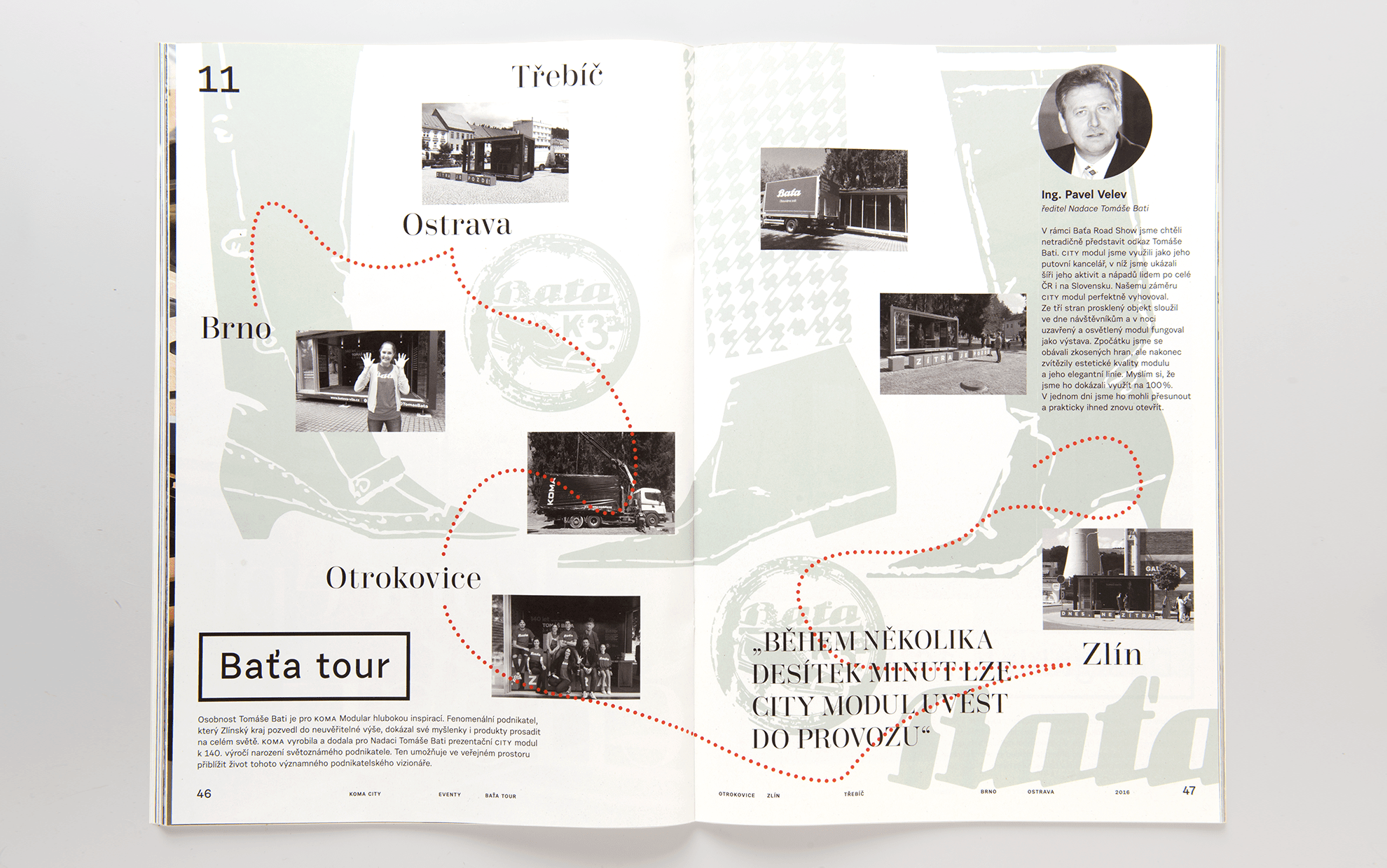
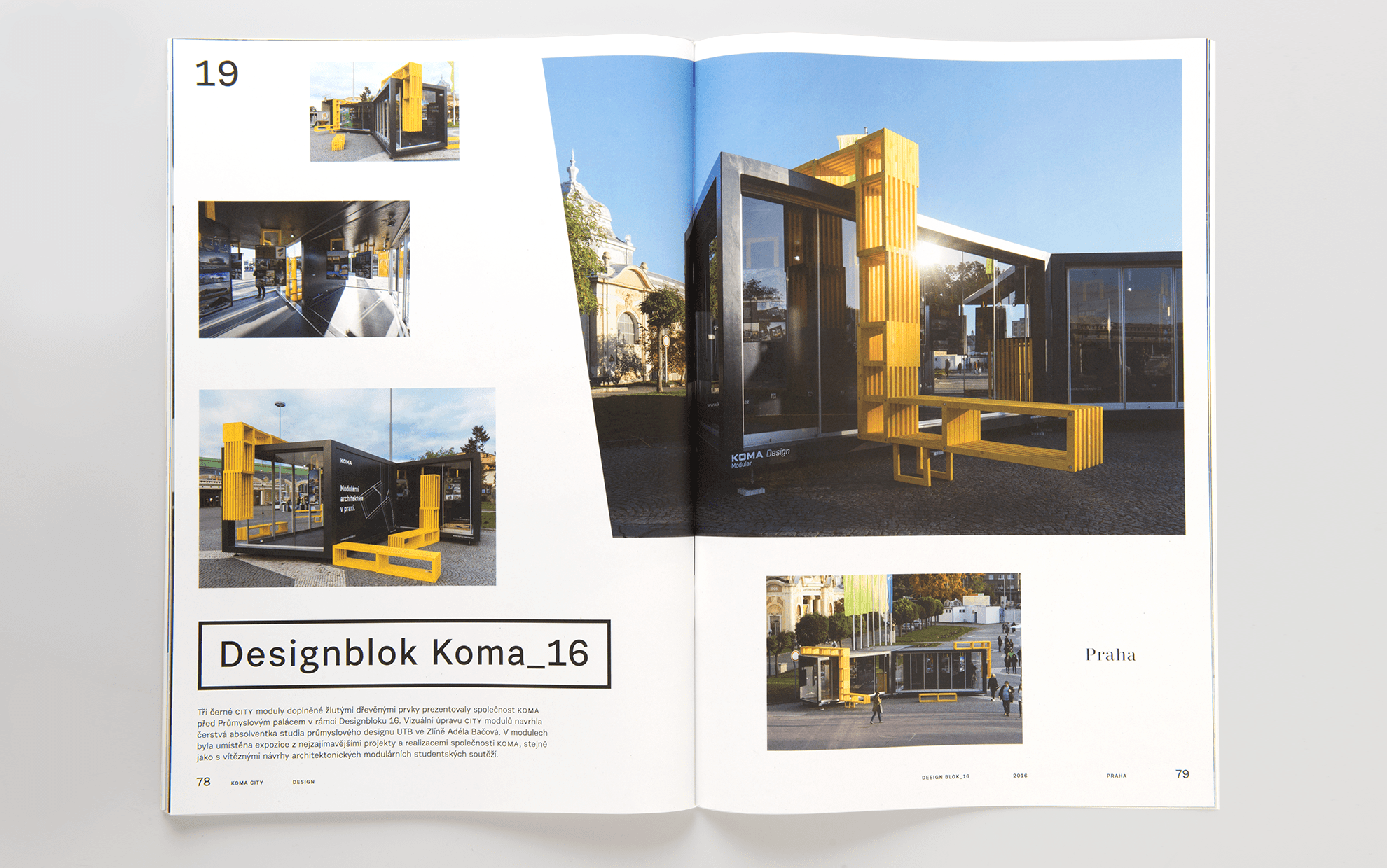
The content also corresponds to that. The architects who work with the module, such as Chybík+Kryštof Architects studio or designers from the Olgoj Chorchoj studio, express themselves here. And the word was also given to those who use it: Jan Press from the Moravian Gallery, Jiří Macek from Designblok, Eva Knapp from the project “Ostře sledovaná prsa” and others.
Used photo: Koma
Font: Trivia Serif, Urban Grotesk
Paper: Cyclus offset
Print: Helbich, Brno
Pages: 88, A3
Client: Koma modular
2016