Works
Terra Florida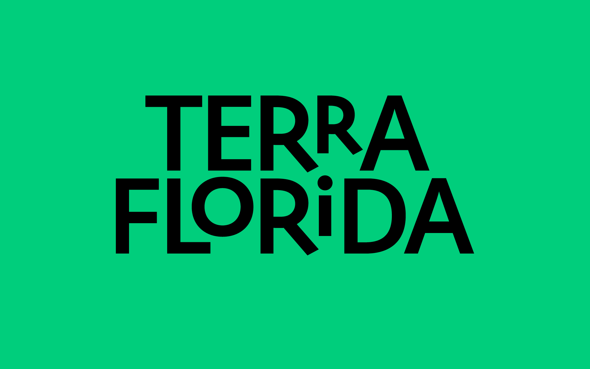
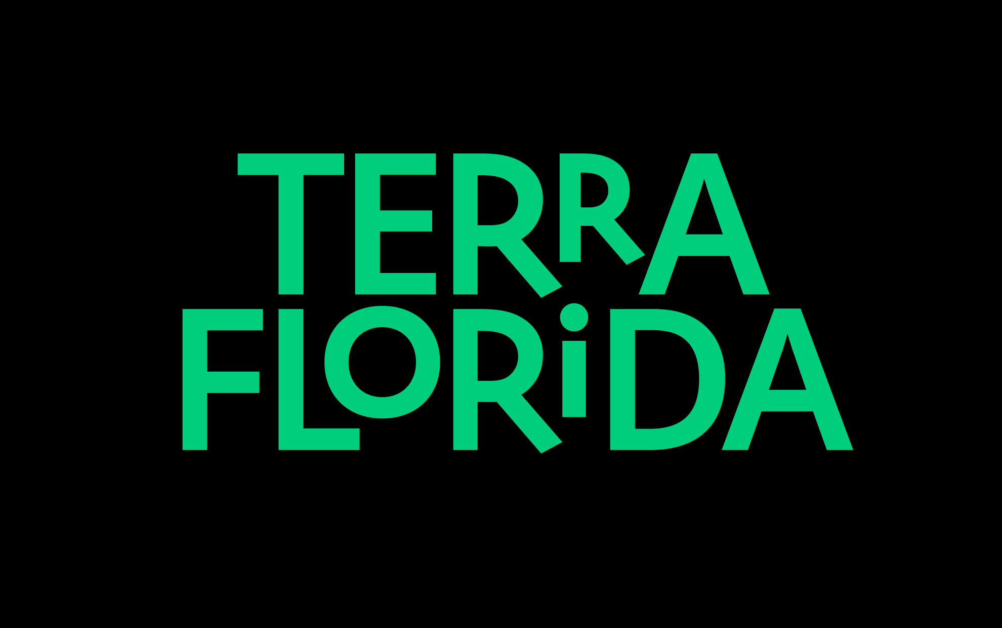
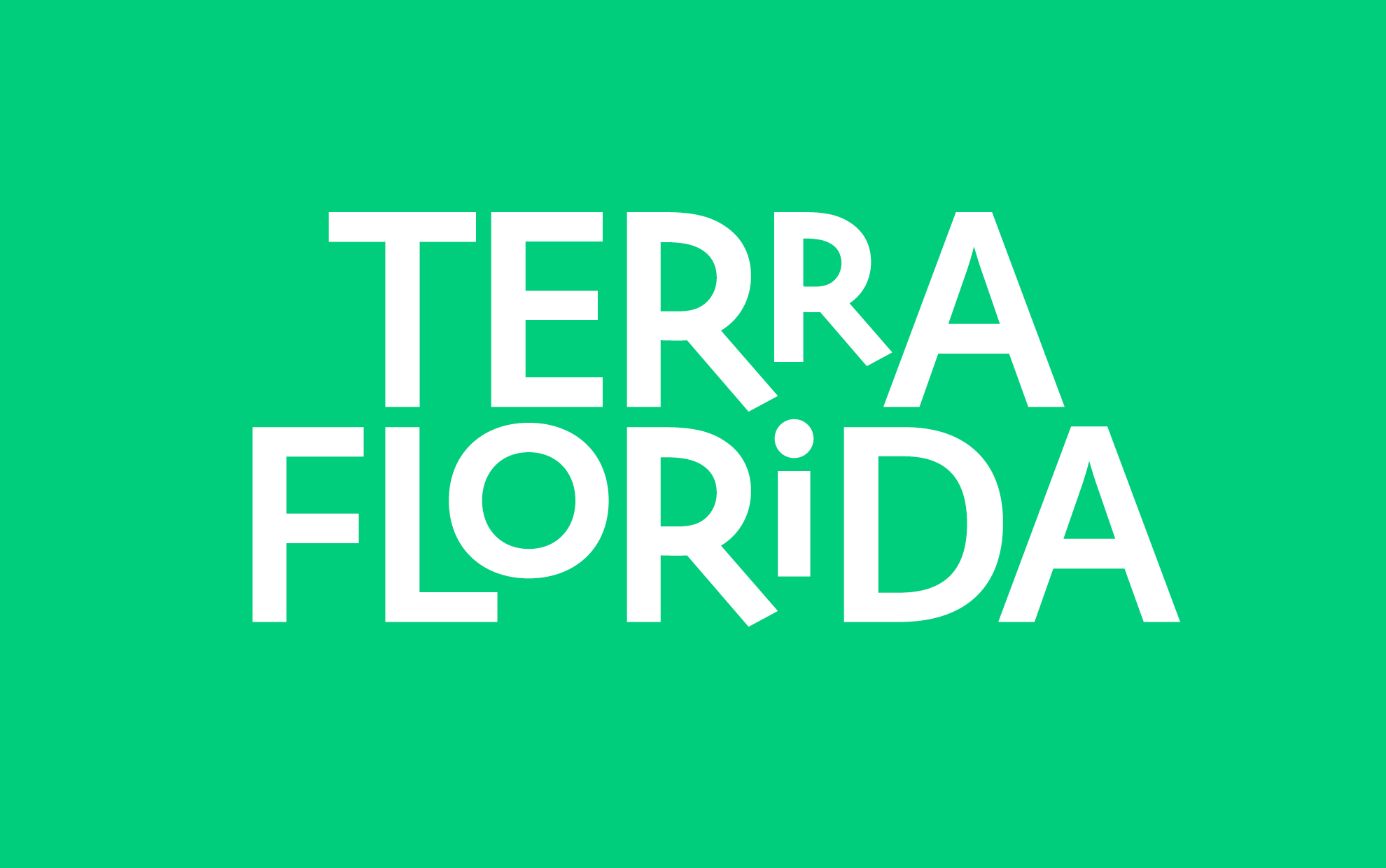
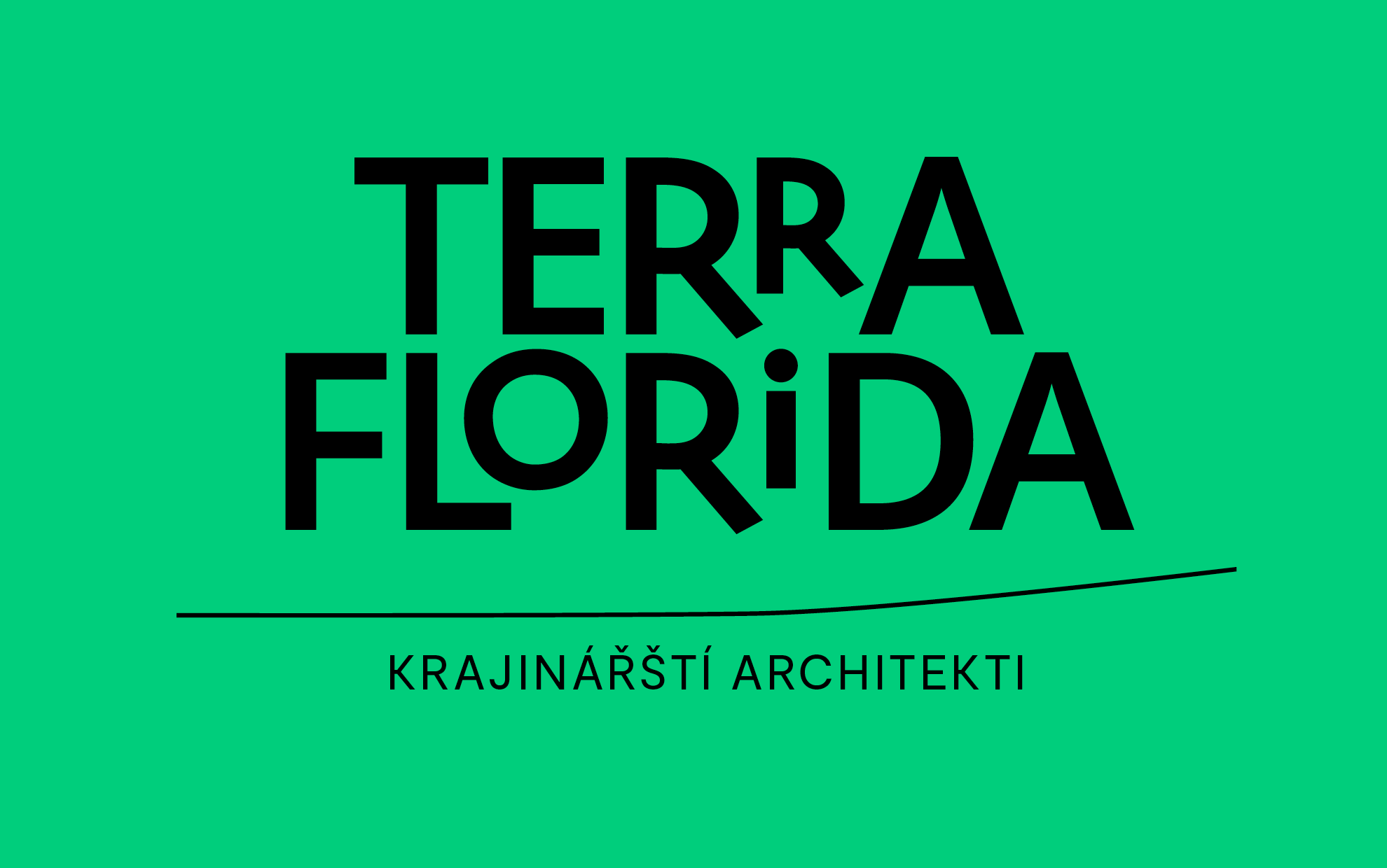
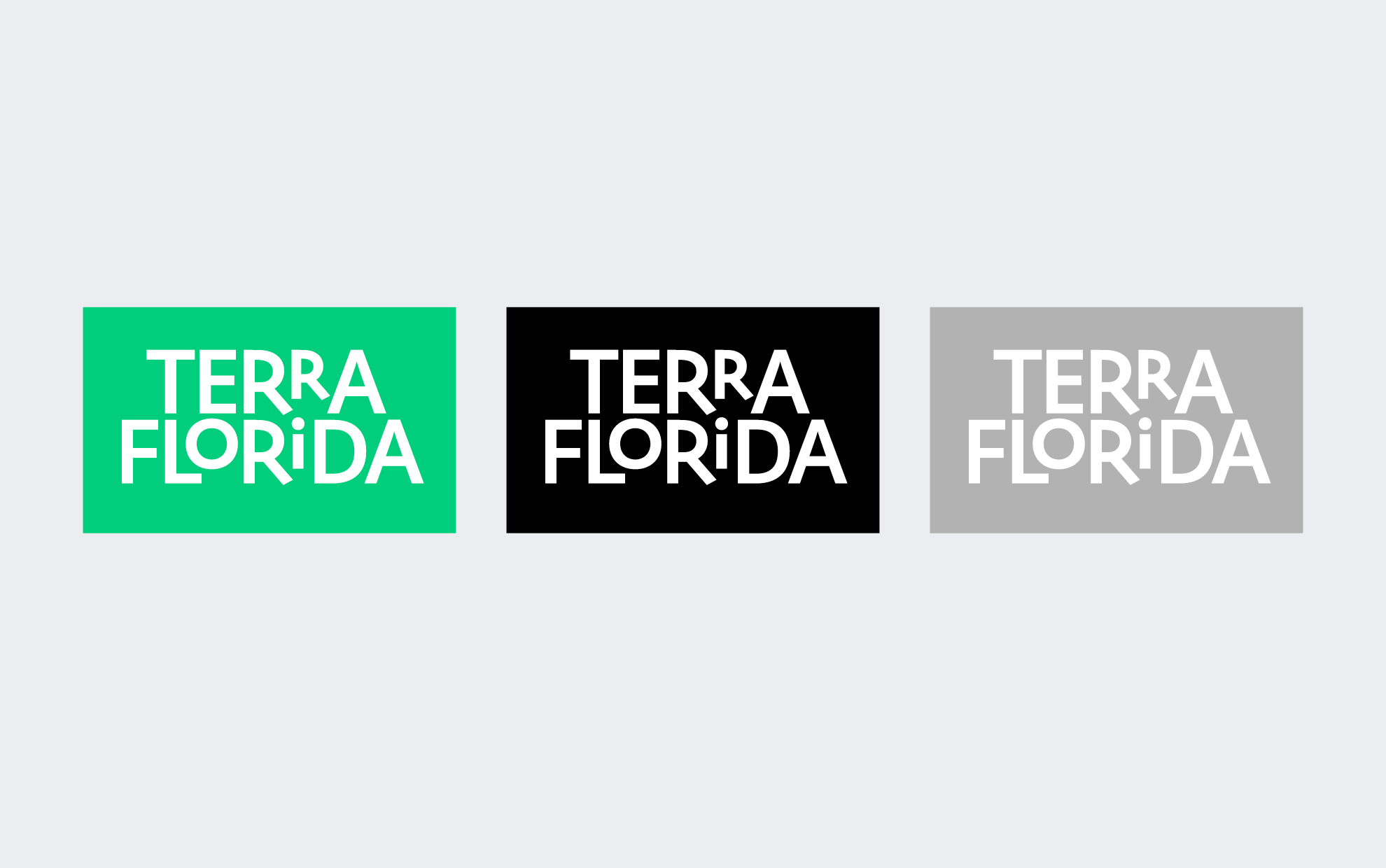
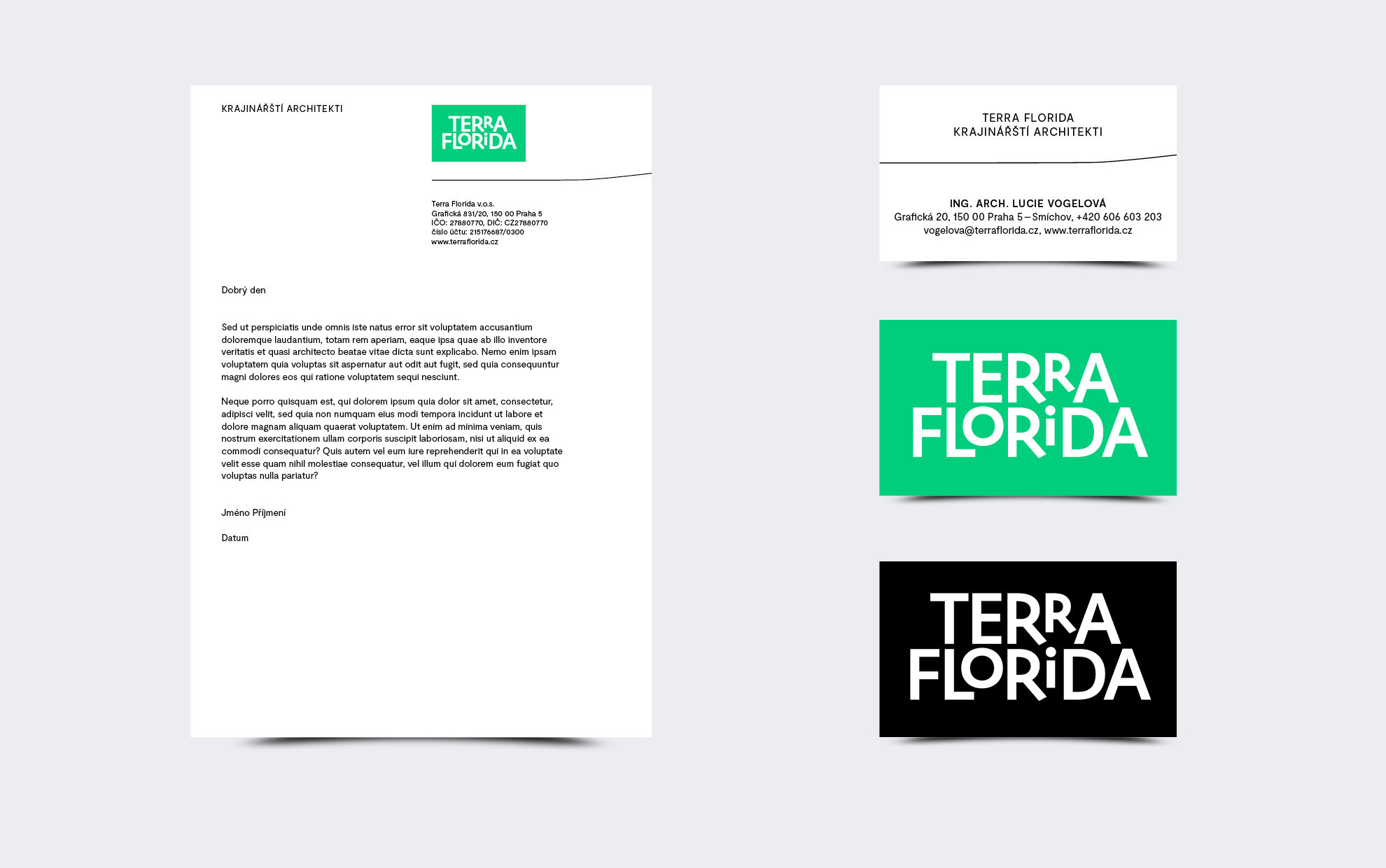
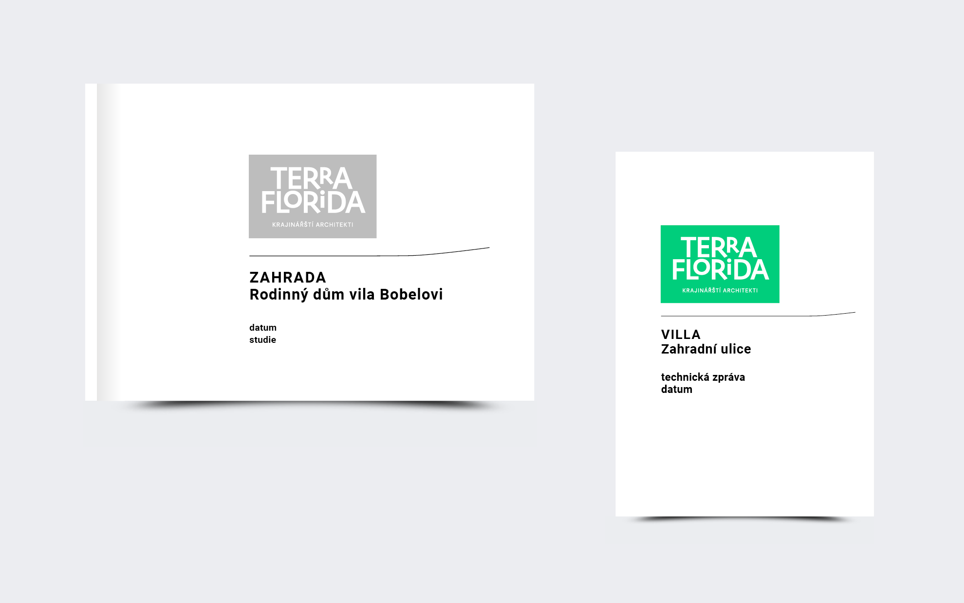
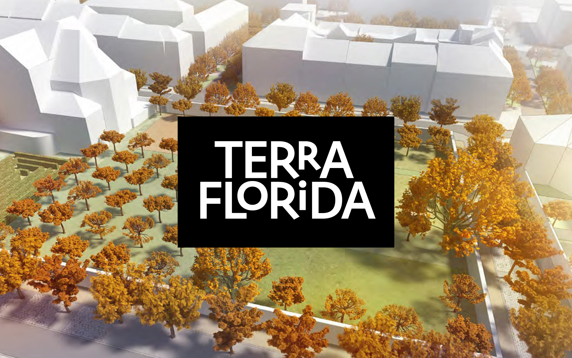
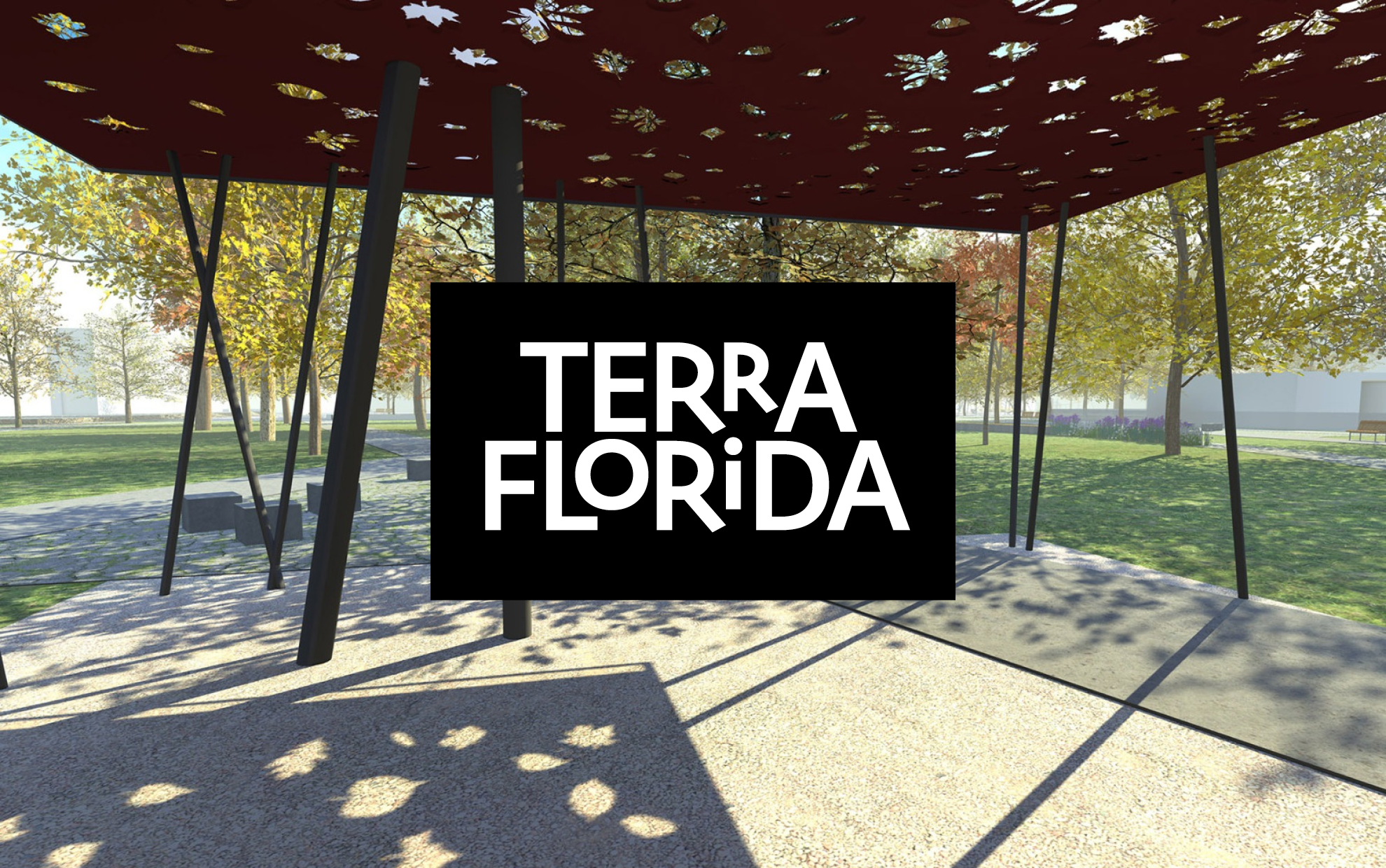
Know that landscape architecture is different from garden architecture. Changing the character of the landscape is a responsibility and a challenge. The Terra Florida landscape architecture studio also wanted to express that with its logo.
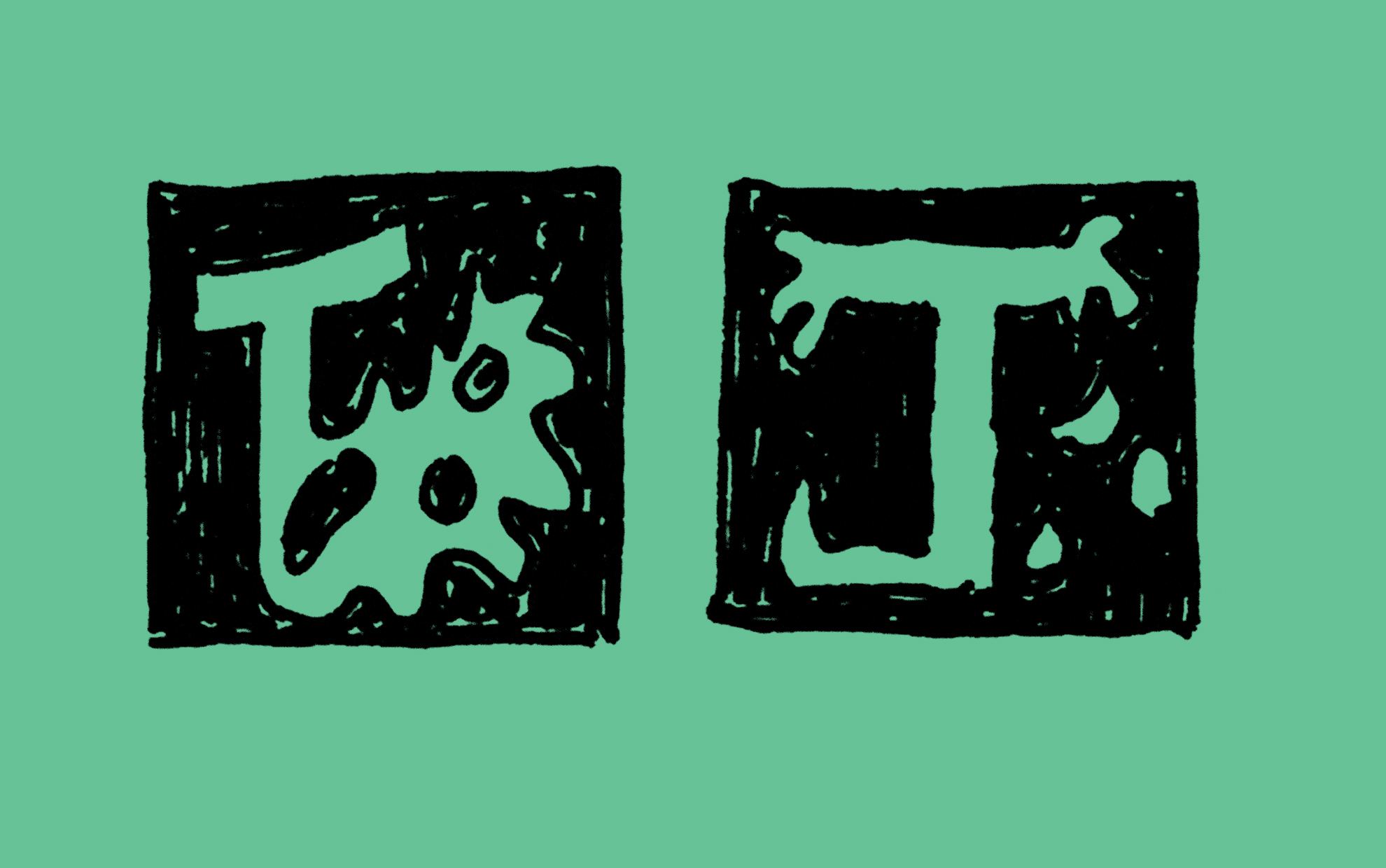
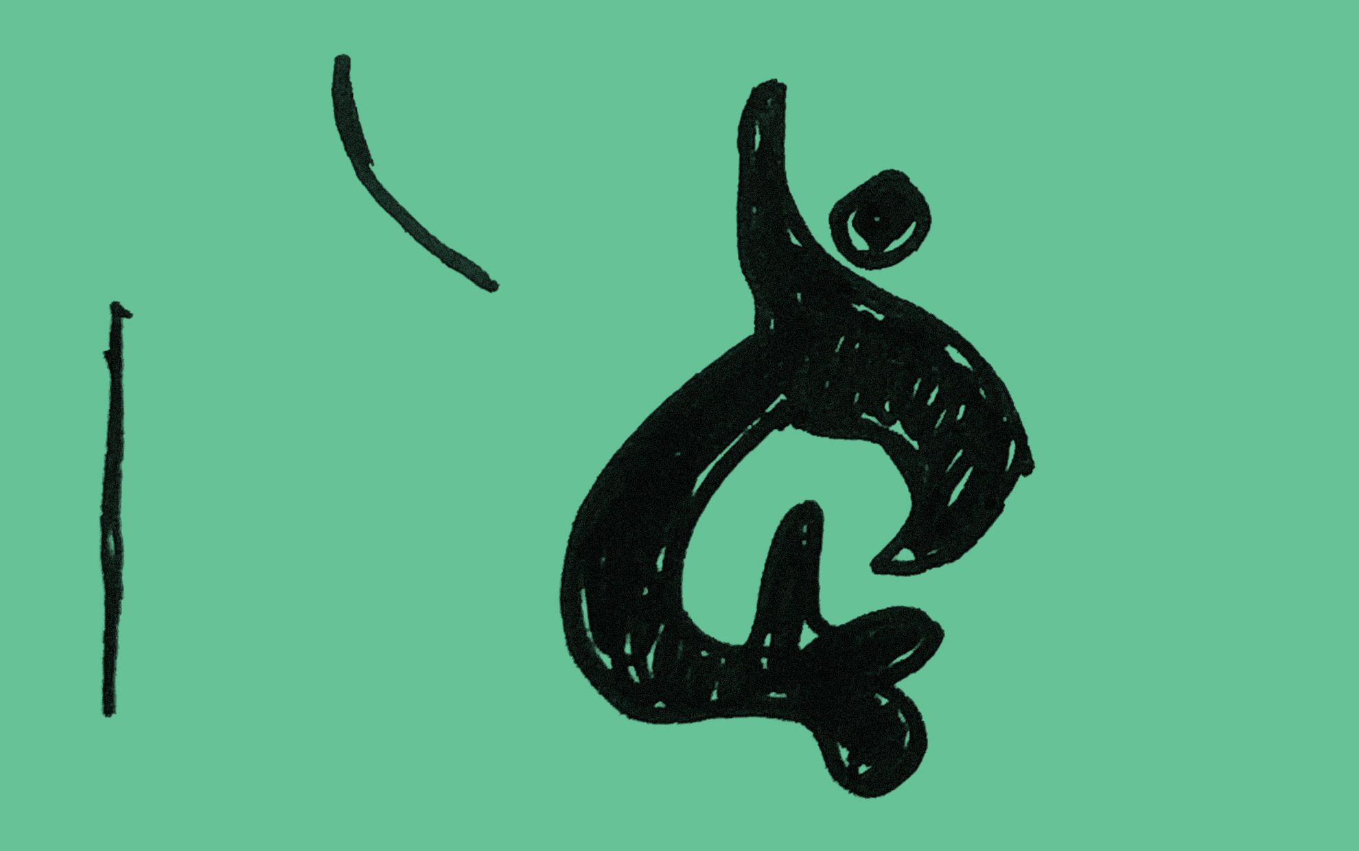
From the several paths we offered them, they chose a simple message, a logo without a symbol. The individual letters were worked on quite adventurously before we figured out how to build the brand. Letters tailor-made, almost organically, as if created by nature. The letters “R” and “O” are reduced, so the inscription is generally narrower, which was the intention to ensure that the alignment of the letters below is not only optically accurate.
Client: Terra Florida
2020